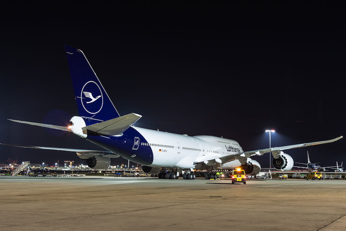
In early February Lufthansa revealed their new brand design, which is their first major redesign in about 30 years. With this brand design, dark blue becomes the leading brand color, and yellow accentuates, while previously Lufthansa had a lot more yellow in their branding. As part of this redesign they introduced a new livery, which wasn’t very popular with most. Actually, after introducing the livery they realized it didn’t look quite the way they were expecting, and they’ve made the decision to modify it.

Lufthansa Group is the parent company not just of Lufthansa, but also of Austrian and Swiss. It looks like another one of those airlines is getting a makeover. Austrian Airlines announced a rebranding today, which they say offers “adaptions to fulfill demands of the digital world.”
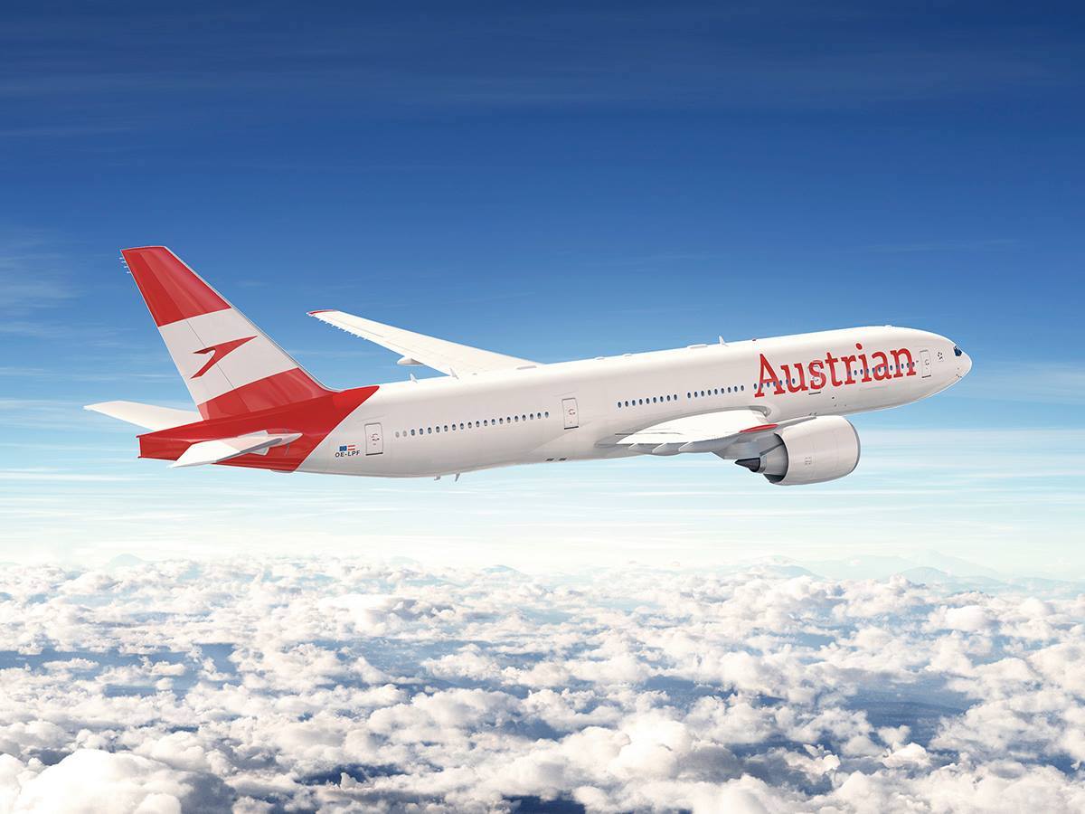
While this is part of a larger rebranding, perhaps the most visible change will be to the livery. The first aircraft featuring the new livery, a new Boeing 777 with registration OE-LPF, will be in service as of May 2018. Austrian says it will take about seven years until all Austrian planes have the new livery, which is quite a while.
Here’s how Austrian describes the new livery:
The primary new features of the aircraft’s exterior design: the empennage will be optically enlarged by expanding the red area from the empennage downwards across the fuselage. In this way, the logo is more dynamically highlighted and shown to be bigger. The wordmark “Austrian” in the front area of the fuselage is also displayed over a larger surface area and thus be clearly readable from far away. In the future the jet engines will be painted in a resplendent white. As a result, the chevron and wordmark “Austrian” will be visually highlighted in a more charming manner. The typical Austrian salutation “Servus” will remain on the aircraft belly.
And here’s the new livery:

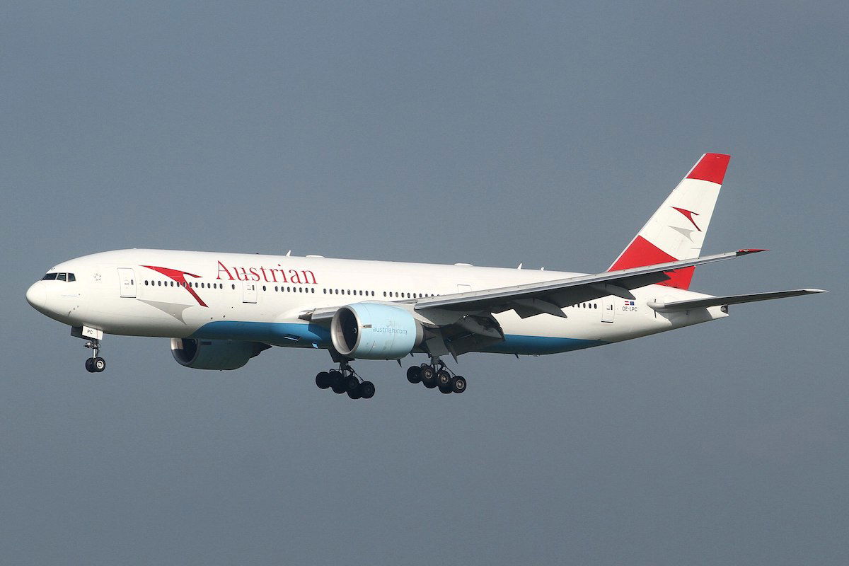
As a point of comparison, here’s the 777 in the old livery:

My initial thought is that I don’t mind the new livery. In the case of Lufthansa I actively disliked the new livery, while here there are things I like and things I dislike. I love that “Austrian” is written in bigger letters than before, and I think the new tail design is more beautiful, and love that it goes beyond just the tail.
However, in many ways the changes remind me of Lufthansa’s new livery, which I don’t like. I’m not sure why Austrian decided to eliminate the baby blue, since I feel like it added a nice splash of color. I get wanting to go for a clean look, but I feel like they’ve just gone for something that’s almost boring.
So I sort of like the new livery, I think it’s better than Lufthansa’s new livery, but I still don’t love it.
What do you make of Austrian Airlines’ new livery?
(Photo credit for old livery picture to Kentaro Iemoto)


Austrian hasn't had that blue in a very long time.
Seeing this, we can all assume what Swiss' new lively will look like when they unveil it in 2 months.
@James
The only radical change which was widely accepted was Etihad in my opinion.
It's...meh. Not as bad as the Lufthansa redesign, but I'm not a big fan of "billboard" lettering, and I thought the shadows of the logo were distinctive and a nice touch.
They did release a new livery that was basically the old one but without the blue and everything else being red.
I swear the new old livery was created in 2016
They dropped the baby blue, so why not make the engine cowling red? To me it seems so obvious - not only would it look great but red-white-red are after all the colors of the Austrian flag.
How many rebrandings has Austrian done during past 20 years or so..? I've lost count, but they sure seem to rebrand themselves quite often!
*Ctrl-B*
Redesign done.
Lucky the livery you have showed as the "old" livery is the "old, old" livery. They introduced a revised livery a couple of years back.
Perhaps OMAAT needs some kind of editorial double check of Avgeek posts as I have noticed a fair number of your av geek slanted posts contain mistakes like these. A simple search on a.net would have stopped this error appearing.
So LH copies the style of Qantas (coloured vertical stabiliser with colour extending to the fuselage at an angle; otherwise white fuselage) and OS opts for a red tail and otherwise white fuselage. If they combine both liveries and add a "roo", they'll have a Qantas livery ...
I generally like the direction the airline world is going on new liveries, including this one.
#nokangaroosinAustria #keinekängurusimÖsterreich
I prefer the current livery, as I'm not fond of airline names on fuselages when the letters are punched-through with windows - as is the case with Austrian's new livery.
Also, I like the current 'shadow' of the Austrian logo on the tail and fuselage.
All in all this new livery isn't bad, I just don't see it as a real improvement.
(Just as an aside, my Vienna - New York flight aboard an Austrian...
I prefer the current livery, as I'm not fond of airline names on fuselages when the letters are punched-through with windows - as is the case with Austrian's new livery.
Also, I like the current 'shadow' of the Austrian logo on the tail and fuselage.
All in all this new livery isn't bad, I just don't see it as a real improvement.
(Just as an aside, my Vienna - New York flight aboard an Austrian 767 several years ago was one of my worst-ever transatlantic flights. Uncomfortable seating, awful meals, rude (Tyrolean) cabin crew. I swore I'd never fly Austrian again - and I haven't.)
There is nothing exciting about this livery. So boring. Why waste all this money?
Emirates wanna-be #69
LH's new livery is good but the old one is great. They could make the new one much improved by a little yellow on the bird on the tail.
The big question.....
Why are they getting rid of the kangaroo??????? It's a big mistake to replace the kangaroo with a stylized bird.
:P
Ben, the livery you listed at their old livery is not their current livery. Their current livery does not have the blue on the bottom of the plane. See example: https://www.flickr.com/photos/kenfielding/24412117592
Actually, Lucky, the image which you show as old, is not the lates liver from Austrian.
Last livery has already ‘lost’ so called baby blue belly and enginee were painted red and white. However, they did not repaint all the planes in this new, now old, livery up to date. And this one was introudced just couple of years ago.
For my taste the blue color they used looked worn so it looks much better...
Actually, Lucky, the image which you show as old, is not the lates liver from Austrian.
Last livery has already ‘lost’ so called baby blue belly and enginee were painted red and white. However, they did not repaint all the planes in this new, now old, livery up to date. And this one was introudced just couple of years ago.
For my taste the blue color they used looked worn so it looks much better without it.
https://www.airplane-pictures.net/photo/789054/oe-lpd-austrian-airlines-arrows-tyrolean-boeing-777-200er/
@James : How about GA's livery ? I think its a huge improvement over the old ones
@Paolo
Sometimes it’s because an identity designed in an analogue world doesn’t work in new small-screen applications (ironically, of all organisations, the BBC had this problem, where its old sloped logo degraded badly on PC screens. The BBC now uses upright letters in blocks (or “cameo” style), which works well).
It’s often a simple technical issue which is usually easily solved.
@James: What about the return of JAL's crane roundel in 2011? I love that roundel and was very pleased to see that replace the rather boring rising sun on the tail. I have to think that was fairly popular
I really like this new livery, especially the tail design. I just wish that they did more to distinguish it from the SWISS livery.
LOL, I didn't even know that there was baby blue on their planes, so I like the new look better.
If the livery is similar to LH, wouldn't make it easier to relocate planes between the companies?
@James: Yes, that's true. I can't recall one either.
Also the Austrian livery has gone through so many micro-variations over the last decades that this seems more like a tweak than a full overhaul. I don't love it either, but do love the tail.
The elimination of the baby blue belly may be to save costs?
It's all right. Not a huge change.
Then again, I don't mind Lufthansa's new change either.
I think it's... fine. Not very interesting, and it looked quite good in the first place, but as you say, Lucky, not actively worse like the Lufthansa livery. Oh well, we can be pretty sure that LX won't get a simpler livery, given how simple their's already is...
Its not much of a change from the old livery so shouldn't be controversial.
I can't remember the last time an airline changed its livery and it was universally praised!
"...adaptions to fulfill the needs of the digital world ".
In other words a bunch of sleazy consultants has told them their image in insufficiently modern/fresh/vibrant/ millennial-focused ( and sent them a bill for € x million.)
And they pay. Moronic. They need to pay more attention to the basics, eg, their uncompetitive, uncomfortable long haul J ( including the throne seat). They're ok for hopping around Europe but no further.
Both LH and OS new livery are underwhelming. Yes, you recognize their specific brand instantly..but comparing to GF..they are so boring...that is the problem..either be really innovativ or risk losing your own branding..
How about new planes instead?
5 star airline group releases 5 similar rebrandings in 5 years.
Yeah - sort of like it, sort of don’t.... it’s a little too “obvious”. The light blue was very distinctive. It’ll be interesting to see what the interiors bring....
Am I wrong or didn't Austrian introduce that (now old) livery recently?