
There had been rumors for quite a while of Lufthansa introducing a new livery for their planes, after having the same livery for about 30 years. On February 1 the new livery was unofficially revealed, in the sense that pictures of it started to appear online, even though the airline had scheduled a media reveal of the new livery on February 7 (today).
As expected, today Lufthansa has officially unveiled not just a new livery, but also a new brand design. As they describe it — “Heritage meets the future. Lufthansa presents a new brand design.” With this brand design, dark blue becomes the leading brand color, and yellow accentuates.
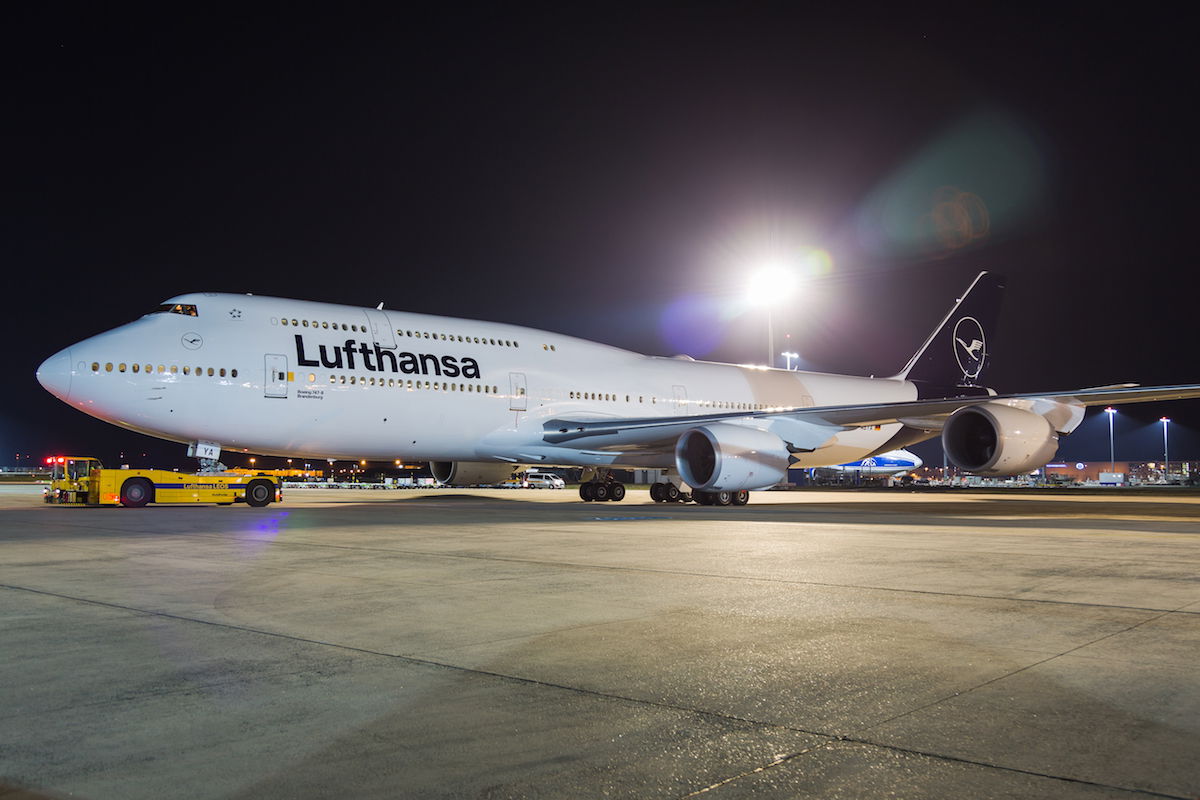
The airline held two events today, in Frankfurt and Munich, where they showed off a 747-8 and A321 sporting the new design. Lufthansa suggests that the response to the new appearance has been predominantly positive, though notes that some people miss the traditional yellow tone. I’m not sure I’d agree that the response has been overwhelmingly positive, though I don’t remember the last time an airline introduced a new livery and people initially liked it.
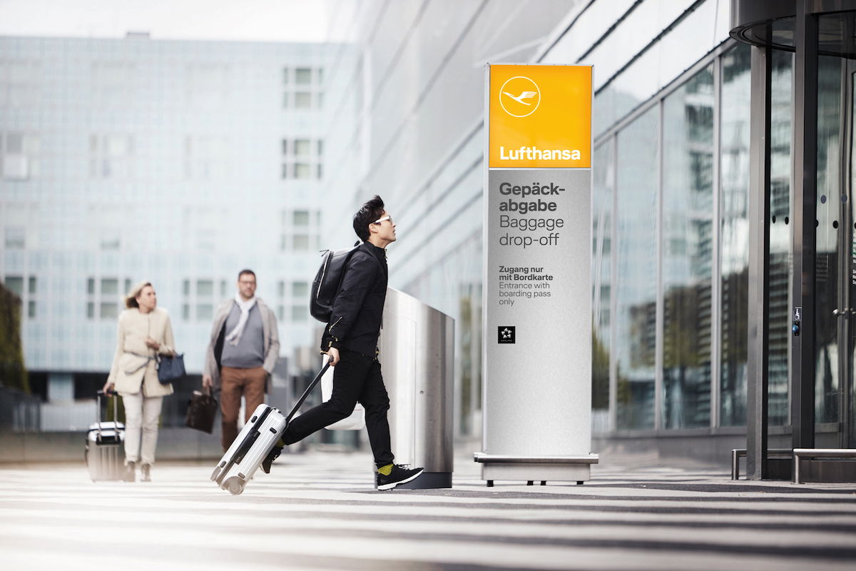
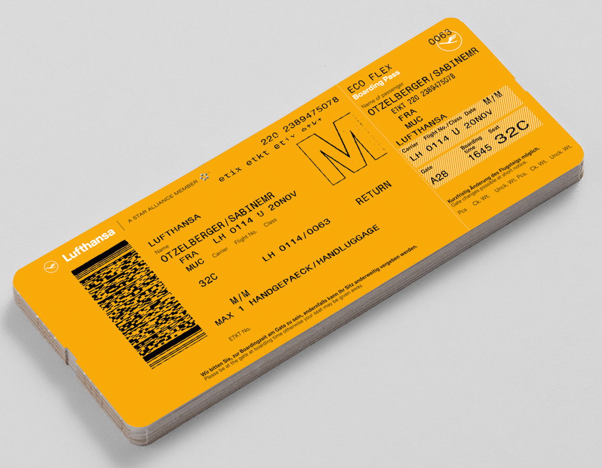
Lufthansa notes that the yellow tone “will receive a specific function to serve as a means of orientation and differentiation” (I don’t actually know what that means), and says that the color will be found in the future on every boarding pass and at every Lufthansa counter at the airport.
Here’s what Lufthansa’s CEO has to say about the redesign:
“Lufthansa has changed and is more modern and successful than ever. From now on, this will also be visible to the public through a new design”, says Carsten Spohr, Chairman of the Executive Board of Deutsche Lufthansa AG. “The crane has always been with us and clearly stands for the promising performance from Lufthansa. To this day, it still stands as a symbol of highest quality, excellent service, flying expertise, reliability, innovative spirit; and it stands for trust.”
The airline claims that they decided on this livery after considering more than 800 designs:
The design was developed in a complex process with numerous experts. After intensive preliminary studies, more than 800 designs and own color developments in the laboratory, the new aircraft design was completed. In keeping with the airline’s claim to be premium, the blue color of the livery will dominate the sky and the world’s airports for the next few decades.
It took 800 designs to decide on this simple copy of the Qantas livery (in blue instead of red, and with the crane instead of the kangaroo)?!?
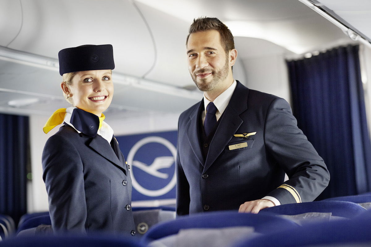
It’s not just planes that will be repainted, but over the next couple of years Lufthansa will also be exchanging up to 160 million items onboard to feature the new branding, including tableware, amenity kits, blankets, pillowcases, and more. Furthermore, while Lufthansa isn’t completely reworking employee uniforms, they are adding some accessories featuring the new branding.
As part of this rebranding, Lufthansa will be launching a new #SayYesToTheWorld brand campaign. This campaign will “question familiar ways of thinking and habits.” I guess we’ll see more on that campaign soon.
What’s interesting here is that Lufthansa will essentially have two different logo designs going forward. For reference, up until now they’ve used the following logo, incorporating blue and yellow:
![]()
Meanwhile going forward their logos will be blue and white or yellow and white, as you can see below:
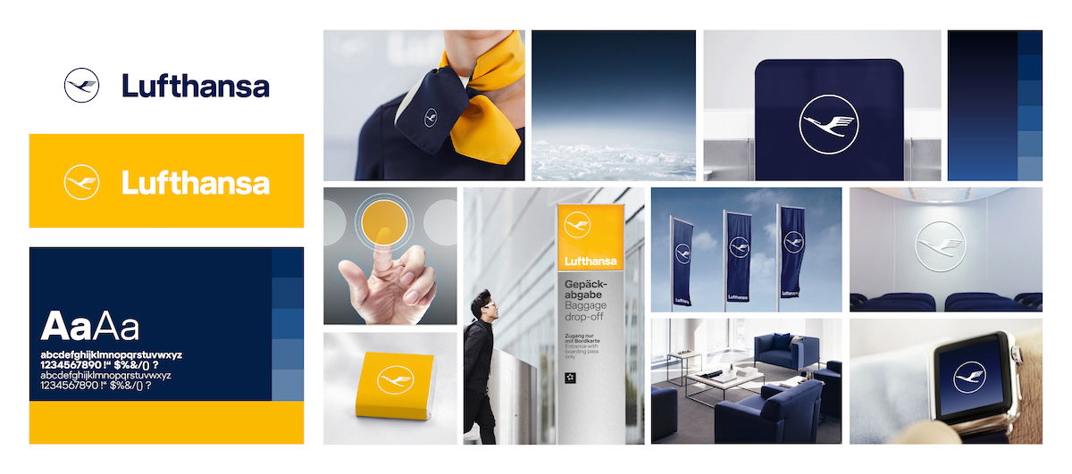
While Lufthansa has a lot of brand recognition in Germany, that’s less the case in other parts of the world. As a result, you’d think a single, consistent logo for an airline would make sense. That’s why I find it weird that check-in counters will have a yellow and white logo, planes will have a blue and white logo, etc. Isn’t that unnecessarily complicated?
What do you make of Lufthansa’s new branding?


I hate the new design. They needed to keep some of the YELLOW in the livery. Now they could be anyone else.
I must say though that it is a better rebrand than: Iberia (horridly generic), American (tail is overwhelming) and others. Sad to see the old livery go.
The grey underbelly was iconic. I don’t mind the tweak if the crane but should have been yellow.
Simply beautiful design. Feels more premium, yet stylish. Excellent job lufthansa! I think this finely echoes the technical perfection to which it operates. Sure prices may be higher, but if you buy a Porsche, BMW or Mercedes, Apple, or any other premium product, thats what you have to accept. ... improving the catering would be nice, but that was not the question here.
Lufthansa - the new frozen Airline ! and the Kranich only white now - short before he´s finally flying on a white background ...
and the new counter design ... greetings from DENK !
Did they forget that a lot of airports in the world already use yellow for signage ? Therefore I doubt that the use of their yellow will have the eye-catching effect they want...
By random luck, I was on LH 400 from Frankfurt to JFK on Friday, 9 February at Gate Z52. I upgraded using 20,000 Lufthansa miles to go to Business Class. I have a wonderful photo with me and a flight attendant in front of a large 10 foot by 10 foot wall celebrating the brand redesign which got about 200 likes on Facebook. The plane left 30 minutes late because they had a big party at the gate with all kinds of food and beverages.
Somebody did the Photoshop fix, which improved the look...
https://i.imgur.com/h1CqQCU.jpg
I would prefer to see yellow retained for circle and crane like on one-off 737-200 in the photo taken in 1983.
https://www.airlinefan.com/airline-photos/Lufthansa/Boeing/737-200/D-ABHD/1147305/
I still don't get it why Lufthansa has to make crane looking like a ghost, sucking the colour out of it.
It looks fabulous, very modern! Most people struggle with change.
Lufthansa has their own marketing & brand department...since forever. They have designed that livery...but I agree, it is rather bland and too understated.
Surprising how many people can't handle change, the look is clean and modern, i think it's a good rebranding which many airlines need to move toward. Stop holding on to old liveries, periodic updates are needed to match the current century.
you are all, as usual missing the point. LH WANT it to be bland, WANT to be unindividual so when they "merge" with other carriers with similar logos, the other carriers become LH more quickly. Just like the StarAlliance logo is similar (a ring of stars) to the Euro flag! Wake up everybody to Greater Germany aka EU
so unoriginal but honestly doesnt make a difference to me, next
I initially thought it was only part of the design and i was disappointed. Yes, its plain but like Air Canada's new livery, its classic. I am starting to like it for its simplicity and its reference to its history. I do miss the yellow, though. I am glad that the yellow will be the signature colour on airline items, tickets and ground servicing. When you see the aircraft on the ground, the traditional colours...
I initially thought it was only part of the design and i was disappointed. Yes, its plain but like Air Canada's new livery, its classic. I am starting to like it for its simplicity and its reference to its history. I do miss the yellow, though. I am glad that the yellow will be the signature colour on airline items, tickets and ground servicing. When you see the aircraft on the ground, the traditional colours of navy and yellow will all come together as the aircraft is serviced.
It's a shit airline unless you fly First.
What a crock of shit. What a waste of money. One day someone in management will stop listening to this crap...Has anyone read the billboards in Heathrow lately about the airport "opening new horizons to a new way of living..." What a lot of crap.
I actually don’t mind the new design, although I will join nearly every other commenter and confess I don’t understand why they couldn’t incorporate yellow accents on the tail, or at least in one version of the logo (eg use yellow and blue as they currently due for check-in and boarding passes.
The design itself on the aircraft is clean and elegant, just not enough of a striking departure to warrant this hype.
How about they use the millions of Euros they spent (and will be spending on the repainting) to improve the on board experience?
Could care less about the outside as long as the level of service that I am accustomed to is maintained or improved.
Just what the world needs. Another blue and white airplane!
Slightly off topic:
During the presentation, they also revealed the design for the amenities, including the Pyjamas and mattress pads that will be available in J. They explained, however, that the Pyjamas are mere "sleeping shirts", no pants, and that the shirts and mattresses will only be available on outbound night flights over 10,5 hrs in duration. That means that the heavily frequented premium routes over the Atlantic will not feature the new amenities,...
Slightly off topic:
During the presentation, they also revealed the design for the amenities, including the Pyjamas and mattress pads that will be available in J. They explained, however, that the Pyjamas are mere "sleeping shirts", no pants, and that the shirts and mattresses will only be available on outbound night flights over 10,5 hrs in duration. That means that the heavily frequented premium routes over the Atlantic will not feature the new amenities, which is just such a cheap move.
its surprising that after looking at over 800 designs, they chose one that is very similar to QANTAS.
Ok, so, like - this actually really works.
I get where they are going with the yellow to denote important things - your boarding pass, check-in counter, etc. Frankly yellow is an "alarming" color to the human brain - so do you really want to see "alarming" when you see an airplane? Going with the blue is "calm" - that makes sense. Blue, especially this dark blue they are using gives a feeling of...
Ok, so, like - this actually really works.
I get where they are going with the yellow to denote important things - your boarding pass, check-in counter, etc. Frankly yellow is an "alarming" color to the human brain - so do you really want to see "alarming" when you see an airplane? Going with the blue is "calm" - that makes sense. Blue, especially this dark blue they are using gives a feeling of luxury which, given how airlines in Europe are either full service or low cost is the feeling they want to give to their users.
Love it or not, Lufthansa was due for a re-design. I think the design team did try really hard here, I can see the tones of true design thinking in the end result. But, I would love to buy the team a beer and hear their war stories - because I am sure the first version they presented was 10x better and internal politics dulled it down to this.
The sleek German ingenuity that is Microsoft Office 2007!
They just copied Qantas. Sheesh, just replace the blue with Qantas red and there you are. I sure hope they didn't pay whomever designed this new scheme a lot of cash, 'cuz all they did was a quick and dirty cut and paste.
That was the idea of Otl Aicher, to use the color yellow just as an accent.
Who gives A FUCK...Oh yeah BS design school grads trying to justify how much money they blew on their Educmacation while telling the parents it's a growing field...lol
I think it's sharp and chic. I'm old enough to remember the old BOAC livery which was extremely elegant and simple with that icy dark blue and thought the move to colourful BA livery a step backwards. Any change in airline livery sparks ourage because we feel comfortable with what we know. But given time I think this redesign will win most over. As for comparing it to Qantas, get over it. The airline that...
I think it's sharp and chic. I'm old enough to remember the old BOAC livery which was extremely elegant and simple with that icy dark blue and thought the move to colourful BA livery a step backwards. Any change in airline livery sparks ourage because we feel comfortable with what we know. But given time I think this redesign will win most over. As for comparing it to Qantas, get over it. The airline that started the triangle tail full block colour was French airline UTA. Look it up! Hi from Australia - and yes I I don't like Qantas: all show no go.
I really like it. That shit is cleeeean.
I do feel like it is aimed at a younger crowd. But it seems like from the comments, quite a few like it.
Do a poll asking whether we like it and then an age bracket and see what the correlation is.
I genuinely love the new design!
It's very weak. They could have been more bold, maybe red, white and black. Those colours work well.
Bland as it may be, this new design shows some... German-ness to me, for some reason.
The reason these types of designs are becoming popular is that they're easier to implement across all medium (mobile, web, desktop, signs, planes, etc.). It's an area known as flat design or responsive design, and these types of designs scale up or down to nearly any size without needing a new design asset. This trend became popular as the number of different mobile devices grew substantially and made it difficult to implement designs that look good on all devices.
I think their re-branding is great! We always have to be negative because of changes right ;)
I think many people here flew Lufthansa first class and see the yellow color as part of their memory of Lufthansa's first class. But this new color scheme is ready for a new generation, a new business class and a modern Lufthansa.
omg, I think they should hire me as a sales person...
Am I the only who actually really likes it?
And I say that as a German and long time Lufthansa user.
I like it ♂️
On the other hand, I think if they instead opted for the yellow color as the main livery color, it would be too “millennial” and too LCC-looking for the backbone of its cutomers. I find the blue color more classy, although it is a shame that they can’t find a good way to incorporate a touch of yellow.
It looks like a leased Atlas airplane with a temporary “Lufthansa” logo for good measure. Uninspiring!
Who cares. The color of the planes and boarding passes has precisely nothing to do with what airlines I fly...
LH's pr people are like Trump. Believe their own propaganda. Pathetic
I love the new design - and the concept behind it. 110%
Lufthansa is awesome
Guys, I would be so happy if Lufthansa CEO would look at all your opinions here and he would see what real passengers think about his marketing team. Its really said that such companies like Lufthansa don’t take our opinions seriously. Please tell me, how much will cost rebranding planes and check-in areas into different colours and styles? Who will pay? Lufthansa staff? No, their passengers I am afraid...
Pour one out for the death of another timeless livery, but I can see what they're going for here. From a graphic design standpoint, yellow is a super fun color to use for wayfinding or to draw the eye to specific place. It would work super well for signage, luggage tags, help kiosks, napkins, serving trays, etc. (also those tickets ) BUT I think the trick is you need one piece to tie it all...
Pour one out for the death of another timeless livery, but I can see what they're going for here. From a graphic design standpoint, yellow is a super fun color to use for wayfinding or to draw the eye to specific place. It would work super well for signage, luggage tags, help kiosks, napkins, serving trays, etc. (also those tickets ) BUT I think the trick is you need one piece to tie it all together, and a logo (or a livery) would be a perfect opportunity. To not pair the yellow and blue in at least one place is a mistake, imo. But I'm withholding judgement until we see how they execute the new language in a fresh way.
They can leave the planes plain white for what it's worth. However, if 'recognizability' is the stated goal, then this is a complete failure. And the comparison to cargo airlines/charters is spot-on.
LUFTHANSA is forming an alliance with Syrian airlines and those PR guru's at LUFTHANSA thought they would just copy Syrian airlines livery.
Check it out.
So bland and boring! It could be any airline. They say they want to be premium and well-known, but this new livery says "I am cheap and unoriginal and could be any airline today." So disappointing of Lufthansa. The previous livery was classic while still being modern; it definitely didn't need to be scrapped.
I have to say I really like it - it is different, it might be a bit cold and I like the new plane-design. Why they still keep the orange/yellow color on other spots, I can't understand and is really half of the story.
Agree with Callum about the confusion when people are at the gate and outside is the new "blue-silver" plane - especially older people on airports with less good information gates. Hopefully...
I have to say I really like it - it is different, it might be a bit cold and I like the new plane-design. Why they still keep the orange/yellow color on other spots, I can't understand and is really half of the story.
Agree with Callum about the confusion when people are at the gate and outside is the new "blue-silver" plane - especially older people on airports with less good information gates. Hopefully Lufthansa will continue the change in the next years. Let's see at the ITB fair in March in Berlin what they might also say about the change...
I would like to meet the male flight attendant in the promotion picture.
To be fair, it's not a complete ripoff of qantas. It's similar to Brussels airlines, a subsidiary of theirs.
This seems very half-baked, and I agree with Ben, the removal of yellow on the aircraft, but keeping it on everything else, seems inconsistent.
This was such an iconic livery, they should have just tweaked it the way that KLM and Air France each did successfully. (KLM twice, if you count the stripe refresh a few years ago).
Even the new 'blue' is so much drabber than what it replaced.
You SERIOUSLY think people are going to get to their boarding gate, stand under the screen which states Lufthansa and their flight details, look out the window and see a plane with "LUFTHANSA" written on the side but be confused whether they're in the right place or not because the tail is blue not yellow???
I LIKE IT. THERE. I SAID IT.
:)
I love the new look - clean and modern. There are many more Airlines with worse. Maybe you can write a post on truly ugly ones.
What I thought interesting in the press release were two things:
1. No mention of who actually did the design, e.g. Landor Associates does a lot of airline branding
2. No mention of focus groups or any other traditional feedback sessions being held
It seems they developed it in house and then decided "We are GOOD! GO US!"
And now we have this.
@lucky, sorry to comment a bit off topic but it’s probably Faster to get it thru. Do you think LH ex US award surcharges are a scam? Can you reach out to LH to comment on this ridiculousness. E.g.: one way award MIA-FRA-VCE (slightly lower via ZRH but some Crazyness. Y -30k mi + $211.51—Y+ 40k mi + 211.51—C 52k mi + $539.51!!!!!WTF. Same route in reverse has taxed about $100’lower in C, but still double than Y/Y+. I’d say it’s borderline legal.
The logo doesn’t make a difference. People will fly Lufthansa based upon routing, pricing, and available award seats.
It would be much better if the logo were yellow/gold As it stands now the new one was designed with little effort
Finally! They changed their boarding pass and took out the weird workers' face. I do like their boarding pass color - but the tail design is VERY disappointing, and I will miss the yellow dot when looking up and knowing it's LUFTHANSA!
Let's stop pretending this is anything other than a design that's less expensive. Old design? Four colours. New design? Two colours. Someone in accounting probably calculated that a bunch of their planes would need repainting soon and that they could save more than it would cost to rebrand by coming up with a more cost-efficient design for the planes.
AC's update, while more creative (in my opinion), was mean to essentially accomplish similar things...
Let's stop pretending this is anything other than a design that's less expensive. Old design? Four colours. New design? Two colours. Someone in accounting probably calculated that a bunch of their planes would need repainting soon and that they could save more than it would cost to rebrand by coming up with a more cost-efficient design for the planes.
AC's update, while more creative (in my opinion), was mean to essentially accomplish similar things (given the many paint colours the frosted leaf design used).
This design doesn't deserve to be dissected any further.
I actually like it.
Gee, like no airline ever had a blue and white livery before. How original.
Honestly, this was an incredibly unimaginative decision on the part of Lufthansa. If the iconic Lufthansa yellow was thought to be important enough to retain on signage, boarding passes, employee uniforms, etc., then why remove it from the aircraft tails?
I am with @Megan on this one and don't necessarily think that the average Joe flying will notice much of a difference once onboard where blue ("premium feel") has been a predominant choice of colour in their newest economy cabins (A350) anyway.
Also, I do like the "new" (somewhat elegant and understated) livery and see it as a new differentiating factor from LCCs Ryanair, Vueling or Condor that have used Lufthansa's previous colour scheme...
I am with @Megan on this one and don't necessarily think that the average Joe flying will notice much of a difference once onboard where blue ("premium feel") has been a predominant choice of colour in their newest economy cabins (A350) anyway.
Also, I do like the "new" (somewhat elegant and understated) livery and see it as a new differentiating factor from LCCs Ryanair, Vueling or Condor that have used Lufthansa's previous colour scheme (blue/yellow or yellow only) across Europe and the globe before.
This is what happens when a committee makes decisions.
Who cares? The plane could be all white for all I care. It’s what happens in the plane that matters. The seats, food, service, etc.
Not news.
I will be contrarian: I think it's gorgeous. Clean, Germanic, retains their tradition.
PS - I do not work for LH, or the designer ;)
There's 3 boring ways to paint a plane :
Standard Eurowhite, freaking-bland coma-inducing eurowhite like MU, and the new Lufthansa livery
Do I sense a #SayNONONOToTheRedesign campaign brewing?
Nuts. Totally unnecessary. And not much of a change. Just more money wasted. How much did LH pay an ad agency to come up with this'creative idea', probably millions of Euros. What a world. What a shambles.
I wished Lufthansa modernized by not charing me CDN 1,500.00 for a "free" ticket redemption. For that much money I can fly ANA (just as good in my opinion and no surcharges) and have a great week, instead of just some hours on a blue plane.
Airlines seem to be moving to some more modern style liveries. Check out China Eastern's newest livery compared to there old one.
Glad they are spending unnecessary money on this instead of actually improving the horrible catering on their flights! Was on LH400 a week ago and the Red Snapper was inedible as have been so many meal on LH recently that I cannot remember. Glad they got their priorities straight!
I think the average traveler won't notice or care, especially about a plane livery. If they are going to have two color schemes, it makes sense to me that they are keeping the yellow where most travelers will be looking for something familiar. Beyond check-in, I double most people even look at the planes livery.
Do these marketing people actually believe the crap that they write? Honestly!
The main complaint about the new livery is the removal of the yellow colour. If they had just made the thin circle line around the crane yellow rather than white I think people would be a lot happier.
At least somebody got well paid for this „concept“ :-)
DUMB. JUST REALLY DUMB.
I would love to see Lufthansa point to specific examples of a "positive" reception. Everything I have seen and read has been predominantly negative.
Guess the new blue "orientation" makes prices lower and service better. Smh.
The new livery looks awful. It is cold. Unimaginative and recalls a short lived Air India rebrand that was introduced in the early 1990s and did not last. The yellow, if used correctly, adds warmth and can be very modern and fresh. Lufthansa's branding was just fine. Maybe it required a few tweaks, but the new version is just awful.
In its total lack of creative ambition, the new livery reminds me of cargo airlines like Atlas Air and Polar...