
It seems like every week I’m writing about how another major airline has revealed a new staff uniform. In 2016, American launched new uniforms for their 70,000+ staff to huge fanfare. While the design was smart and professional, the comfort and practicality of the uniforms was a disaster.
In late 2016, employees reported that the new uniforms were causing them to break out in hives.
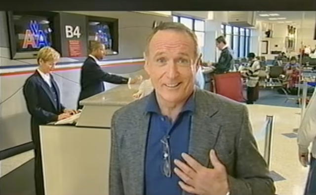
After 5,000 complaints (particularly from cabin crew), in 2017 American finally dropped the supplier of these uniforms, Twin Hill, announcing that they would not be renewing the contract after it expired in 2020.
So, American then had the problem that they needed a new supplier to provide uniforms from 2020 onwards, but the existing uniforms were uncomfortable and unpopular for staff to wear.
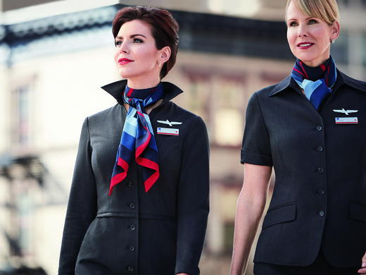
So their solution was not only to design a new uniform (again), but actually allow employees to vote on a choice between final designs. This is a smart, respectful way of choosing the new uniforms because it both includes their staff in the decision making process, and should, hopefully lead to far fewer complaints.
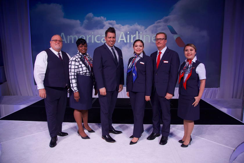
American held a fashion parade in Dallas last week with real American employees acting as the models, where 85 representatives of the carrier’s 70,000 employees (who were part of the Frontline Uniform Advisory Team) voted on the final two designs American management had narrowed down the options to, after working with the new manufacturer, Lands’ End.
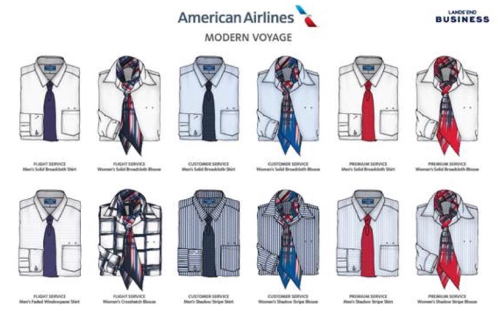
The two options to choose from were dubbed ‘Skybound’ and ‘Modern Voyage,’ with Modern Voyage being the winning design with 60% of the vote.
Here are some images of the winning design, ‘Modern Voyage,’ that will become the standard American uniform from late next year onwards.
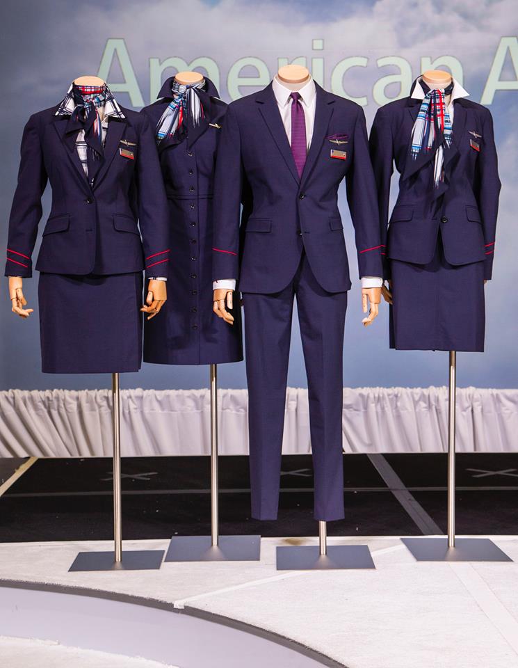
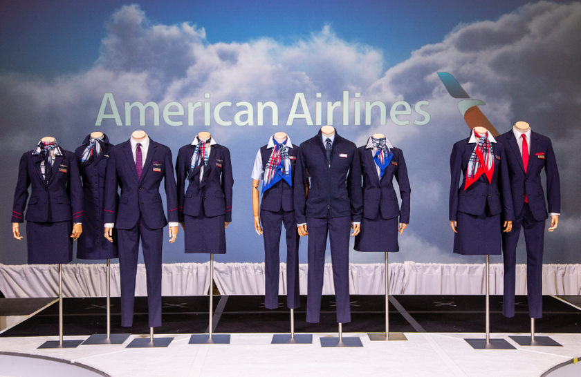
I couldn’t find any images of the losing design, ‘Skybound,’ but it’s understandable American wouldn’t widely circulate these and then have employees of the public claiming the losing design looked better than the winning design!
My thoughts
Meh, they’ll do.
There’s nothing memorable or stylish about them — when I’m checked in by a third party contract worker at an outstation for a major airline like Singapore Airlines or Cathay Pacific (where they will move to a different airlines check in desk every few hours), they are often wearing plain dark suits with a scarf of the colors of the airline.
This doesn’t look much different.
The focus of this design is obviously on comfort and practicality, rather than any fashion statements. While Delta’s ‘Passport Plum’ purple would certainly turn heads as a crew marches proudly through an airport to their aircraft, I doubt anyone will really notice these new American uniforms in a busy airport.
I imagine the designer could pitch something very similar to head office at something like a Comfort Inn or Holiday Inn Express, and they’d be approved.
Funnily enough the most memorable part of the uniform from the images above for me is the female white shirt with the large blue check, which looks incredibly dated and ill fitting already.
Bottom line
I am impressed that American has allowed their staff to select their own uniforms. I can’t recall any other airline doing this in recent memory.
The supply is a massive project, with over two million pieces to be produced, distributed and worn, so understandably American is taking no chances after the disaster of 2016, and choosing plain, comfortable fabrics rather than some fashion statement that will turn heads.
The new uniforms will receive the strictest testing for comfort and quality available in the United States.
I also love when airlines use actual staff to model the clothes rather than catwalk models, to give a more realistic vision of what the uniforms will look like as worn by most of the staff.
You should be seeing these new uniforms appearing at airports and on flights from late next year onwards.
What do you make of American’s new uniforms?


Membership is free and takes no more information than commenting as a guest. Earn status points for good contributions, and see fewer ads as your status grows.