
Earlier I covered how Singapore Airlines unveiled its new first & business class, which should enter service in 2027 (hopefully). These products look like very nice improvements over the existing cabins, even if they’re not revolutionary.
That being said, I have to give Singapore Airlines some tough love on the new business class seats. Let me acknowledge that I’m a huge fan of Singapore Airlines as a brand. Any list I keep of the best airlines in the world (whether it’s the best airline brand, best first class, best business class, best inflight service, best inflight entertainment, etc.) has Singapore Airlines on it… that’s how highly I think of the brand!
But I’m also honest, regardless of how it fits my preconceived notions of a brand. I feel like I’m saying what everyone else is thinking, seemingly except for most influencers who are in Singapore for the launch event, who are just casually glossing over this… so much for attention to detail!
Singapore Airlines’ botched business class finishes
When I think of Singapore Airlines, the first thing that comes to mind for me is how deliberate the airline is. I don’t think there’s an airline that’s more intentional with every aspect of its guest experience, from the tone of voice with which staff speak, to warm and elegant design.
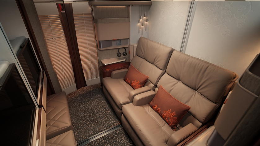
I’d say Singapore Airlines’ new first class actually looks really on brand. It’s a nice evolution of what the carrier has historically offered — it’s warm and elegant without being outdated.
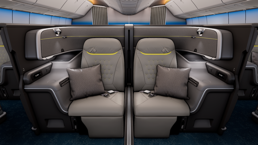
And then you move to business class, and it looks like Scoot and Spirit Airlines had a baby. The gray and black is generic, the yellow accents look cheap, and then there’s so much going on with the blue and white bulkheads (if that’s actually how they’ll look).
And the Scoot reference isn’t even sarcastic. For those not familiar, Scoot is Singapore Airlines’ low cost carrier, and look at the seat finishes you’ll find there!
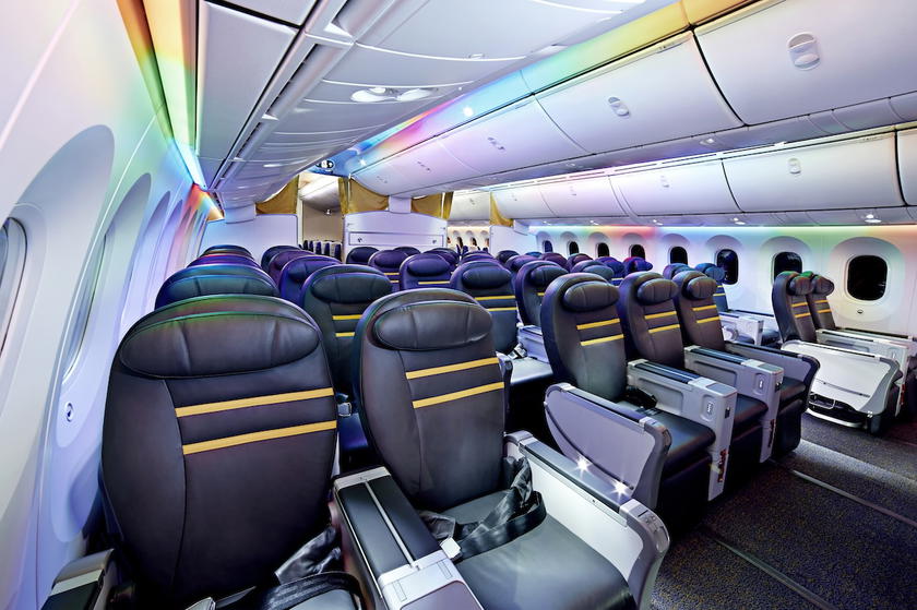
Usually there’s some consistency between seat finishes and wider branding, including the livery, flight attendant uniforms, etc. In this case, it’s not only not aligned, but they seem at odds with one another. There’s otherwise not a hint of yellow (or neon green, or whatever that is) in Singapore Airlines’ branding.
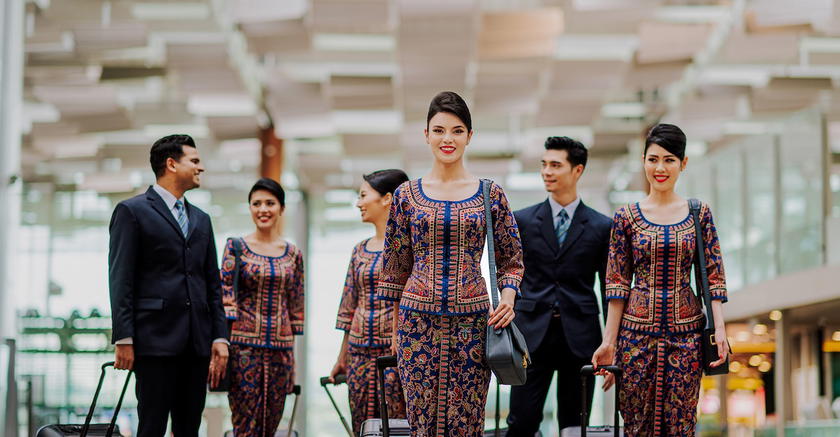
What so bizarre to me is how the first and business class finishes are completely mismatched, and you wouldn’t assume they belonged to the same airline. That’s because Singapore Airlines worked with different design firms (separate from the seating manufacturers as such) for the two cabins.
BMW Designworks was behind the business class seats, while PriestmanGoode was behind the first class seats. I think it’s safe to say there was no coordination between the two. I guess the argument from executives is that they want the cabin to look more modern and high tech, and go after a younger crowd, but I just don’t follow the logic.
It’s clear that Singapore Airlines put many years of effort into this product, and frankly I’m just surprised that Singapore Airlines executives signed off on this. Am I just in the minority in thinking this isn’t a good look for the airline? Did some marketer assure Singapore Airlines executives this was great branding, and they were wrong? Or did everyone just independently decide that this looks great?
If they at least eliminated the yellow stripes, it would no longer look cheap, but would instead look generic. I’m just surprised that this is the conclusion they came to.
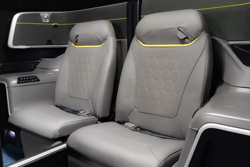
Many influencers are conveniently glossing over this
Singapore Airlines of course had a big media event in Singapore to celebrate the launch of this product. I don’t attend media events, just as a general policy, because I don’t find them to be a great use of time. But I certainly do enjoy seeing the coverage from others.
What I find fascinating is the inherent bias that exists when someone is invited to something. For example, if you look at the comments on my post about the new cabins, the single thing most commented on by OMAAT community members is how bad the business class colors look.
If you watched the videos on social media about this, there’s oddly no commentary on that. Admittedly I haven’t seen all the coverage, but the worst coverage I’ve seen is someone saying they “don’t mind” the colors, and that it’s a “big departure” from the old look. Okay, that’s not exactly an endorsement.
I also haven’t found a single person who attended the event who said “I love the new colors,” which probably tells you everything you need to know. For that matter, it’s one thing if people acknowledged “I realize the colors might not look good in pictures, but in person, it’s a different story.” But I haven’t heard that either.
To me this gets at the rather complicated relationship between so many brands and influencer types. If you can say all the things you love about the product, shouldn’t you also feel totally comfortable criticizing the parts of the experience you don’t like, though?
While we’re on this topic, let me add one more point. Being able to sit in seats at media events like this is of course cool, but it really doesn’t actually give you an impression of what it’s like to fly in a product, and that’s why it’s not something I particularly value, as an experience.
Of course a big business class seat is comfortable when you sit in it for a minute, and you’re filming content. But the real test of a product is when you spend hours in the seat, when you recline the seat into a bed, when you try to move your laptop around while you’re being served a meal, etc.
I once had the opportunity to spend a night in an aircraft seat on the ground (I can’t really say more, since I signed an NDA, but it was to provide feedback to a seating manufacturer). To me that was fascinating, because it really gives you an understanding of what the experience is like. My feeling about the seat was very different after being in the seat for many hours vs. when I sat down.
Bottom line
Singapore Airlines has unveiled its new cabins, and there’s a lot to be excited about, as the hard products look very nice. However, Singapore Airlines’ new business class cabin finishes are a real mystery to me, because the yellow stripe looks cheap (I mean, it seems to be inspired by the carrier’s low cost subsidiary), and completely mismatched with first class.
The airline used different design firms for first class and business class. For an airline so focused on attention to detail and being very deliberate in terms of design, this strikes me as a misstep. Anyway, Singapore Airlines, I still love you and think you’re one of the best airlines in the world…
Where do you stand on Singapore Airlines’ new business class seat finishes? Does anyone love them?


Membership is free and takes no more information than commenting as a guest. Earn status points for good contributions, and see fewer ads as your status grows.