If there were an animated movie entitled “The Secret Life of OMAAT Contributors,” it might just be 90 minutes of a Pixar-rendered Tiffany instant messaging with similarly animated versions of Travis, Andrew B., Mike, Matt, Ford and myself.
Because both Tiffany and I stayed at renovated hotels recently with very noticeable design directions — Tiffany, at the Concourse Hotel LAX, which was redesigned with a “mid-century aviation” approach to great success, and me, at the Fairmont Olympic Seattle, a former grande dame whose renovation was executed in the “Z Gallerie Outlet, but slightly cheaper looking” aesthetic — we found ourselves in a discussion about what we like and dislike in hotel design.
Tiffany’s also currently staying at a Fairmont property, so we discussed the peculiarities of that chain — one we both really like, but one that’s hard to pin down.
So here goes, against Tiffany’s every instinct, our first (and possibly last!) installment of “An OMAAT Chat” – a nice, open-minded back and forth between Tiffany and me. But, as always, OMAAT is about the readership — so consider this just the beginning of a conversation, and please add your thoughts to the comments below!
Nick: Great review on the Concourse – it actually looks nice? At least from a room perspective, maybe the top option at LAX?
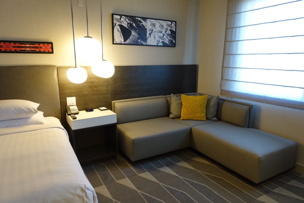
Tiffany: Yeah, for sure. It has the best shuttle situation, and is walkable.
Nick: Speaking of hotels, how’s the Fairmont? Are you stocking up on Le Labo?
Tiffany: Service is great, really impressed!
Nick: I really do admire the Fairmont brand now, even if they screwed the pooch on the Olympic redo. They’re kind of hard to place on the hotel spectrum… like not quite up there with Four Seasons, Ritz, St. Regis, Park Hyatt; but also clearly better than a Westin or JW Marriott.
Maybe the equivalency is… Le Meridien? Intercontinental?
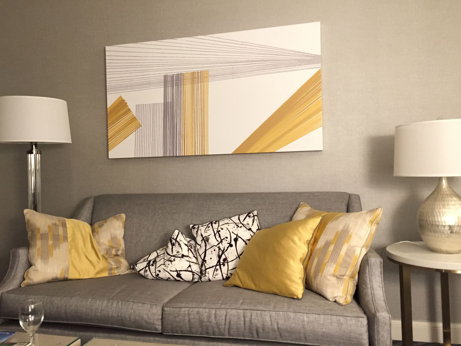
Tiffany: For this property? I think it’s like a big Park Hyatt, if that makes any sense.
Nick: Sort of? But there are certainly some middle of the road Fairmonts, especially, I think, in Canada.
Tiffany: Well, I’m thinking the service level is 5*/Boutique levels. The physical plants are not necessarily great.
Nick: Hmm, I’m still a little miffed by the bizarre breakfast benefit at the Fairmont Olympic — I thought it was cheap. It felt very nickel and dimey in a way that I don’t think a Four Seasons would ever do.
Tiffany: Fair point.
Nick: As for the physical plant, are the rooms updated? The pools nice? I recall it being a giant white Moorish castle… which may or may not feel dated years down the road.
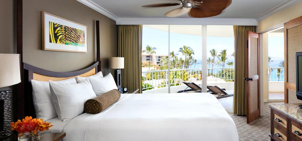
Tiffany: Umm, not really updated, but so neutral as to not feel necessarily dated. I don’t expect much in terms of style from Hawaii hotels, honestly.
Nick: Which, my gosh, shouldn’t be that the ethos behind any hotel renovation?
Tiffany: Sure, but I can see the desire to have things be “fresh” and “current.” This is all sorta “island-neutral.” Not bad, just not notable.
Nick: Right. And I can’t think of any Hawaii hotels that go balls-out, decor wise. Maybe the Royal Hawaiian redo, but that actually sort of looks fun?
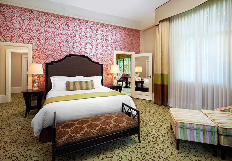
Tiffany: I think my hotel preferences might be esoteric.
Nick: I mean, you DID love that wackadoo hotel in Milan.
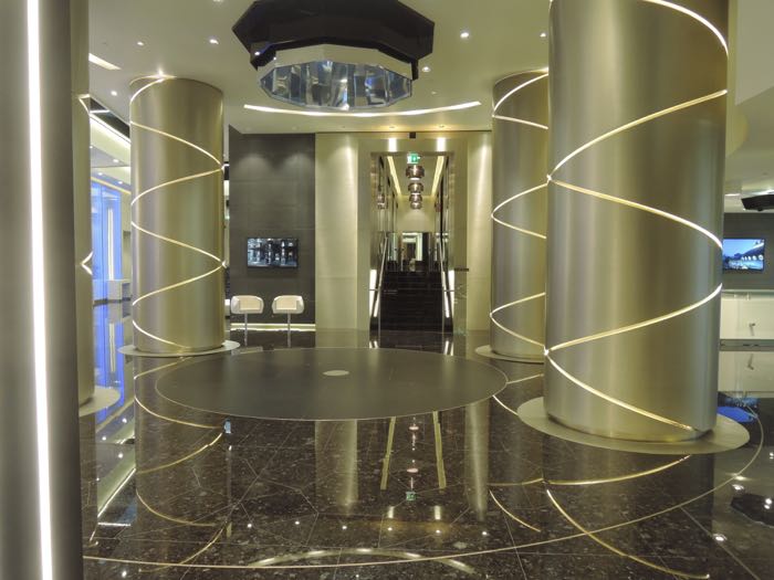
Tiffany: Well, I loved that it was unique and committed — I am a fan of commitment in general.
Nick: Right, like with the retro midcentury modern airplane decor at the Concourse.
Tiffany: Exactly!
Nick: I mean, some Vegas hotels do that to horrifying effect, though!
Tiffany: Hah, yes…
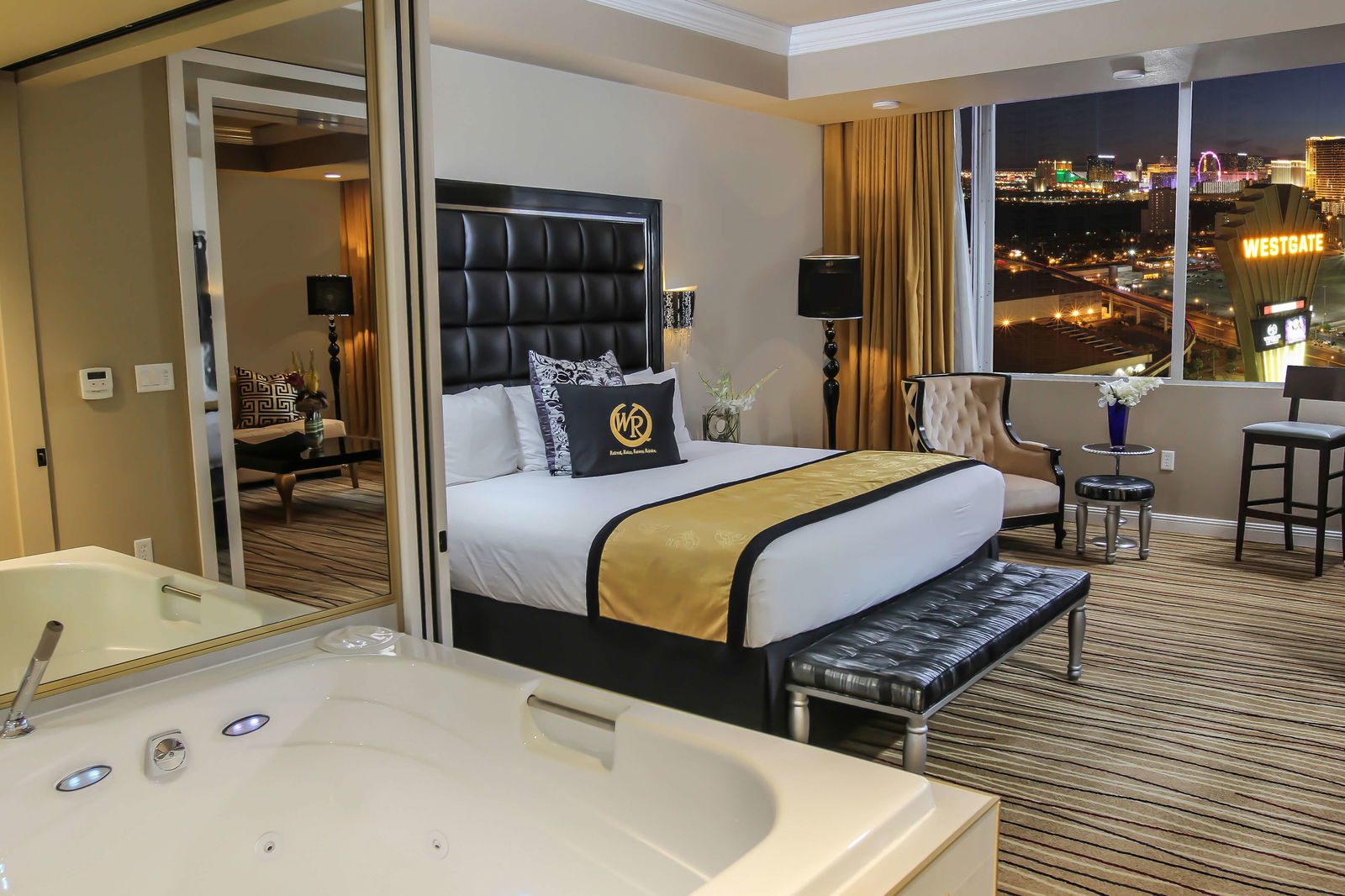
Nick: I had to stay at the Westgate for work and they upgraded me to a suite and I’ve never seen so much vinyl and crushed velvet used to such ill-suited ends.
Tiffany: Okay, so that’s actually a good example — I remember when I was a kid we stayed at the Disneyland Hotel — I was super little, so this would have been late ’80’s. My parents thought it was strange that the only “theming” was Mickey silhouettes stamped into the ashtrays.
And it’s like…why not go all the way?
Nick: Versus the hotels at Disney World, which are themed out.
Tiffany: Yeah, and they’re all better now, this was years ago.
Nick: I mean, when I was a kid we stayed at the Contemporary which was probably un-themed. But, the Grand Floridian was certainly themed, in a Mary Poppins-y way.
Tiffany: The “theme” of the Contemporary is sorta “we put a monorail through our Holiday Inn.”
Nick: HA!
Tiffany: So I’m not saying I’m a fan of themes per se.
Nick: Well, I admire when a hotel can commit to a concept without necessarily going in on a theme.
Tiffany: Just the commitment to a design concept, yes.
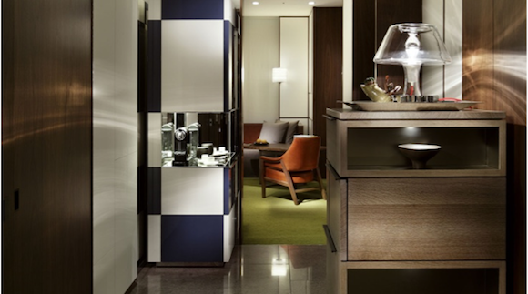
Nick: I mean, the Andaz Tokyo did that, to me, exceptionally well. Probably my favorite hotel room in recent memory… and you know how I feel about the Park Hyatt there, whose theme is “1993.”
Tiffany: I liked at Al Maha that they had Bedouin fabrics and art pieces, but I didn’t actually feel like I was camping.
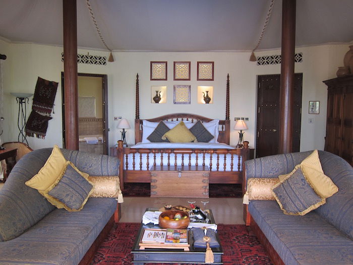
Nick: Right, I saw your trip reports from those places and it seems the Luxury Collection does have some truly excellent properties in the Middle East in that regard.
Tiffany: Love the Hyatt Regency Kyoto, which is super minimalist, lots of organics, very garden-inspired.
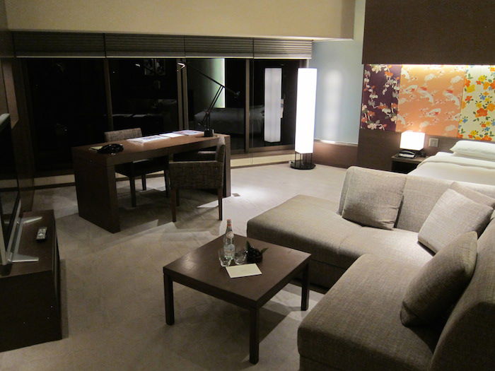
Nick: Yeah, those photos make it look beautiful. I think minimalism is maybe a concept more US hotels should embrace…
Tiffany: Well, but you have to be careful there, because that is so often done so poorly as well.
Nick: True, and when it is – yikes!
But, like, at the Fairmont Olympic — they had faux curtains that were affixed to the wall. That’s just absurd.
Tiffany: Westin Berlin had that too — you opened them up to reveal…blank wall.
Nick: Well that’s even worse – using them to pretend there are windows when there aren’t!
I don’t know that anyone walks into a space and says “God, I love the look of curtains!!”
Tiffany: Mmm, women of a certain age do, I think…
Nick: That’s funny. I showed my mom pics of the renovated rooms at the Park Hyatt Saigon and her reaction was “why did they make it look like someone’s grandma’s house?”
Tiffany: Yeah. Fair question!
Nick: I can’t wait to actually see the Park Hyatt Saigon – it could either really work or really flop. Talk about commitment — have you seen the photos?
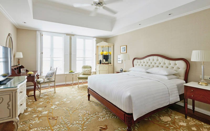
Tiffany: Hah, yes!
Nick: It’s maybe just the slightest bit American Girl dollhouse.
Tiffany: Let’s go back to why you think the Gallia hotel in Milan was wackadoo — I thought it was great!
Nick [looking at photos from Tiffany’s trip report]: OK, so first thoughts — granite or dark marble tiled floors always make me feel like I’m in a nice medical office building, so it seems cold in a hotel.
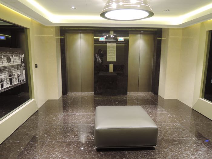
Tiffany: But it’s Milan! If it didn’t have granite or marble floors, it would look low-rent.
Nick: Does the hotel want to be Art Deco or Mid-Mod? It can’t decide.
I grant you that it’s not a cookie-cutter renovation, and that’s commendable. But I have an aversion to that sort of poofy colored leather (white/red, etc.) 1980’s Italian look, personally, but if the hotel carried that all the way through it’d be great — what’s jarring is that it is in a historic building and that some of the spaces reflect that and others don’t… like the pool and gym area is a wildly different aesthetic than the guestrooms.
And they are using an art-deco 1930’s font for all their signage which jars against a 1960s-1980s design concept. And you know how I feel about fonts!
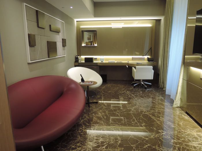
Tiffany: See, and I sorta liked that it was their own thing. Like an homage to Milanese style over the decades, culling the best aspects of each style.
Nick: That’s fair, of course. I mean at least they took design cues from Milan and the rest of Italy. I mean, the Hyatt Carmelo, in Uruguay – which used to be a Four Seasons! – is designed to look like a Balinese villa and it’s in Uruguay! Weird.
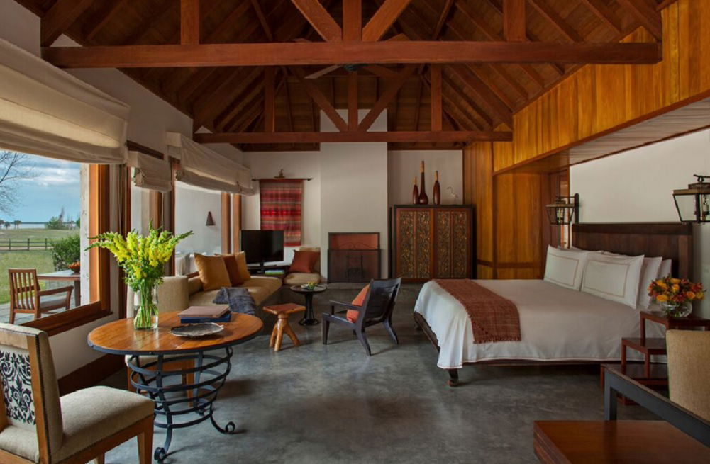
Nick: Do you love the Park Hyatt Paris Vendome, too?
Tiffany: I’ve only stayed there for one night.
Nick: I think they did a great job of fusing the 1930’s Parisian art deco look with modern touches.
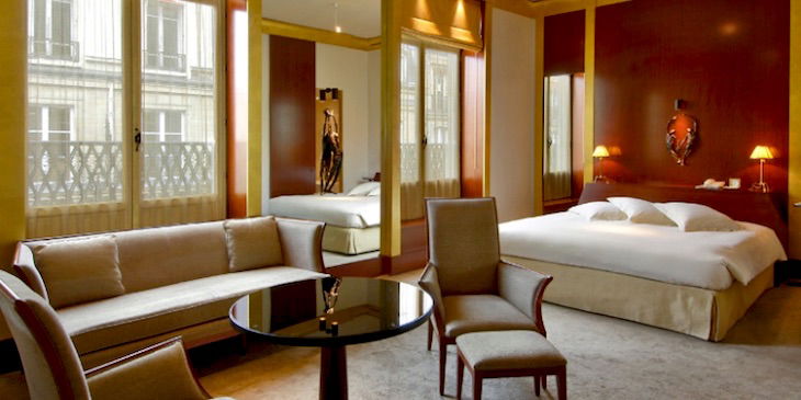
Tiffany: I’ll defer to your judgment there, I mostly remember there being a ton of gold.
Nick: Well, it sounds like the bottom line is, taste is subjective for everyone! But we can all agree: the old, pre-renovation Concourse at LAX Hotel was crappy.
What are your favorite and least-favorite examples of hotel design? Would you rather have a neutral room or a balls-to-the-wall example of local flavor? Let’s continue the conversation!


Wow a lot of thought obviously went into this post. Props for bringing something completely different to the blog.
Fun conversation, thanks for sharing! Interesting thoughts too, especially given the variety of personal taste and impressions.
As to best LAX hotel - the Westin by far. Have to say, I've been several times and will go out of my way to stay there. They take such great care of me, and the GM pays attention to things like FT, so he is well-connected with the typical travelers. The service is incredible, and can't say...
Fun conversation, thanks for sharing! Interesting thoughts too, especially given the variety of personal taste and impressions.
As to best LAX hotel - the Westin by far. Have to say, I've been several times and will go out of my way to stay there. They take such great care of me, and the GM pays attention to things like FT, so he is well-connected with the typical travelers. The service is incredible, and can't say there are any issues/imperfections there, so solid choice.
@Stvr LOL!
@stvr-
Heyyyy Gurrrrrl...go fcuk yourself!
Loved this. Would really like to see more hotel reviews and discussions on this blog. Great job!
I enjoyed the repartee, thanks guys! Sorry Tiffany, I think I have to side w/ Nick on the Milan hotel!
The park Hyatt Saigon has a great swiming pool, great food and a great spa...
I like hotels with sincere and good service, a nice breakfast and clean refreshing rooms with ample natural light. I spend on average 7 hours a day in the hotel room so couldn't really care so much about the amenities or decor as long as it looks polished and maintained.
Now, having said that, my favorite hotel chains tend to be the Taj Hotels, the Oberoi Hotels, the Ritz's and the Four Seasons. They...
I like hotels with sincere and good service, a nice breakfast and clean refreshing rooms with ample natural light. I spend on average 7 hours a day in the hotel room so couldn't really care so much about the amenities or decor as long as it looks polished and maintained.
Now, having said that, my favorite hotel chains tend to be the Taj Hotels, the Oberoi Hotels, the Ritz's and the Four Seasons. They are a mixed bunch but overall they have unique character to each of their properties.
I like my hotel rooms to have 'commitment' as you put it, to a design aesthetic. But even more, I like it when they get the basics right - like a desk and chair you can work at, or a sofa/loung you can comfortably recline on. So many don't.
One recent renovation I was impressed with was the Melbourne Grand Hyatt (not so recent now). They developed this round table office chair and lounge suite combination that allowed both dining and work. I think it's a triumph.
I hate to admit it, but I'm more a function over form guy when it comes to hotels.
A weak shower, lack of power outlets, weak/noisy AC, lack of workspace, curtains which don't block out light, and many other things will be noticed & remembered by me long after the initial impression of decor.
I don't mind tasteful theming. Some of Disney's properties, especially their lower end, are rather dreadful, to the point...
I hate to admit it, but I'm more a function over form guy when it comes to hotels.
A weak shower, lack of power outlets, weak/noisy AC, lack of workspace, curtains which don't block out light, and many other things will be noticed & remembered by me long after the initial impression of decor.
I don't mind tasteful theming. Some of Disney's properties, especially their lower end, are rather dreadful, to the point that there aren't many brands which would allow them to be brought into their chains. Outdoor hallways & window ACs? That's so 1960s, and not in a good, fun retro way.
Actually, I do want SOME theming relating to the area in a room. I hate when I get to a hotel in a foreign destination and the room could have easily been out of a hotel in Kansas. Worse is when you wake up and have to look at your phone or the hotel phone to figure out which country you're in. Even a few photos / paintings of the area go a long way to personalizing the room to the locale.
My takeaway is that I am impressed that I can care so little about something you are so passionate about