
Last week Ben (humorously) speculated that Cathay Pacific might be joining Star Alliance soon, since Star Alliance is using a photo of Cathay’s first class cabin as part of its own marketing campaign — even though you can’t fly Cathay on Star Alliance. 🙂
May I suggest that the graphic designers behind Hilton’s new Curio brand seem to suffer from that same sort of brand confusion? In this case, they seem to be copying both Marriott’s and Starwood’s distinctive marks.
I happened on the website for the Diplomat Resort & Spa in Hollywood, Florida, which was a Westin property up until a few years ago. Now the Diplomat is affiliated with Curio, Hilton’s “hip, independent” brand.
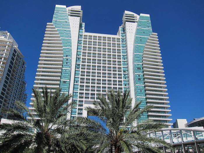
Trouble is, no one bothered to change the Diplomat’s branding. The hotel is still branded using the Westin font, which, while not proprietary, is instantly recognizable to any frequent traveler.
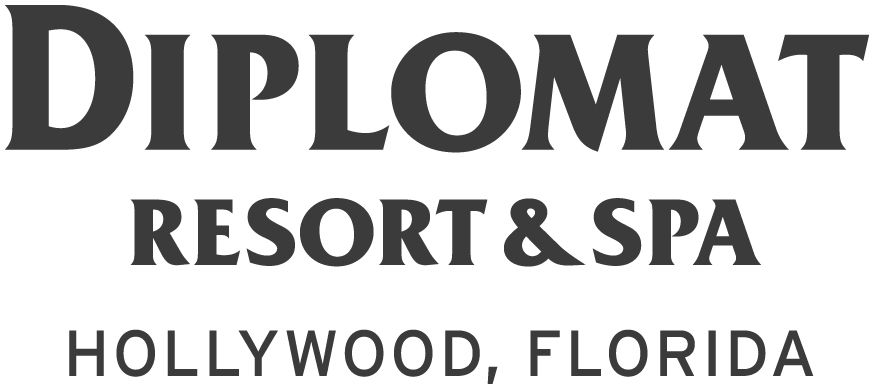
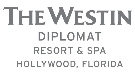
What’s strange is that this wasn’t an accident or laziness. It’s not like they simply lopped off the “Westin” part of the old Westin Diplomat logo — the hotel’s branding team consciously used the Westin font, and what’s more, Hilton seems to be totally okay with this.
In fact, the image title of the “new” Diplomat logo I shared above — which I got from a recent press release issued by the hotel’s PR agency — is “DiplomatLogo_ExactWestnFont_wHllywd.jpg”.
![]()
That’s right: “Exact Westin font.” And to be clear, this same press release touted the hotel as a Curio property.
I don’t know a whole lot about trademark law, but I do know that the law frowns upon one business willfully trying to deceive a customer into thinking it’s another business. In this case, I can’t help but imagine that they felt by keeping the Westin font, they were going to mitigate any losses sustained by losing the familiar Westin brand.
But what about Curio? Surely, the Diplomat should be able to borrow some of Curio’s fancy new branding. Let’s take a look at the Curio brand, shall we?
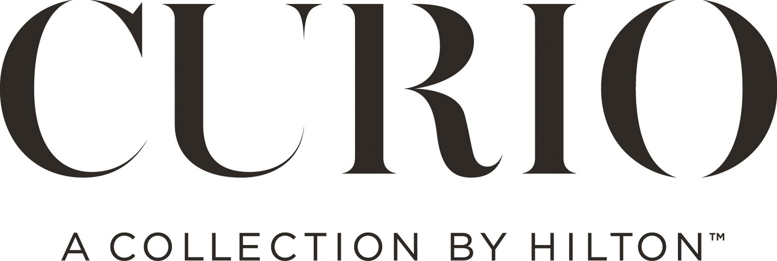
Wow, what a logo! Sexy and sleek, modern and youthful, but sophisticated all the same.
Curio’s website states that Curio is “a collection of independent, remarkable hotels. Hotels with personalities and stories all their own.” Such an exciting concept. There’s no other hotel brand like it!
Except for Marriott’s Edition brand, which Marriott describes as “an unexpected, refreshing collection individualized, customized, one-of-a-kind hotels.”
I mean.
The same font. Again. It’s worth noting the Edition logo and brand are, at this point, 7 years old, so while the Edition font might not be as recognizable as the Westin font — it still seems “familiar” to frequent travelers.
To be clear, Hilton isn’t doing anything in violation of the law here, but you have to admit it’s a bit sketchy to build a brand — in this case, Curio — on the backs of other, more successful brands like Westin and Edition (both of which belong to the Starwood/Marriott).
I realize in this case the duplication of Starwood and Marriott fonts with the Diplomat property isn’t a concerted effort by any one person — because surely whomever signed off on the new Diplomat logotype had nothing to do with signing off on Curio’s — but rather a perfect storm where the Diplomat’s own lazy, in-house branding team and Hilton’s lazy branding team converged.
If you want to advertise your hotel brand as having “hotels with personalities and stories all their own,” copying other hotels’ distinct brands is probably not the way to go about it!
What do you think — am I just nitpicking, or is this just straight-up sketchy?


I worked for Hilton when they were launching Denizen the concept which was stolen from Starwood and Ross Klein the guy Chris Nassetta brought in from Starwood led to a $75 million dollar settlement so its not surprising they copied Edition and "intrepreted"it as Curio...
@Zow I stayed there this past weekend as a Diamond too. Its a great property but they charge you for everything. They charged me $3 to send a fork to the room! Also, the beach chairs are supposed to be free but they mess up and at the beach they will try to charge you, just say that you already paid the resort fees and that its included for free! Parking is expensive at $36...
@Zow I stayed there this past weekend as a Diamond too. Its a great property but they charge you for everything. They charged me $3 to send a fork to the room! Also, the beach chairs are supposed to be free but they mess up and at the beach they will try to charge you, just say that you already paid the resort fees and that its included for free! Parking is expensive at $36 valet and $26 self park since there is no other parking around! As a Diamond you also get $15 per person (max $30) in credits for breakfast, just remember $15 is a parfait and coffee, which is ridiculous since they should at least offer $25 since there is no lounge or even a free breakfast!
@frank. Thanks very much. Must have been a very special fork! We'll do Uber to avoid the parking. And we'll bring our own plastic cutlery and snacks to supplement the "breakfast" allowance.
Dude !
What are you smoking ???
@Nick, thank you. I enjoyed Lucky's review, but I think a lot has changed. They apparently don't have a club lounge anymore (must have gone away with Starwood-->Hilton). Still, looks beautiful.
curio doesn't use bodoni or even a modified bodoni
nick, i'm a graphic designer and you're not and you better think twice before writing this kind of stuff and stick to writing about travel related content ...
there are zillions of websites that are dedicated to brand identity, new logo, plagiarism and last time i checked OMAAT isn't one of them
Nick says:
"If the best people can do is be pedantic and nitpick over the differences in bezel angle on the serif of an “I,” it’s clear to me there’s no disagreement that the typefaces are substantially similar, which is really the point."
Thank Zeus there was a point to all this pointlessness...
@Nick: Your condescending assurance notwithstanding, anyone familiar with fonts can see that these are different fonts. Both fonts have serifs and thick vertical strokes (and they're both all caps in the Latin alphabet), but that's where the Curio logo's similarity with Bodoni (which does appear to be the Edition logo's typeface) ends.
A Bodoni "C" has serifs top and bottom. The Curio "C" has one serif. Bodoni has hairline serifs. The Curio logo has wedge...
@Nick: Your condescending assurance notwithstanding, anyone familiar with fonts can see that these are different fonts. Both fonts have serifs and thick vertical strokes (and they're both all caps in the Latin alphabet), but that's where the Curio logo's similarity with Bodoni (which does appear to be the Edition logo's typeface) ends.
A Bodoni "C" has serifs top and bottom. The Curio "C" has one serif. Bodoni has hairline serifs. The Curio logo has wedge serifs. The Curio "R" has a spur at the end of the right leg; a Bodoni "R" doesn't. Pretty much every typographic detail of the Curio logo differs from Bodoni, once you get past the serifedness and the thick stroke width. (The Curio logo is reminiscent of Baskerville Old Face, but the "R" is different.)
Maybe pointing out differences between fonts is "nitpicking" in your mind, but that's how people who deal with fonts and typography distinguish fonts. I assure you these are not the same font.
The serifs on the two fonts are completely different for starters. I'm not sure how you can't tell these are two different fonts. Edition is definitely Bodoni but Curio is something different.
@Nick I'm not sure where you are spotting these similarities.. Apart from the fact they're both serifs they're not alike at all..
I do agree the top one is a copy for sure but is likely just a hotel with a hate for their former partner and wanting to show it meanwhile Curio which was designed and/or approved by Hilton top management is not a copy of Edition logo in my mind.
With that being said, you can't really blame the actions of one hotel on the whole brand.
The Curio and Edition logotypes are both modified versions of the same font, Bodoni. Yes, the serif on the "I" has been modified in the Curio logotype, and the Curio type has been "thinned out" to a lighter weight, but I assure you they are both derived from the same base typeface.
If the best people can do is be pedantic and nitpick over the differences in bezel angle on the serif of an "I,"...
The Curio and Edition logotypes are both modified versions of the same font, Bodoni. Yes, the serif on the "I" has been modified in the Curio logotype, and the Curio type has been "thinned out" to a lighter weight, but I assure you they are both derived from the same base typeface.
If the best people can do is be pedantic and nitpick over the differences in bezel angle on the serif of an "I," it's clear to me there's no disagreement that the typefaces are substantially similar, which is really the point.
What does this have to do with earning points or miles?
Just looking at the "I" in Curio and the "I" in Edition show they aren't the same font.
As for the Diplomat, maybe they used the same font for continuity, because they wanted people to think of it as the same hotel, "The Diplomat", regardless of brand, which is a different motive than trying to make you think it's a Westin.
It seems to me that people who are picking apart exactly the differences between the Curio and Edition fonts are missing the forest for the trees here. From how I read it, the Curio/Edition similarity is only an aside after the main point that the hotel released a file named DiplomatLogo_ExactWestnFont_wHllywd.jpg to the press. (If we're going to be really pedantic about it, they aren't even exact, the Diplomat logo uses a slightly heavier weight.)
...It seems to me that people who are picking apart exactly the differences between the Curio and Edition fonts are missing the forest for the trees here. From how I read it, the Curio/Edition similarity is only an aside after the main point that the hotel released a file named DiplomatLogo_ExactWestnFont_wHllywd.jpg to the press. (If we're going to be really pedantic about it, they aren't even exact, the Diplomat logo uses a slightly heavier weight.)
Part of what that hotel was paying for when they paid dues to Starwood was the Westin brand, and they're still trying to loosely use it, even if they are keeping just enough distance to have what they're doing be legal. Legal or not, it's scummy.
Nick,
I have plans to visit the Diplomat next month for a 5-night stay. Did you stay there recently? Any advice/suggestions? I'm Hilton Diamond, FWIW. Thanks.
@zow, I haven't stayed there since 2010, but you may appreciate Lucky's review from 2012.
Wow
I just realized that omaat is now a hotel review blog site!
Great stuff Nick, great stuff.
Can't wait until your next exposé.
They aren't the same font.
Gotta love the title.
The edition and curio fonts are different though, not major but you can make out the ever so slight difference just by looking at the 'O'.
The Edition font is Bodoni, but the Curio font very definitely is not. Both are serifed fonts with a very big variation in stroke width between vertical and horizontal strokes, but look at the shape of the serifs--in the Edition font, they're longish thin lines; in the Curio font, they're little tapered triangles. Not the same font at all.
Both the Diplomat and the Westin use Friz Quadrata, but that's a very widely used, 50-year-old font.
@Nick It may be the same font-family but that is definitely not the same font by any means.. There is fairly obvious big differences between them.
By that logic, any company using one of the 4-5 main sans-serif font-families (which are used in most modern logos!) are copying each other..
If you stay at the property, you'll see that branding in the room (i.e. fire escape plan on back of door) has just had the Westin part blanked out. So what was "The Westin Diplomat..." is now "The ______ Diplomat" For supposedly being a high end hotel, this is pretty chintzy.
Okay, I think the issue here is terminology. I am not a font expert but I will certainly concede they may be in the Bodoni typeface or family. They are however, different from each other, i.e. they are distinct 'fonts'.
@DougG: The Curio and Edition logotypes are both in the Bodoni font: https://en.wikipedia.org/wiki/Bodoni
Perhaps I am missing the point but are you trying to say that the Curio and Edition logos above are using the same font? Because they are clearly not.