It seems like every week I’m writing about how another major airline has revealed a new staff uniform. In 2016, American launched new uniforms for their 70,000+ staff to huge fanfare. While the design was smart and professional, the comfort and practicality of the uniforms was a disaster.
In late 2016, employees reported that the new uniforms were causing them to break out in hives.
After 5,000 complaints (particularly from cabin crew), in 2017 American finally dropped the supplier of these uniforms, Twin Hill, announcing that they would not be renewing the contract after it expired in 2020.
So, American then had the problem that they needed a new supplier to provide uniforms from 2020 onwards, but the existing uniforms were uncomfortable and unpopular for staff to wear.
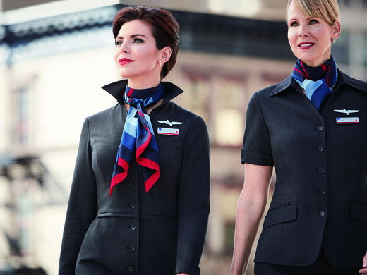
So their solution was not only to design a new uniform (again), but actually allow employees to vote on a choice between final designs. This is a smart, respectful way of choosing the new uniforms because it both includes their staff in the decision making process, and should, hopefully lead to far fewer complaints.
American held a fashion parade in Dallas last week with real American employees acting as the models, where 85 representatives of the carrier’s 70,000 employees (who were part of the Frontline Uniform Advisory Team) voted on the final two designs American management had narrowed down the options to, after working with the new manufacturer, Lands’ End.
The two options to choose from were dubbed ‘Skybound’ and ‘Modern Voyage,’ with Modern Voyage being the winning design with 60% of the vote.
Here are some images of the winning design, ‘Modern Voyage,’ that will become the standard American uniform from late next year onwards.
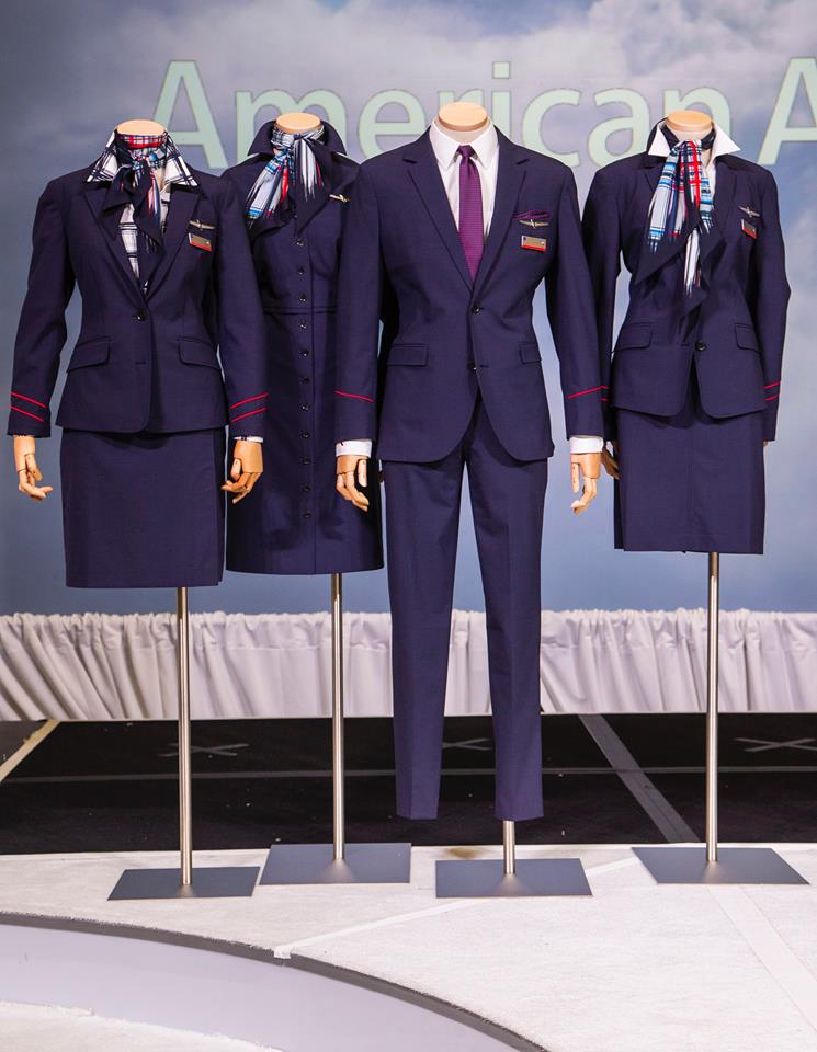
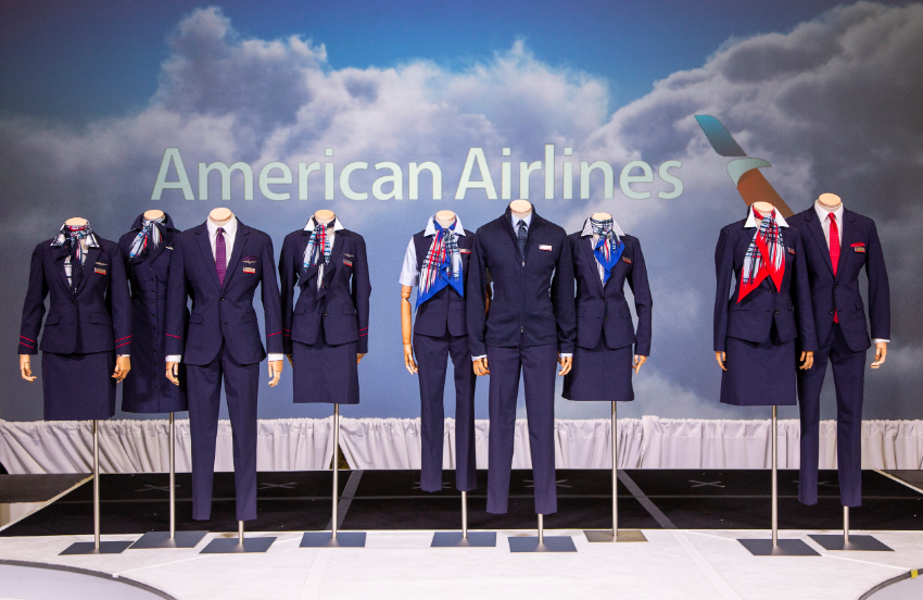
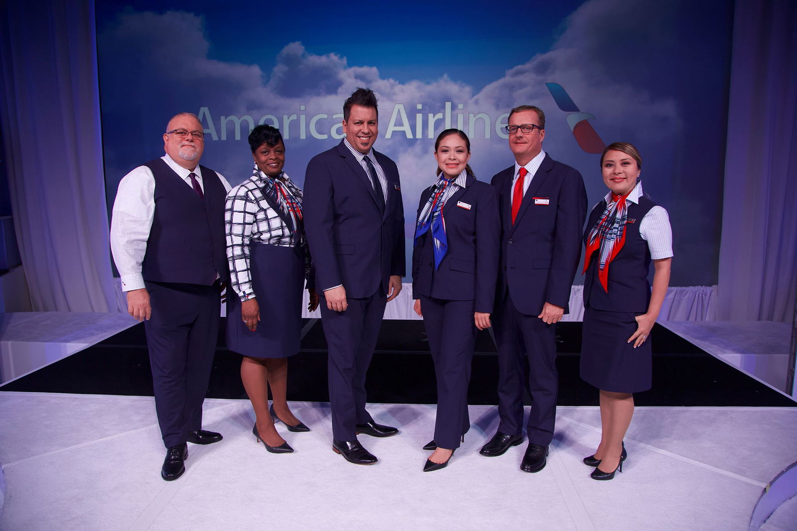
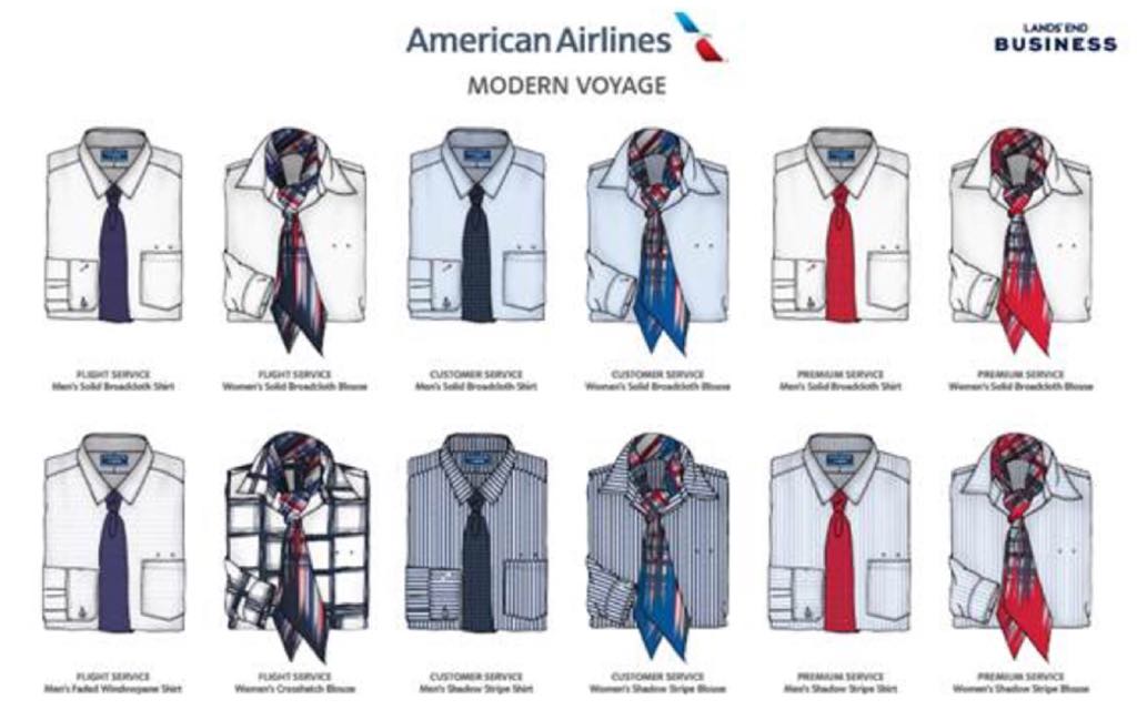
I couldn’t find any images of the losing design, ‘Skybound,’ but it’s understandable American wouldn’t widely circulate these and then have employees of the public claiming the losing design looked better than the winning design!
My thoughts
Meh, they’ll do.
There’s nothing memorable or stylish about them — when I’m checked in by a third party contract worker at an outstation for a major airline like Singapore Airlines or Cathay Pacific (where they will move to a different airlines check in desk every few hours), they are often wearing plain dark suits with a scarf of the colors of the airline.
This doesn’t look much different.
The focus of this design is obviously on comfort and practicality, rather than any fashion statements. While Delta’s ‘Passport Plum’ purple would certainly turn heads as a crew marches proudly through an airport to their aircraft, I doubt anyone will really notice these new American uniforms in a busy airport.
I imagine the designer could pitch something very similar to head office at something like a Comfort Inn or Holiday Inn Express, and they’d be approved.
Funnily enough the most memorable part of the uniform from the images above for me is the female white shirt with the large blue check, which looks incredibly dated and ill fitting already.
Bottom line
I am impressed that American has allowed their staff to select their own uniforms. I can’t recall any other airline doing this in recent memory.
The supply is a massive project, with over two million pieces to be produced, distributed and worn, so understandably American is taking no chances after the disaster of 2016, and choosing plain, comfortable fabrics rather than some fashion statement that will turn heads.
The new uniforms will receive the strictest testing for comfort and quality available in the United States.
I also love when airlines use actual staff to model the clothes rather than catwalk models, to give a more realistic vision of what the uniforms will look like as worn by most of the staff.
You should be seeing these new uniforms appearing at airports and on flights from late next year onwards.
What do you make of American’s new uniforms?


A.A. flight attendants did not choose this...it basically was chosen for them. Most actually like the grey option better but because of all the outbreaks, they are temporarily allowed to wear whatever until the issue is resolved. This is why there are so many ‘options’ and variations out there. The new uniform which is currently only being worn by the wear testers, is basically the same grey uniform done over in blue with the exception...
A.A. flight attendants did not choose this...it basically was chosen for them. Most actually like the grey option better but because of all the outbreaks, they are temporarily allowed to wear whatever until the issue is resolved. This is why there are so many ‘options’ and variations out there. The new uniform which is currently only being worn by the wear testers, is basically the same grey uniform done over in blue with the exception of the rodeo shirt and the jacket stripes. I m guessing this was a way of making sure no one wears the contaminated pieces with the new ones.
How come all the European carriers can get it right and American has never gotten it right with there uniforms.
Maybe because the other European carriers make there uniforms with quality rather than quantity.
There’s a saying “you buy the best and you never buy it again.
Boring, and actualy pretty ugly. Yet another lost opportunity from the airline that is quickly becoming the worst of the “big three”. Their management is so unimaginative it’s painful.
I find it interesting that the colors are basically the same as Delta's old uniforms.
The scarves are the biggest miss to me...they’re so busy they just look messy when also twisted and wrapped around themselves. The previous design had enough structure in the pattern to avoid that.
I’m surprised they went with purple accents. After Delta went all in on purple I think people might mistake them for another airline!
I thought the grey looked very classic. Too bad a fabric supplier led to this.
Alternative headline:
“Airline crew voluntarily choose to ditch stylish uniform to look more daggy”
Opening paragraph: “As further evidence that flying is no longer fashionable, AA crew has opted to look like 90s throwback...”
An expensive mistake. Nothing to indicate they have a polished, professional image. Too causal looking. However, I wasn't really expecting anything exciting.
Virgin America (and Atlantic) always looked stylish.
JetBlue always looked pretty sharp too.
These look kind of county fair if you ask me.
Glad, I’ll get to see their dark suits with red ties/scarves for “premium services” as I’m only flying PAID first class.
On a side note: aren’t these selected employees a bit too healthy? I totally agree with Super VC10. Disgusting. A 250-lbs unionist serving me champagne isn’t the most charming way of AA’s CI.
Agree with @ super vc10. BTW used to love flying on that plane during school holidays. But to the AA uniforms, I wonder how long it will take before their staff adopt them to whatever they want like running sneakers, leggings etc as I have often seen. Poor presentation. Staff at US carriers have such a poor standard.
Excuse me for being blunt, but why do U.S. airlines select employees who are the size of a Buick to model new uniforms? Someone who weighs 250 pounds is not going to look good in ANYTHING.
I don't live in the States - and haven't for more than a dozen years - so maybe I'm completely missing something. Are these XXL-size American Airlines employees typical of how folks look in the States now?
...Excuse me for being blunt, but why do U.S. airlines select employees who are the size of a Buick to model new uniforms? Someone who weighs 250 pounds is not going to look good in ANYTHING.
I don't live in the States - and haven't for more than a dozen years - so maybe I'm completely missing something. Are these XXL-size American Airlines employees typical of how folks look in the States now?
Earlier this year Delta Air Lines also introduced new uniforms by having them modeled by employees who in several cases were not just a few pounds overweight, but were morbidly obese.
What kind of message are U.S. airlines trying to send?
The uniforms look good on the mannequins...not so much when they are worn by actual people. :/
The Navy jackets with red stripes on the blazer arms look far better than United's drab grey/black look with the faded gold stripes... Honestly while I like the bright blue dresses and cardigans, the black and grey jackets and pants always look like they're 20 years old and the color has faded rather than some intentional design choice.
You know when your school had a uniform with a machine knitted jumper? There would always be one kid who’s mother out of necessity or parsimony would provide a kid with a home knitted version? That’s what these uniforms look like.
Nothing to get excited about but much better than that purple hot mess Delta cooked up and the frumpy Southwest garb.
These certainly aren’t Zac Posen designs!
If you are going to put so little variety into the uniforms, why not just put every job into the same uniforms? I am surprised there is no sweaters. These uniforms don't seem very versatile.
Good grief, they look as though they've just walked out of Jimmy Jazz.
Boring and a lost opportunity for American to make a confident brand/marketing statement with their uniforms. Think of the hullabaloo and all the attention that Hainan got with their recent uniform roll-out, or the attention that SQ gets with their Sarong Kabaya's (albeit only for the female uniforms, the male suits are just as boring as American's). That said, it pretty much accurately reflects American Airlines' company and service image. No one ever said that...
Boring and a lost opportunity for American to make a confident brand/marketing statement with their uniforms. Think of the hullabaloo and all the attention that Hainan got with their recent uniform roll-out, or the attention that SQ gets with their Sarong Kabaya's (albeit only for the female uniforms, the male suits are just as boring as American's). That said, it pretty much accurately reflects American Airlines' company and service image. No one ever said that AA was world-beating in terms of design.
oh dear god no
I guess if the flight attendants were voting for their favorite it would make sense that they would choose something dated given that AA's cabin crew median age must be at least 50.
On a serious note, I get that the 2016 uniforms had huge problems but at least I thought they looked sharp and professional, the new ones frankly just look classless (much like AA)
Though these uniforms will not win any design awards, what I do applaud is the consistency. It looks like there are not hundreds of options to choose from where cabin crew/flight attendants can choose from and create their own look. Here when you see a crew walking through an airport they look like they work for the same airline.
In the U.S. it seems there are so many options to make everyone happy that...
Though these uniforms will not win any design awards, what I do applaud is the consistency. It looks like there are not hundreds of options to choose from where cabin crew/flight attendants can choose from and create their own look. Here when you see a crew walking through an airport they look like they work for the same airline.
In the U.S. it seems there are so many options to make everyone happy that when you see a crew walking a terminal, even though they work for the same airline, they could easily work for multiple!
I will accept a dull uniform for a consistent professional look. However, one other comment, these do have elements that remind me of Norwegian! The scarves in particular. Or am I the only one?
Agreed. Meh.