
Several weeks ago I wrote about ZIPAIR Tokyo, which is Japan Airlines’ new low cost carrier. The airline will be launching in summer 2020 using Boeing 787-8s, and will initially operate flights from Tokyo Narita to Bangkok and Seoul Incheon.
While we previously knew what ZIPAIR Tokyo’s logo would look like, this week the airline has revealed more of their image, as they’ve released their livery, as well as their uniforms.
First, here’s ZIPAIR Tokyo’s livery on the 787:
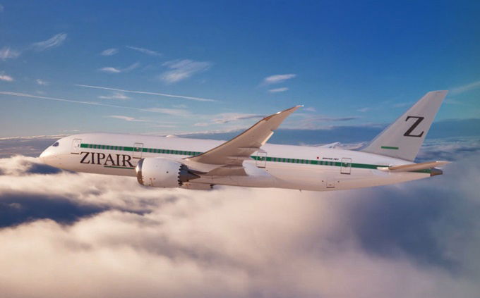
I mean, on one hand I commend them for coming up with a livery that’s a bit out of the ordinary nowadays, though am I the only one who feels like this already looks like a retro livery, and not a timeless one at that?
I also feel like it’s unnecessarily nuanced. For example, there’s a “Z” on the tail, but also an underscore character, so really it’s supposed to show “Z_.” Why? It’s supposed to be an “infinity blank” that highlights “the trueness of the ever-changing times and customers, to continue being an airline aiming for the future of the ultimate.”
I’m sure everyone looking at the plane will immediately get that! 😉
The airline has also revealed employee uniforms:
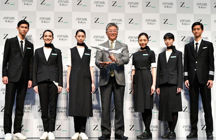
I mean… I’ll be the first to admit that I’m no fashionista, and also acknowledge that Japan has a unique fashion scene. But am I the only one who is getting sort of alternative Addams Family vibes here?
And couldn’t they have at least custom fit the uniforms for the models they were using for the launch? I’m most distracted by how some of the uniforms just don’t fit some of the employees.
On the plus side, I’m happy to see them add sneakers as a uniform option. I’m all for people being comfortable, and that seems like a reasonable development, especially for a leisure low cost carrier.


@Jason, I think if you are talking about another OMAAT contributor Ben aka James, he might “transit” to the other team, so we can no longer find any new article from him. Anyone please corrects me if I am wrong.
What does Debit think?
Personally I love the livery. Reminds me of the 80s/70s. I feel like Ben should stop trying to analyze Japanese marketing. He also made fun of ANAs Hawaii marketing.
I like the simple livery. Maybe it's the novelty of seeing an airliner cheatline in this era of Eurowhite!
But I really HATE the uniforms, which are astoundingly unflattering and look more appropriate for employees at a funeral home rather than an airline.
You truly aren't a fashion guy Lucky - those uniforms are fit to the models wearing them. They are intended to look that way. It's very Japenese - I like it.
Hate the logo, but, that's where I realize even I am getting "old" - this type of aesthetic is in style right now.
Both the livery and the uniforms are clearly marketing toward Japanese millennials (JAL's response to Joon?). That "dumb" MS Word aesthetic is seen on a lot of millennial-targeted branding in Japan and Asia more broadly; note, also, the shoes. Personally, I like.
Z_ on the tail matches the underlined "air" in ZipAir
Windows 95 called, they want their word art back
@Jason: i was thinking the same thing. wonder what happened to him.
I suppose the uniforms are a way of getting the name out there, something distinct and unique.
I love the livery, actually. While I don't personally like the uniforms I can see where they are coming from. It's trendy. Welcome to Asia!
I’ve never understood the point of full service carriers establishing low cost carriers. They of course won’t provide the service or amenities that people expect of JAL nor will they provide the bargain, bare bones transportation that leisure travels are expecting.
I like the unis, especially the dark suits with white shoes!
Looks like even a worse copy of poor Joon...
Another attempt to create a hipster low cost?
The uniforms are ok I guess, though at the same time they’re not something that really matters that much. However, the livery (among with the rest of the brand) is objectively terrible. This is like some sort of April Fools joke that went way too far and now it’s too late to stop.
Exactly what Ed said. Looks like something I could do in a couple of minutes in Photoshop. Looks too amateurish.
Wow, I’d love to try this when it comes to ICN.
I never see James post anymore. is he gone?
I saw this on NHK this evening and the best I can say about he logo is at least they are keeping with the low cost philosophy they haven’t been bothered paying a graphic designer.
Uniforms are fine but white trainers seem like a poor choice and will be difficult to keep clean.
I personally love the uniforms. It's a take on a lot of the deconstructionist designers that have come out of Japan over the years...Yohji, Issey, etc. And is a play on the look of Rick Owens today....including the sneakers.
Very modern and very out of the box for a uniform and VERY practical! Funny thing is I also wear Rick Owens and Yohji as my flying "uniform" as it's less constricting and you can...
I personally love the uniforms. It's a take on a lot of the deconstructionist designers that have come out of Japan over the years...Yohji, Issey, etc. And is a play on the look of Rick Owens today....including the sneakers.
Very modern and very out of the box for a uniform and VERY practical! Funny thing is I also wear Rick Owens and Yohji as my flying "uniform" as it's less constricting and you can sleep in their clothing and still look great.
The logo is meh though.