
Air India is undergoing a major transformation at the moment, after being privatized. The airline is investing hugely in modernizing its fleet and improving the passenger experience. This includes ordering 470 new aircraft, and also introducing a new passenger experience.
As the first visible sign of the “new” Air India, the company has just unveiled its updated branding, and it’s… drastic (Air India Express has separately unveiled a rebranding).
In this post:
Air India showcases new livery
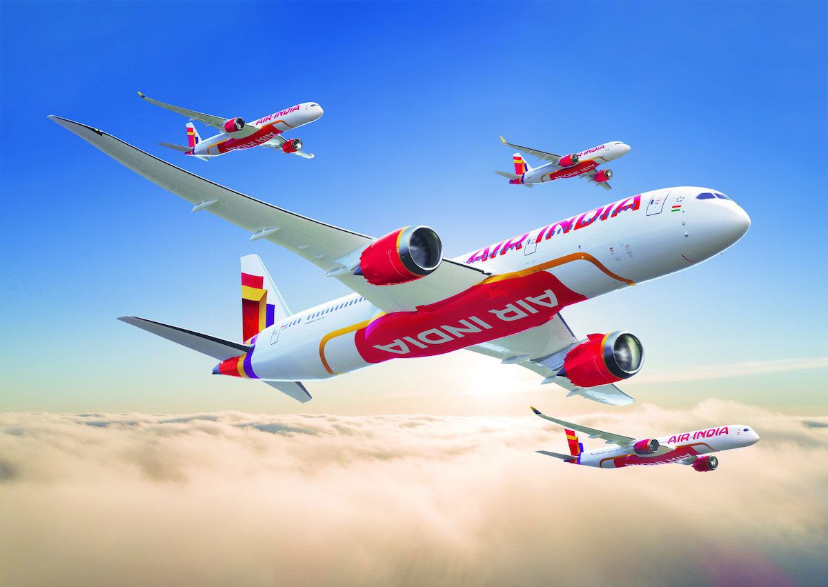
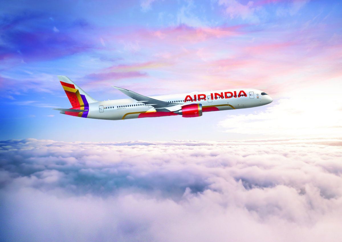
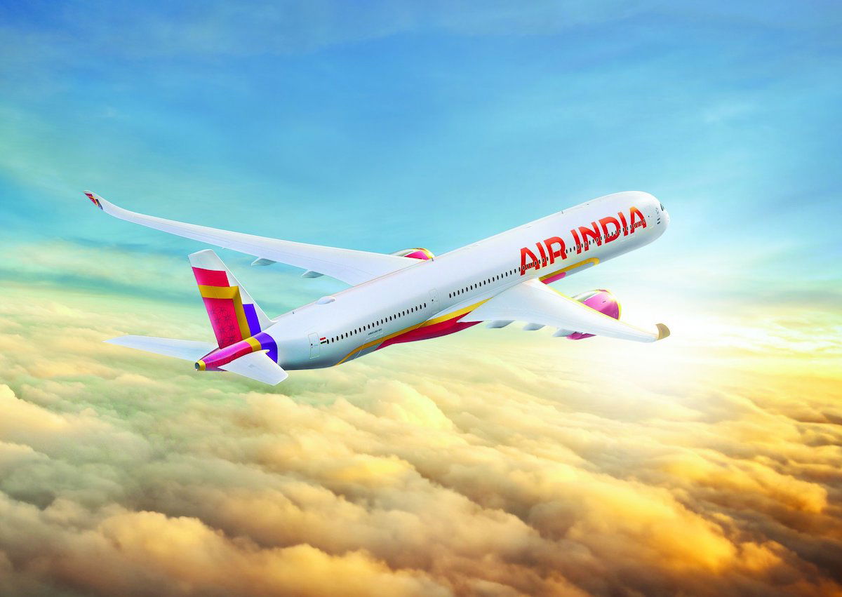
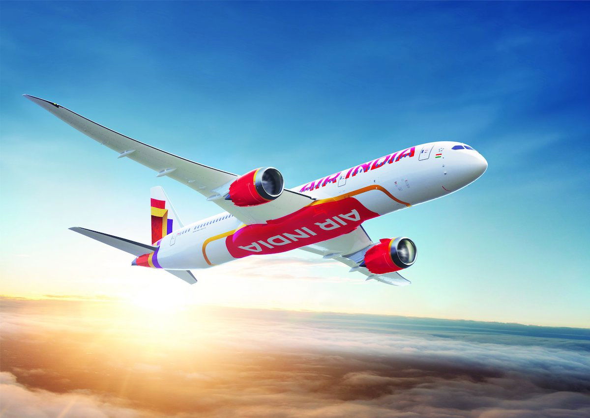
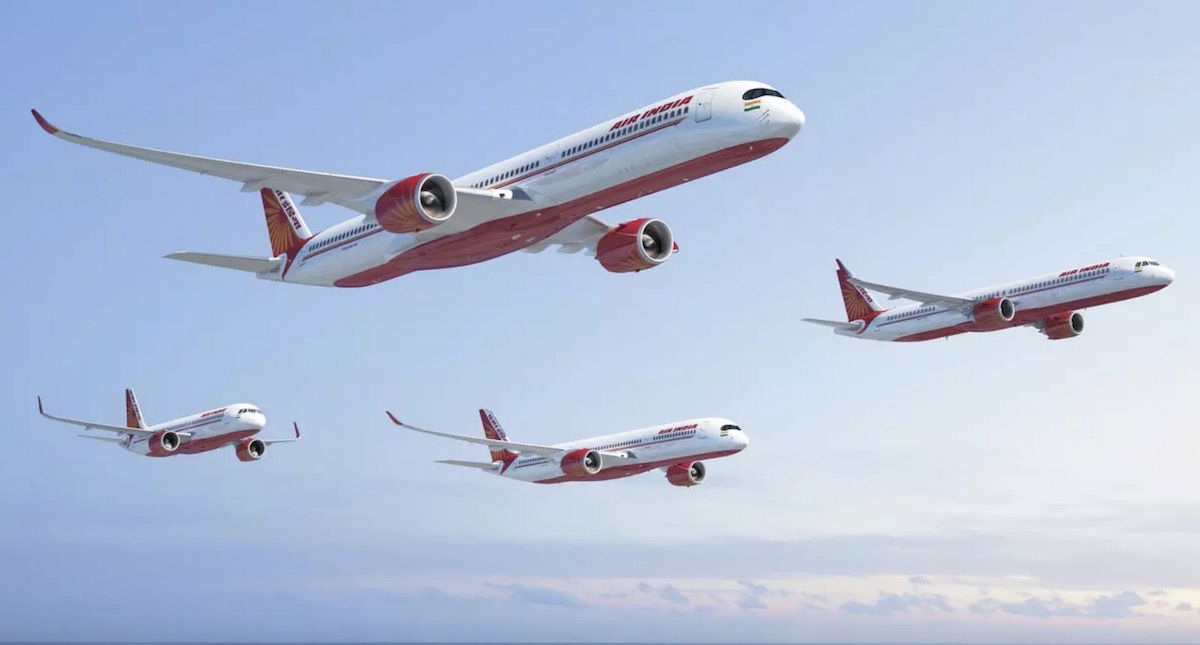
Air India’s new livery looks very different than the old one, and that’s either good or bad, depending on how you look at it. To start, below are some pictures of aircraft in the new livery, as well as a video about the new livery.
As a point of comparison, below is what Air India’s old livery looks like.
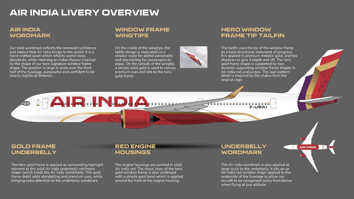
So, how does Air India describe its new livery (ignoring the suspicious F-UBAI registration code)?
- The carrier’s name is written boldly as “AIR INDIA,” intended to reflect the renewed confidence and stature that Air India brings to the world, while retaining an Indian flavor
- “AIR INDIA” is also written boldly on the underbelly, to allow the aircraft to be recognized from below when flying at low altitudes
- The underbelly is painted red, as are the engines, along with a gold frame on the underbelly, which “adds storytelling and premium cues”
- The tailfin uses the tip of a window frame “as a bold directional statement of progress,” in premium metallic gold, along with red and purple (with the purple presumably intended as a nod to Vistara, which will be integrated into Air India)
As I always say, I find that my take on new liveries tends to evolve over time, as I start to see planes “in the flesh,” and also as I start to associate the airline with the livery. I’ve had some liveries that I hated at first but ended up loving, and vice versa.
What’s my initial thought on Air India’s new livery? Well, it feels much more fresh and modern than the old one, which is good, since I assume that’s what the airline is going for. However, I can’t help but feel like it doesn’t feel particularly premium or Indian.
There’s something about the livery that just seems like it would be on a low cost carrier, and I’m not sure why exactly that is. Also, there’s a lot going on with the livery. On the one hand, I suppose I appreciate that, with so many airlines now using the same white livery, just writing the carrier’s name in bold letters, and putting some art on the tail. I could imagine this livery looking quite good if a plane is in good condition, but if it’s not washed frequently or is in need of a new paint job, I can’t imagine this will be pretty.
Air India showcases new logo
Air India has also unveiled a new logo, which seems quite simple. So start, below are the two versions of the new logo.
As a point of comparison, below is what Air India’s old logo looks like.
Air India is calling its new logo “The Vista,” and claims that it’s “inspired by the peak of the gold window frame, signifying limitless possibilities, progressiveness, and the airline’s bold, confident outlook for the future.” The logo also features a new custom-made “Air India Sans” font, which Air India thinks “marries confidence with warmth to “position Air India as premium, inclusive, and accessible.”
I’d say the logo goes well with the livery, but again, I’m not sure my initial reaction is “oh, that’s really elegant and premium.” What I am a big fan of, however, is Air India’s new brand film, which I think any avgeek will appreciate.
Bottom line
Air India has unveiled its new livery and logo. They’re both completely different than the old ones, which probably reflects the extent to which the airline is hoping to transform itself.
I’m not sure what exactly to think at this point. My initial reaction this new branding feels more modern but not very premium or Indian, though I’m curious to hear what OMAAT readers think.
What do you make of the new Air India livery and logo?


The old lettering style gave historic continuity that extended back over half a century but still managed to connote jet speed AND Indian character. I will equally miss the absolutely unique individual window treatments. Not a fan of this new livery. I think it would work on a new entrant, but not on a carrier with Air India's history.
As per Iberia, Lufthansa, American, Air France, et al... bland, dull and uninspired. Certainly, it doesn't give the impression of India one would hope for: exotic, millennia of history, beauty in its colors and people. Sort of reminds one of the old Air Belin rebrand or current Lauda scheme... better luck next time. That all said, sometimes you have to do something radically different just to show you are innovating. The old branding was definitely...
As per Iberia, Lufthansa, American, Air France, et al... bland, dull and uninspired. Certainly, it doesn't give the impression of India one would hope for: exotic, millennia of history, beauty in its colors and people. Sort of reminds one of the old Air Belin rebrand or current Lauda scheme... better luck next time. That all said, sometimes you have to do something radically different just to show you are innovating. The old branding was definitely more Indian in feel and look but perhaps just too linked to the tired miserable airline of the past.
Typical Western/American in design - brash, loud and lacking any sophistication. Air India should have made slight redesigns to the existing livery, which was tasteful, distinct and sophisticated.
Ninety percent of airline liveries suck. There are especially unattractive if they have to spell out the name of the airline boldly.
Ninety percent of airline liveries suck. There are especially unattractive if they have to spell out the name of the airline boldly.
This livery reminds me of the typical American or Cheshire gal dressed for a night out - hot and spicy, but ultimately intellectually limited, skanky and far from anything beyond a one night stand.
Why should premium always be drab and dull (like most of the European carriers' liveries, with Lufthansa a particularly bad example in my opinion)? And, yes, contrary to the post's author's claims, the colours and motifs Air India chose for its new brand identity definitely have a very strong Indian connotation. I think the issue here when judging the new Air India brand identity is that many people who comment on this have very little...
Why should premium always be drab and dull (like most of the European carriers' liveries, with Lufthansa a particularly bad example in my opinion)? And, yes, contrary to the post's author's claims, the colours and motifs Air India chose for its new brand identity definitely have a very strong Indian connotation. I think the issue here when judging the new Air India brand identity is that many people who comment on this have very little exposure and at best only a very shallow knowledge of Indian culture, customs and traditions in their full breadth and variety living up to the motto which in my opinion best defines Indian society - unity in diversity - and instead form their opinions based on Western cliches about India, like, for example, the widely held Western misconception that curry is India's national dish when in fact India doesn't have an overarching national dish, with food (like language) changing approximately every 200 km and curry actually being an invention by Bangladeshi / East Pakistani chefs who emigrated to and settled in the UK, and even though the anglicized word "curry" is a lose derivation of the Tamil word "kari", "curry" and "kari" actually have very little in common, with the people in parts of the southern Indian state of Tamil Nadu where "kari" is a regional dish probably unable to recognize "curry" as "kari", which arguably makes "curry" a British rather than an Indian dish (likewise "Bombay Duck" and "Chicken Tikka", where people in India who have never been to the West or selected 5-star hotels in big cities in India like Mumbai, where these dishes have been "imported" from the UK, have never heard of them and haven't got a clue what they are).
Looks more like a budget airlines livery
Agree with the comments. I thought it was about the soft and hard products inside the aircraft and the pricing, routing, etc. Last time I checked I did not choose an airline because of how the plane looked and the logo.
"Is it premium?" had got to be the dumbest 'question' to apply to a discussion about a new livery.
The livery is just fine. Remember that you fly *inside* the aircraft.
Disclaimer:
I am not a fan of AI. However, I secretly want them to wow the world.
So, this livery is totally taken away from India is all about.
My version of the livery would be a tapestry of colors and languages of India.
Each aircraft would be unique, representing different states and languages of India.
I am surprised that there is no National language in the livery. Hmmm!
Who did they hire for this?
Thats because its not a state owned airline as you can see none of the privates have national language either go further east none of the Asian airlines carry their language either apart from China, North Korea and Mongolia
Where the F is the Maharaja. Keep this icon.
Would the actual colours be like the infographic which are a lot more muted than compared to the bold colours on the pics and YouTube video. If the colours are like the infographic then I think they are quite acceptable
As with almost every livery reveal, suddenly everyone has a Master's Degree in Design. They're always critics every time.
It's growing on me. I don't mind it at all. I like the mixture of gold, red and purple.
And for everyone saying it's not premium enough, Brussels Airlines is literally just dots. ANA is just a blue stripe. SAS don't even have a logo at all just "SAS" on a plane blue tail....
As with almost every livery reveal, suddenly everyone has a Master's Degree in Design. They're always critics every time.
It's growing on me. I don't mind it at all. I like the mixture of gold, red and purple.
And for everyone saying it's not premium enough, Brussels Airlines is literally just dots. ANA is just a blue stripe. SAS don't even have a logo at all just "SAS" on a plane blue tail. Finnair entirely white with just a blue "F". How are any of those more original and high end?
With AI on course for one of the world's largest fleets, cost effective simple liveries are the way of the future, that's just the way it is.
The existing Air India livery wasn’t that difficult to paint. It was mostly white and all of the colors were flat. Particularly the slightly modified livery they have on the 787-8s. Add red engines and a purple flair to that and it’s perfect. I’d argue that the new livery would be MORE difficult to paint than the existing one because it involves considerably more gradients, textures, and patterns.
I can't understand how a simple paint job can be "premium." There's nothing premium about - paint.
The logo is exactly the same with Aegean Airlines, the biggest Greek carrier!
I like it, even if it is part of the minimalist design modern design trend. Gold usually looks better in person than pictures/renders, especially if it is metallic.
I’m not a fan - it lacks the heart of the country I think
I’m not a fan
Font looks very similar to Iberia's uninspiring font/ logo...
https://es.logodownload.org/iberia-logo/
The new livery looks extra gaudy. Amazingly, they somehow found a way to push forward something that makes me long for the legacy instead of this “new” stuff.
The following is 100% true and please don't laugh
Starting around 3:30pm NZT (9am IST) I was checking all the websites for updates on the new livery and just couldn't sleep until well past midnight still checking phone. Not sure what time it was, but probably around 2 - 3am when I saw the new livery, I just couldn't sleep after as well as a result of utmost disappointment with the underwhelming outcome after months of buildup!
Grade: D-.
What a disappointing downgrade for Air India. This livery doesn't feel Indian or like the premium global airline that they're trying to become. It feels a bit like a LCC. It really sucks that they pretty much didn't keep any elements from the current livery besides the red engines. Good rebrands should build on top of what is currently there. I wish they found a better way to incorporate the Ashoka Chakra wheel...
Grade: D-.
What a disappointing downgrade for Air India. This livery doesn't feel Indian or like the premium global airline that they're trying to become. It feels a bit like a LCC. It really sucks that they pretty much didn't keep any elements from the current livery besides the red engines. Good rebrands should build on top of what is currently there. I wish they found a better way to incorporate the Ashoka Chakra wheel from the old logo.
I guess they kept the Taj Mahal arch motif in the logo, but that doesn't really count because it's not effectively communicated. On the logo, it's hard to tell that the upward arrow symbol is supposed to be a Taj Mahal arch. It doesn't fit well as a superscript logo (e.g. Asiana, Ethiopian) and it almost looks like they angled it like that to avoid getting sued by Aegean. The logo could almost be mistaken for the logo of a bank or law firm if we didn't know better. This is a perfect example of the current trend toward logos that are more minimalist and less sophisticated or meaningful. On the tail, the arch is cut off and angled in a way that you can't really make out what it's supposed to be. It doesn't help that the arrow logo is jumbled among the red and purple, which they understandably had to put somewhere. Pretty much every airline makes sure that its logo, like the one you see at the check-in counter, on the website, etc., is easily recognizable somewhere on the actual plane, whether it's on the tail, the fuselage, or the engines. Air India's old livery did that successfully. This rebrand fails to do that.
I'm not too fond of the belly design. Yes, the gold frame is unique, but it also makes the livery look tacky and not smooth.
I actually kind of like the font used for the titles. It somehow does feel Indian. That's why this is not an F. I don't like how they gave into the trend of making them billboard sized though.
The existing Air India livery and branding is much better than this abomination. It was distinctive, smooth, classy, and professional for a flag carrier airline. There were only a few things that needed updating in order to make it future-proof. They were: changing the typeface to a less thick, more modern one; getting rid of the lines underneath the windows (like on their 787s); and getting rid of the white area with the titles on the tail (like on their 787s). Basically just like the one shown in the renderings for their large Boeing order recently. Then they should add a strip of purple somewhere inside or on the edge of the flying swan and call it a day.
Like so https://i.postimg.cc/1tB9QLCZ/AI7773.png
I am brown, and so wonder if some of the comments here with their insulting and colourful words and phrases supposedly used to describe 'just a new livery' are somehow not tainted - at least subliminally - by a anti-Indian bias (aka racism?).
Having said that, the logo and livery are extreme let downs. Cannot imagine that FutureBrands would do such a terrible job, considering the awesome work they did on Fiji Airways et...
I am brown, and so wonder if some of the comments here with their insulting and colourful words and phrases supposedly used to describe 'just a new livery' are somehow not tainted - at least subliminally - by a anti-Indian bias (aka racism?).
Having said that, the logo and livery are extreme let downs. Cannot imagine that FutureBrands would do such a terrible job, considering the awesome work they did on Fiji Airways et al. Others have already pointed out that the fonts look childish (look, the Emirates fonts are in a league of its own) and the overall design tacky. Something classy and elegant like Air Canada's or Luthansa's would have been more appealing.
I last flew AI out of LHR to India, mainly because it was cheaper, direct to my final destination, had a more generous baggage policy, and most importantly, wanted to know how things were improving under the new management. The 'hardware' was definitely below par compared to BA, Emirates etc, but I found the attitude and service had greatly improved!
All the best to the 'new' Air India!
You see racism even in your underwear drawer. Give it a rest already, nobody cares.
And the new livery looks like an Indian ryanair
Whether someone cares or not is beside the point. But "turd" is not exactly the kind of word I'd use to describe an airline's livery, especially a national flag carrier's. Maybe we went to different schools. Maybe I'm in the wrong site. That's all.
Firstly I'm "brown" too and secondly this just an extremely bad faith reading of what I said. You don't have to look far online, whether thats customer reviews on Skytrax or elsewhere to know that Air India is extremely terrible airline, and yes that includes from lots of Indians themselves who refuse to fly it. Emirates does a roaring trade on the subcontinent precisely because of how bad AI is, people are even willing to...
Firstly I'm "brown" too and secondly this just an extremely bad faith reading of what I said. You don't have to look far online, whether thats customer reviews on Skytrax or elsewhere to know that Air India is extremely terrible airline, and yes that includes from lots of Indians themselves who refuse to fly it. Emirates does a roaring trade on the subcontinent precisely because of how bad AI is, people are even willing to pay a premium to fly one-stop over direct flights because of how abysmal, uncomfortable and awful the customer service of AI is.
Please be trolling about the racism insinuation
I can assure you that my comments purely describe my thoughts on the new livery, and I had no hidden racist message(s).
Speaking of the logo and livery, yes, I agree that they're disappointing. This livery could've looked a lot classier.
I agree with many here, Logo and Livery looks MS Word art (maybe step above using PowerPoint).
But people, get used to it, in next 5 years AI will be top 5 airlines in world. There is just no way to stop that. Even they just fly domestic, still they will be top 5 airlines, with 500+ planes and many non-stop EU and US/Canada routes, it is difficult to stop them in 5 years. (With growing Indian population in all continents, AI will be enjoying tremendous growth)
I think they are making a big mistake merging Vistara into Air India. Tata could have kept them separate having each focus on certain markets & routes.
This new livery is shockingly loud. I actually like the frames they have around the windows. They could have updated enlarged the titles with a more modern font. A simple modernization would have gone a lot further than this mess.
I think they could have just changed the name to Air India on the Vistara branding (a bit like how United adopted Continental branding) and it would have been better than whatever this is.
Absolutely love it! It’s going to look terrific in the flesh.
The livery reminds me of Avelo's livery.
Tacky and loud.
I'm more interested in what's happening onboard though.
Mmm, not sure about the livery myself --- looks like a sari! --- but sure to be noticed at any airport. Which is probably what AI is aiming for.
It could have been so much better. To start with, the font on the fuselage is staid, uninviting and without much taste or style. The purple on the tail seems rather forced - it does not complement the red and gold, nor serve as a delectable contrast. The airline tried go for bold and ambitious, but India is also sophisticated, modern with a cultural grounding and subtle in it's tastes, sights and sounds. The livery,...
It could have been so much better. To start with, the font on the fuselage is staid, uninviting and without much taste or style. The purple on the tail seems rather forced - it does not complement the red and gold, nor serve as a delectable contrast. The airline tried go for bold and ambitious, but India is also sophisticated, modern with a cultural grounding and subtle in it's tastes, sights and sounds. The livery, as you said, is more of a low cost carrier. The logo is slightly better, but is taken down by that distasteful font. The diagonal arch, a call to India's Muslim architecture, seems to be stolen from British Airways' top right banner. Altogether, I expected much better. This is C+ at best.
Old logo was better. New logo on tail has no Indianness to it or looks bold. Ot looks like a modified version of PLO flag SUCKS at best.
However AIR INDIA on sides look fresh & bold
Wow. That is some ugly work there. Did they have to hire a relative of Modi to create that? The only good thing to say about it is that it's better than the previous livery.
Created by Modi's grandson's under-7 art class.
Created by Modi’s best friend - Don Trump
Previous livery was distinctive and understated. Current logo is much like Trump and more American - brash and loud
Air india should focus on improvement in the services. Logo change is just bogus. Please explain what special is there in the new logo.
Air india should focus on improvement in the services. Logo change is just bogus. Please explain what special is there in the new logo.
The livery looks like a toilet bowl after a dodgy curry
Lots of whinging over something that's not going to change now...and I actually think it quite fresh. There's another website that actually has the full backstory on the rebrand, with which context it makes a lot of sense (SimpleFlying).
You can put lipstick on a pig, but it's still a pig.
Looks like a LCC because of the “fun” bubble font and bright colors. More “luxury” brands have quieter colors and formal looking font.
Awful...cheap and tacky
When Air India announced their new aircraft and vision a few months ago I remember some other readers ripping my comment apart that they needed a full rebrand. Even if you don’t like this new livery, and there’s a lot not to like, they have to get away from ALL the nearly exclusively negative associations with the AI brand of the past.
Personally I think something simple and refined would be nicer. Maybe just the...
When Air India announced their new aircraft and vision a few months ago I remember some other readers ripping my comment apart that they needed a full rebrand. Even if you don’t like this new livery, and there’s a lot not to like, they have to get away from ALL the nearly exclusively negative associations with the AI brand of the past.
Personally I think something simple and refined would be nicer. Maybe just the Ashoka Chakra on the tail and Air in orange font and India in green font on the body. However, at least what was released today is about being modern. The old livery said 1970. That doesn’t represent the country or an airline seeking a new image.
Agreed. Indeed, taking that to its logical conclusion the sensible thing would have been to retire not merely the livery and logo of AI but the airline. Liquidate AI and focus on the much better and better regarded Vistara. Water under the bridge now though.
what lame rework! it is just a re-work! not re-branding!! -- after all the euphoria - c'mon tata's! Are you trying to work the TATA's "A's" in to Air India? Besides the big plane orders...and added routes to the West and more expensive fares to india than ever! I do not see any other good things coming out of TATA's take over so far....we are waiting...I think the new owners are taking the new business...
what lame rework! it is just a re-work! not re-branding!! -- after all the euphoria - c'mon tata's! Are you trying to work the TATA's "A's" in to Air India? Besides the big plane orders...and added routes to the West and more expensive fares to india than ever! I do not see any other good things coming out of TATA's take over so far....we are waiting...I think the new owners are taking the new business along the same route as other businesses of Tata's -- with an excpetion of TCS....slow, lumbering giant more akin @ an elephant pace
Better than Continental's...I mean United's...whiffle ball. Still think that's one of the biggest fails in "rebranding" ever.
You mean, globe... the thing they're flying across.
No idea why people are still so butthurt over that livery, lol.
Because it's mediocre. So is the airline to be fair
Air India improved A LOT during the last few months. Flew them last week.
-Tumi PJs and amenity kits (even on dayflights)
- Extensive cocktail list on board
- Better plating and overall better food quality.
Give them 5 years and people will love them again.
They removed the window trim! Huge change.
Seems like they retired the Maharaja...
https://economictimes.indiatimes.com/industry/transportation/airlines-/-aviation/is-air-india-retiring-its-maharaja-the-aging-mascot-hits-a-crossroads/articleshow/101381142.cms?from=mdr
It looks awful, to say the least! There was no need for the red markers under the belly and on the side engines because they are not needed. It would have been nice if they had followed the Emirate's Air example of keeping the whole body white and just the Air India lettering on the sides. The red color is not very pleasant to the eyes!
As far as the logo, a folded hand Namaste would have been nice.
They should've started with updating interiors on existing planes, reupholstering seats on recently leased 777s, or at the least, maintaining hygiene and proper interior functioning. That would've looked more better....
You can put lipstick on a pig, but it's still a pig.
I had the same thought. No strong opinions on the exterior, but their cabins are uncomfortable with all the red (seats and carpet) mixed in with some mustard brown. My 15-hour flight felt even longer than it was.
their new logo looks like it borrowed from aegean airlines’ logo.
This new livery is giving me Icelandair vibes.
A better (and cheaper) rebrand would be retaining Vistara's brand identity with Air India wording!
Kinda like United and Continental...
Even better, and even cheaper, would have been to liquidate Air India and put the money that would save into growing Vistara.
It checks the box on every livery cliche of recent years:
tailfin design extending down to fuselage (LH, Qantas, EK, Asiana, AA, Fiji, etc.)
large underbelly id (EK, Delta, Qatar, Qantas, Fiji, etc.)
name in large letters slapped on fuselage (Qatar, EK, AA, UA, Finnair, LOT, etc.)
Add to that, non-distinguished, childish looking font that looks like something one would find on snack packaging; it doesn't give any premium vibe.
Overall,...
It checks the box on every livery cliche of recent years:
tailfin design extending down to fuselage (LH, Qantas, EK, Asiana, AA, Fiji, etc.)
large underbelly id (EK, Delta, Qatar, Qantas, Fiji, etc.)
name in large letters slapped on fuselage (Qatar, EK, AA, UA, Finnair, LOT, etc.)
Add to that, non-distinguished, childish looking font that looks like something one would find on snack packaging; it doesn't give any premium vibe.
Overall, it would look horribly dated by the end of the decade.
At least the base color has been changed to white than off-white that looked unclean no matter what.
Agreed on the font. I'm no typographer but I think fonts that are rounded, either at the ends of the letter (where a serif would be) or where the letter themselves are "rounded" or "fattened" makes it looks juvenile...like a child's toy meant to have large, easily read writing to assist with their language development. I think that's why it screams (U)LLC. As if there was minimal budget so someone's nephew with some marginal PowerPoint...
Agreed on the font. I'm no typographer but I think fonts that are rounded, either at the ends of the letter (where a serif would be) or where the letter themselves are "rounded" or "fattened" makes it looks juvenile...like a child's toy meant to have large, easily read writing to assist with their language development. I think that's why it screams (U)LLC. As if there was minimal budget so someone's nephew with some marginal PowerPoint skills came in and increased the leading on some words then scrunched them a bit and was like, "Voila! Your new logo!"
Two thoughts on seeing this new livery.
1. Yuck!
2. Yuck!!
I saw the logo and immediately thought of Iberia, lol. And I've never flown with either.
You're not missing much by not flying on Iberia lol. I haven't flown on AI either, but they don't usually get overly positive reviews.
But, in fairness, Iberia's reviews are probably not bad when compared to AI's.
@hbilbao True.
One my favorite airline. Will solely rely when traveling to India. Like the livery. Authentic & unique. I foresee a brighter future of Air India.
I'd rather awful livery and quality airline, like EVA, than vice versa.
LOL, how's EVA "awful"... I'd say theirs is one of the better done liveries.
Incorporates a color not often used (sticks out) in a pattern that on the other hand is fairly common. And the emblem is a compass, something actually relevant to travel.
Helps them stand out, being based in the world's only airport that's a hub for 3 aspiring global-connecting airlines.
Or, home-hub I should say, as LAX also fits that description.
EVA has an awesome livery. It's your taste (or lack thereof) that's awful.
Eva Air's livery is really nice. It manages to be distinctive and good-looking, and it would be one of my favorites with a few tweaks (such as centering the globe on the tail and making the underbelly a bit more prominent). But, as it stands, EVA's livery is solidly above-average (IMO), unlike what Air India has come up with.
It’s simple, Air India wants to appeal to more than the decadent crowd. Than I think, the average traveler will not give a damned what the livery looks like.
Wow. It looks awful! Yes, it's newer and fresher than the old livery, but everything about this design looks tacky, loud, and LCC-like. I'd give it a solid 1/10.
Additionally, the new logo lacks character, and I'm sad to see the unique window outlines go.
Terrible. Disappointing. But i guess not too surprising. Campbell Wilson, Air India’s CEO, previously ran Scoot which until today had the ugliest livery in the world.
Air India has serious problems, and changing the livery and logo aren't addressing them. But if some marketing type really feels the need to improve the airline's image, they could change its name to something associated with quality. How about "Vistara"?
Absolutely awful. The font is also a direct copy of Iberia's. Simply polishing a turd. Air India is an awful airline. Always has been. Always will be. No sum of money is sufficient to turn it into Singapore Airlines. I'd rather fly United. Hard pass.
"...Air India is an awful airline. Always has been. Always will be....." Thank God, they didn't hire you as Chief Executive....such a jerk !!
Please fly United and leave those new AI seats for us.
Just offering a different perspective. I believe AI is taking inspiration from the vibrant colours associated with India’s culture. The tail too, I believe, resembles fabric of the Indian saree, a traditional women’s attire. Regardless, agreed that the whole logo and identity could’ve been designed differently to make it appear more premium/full service than low-cost albeit the much appreciated fresh look.
Sure, but the thing is: if one has to EXPLAIN IT using that level of detail, then they (company) has missed the mark on marketing.
I mean, on one hand, I don't know of many people who choose their flight purchase based on a livery...
...but on the other hand: airlines wouldn't pay marketing companies millions to come up with these things, if there weren't a significant amount of inherent brand value involved.
But one...
Sure, but the thing is: if one has to EXPLAIN IT using that level of detail, then they (company) has missed the mark on marketing.
I mean, on one hand, I don't know of many people who choose their flight purchase based on a livery...
...but on the other hand: airlines wouldn't pay marketing companies millions to come up with these things, if there weren't a significant amount of inherent brand value involved.
But one shouldn't have to sit through a cultural lecture in order to understand it, especially if the carrier's goal is to grow their non-native reach.
The fuchsia lettering screams ULCC. Looks cheap and overdone.
Definitely getting a WOW Air / SWOOP vibe
I think many people put too much emphasis on the livery.
This one is fine - not gorgeous, but perfectly passable. I'd much rather they succeed turning it into an airline people really want to fly. Personally I think they have a decent chance of doing it.
Agreed!
this logo looks like Air Arabia's lol.
Kinda looks like Iberia?
Nothing is as bad as Iberia’s awful livery.
My thoughts exactly – looks like a lowcost carrier. I suppose it's the combination of the strong red colour combined with the huge lettering.
The low-cost association may come from Ryanair’s LAUDA or MALTA AIR, which also have these big red letters.
Looks very Lauda!
Wow, who approved this? Still rooting for Air India of course but this rebranding is a disaster… it looks downmarket and cheap. Old livery was dated but at least it was classy. Hopefully it grows on me.
For all the drama and hype surrounding the rebrand I expected something more Mona Lisa and less MSWord Art.
Nothing wrong with it, but it will need to grow on me.
Have to agree with your comment on not looking premium or Indian. No richness in the font makes it look low cost. But the logo has got a simple royal touch and continuity to the maharaja's turban. Finally it comes to the quality of service. Let's wait but am confident.
As an Indian and an avgeek, I had so much hope and excitement for the new brand identity. Specially given SQ has a significant stake in AI, which I thought would add some much needed elegance.
But I am disappointed to say the least. You’re on point with the opinion that it looks like a low cost carrier.. just so basic and uninspiring. What were they thinking :(
The existing AI livery was elegant enough in my opinion. It just needed some modern tweaks like changing the typeface, getting rid of the horizontal lines beneath the windows, and getting rid of the white area with titles on the tail. Then add some purple to the swan design and voila! Plus the existing livery effectively used the Ashoka Chakra, a national symbol found on the Indian flag. National symbols beat out architecture in my...
The existing AI livery was elegant enough in my opinion. It just needed some modern tweaks like changing the typeface, getting rid of the horizontal lines beneath the windows, and getting rid of the white area with titles on the tail. Then add some purple to the swan design and voila! Plus the existing livery effectively used the Ashoka Chakra, a national symbol found on the Indian flag. National symbols beat out architecture in my book. You don't see French airlines trying to incorporate the Eiffel Tower into their livery design.
There are some things AI couldn’t have done better, like the brand film with a little girl holding up the new window symbol to see the world change, as well as the tail design and new custom corporate font.
Link to brand film: https://twitter.com/Vinamralongani/status/1689637828849029120
However, the wordmark is far too blocky and Iberia-like, and I wish lowercase letters had been involved like for Vistara. That said, it is a drastic (as Lucky said) and...
There are some things AI couldn’t have done better, like the brand film with a little girl holding up the new window symbol to see the world change, as well as the tail design and new custom corporate font.
Link to brand film: https://twitter.com/Vinamralongani/status/1689637828849029120
However, the wordmark is far too blocky and Iberia-like, and I wish lowercase letters had been involved like for Vistara. That said, it is a drastic (as Lucky said) and much-needed turnaround for the country’s only full-service carrier. More brand images/videos: https://twitter.com/Vinamralongani
I mean this like polishing a turd to be quite frank, no matter how you brand it this will always be a terrible airline to travel on. Even so very poor branding, looks very generic and as you say not very Indian - extremely poor show from FutureBrand here who have otherwise done some decent airline rebrands in last few years.
Yes. This. Air India needs to fix the fundamentals before it fools around with logos and livery.
I mean they also unveiled new interiors and the new livery and cabin will feature on all the new planes they're ordering. I'd argue that this is all pretty much 'fixing the fundamentals'.
Why so convinced that AI will "always be a terrible airline"? It might be now, but there are significant efforts to improve it, including investment from Singapore Airlines. The new livery is just a tiny part of the makeover. It does need a lot of more substantial improvements, but I don't understand the lack of faith that it has at least a chance of succeeding.
@vicnc - when was the last time you actually flew Air India? Was terrible in the past but the soft product and service are light years ahead of where it was 2-3 years ago. "polishing a turd" is a lazy and frankly racist comment.
Granted, livery doesn't mean anything for an airline quality - but to simply say Air India "will always be a terrible airline" regardless of the actual facts and discussion surrounding the new management is just being a hater/racist.
and frankly racist comment.
Oh please....
I am literally South Asian myself lol. And yes this is based on recent assessments. And including the opinions of many Indian's I know who refuse to fly them. It's bad service, terrible hard product as well as soft product, lazy entitled staff, terrible food and dirty planes - oh my the filth and discomfort of how dirty it is what everyone including my brother who flew with his family with them reflect back at...
I am literally South Asian myself lol. And yes this is based on recent assessments. And including the opinions of many Indian's I know who refuse to fly them. It's bad service, terrible hard product as well as soft product, lazy entitled staff, terrible food and dirty planes - oh my the filth and discomfort of how dirty it is what everyone including my brother who flew with his family with them reflect back at me. They have relatively new planes that have interiors that look like they are way older due to lack of maintenance and cleaning. And let's not get on to the state of those toilets half way through the flight..
Good thing Asiana is disappearing soon
Off-topic, but I just want Korean Air’s awful, awful 1980s livery to disappear. Some will call it a modern classic, but to me it’s disgusting. Air India’s old livery was timeless, but I can’t say the same for KE. I can’t wait for 2025 when it disappears.
Asiana, on the other hand… lovely, modern and more global than Korean. I’ll be sad to see it go, like Vistara.