
In early 2018, Lufthansa unveiled their new livery, which represented the first major branding overhaul for the company in about 30 years.
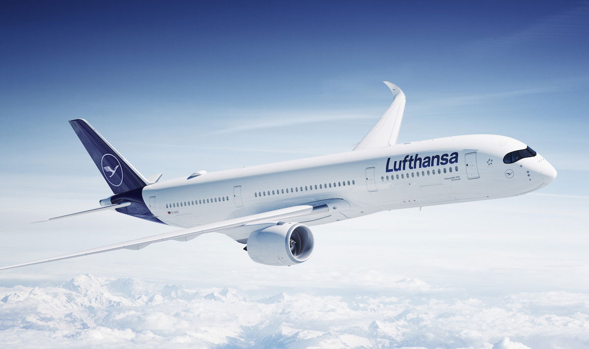 Lufthansa A350-900 in new livery
I’ll admit that the livery has grown on me a bit. I found Lufthansa’s old livery to be so iconic, so I struggled with seeing change. However, I think the new livery looks pretty good in person, at least on some planes.
Anyway, AeroTelegraph reports on an interesting dispute has come up regarding Lufthansa’s new livery, as another airline is objecting to it.
In this post:
LOT Polish Takes Issue With Lufthansa’s New Livery
It appears that LOT Polish is taking issue with Lufthansa’s new livery, claiming that Lufthansa’s new look creates a “likelihood of confusion,” offers Lufthansa “an unfair advantage,” and threatens the distinctiveness of LOT Polish’s brand.
Lufthansa had no problem getting the new design registered as a figurative mark in Germany, but as they have tried to register it in the rest of Europe, a law firm acting on behalf of LOT Polish has tried to fight the protection of the dark blue tail with a white crane inside a circle.
Lufthansa has confirmed that they are in talks with LOT Polish, though that’s all we know as of now. What makes this all the more interesting is that LOT Polish actually uses Lufthansa Miles & More as their frequent flyer program.
Here’s a comparison of the two liveries on a 787, so you can decide for yourself:
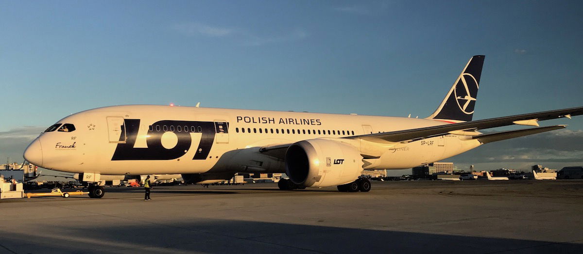 LOT Polish 787
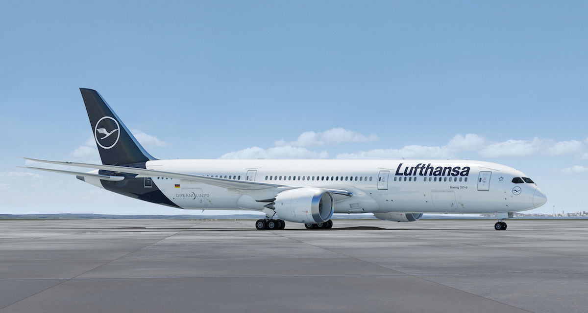 Rendering of Lufthansa 787
Lufthansa Had The Crane First
It’s interesting to note that Lufthansa has been using the crane logo since 1918, while LOT Polish has been using it since 1930. So Lufthansa has actually been using the crane in a circle for longer than LOT Polish has.
LOT Polish’s objection comes from the fact that Lufthansa now uses similar colors and a similar crane, while previously wasn’t the case as much.
My Take
I’m not a lawyer of any sort, let alone specialized in European trademark law, or whatever. I will admit that when I look at a comparison of the tails, I do think to myself “yeah, they do look similar.” I’m not sure I buy the logic that this creates brand confusion or puts LOT Polish at a disadvantage, but I see where they’re coming from.
However, I’m not necessarily sure Lufthansa has done anything wrong here:
- They’ve been using the crane for a longer time than LOT Polish
- While their colors are now similar to LOT Polish, we can hardly attribute that to Lufthansa trying to mimic LOT Polish or take advantage of their branding; rather white/metallic & blue planes are all the rage nowadays, as we’ve seen similar designs from SAS and United, for example
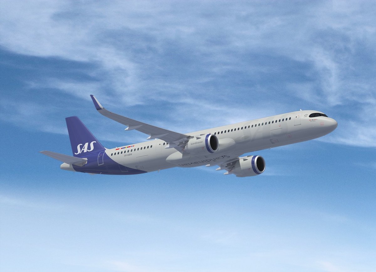 The new SAS livery is also quite similar to Lufthansa & LOT Polish
Bottom Line
I’ll be curious to see what comes of this dispute between LOT Polish and Lufthansa. While the tails look similar(ish), logically I don’t think LOT Polish has much of a case. Lufthansa has been using the crane logo for longer than LOT Polish, and their transition to a blue & white livery follows the industry trend.
Furthermore, the tail (and the logo) is only a small portion of the overall branding. I don’t think this actually creates much confusion among consumers.
What do you make of this situation between Lufthansa & LOT Polish?
(Tip of the hat to @TSniedziewski)


Small correction regarding a crane logo today’s Lufthansa began operations in 1953 not 1918 and since then they started using crane logo (1953) that In fact previously belonged to Deutsche Luft Hansa A.G. 1926-45 but there is no legal connection between the two so today’s Lufthansa is not a continuation of Deutsche Luft hansa A.G. Therefore LOT is using their crane logo much longer than today’s Lufthansa .... LOT Polish Airlines were established in 1928...
Small correction regarding a crane logo today’s Lufthansa began operations in 1953 not 1918 and since then they started using crane logo (1953) that In fact previously belonged to Deutsche Luft Hansa A.G. 1926-45 but there is no legal connection between the two so today’s Lufthansa is not a continuation of Deutsche Luft hansa A.G. Therefore LOT is using their crane logo much longer than today’s Lufthansa .... LOT Polish Airlines were established in 1928 and started using their logo 1929-1930.
Lufthansa is blatantly ripping off the color scheme and placement. Definitely should eb forced to change it to less similar
The new livery is madness in a box. Lufthansa Yellow - the shade was defined as such, I believe - was featured in the design catalogue as the "welcoming colour" and that was precisely its effect. Identifiable at a distance at any airport in the world. I have *no* idea what Carsten Spohr was thinking. If he was thinking at all...
LOT Polish? I had them as client on a major IT migration project....
The new livery is madness in a box. Lufthansa Yellow - the shade was defined as such, I believe - was featured in the design catalogue as the "welcoming colour" and that was precisely its effect. Identifiable at a distance at any airport in the world. I have *no* idea what Carsten Spohr was thinking. If he was thinking at all...
LOT Polish? I had them as client on a major IT migration project. You'd negotiate a deliverable, sign it off and then MONTHS LATER they'd want to renegotiate it. Happened frequently. A real pain in the proverbial and they're not to be taken seriously. Mean-spirited and vindictive.
@ray
KLM still holds an iconic livery luckily.
my guess is that it is just a way for LOT Polish Airlines to make headlines for no one hears a LOT about LOT Polish Airlines in Europe or the world let alone about their livery....
The article is simple lying with statement "Lufthansa Had The Crane First"
Deutsche Luft Hansa ceased to exist in 1945, while Lufthansa we know today was founded in 1953 and there is no legal connection between the two.
I hope LOT wins the battle. This will then force LH to find a fresher and more appealing livery. I just don't like the new LH livery.
The new Lufthansa livery looks a lot like Lot but so what.
If we look at Asian airlines it's easy to note how distinctive their liveries are; from Air India to Korean Air, Cathay Pacific to Garuda Indonesia, even regional rivals Singapore Airlines and Thai Airways. European airlines are just unimaginative
By 2025 Lufthansa will have bought the two-companies.
I agree with a writer here, SAS's new paint is the best of the bunch.
I still don't like the new look of LH paint however it does look good on certain aircraft.
LOTs Livery is perfect and classic
This information from Wikipedia may explain the similar insignia of LOT and TAROM:
[Polish LOT] services were suspended after the outbreak of the Second World War on 1 September 1939 and during following German occupation; most of LOT's aircraft were evacuated to Romania . . . Thirteen airliners, that got to Romania, were next seized by the Romanian government. For the duration of the Second World War, the airline suspended operations.
Lufthansa's new livery reminds me of Cathay Pacific's new livery, looks like Airlines are using less colours for their liveries as a means of cost-cutting
Lufthansa didn’t always have a crane in their tail. I guess they did a bit of oragami and created a swastika. Their livery included swastikas in different places in the 1930s-1940s.
https://gwulo.com/atom/14052
You are spot on. Lufthansas old livery was iconic. Very iconic. Changing it to this random blue white scheme is an act of barbary in my opinion.
Like others have said, LOT is much older then Lufthansa. LOT goes back to the 1920s while Lufthansa was only founded in the 1950s.
So it makes sense for LOT to protect its branding.
Who cares WTF it looks like, as long as they don't plant it in the ground I'll be happy
Who cares? Is anyone actually booking a seat because of the livery their saw on a plane? You book for scheduling, pricing and/or service experience. For goodness sake.
Small correction, Lufthansa as it's now was funded in 1955 without any legal connection with its pre war antecedent.
LOT was funded in 1928 and continues without any break till now, which makes it one of the oldest airlines in the world.
Not that I agree with LOT Polish, but Lufthansa introduced circle in its logo in 1960s (so Lufthansa has actually NOT been using the crane in a circle for longer than LOT Polish has). Lucky, I realize that it is a blog - however, usually when reading your posts I tend to believe them (and I like them btw). That said, checking those simple things (before publishing new material) from your side would be really appreciated!
It's funny, I was reading this and also thought about Tarom Airlines. It's hard to tell Tarom and LOT apart.
Also, doesn't LOT airlines share the Miles & More program with Lufthansa?
Funny - United, Lufthansa, SAS all have new and very similar blue tails - maybe a STAR ALLIANCE trend !
This could become a bigger problem if the new Warsaw airport (Google it, there's not much info as of yet but I'd expect to see a lot more fairly soon) opens and LOT gets to expand as much as the Polish government would like it to.
FYI LOT consistently has low business class tickets from the USA to Europe. I have flown them many times because they were much cheaper than the others. Not an inspirational product, but more than does the trick
I bet LOT just wants at bit of $$$$ from LH
Lufthansa livery would look much better if crane was yellow instead of white! It was yellow for so many years - don't know why it was changed to white
I’m surprised Lufthansa’s livery hasn’t incorporated a crescent moon and star.
I think LOT livery is closest to UIA and Aeroflot. Could be because they had the same pedigree.
Anschluss.
Early next month Aegean will also unveil a new livery on its first A20N that has a blue tail running down under the body of the aircraft, it's under wraps at the moment and no one who's telling has had access to it that I'm aware of. The belief is that it's an inversion of the current tail so the new will be predominently blue with some white patterning.
It's so under wraps that SX-NEO still has covering on it and it has flown to Athens with covering in tact.
Kevin B totally with you. All three of them are so similar because they couldn't get any more boring. White on blue tail. Meh.
I’ve always found LOT and Tarom’s livery’s to be very similar!
Why does LOT use Miles and More anyways?
My first thought when I saw LH's new livery was it looked too much like SkyTeam livery.
Agree with Jason above that when I first saw the new LH logo I did immediately think of the LOT logo (especially the older pre-787 one). However, as others have said, this is ultimately a non-issue since it only helps LOT to be mistaken for LH. I will miss the distinctive yellow from LH though--it created a nice blend with the brown and beige interiors that the blue will contrast with.
@ Dylan - gradients are infinitely scaleable. But:
- the bigger they are, the finer the flow control needed to prevent banding (assuming same viewing distance);
- past a certain size, you have to feather parallel passes, and that's a lot more difficult for gradients than for a solid color (for which, with an opaque paint, you only do to prevent buildup);
- 2D gradients, or multiple gradents, require even finer feathering...
@ Dylan - gradients are infinitely scaleable. But:
- the bigger they are, the finer the flow control needed to prevent banding (assuming same viewing distance);
- past a certain size, you have to feather parallel passes, and that's a lot more difficult for gradients than for a solid color (for which, with an opaque paint, you only do to prevent buildup);
- 2D gradients, or multiple gradents, require even finer feathering and additional control over the nozzle - either roll about one or more axes, flow across the nozzle itself, or a combination thereof;
- multiple gradients (with a sharp divide) require multiple stencils.
@Ben doesn't UIA look more similar to Lufthansa.
@Dylan
Wrong and wrong.
Most logo can be (and is already) designed using vectors. They are bland because the design studio have to sell some concepts which unfortunately these days point to a more conservative design that will please the boomers and millennials alike. Vector design is not good for pictures (as details eat up processing power) same goes with videos. Besides that vector has nothing to do with bland designs.
White is not directly...
@Dylan
Wrong and wrong.
Most logo can be (and is already) designed using vectors. They are bland because the design studio have to sell some concepts which unfortunately these days point to a more conservative design that will please the boomers and millennials alike. Vector design is not good for pictures (as details eat up processing power) same goes with videos. Besides that vector has nothing to do with bland designs.
White is not directly the cheapest nor easiest. It is the easiest to modify and paint over (thus easiest to sell). Material has nothing to do with color with exception to only the bare metal skin like the old AA, which needs metal. Composite needs paint to cover the materials from exposure to harmful particles.
White is mainly chose because it is indirectly cheaper, as you need less paint to paint over.
LOT has a good point. In terms of consumer awareness, no, you can't back your way into "we were there first" with an iconic shape and color scheme by making a radical color change.
I find it odd that it took LOT this long to try to make its case.
All 3 are really boring and unoriginal.
@Frederik, two reasons, responsive design, and how new aircraft get painted.
The first is from a tech perspective, if you want to create a single logo that can scale to all sizes, from aircraft to print, to web and mobile, you need a logo that can basically get represented with a series of vectors so that it can get resized without changing its appearance. This limits how you design a logo as it needs to...
@Frederik, two reasons, responsive design, and how new aircraft get painted.
The first is from a tech perspective, if you want to create a single logo that can scale to all sizes, from aircraft to print, to web and mobile, you need a logo that can basically get represented with a series of vectors so that it can get resized without changing its appearance. This limits how you design a logo as it needs to be easily scalable.
The second explains more around why all new plane designs are white for example... with the changes in aircraft materials from metal to polycarbonate, white is what is cheapest/easiest.
As a side note, why are airline liveries going so bland. Not only LH but also SAS, Lingus, Delta, LATAM all getting blander and corporate sameness cheap looking. BA started this simple trend but with them it actually works and was original.
Gone are the days of Northwest, American, Delta and Pan Am in strong and very distinctive colours.
LH will just buy LOT with all the rights, end of story.
@jonathan because TAROM has a very limited route network and isn't actually that much competing with LOT.
LOT and TAROM has practically the same livery, and no one is confusing them. Why Lufthansa is a problem?
All of the new liveries are boring. And most of them pretty much look about the same: dull white paint over most of the aircraft, name of airline splashed over aforementioned white paint in large (obnoxious) font, then a tail swoosh with some form of blue paint that is marked with a monochromatic logo. Compare with liveries from 30-40 years ago and it's becomes obvious that they all look like crappy adverts conceived in imagination-less...
All of the new liveries are boring. And most of them pretty much look about the same: dull white paint over most of the aircraft, name of airline splashed over aforementioned white paint in large (obnoxious) font, then a tail swoosh with some form of blue paint that is marked with a monochromatic logo. Compare with liveries from 30-40 years ago and it's becomes obvious that they all look like crappy adverts conceived in imagination-less board rooms.
Does the new LH livery look like LOT? Yes, And SAS and many other new liveries. It's unimaginative and boring. But it's not infringement either.
I've grown to appreciate the new Lufthansa livery, though I do miss the yellow.
That said, when Lufthansa unveiled their new livery, the first thing I thought to my self was that it looked exactly like LOT Polish's livery. So there's that.
I think lufthansa must keep crane yellow... It would be more recognizable. Except for that, its new livery is cool.
They have a problem with Lufthansa? Have they never seen a Tarom aircraft?!
A stupid PR stunt from LOT, that's the only I can see and I hardly doubt that LOT will have any Customer issues with that.
LOT management is out of touch with reality. It helps them to be mistaken for a better airline like Lufthansa
Apparently Europeans are pretty uncreative.
SAS hast the best livery of these three.
Lufthansa's tail combined with Lot's letters would look great imho.