Italy’s ITA Airways Reveals Bold (And Strange) Livery

It’s a big day for aviation in Italy. Yesterday Alitalia technically ceased operations, and today Italy’s new national airline, ITA Airways, launched. We’ve very slowly been learning the details of the new airline, including the carrier’s fleet plans, though there are some more updates today.

ITA Airways reveals livery

While no planes are fully painted in this livery yet, ITA Airways has revealed its new livery, and it’s… creative and not what you’d expect. The plane features the colors of the Italian flag (green, white, and red) on the back of the tail and the engines, and then the rest of the plane is Savoy blue.

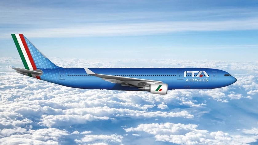
ITA Airways livery rendering on an Airbus A330

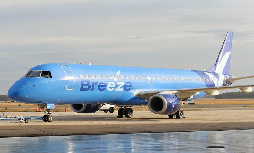
Admittedly the blue has some historical significance, but I can’t help but feel like the livery doesn’t match, and looks like it belongs on two different planes. The new livery almost looks like a cross between Alitalia and Breeze Airways.
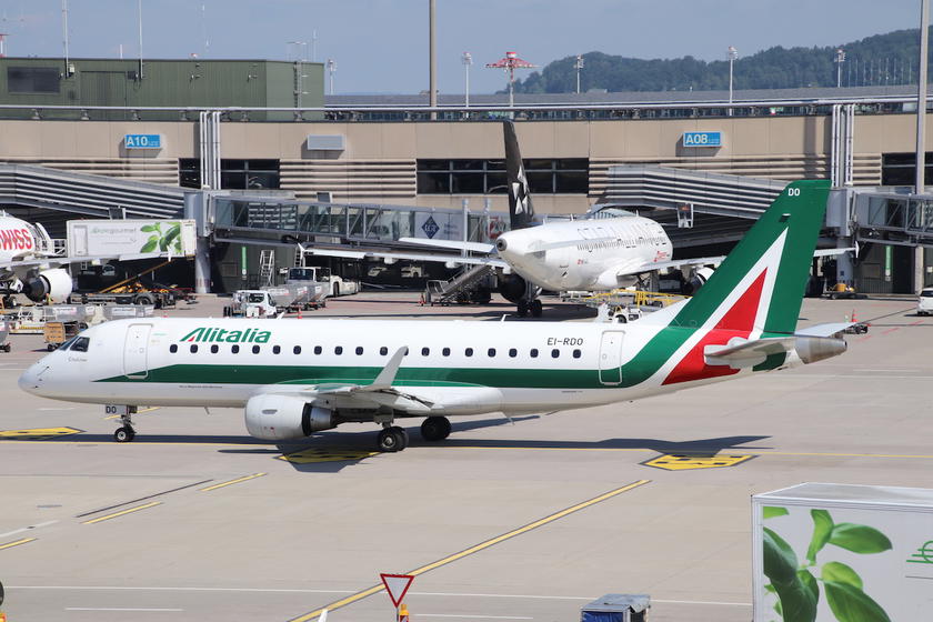
Alitalia’s livery
Breeze Airways’ livery

I guess ITA Airways should be commended for not choosing the same boring white livery you find on just about every airline. So yeah, I’m conflicted about this livery, and not sure what to make of it. It’s bold, but maybe a bit too much? If the airline was going to choose blue for the livery, I feel like it might have almost made more sense to just ditch green and red, at least so prominently?

ITA Airways also bought the Alitalia brand

Yesterday it was announced that ITA Airways bought the Alitalia brand for 90 million EUR. This caused many to wonder whether Italy’s new airline would indeed be called Alitalia. Well, the answer seems to be no. Rather ITA Airways claims to have purchased the Alitalia brand to avoid any other investors from obtaining the rights to the name.

I’m not totally sure this is the best use of $100+ million in taxpayer money, but then again, that’s a drop in the bucket compared to what taxpayers have spent on the airline up until now…

Bottom line

Alitalia finally (officially) ceased operations yesterday, and today ITA Airways was born. While the airline is having a really slow start, it looks like the ITA Airways brand will be used for the new airline, despite the new company paying over $100 million to acquire the rights to the Alitalia name.

What do you make of ITA Airways’ new livery?

Conversations (74)
The comments on this page have not been provided, reviewed, approved or otherwise endorsed by any advertiser, and it is not an advertiser's responsibility to ensure posts and/or questions are answered.
Comment as a member

Membership is free and takes no more information than commenting as a guest. Earn status points for good contributions, and see fewer ads as your status grows.

Type your response here.

If you'd like to participate in the discussion, please adhere to our commenting guidelines. Anyone can comment, and your email address will not be published. Register to save your unique username and earn special OMAAT reputation perks!

  1. Loading comments…
Recent Comments
The latest from the OMAAT community.

The comments on this page have not been provided, reviewed, approved or otherwise endorsed by any advertiser, and it is not an advertiser's responsibility to ensure posts and/or questions are answered.

Bojan Luncer Guest

Exceptionally ugly livery. Looks so cheap. It hurts to watch their planes. And I guess quite pricey in comparison to predominantly white as alternative.

0
‼ 0
Roberto Feldmann Guest

Thank you for allowing comments. I think it's so ugly, vulgar, pretentious, with the glossy, shining blue (squadra azurra). Alitalia's livery was nice. So long to Alitalia, I will miss her.

0
‼ 0
Jetpill Guest

The blue actually works for me. It's different, nice and shiny. I'm even curious about that pattern on the tail extending towards the fuselage. I wish it were more visible, not so much opacity as to be barely visible and tail looks empty of meaning. ITA is such a meaningless name and the entire name ITA Airways simply doesn't work for me. It has zero appeal, nor brand recognition, and is weird to pronounce. ITALIA Airways would have worked better, even better Air Italia. And hideous brand font.

0
‼ 0
Willem Guest

Very ugly. The latest Alitalia livery was so classy. I get the Savoy blue, but together with unimaginative flag design and logo it just looks cheap and wrong. Looks like a low budget airline.

0
‼ 0
WhiteWail Guest

I don't see what's "strange" about this livery, it's beautiful, classy and embodies the Azzurri theme. And it's a step aside of the all too common 'eurowhite' seen in too many liveries

0
‼ 0

Save posts to read later

Saving posts is a member feature. Become an OMAAT member to build a reading list you can come back to from any device.

Become a member
Meet Ben Schlappig, OMAAT Founder
5,883,136 Miles Traveled

43,914,800 Words Written

47,187 Posts Published