
HK Express, which is a Hong Kong-based low cost carrier that was acquired by Cathay Pacific in 2019, has this week announced a rebranding. Admittedly us avgeeks are often resistant to livery and branding changes, but I actually think this one is particularly not good…
In this post:
Details of HK Express’ new branding
HK Express has announced a full rebranding as of early 2023, coinciding with most coronavirus related restrictions being lifted in Hong Kong. That makes sense, since HK Express is a leisure oriented airline, and leisure travel to & from Hong Kong hasn’t been very practical for the past few years.
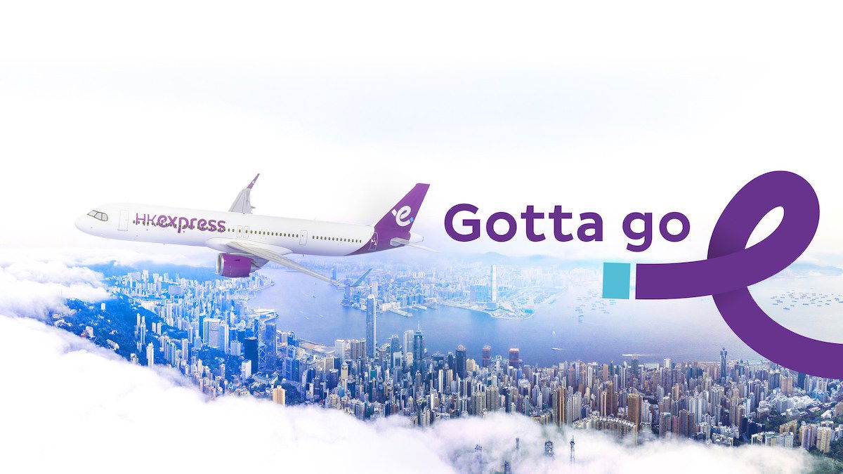
The airline will progressively be introducing a new logo, a new livery, new font and typeface, a new website, and new crew uniforms. Below is a picture that gives you a sense of the rebranding, as it shows the company’s new livery and new slogan.
As a point of comparison, below is what HK Express’ old livery looks like.
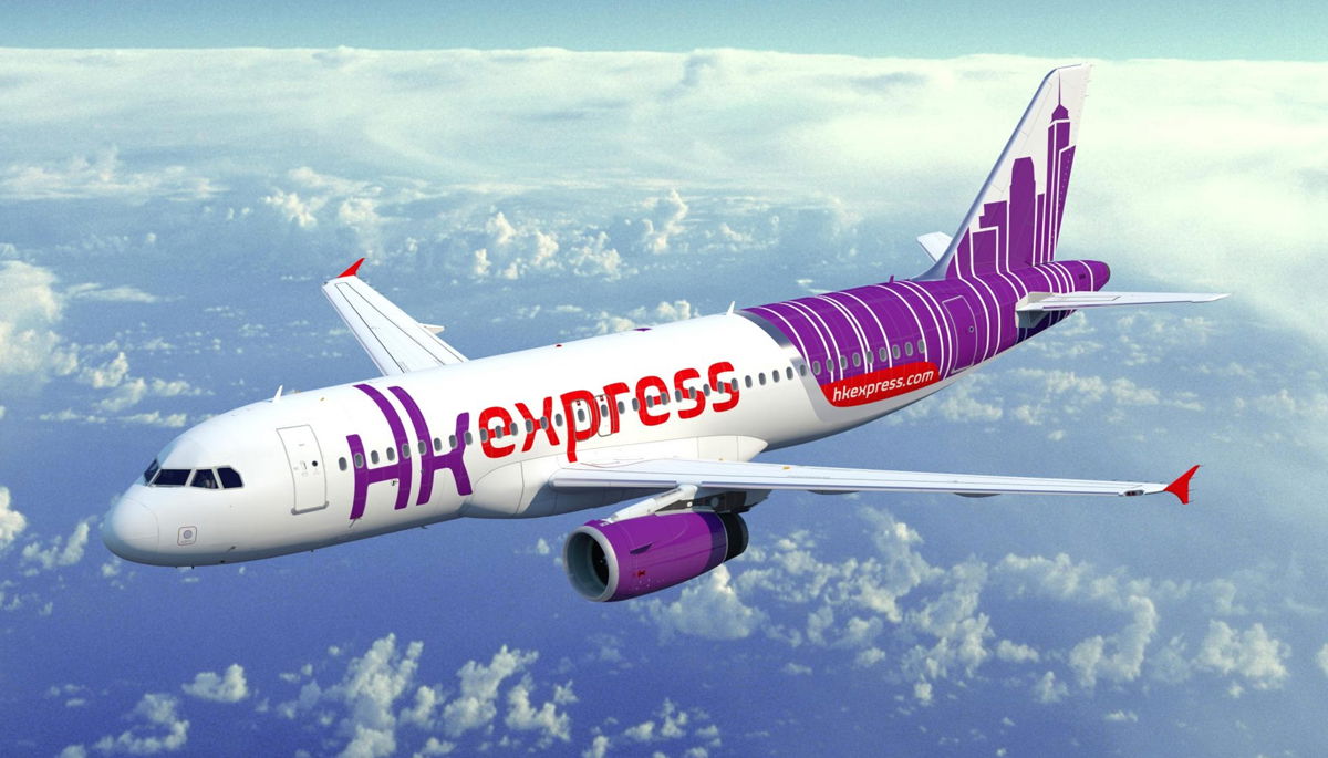
As before, the airline is continuing to use purple as its primary color. However, the image of the iconic HK skyline will be removed, and replaced by a stylized “e” on the tail. That same “e” logo will also be applied to the winglets, as well as the bottom of the aircraft.
It’s expected that the new livery will debut on a newly delivered Airbus A321neo, which is expected to be delivered to the airline in the fist half of 2023. The airline has 16 A321neos on order. HK Express has an all-Airbus A320 family fleet, with 26 planes between the A320, A320neo, and A321.
HK Express is also introducing a new slogan — “Gotta Go!” Below you can see the company’s first marketing campaign featuring the new branding and slogan.
My take on HK Express’ rebranding
Personally I find HK Express’ rebranding to be extremely boring and predictable.
In terms of livery, the airline is going from an actually interesting design that had something that was unique to Hong Kong, to a very generic livery that could belong to an airline based anywhere. I have a hard time imagining that this comes down to anything other than trying to cut costs money, as the new livery is presumably cheaper to paint.
As far as the new slogan goes, am I the only one who finds “Gotta Go!” to be… an unusual choice? Personally it makes me immediately think that someone needs to use the bathroom, rather than travel somewhere.
It also reminds me of Checkers’ “You Gotta Eat” slogan back in the day — it basically just reminds you that you have to eat, and doesn’t tell you why you should eat at a Checkers over a competitor.
It’s not surprising to me, but I think it’s noteworthy that HK Express is maintaining completely separate branding from Cathay Pacific. It would’ve been kind of cool to see HK Express rebrand into something with Cathay Pacific’s signature design elements, but in purple (like how Cathay Dragon essentially had Cathay Pacific’s branding, but only in red).
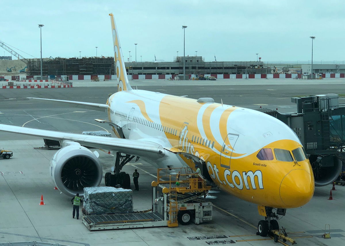
I’m not surprised to see fully separate branding maintained, as many full service airlines like to keep their ultra low cost carrier branding fully separate. For example, just look at Singapore Airlines and Scoot, and Qantas and Jetstar.
Bottom line
Cathay Pacific’s HK Express has undergone a full rebranding, with a new livery and new slogan. In the future you can expect a new website, new employee uniforms, and more.
I can’t say I’m a fan of these changes. I think HK Express went with the most generic rebranding option imaginable, removing any elements that remind you of Hong Kong. Meanwhile I see what the airline intends with its “Gotta Go!” slogan, though that’s certainly not what I’d choose to use.
What do you make of HK Express’ rebranding?

I love the new branding. It is straight forward with bright and attractive colouring. ❤️❤️
gotta go... bust
Hi,
Do you know which company did the new logo? Thanks
Going from a unique livery to being a boring and non descriptive one- don’t they poll a market first
The company I operate (LIFT Aero Design) designed the current HK Express logo, livery, cabin and uniform. We too are sad to see the Hong Kong skyline tossed, as it gives the airline instant recognition and clear differentiation throughout Asia, and communicates "Hong Kong is still relevant". (In reply to a reader's comment, no, the design had nothing to do with Cathay Pacific's special livery.)
It was a tremendously rewarding project, and we truly...
The company I operate (LIFT Aero Design) designed the current HK Express logo, livery, cabin and uniform. We too are sad to see the Hong Kong skyline tossed, as it gives the airline instant recognition and clear differentiation throughout Asia, and communicates "Hong Kong is still relevant". (In reply to a reader's comment, no, the design had nothing to do with Cathay Pacific's special livery.)
It was a tremendously rewarding project, and we truly appreciate the kind words about our design.
"Personally I find HK Express’ rebranding to be extremely boring and predictable."
Extremely boring and predictable is Hong Kong in a nutshell.
Was born there, lived there and worked there for periods of my life, things went downhill when the pool of people running the city were left with yes men and women. The people who were capable even slightly all left.
I thought the one with the city is the new livery like WTF, THAT'S COOLER ENOUGH, for once, I agree the new livery is kinda dull
Is it perhaps possible that this works better in the context of HK/Chinese culture than American ? If so, wouldn't that be the point ?
Well sounds like they need to poop
They reversed Hong Kong in the photo; they used a negative image.
Didn’t someone at the airline, like, verify that Hong Kong is actually Hong Kong during proofing?
Nope.
I guess they’d have to increase prices if they paid for that.
Move beyond vibes
I see a merger in their future...perhaps with Hungarian carrier Wizz Air? (Remember to flush! )
I agree. I like the old one better. But why the change now? They should've kept the tail design and just change the font for "HKexpress" and removed the red. It seems like they want to highlight "express" over "Hong Kong."
Firstly, the original HK Express lacked a logo. The so called standard livery was not in fact, but a special livery.... an updated, purple version of the Hong Kong Asia World City livery won by Cathay's 747-200 previously.
Secondly, this is Peach Hong Kong. HK Express adopts a variant of the Peach livery similar in style to NokScoot's.
Thirdly, it's actually a hidden Mickey, wink. Similar to Peach's function for Tokyo Disney resort, HK Express...
Firstly, the original HK Express lacked a logo. The so called standard livery was not in fact, but a special livery.... an updated, purple version of the Hong Kong Asia World City livery won by Cathay's 747-200 previously.
Secondly, this is Peach Hong Kong. HK Express adopts a variant of the Peach livery similar in style to NokScoot's.
Thirdly, it's actually a hidden Mickey, wink. Similar to Peach's function for Tokyo Disney resort, HK Express will do the same for Hong Kong Disney resort.
I have been into designing liveries as a hobby for a few years now. I have nothing to say about this livery change. They went from what I thought was one of the best LCC liveries to something generic and ugly that reminds me of Lufthansa and countless other awful rebrands. The whole branding concept seems very lazy, like the people behind it just didn’t care. After Cathay Pacific changed their livery years ago and...
I have been into designing liveries as a hobby for a few years now. I have nothing to say about this livery change. They went from what I thought was one of the best LCC liveries to something generic and ugly that reminds me of Lufthansa and countless other awful rebrands. The whole branding concept seems very lazy, like the people behind it just didn’t care. After Cathay Pacific changed their livery years ago and GBA was founded, HK Express was the only remaining Hong Kong based airline with a good livery, and now that is going away. It’s a shame that they think it’s “gotta go”. I guess it’s representative of the state of things in Hong Kong these days.
If you’re stuck on the job and gotta go, download the gotta go app. “My man’s gotta go!”
Cathay Dragon (formerly Dragonair)’s actual dragon livery was my favorite, much more so than the maroon Cathay tailfin
Maybe as part of their cost-cutting measures, they'll eliminate the toilets on the plane, replacing them with another couple rows of seats. When the planes land, "Gotta Go" is what everybody will be saying...
It’s only a logo. What one should be asking is what the onboard experience is like. Does the rebranding confuse you? There are huge letters H & K in the livery as before. The logo is an “e” as in express. Not much to miss here.
He didn’t say the rebranding was “confusing,” he said it was dull and generic, which is true.
“Gotta Go” is a perfect match with the new logo which looks like a stylized colon tied into a knot.
The word on the street is their new slogan is more relevant to all the Hong Kong based pilots. “Gotta Go” to Emirates. “Gotta Go” to Atlas. Don’t really care where, just “Gotta Go”.
Should be "Gotta Flee"...then offer one way flights to Vancouver.
It's a low cost airline. No one cares what the planes look like. They only care about the price.
The logo looks like fuel dumping
Looks like the Lotte Hotels logo. generic, confusing, change for the worse
The logo looks like the Crédit Agricole logo
"Gotta go" as in time to flee Hong Kong, or let's pee?
My immediate thought with “Gotta go!” is … they are targeting customers that are fleeing Hong Kong to move elsewhere? Very weird slogan.
Have to say, but the new livery is a huge downgrade from the old. There are plenty of LCCs — past (WOW air), present (Peach of Japan) and future (Bonza of Australia) — which do a great job with purple liveries. That skyline was instantly distinctive and so HK.
Off-topic, but it would be great if you could cover Vistara’s special 8th anniversary flight where an A321neo drew a number 8 in the sky. I know you really love those things!