Last year Cathay Pacific began a brand refresh, which they called “the next chapter.” As far as brand refreshes go, it has been fairly subtle. Here’s how Cathay Pacific summed up their intentions for the refresh:
Today, we welcome a simpler, cleaner, more customer-focused Cathay Pacific brand.
Our airline has been built on an absolute dedication to customers, service, quality and safety. As we continue on our journey, we are now unveiling a new design philosophy that will help us shape an even better experience for our customers.
The fruit of an 18-month preparation effort, this new philosophy will guide the design of new websites, lounges, cabins, in-flight service, entertainment products and much more – all with greater consistency, beauty and efficiency. Beyond this, it also clearly defines who we are and what inspires us to help passengers travel well.
Our next chapter begins here.
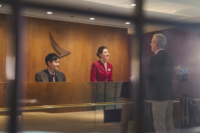
Most of the changes we’ve seen so far have been minor, like changes in lounge design, etc.

However, Cathay Pacific has now revealed what’s perhaps the most drastic aspect of their refresh. Cathay Pacific has unveiled their new livery, which they’ll progressively be introducing throughout their fleet.
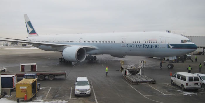
As a reminder, here’s Cathay Pacific’s old livery (while it has been around for a long time, I find it to be quite timeless):

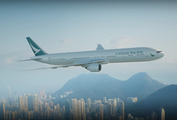
Meanwhile here’s Cathay Pacific’s new livery:

Here’s a video explaining the design philosophy of the new livery:
In it they explain that the livery “symbolizes everything we are, so it matters, it matters a lot.” Well goodness, if your new livery is supposed to represent everything you are, that’s not a whole lot. 😉
On the other hand, the livery is very much in line with what they’re going for. It’s clean and simple, which seems to be the motto of their rebrand. However, I’d say it’s almost so simple that it lacks an identity.
Bottom line
I like simple, so I don’t mind Cathay Pacific’s new livery. That being said, I do feel like the new livery is almost “clean and simple” to the point that it lacks an identity, and I’m not quite sure I get how that’s a good thing for such a design-focused airline.
What do you make of Cathay Pacific’s new livery?
(Tip of the hat to @thinklad)


The designers for the new livery need to be FIRED!! They actually got paid to do this? What a major disappointment to what could have been a defining moment.
BBBOOOORRRRINGGGGGGGGG.......
@Simon:
It's actually a light grey, and you can hardly call that a cheat line as it barely stands out. I have to agree with Carlos that it's bland and uninspiring. Even their font choice (Arrow...basically all-caps Times New Roman with kerning adjusted and the serif extended) is getting dated.
So they moved the wordmark to above the windows. That's hardly a major step forward in design aesthetics. They also removed the red keyline from...
@Simon:
It's actually a light grey, and you can hardly call that a cheat line as it barely stands out. I have to agree with Carlos that it's bland and uninspiring. Even their font choice (Arrow...basically all-caps Times New Roman with kerning adjusted and the serif extended) is getting dated.
So they moved the wordmark to above the windows. That's hardly a major step forward in design aesthetics. They also removed the red keyline from the tail and clipped the end of the brushwing. Really, their "redesign" just removed a bunch of items, made it super boring, they tried to spin it as "new, modern, classic, and minimalist". Even disregarding the fact that it can't be new, modern, and classic at the same time, it's still a dull re-brand - a loose use of the term in this instance - that will make their planes less recognizable to those that aren't airline nerds like we are.
Overall a bad update. I'm all for change if it's meaningful, but this just seems like they forced a livery change because they were updating their lounges and felt they *had* to update their livery, too.
Another bland, uninspiring rebrand.
One thing is minimalism. Another completely different is just paint an airplane in monochromatic white, write the name of your airline in a very average font somewhere in the front, and call it your livery.
And the worst: not only they pay someone for such thing, but also they believe this is cool.
Bad. :-(
Perhaps everyone should have a better look at the new livery.... There's definitely still the light green stripe/cheat line under the windows, and the same colour on the engine cowlings.
I'll reserve my judgement until I see it in the flesh, rather than just immediately jumping to conclusions....but hey! What else is the internet for?
It's dreadful and boring, and neither modern nor contemporary. If anything, it's "safe". Euro white, no cheat line, and the entire tail one color. I think it's a step backward from what they have now.
What's with airlines only painting the tail or empenage? What's so hard about extending the color down the fuselage a little bit?
I like the livery changes; particularly the decision to move the CATHAY PACIFIC lettering from below the windows to above them.
But I still miss the old 707, 747, L1011 livery with two horizontal white stripes on the green tail. THAT was a classic.
Dear lucky, for someone who considers the real housewives series to be a better inflight entertainment selection, I'm not surprised that you aren't impressed by Cathay's new design philosophy.
I like this new sleek look. I guess you're probably looking for a rainbow coloured logo ;)
Still, the best design has to go to BA.
I don't dislike like the new livery, but to this layman, there's little real change.
I'm confused by the narrator's comments (presumably the guy who helped come up with the design): "In the end, we came up with quite a classic, quite a modern, contemporary design."
Say what now?
Cx fanboy here. Like the new livery. Simple and elegant. The reason I prefer cx to begin with.
I like sleek, modern, minimalist.
But this is underwhelming.
The "minor" changes comment is just incorrect. A reflection that Lucky clearly hasnt visited the Pier F yet, as its "the" change worth Cathay that actually matters lately. The rest of these are cosmetic.
The new Pier F is stunning, service and food excellent, and overall much superior to the Wing. Pier F is instantly in the conversation for best overall F lounge. The Wing was never really in that group despite the Cabanas.
...The "minor" changes comment is just incorrect. A reflection that Lucky clearly hasnt visited the Pier F yet, as its "the" change worth Cathay that actually matters lately. The rest of these are cosmetic.
The new Pier F is stunning, service and food excellent, and overall much superior to the Wing. Pier F is instantly in the conversation for best overall F lounge. The Wing was never really in that group despite the Cabanas.
I feel pretty confident were going to get some gaga excited posts from Lucky when he finally visits it. I visited for the ~10th time yesterday, still hasn't gotten old.
I hope they're at least saving a lot of $$ on painting by mostly using white!
Just take a look at the amount of negative comments on that YouTube video of the CX new livery. Just crazy, it seems like 90% of the people dislike it. I think most people dislike it because it is far too simple or it looks dull. The amount of negative comments are running close to 80-90%, while the dislike thumbs down is running around 50/50 mix reaction. Just aweful.
Somehow I liked the new livery its simple, sleek and modern
Lucky's comment that "changes we’ve seen so far have been minor, like changes in lounge design" is very puzzling. To say the least. I mean, has he been to any of the new lounges? Because I have. And they are drastically different from before, drastically different from the rest of the industry, and shall I say...very, very good.
After I've been to their lounges in Haneda, at Hong Kong airport, and I totally understand where...
Lucky's comment that "changes we’ve seen so far have been minor, like changes in lounge design" is very puzzling. To say the least. I mean, has he been to any of the new lounges? Because I have. And they are drastically different from before, drastically different from the rest of the industry, and shall I say...very, very good.
After I've been to their lounges in Haneda, at Hong Kong airport, and I totally understand where they are going with their new design philosophy. To have the confidence to simplify, rather than seek to dazzle is...simply great.
My vote is on Cathay Pacific all the way.
ill miss the current livery which is unique and standing.out from others, and elegant in the meanwhile. would prefer ANZ'd standard livery to Cathay's..
Yeah, I think this new design is not very inspiring. I'd say rather dull. It has no wow factor. Instead, it leaves me thinking: "meh".
I'm not fussed what the plane looks like, I just want a 'hot breakfast' that's actually hot (or even just lukewarm!), a salad that is not frozen and perhaps a glass of port to go with the the cheese plate.
None of which I received in Business Class on today's CX139 HKG-SYD.
Classic. Timely, yet timeless. Much like Hong Kong itself.
As a designer myself, I find the new branding from The Pier F lounge, to their new livery to be quite beautiful.
I'm with you Ben. It's almost a case of "Livery? What livery?" It won't upset anyone....but that's about all I can find to say.
American did a better job with their livery, in my opinion. American's livery change was far more dramatic and kept the same colors, as opposed to Cathay Pacific, which seems to have gotten rid of the red "highlights" and the green on the body, which in my opinion makes the plane blend in too far with the surroundings. Therefore, nothing on the aircraft stands out much anymore (in comparison to American, where its large text...
American did a better job with their livery, in my opinion. American's livery change was far more dramatic and kept the same colors, as opposed to Cathay Pacific, which seems to have gotten rid of the red "highlights" and the green on the body, which in my opinion makes the plane blend in too far with the surroundings. Therefore, nothing on the aircraft stands out much anymore (in comparison to American, where its large text and bright tail colors make it stand out), so I'm not inclined to watch it take off or taxi at an airport. Perhaps one of the most valuable forms of PR that an airline will ever have is the ability to turn heads in the right way, and unfortunately this simply does not turn mine.
Personally I think the design is pretty great. I guess I'm the only guy who likes minimalistic around here, given the comments they show on YouTube (see my post for details @ https://youngtravelershongkong.wordpress.com/2015/11/01/cathaypacificlivery/)...