
We’ve known for a while that Aer Lingus is shortly going to be announcing a brand refresh. Rumor has it that the airline will be revealing their refreshed brand tomorrow.
Most notably, this will include the airline introducing a new livery and new uniforms, as the airline has had the same branding for about 25 years now.
This rebranding comes shortly before Aer Lingus starts taking delivery of A321LRs, which will allow them to take their transatlantic route network to the next level. These planes will also lead Aer Lingus to introduce business class on select intra-Europe flights.
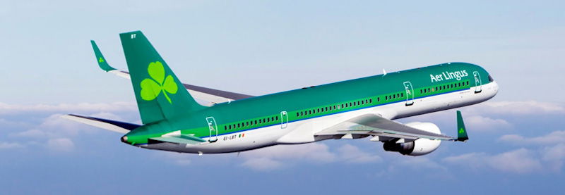
I’m quite conflicted on Aer Lingus’ current livery. On one hand I love how unique it is — there’s simply no mistaking an Aer Lingus plane for any other airline, between the green livery and the shamrock on the tail.
On the other hand, the livery also feels quite dated to me. I’m not sure where on the scale of “classic but timeless” to “ugh, it’s not the 90s anymore” this falls, though.
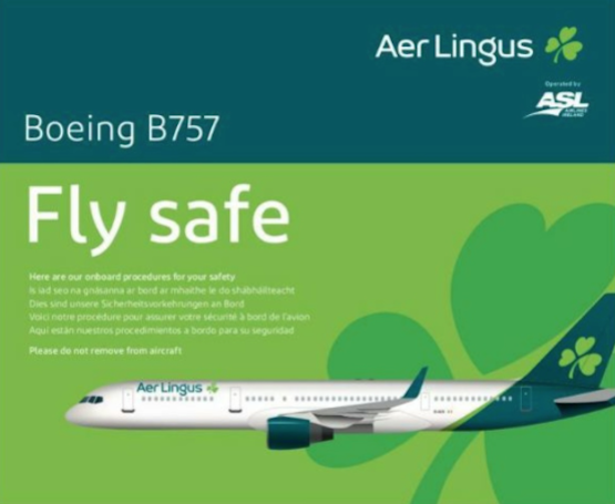
Well, ahead of the official reveal of Aer Lingus’ new branding, it looks like the new livery has at least been leaked, in the form of an Aer Lingus 757 safety card that’s circulating the web. Here’s the picture:
Hmmmm. I’m conflicted.
It’s certainly more modern than the old livery, though it’s also less distinctive. I like that they kept the shamrock, and that the tail, engines, and wingtips are green. But I also feel like they went for the safest option, rather than trying to go for a bold new look.
I’ll be curious to see what the new uniforms look like, and also what the livery looks like on the A330.
What do you make of Aer Lingus’ alleged new livery?


Very, Qantas, Lufthansa, Iberia, West Jet. Extend the tail colour down to the fuselage, and add an accent stripe to it, the rest a white fuselage. It’s the trend I guess, similar to how Airlines did it (except for the bare metal fuselages) with a white upper body, a cheat line in the middle in their corporate colour with the airline’s logo on the tail. Everyone did it then, I guess everyone’s doing this now.
The current livery was introduced in 1996, 23 years ago.
WestJet-esq
Trash.
@Declan - i never noticed the blue stripe. shame on me !
Very disappointed that they’ve dropped St Patrick’s Blue from the livery, the small blue stripe on their past two liveries made a small but important nod to Ireland’s original national colour. All in all it’s very bland and boring, and the shamrock looks like a child drew it.
IAG, EI's owner is known for cost cutting. The current EI livery is costly to repaint hence the scaled down new livery. The A330 is currently in the shop being repainted. I'm surprised the safety card has a B752 in new livery as they are leased until the A321s come online. IB had a livery downgrade too. I happen to like EI's new livery. I will certainly miss my favorite livery to photograph and that is EI's current green.
Green*
Ugh, so bland and derivative. It looks just like Lufthansa, except with a greet tail.
Boring. It's not ugly but like others have said, the current livery is quite unique. I would leave the paint job just like it is now, would change the font to a more modern look, make it bigger, maybe a touch or two on the shamrock and that would be it.
Iraqi Airways?
It's bloody terrible. The full green was distinctive, now it's just derivative.
No, no, no, no, no, no, no.
I love seeing the green of EI when I'm abroad, might be an Irish thing but you do feel proud seeing it. This is horrific and spits on decades of history and legacy.
Airlines paint there planes white as it is lighter, found that out on a tour of the Boeing Factory. So thats the reason behind the white trend.
The current uniform is horrendous.
If you think the current livery is stuck in the 90s, you ought to see the “straight outta 1976” livery that preceded it.
https://www.airliners.net/photo/Aer-Lingus/Boeing-747-130/1155907/L?qsp=eJwlzDEKwzAMQNG7aO5QUyhJtvYCzdALCFnEBjc2soaGkLtHdjZJT/wdKK/Kf/1uhWGCyigU4AYFBX8Vph0wSoprw8E5E4/Kc8iaF8ES2Bu4cbib1Cz63mxvLy8iLmp83T/iWRpxpZ5frOhsYJn7DI9ni8daEvYGK8YEx3ECOOc05A%3D%3D
I like it. I like flying AerLingus. I like Ireland and can't wait to get back on it.
I know many will disagree with me, but I love the old livery, and I think it’s exactly what made Aer Lingus so unmistakably Aer Lingus. The new one is just copy past white with hint of green and no creativity.
Airlines are just playing too safe with their livery these days
White paint is cheaper.
Yawn. Why bother.
The new 3 love hearts shamrock is a mess.
Jesus, how many more all white with a color swoop down the tail liveries does this industry need. They couldn’t think of ANYTHING more creative?
Maybe a new airline alliance?
Aer Lingus, Alaska, Lufthansa, Qantas
It doesn't look bad but it is so ordinary. I agree their old livery is a little dated but at least its something different. It reminds me of what Air Canada did changing their unique, teal blue livery to something that looks so boring and ordinary like this. I wish they kept their all green plane and just made some minor modern updates to it.
Sick of the all-white trend, although I agree that there is still plenty of green in it. Air New Zealand better keep their black colours - and it really stands out too (as did the LH yellow bird). To me, companies are losing their identity when they do this.
Luftlingus
Here are some pictures of it on the A330:
https://i.ibb.co/mSMy1Pm/EI-1.jpg
https://i.ibb.co/2jVcm6h/EI-2.jpg
https://i.ibb.co/9TN5bn9/EI-3.jpg
Every recent refresh or new brand has done the same thing...extend the tail fin line down onto the fuselage: Qantas, WestJet, Lufthansa, Air Tanzania, Alaska, and the list goes on. Just another copycat design...
There's already leaked photos of the a330 in the paint shop and the paint "plans" for it:
https://twitter.com/ShaquilleAKhan/status/1084963289577201664
The plane should be green. All green. Like 26 different shades of green. And then add some more green just to be sure.
Boring, generic, dull, banal.
All great words to describe this pathetic redesign. Do these airline all contract the same ad firm, or is this a case of the entire industry following the same trends?
Noooo, yet another Iberia or Lufthansa. Profoundly forgettable.
I believe the current recipe for airline rebranding is: find a competitor with a livery that looks the least costly to apply, swap out the color palette, replace logos, pick one of four fonts. Done.
Aer Lingus no doubt needed an update but this is so dull and banal. I agree we don't need more eurowhite liveries - one of the distinct things about their brand was the very green planes - think American and its silver, there is a lot of equity in that. It's a real shame they went this direction although it will be definitely cheaper as a paint job which I am sure will keep the dreadful WW happy...
Meh
Great, more Eurowhite. Sigh...
"I’m not sure where on the scale of “classic but timeless” to “ugh, it’s not the 90s anymore” this falls, though."
-Great line @Lucky. I feel this way about SQ's livery which I think is steadily moving from classic to dated and drab.
A bit disappointed. I like the update on the font and the continued use of the unique green and shamrock, but the pattern on the fuselage (80% white with the tail color coming down to the rear part of the fuselage) has been overdone - think Lufthansa's new livery. It's a safe and banal choice, better described as a refresh than a complete redesign.
More Eurowhite is exactly what the world needs?
Absolutely boring refresh. Looks like LH except Green.
BORING. I don’t get overly exercised about airline livery, but this seems like a massive phoning it in and just copy/paste from multiple other airlines updating the color to green and slapping a shamrock on it. Totally unimaginative. While their current livery may be ‘classic’/dated, at least it was distinctive and had brand equity. As mentioned this is just like Alaska/Lufthansa/Iberia etc etc what’s the point.
Looks quite like they used the Qantas 787 as their template lol
@ Gene - to be fair, this is a complete rebrand, not a minor change.
@ Ben -- It amazes me how much money companies spend on these seemingly minor changes in their liveries. I guess that's why they run an airline and I don't.
There's also photos floating around from the paint hangar that pretty much confirm this is the livery. I thought the announcement was Thursday, but I guess I was wrong. First frame is EI-EDY (an a330) and I believe it will make the JFK run first.
I'm conflicted as well. I love the current livery, but I also have a soft spot for Aer Lingus. I love the way they stylized the shamrock on the current...
There's also photos floating around from the paint hangar that pretty much confirm this is the livery. I thought the announcement was Thursday, but I guess I was wrong. First frame is EI-EDY (an a330) and I believe it will make the JFK run first.
I'm conflicted as well. I love the current livery, but I also have a soft spot for Aer Lingus. I love the way they stylized the shamrock on the current livery. Its got a retro feeling to it.
The new livery is just fine for me, it could have been worse, but for a eurowhite livery its okay. The industry is moving in this direction anyway. I hate the new shamrock though looks limp, caught in the wind and drunk. Meh.
Generic
Reminds me of fellow IAG member Iberia, when they had a livery refresh a few years ago. In that they are trying to keep the “image” of the brand while modernising and simplifying the design.
I prefer the new one however, the old one was very nice.
Looks like Alaska's livery but with more green