
HK Express, which is a Hong Kong-based low cost carrier that was acquired by Cathay Pacific in 2019, has this week announced a rebranding. Admittedly us avgeeks are often resistant to livery and branding changes, but I actually think this one is particularly not good…
Details of HK Express’ new branding
HK Express has announced a full rebranding as of early 2023, coinciding with most coronavirus related restrictions being lifted in Hong Kong. That makes sense, since HK Express is a leisure oriented airline, and leisure travel to & from Hong Kong hasn’t been very practical for the past few years.
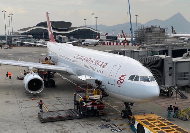
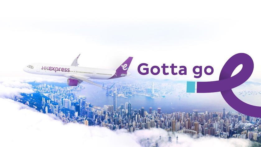
The airline will progressively be introducing a new logo, a new livery, new font and typeface, a new website, and new crew uniforms. Below is a picture that gives you a sense of the rebranding, as it shows the company’s new livery and new slogan.
As a point of comparison, below is what HK Express’ old livery looks like.
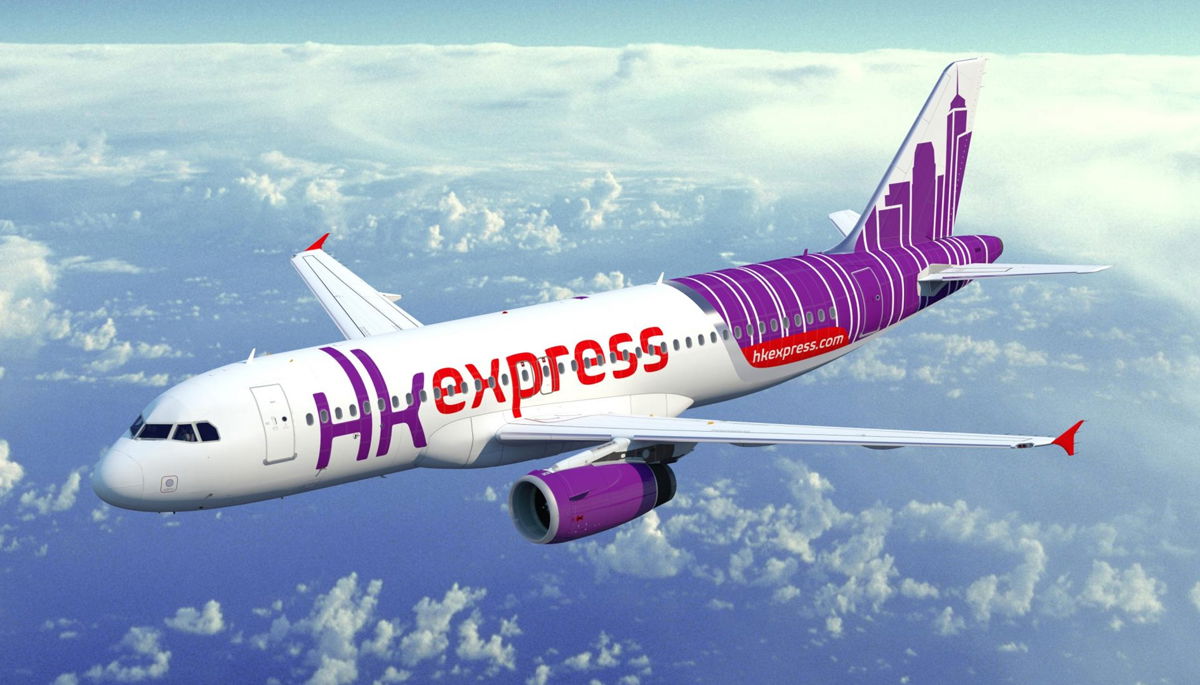
As before, the airline is continuing to use purple as its primary color. However, the image of the iconic HK skyline will be removed, and replaced by a stylized “e” on the tail. That same “e” logo will also be applied to the winglets, as well as the bottom of the aircraft.

It’s expected that the new livery will debut on a newly delivered Airbus A321neo, which is expected to be delivered to the airline in the fist half of 2023. The airline has 16 A321neos on order. HK Express has an all-Airbus A320 family fleet, with 26 planes between the A320, A320neo, and A321.
HK Express is also introducing a new slogan — “Gotta Go!” Below you can see the company’s first marketing campaign featuring the new branding and slogan.
My take on HK Express’ rebranding
Personally I find HK Express’ rebranding to be extremely boring and predictable.
In terms of livery, the airline is going from an actually interesting design that had something that was unique to Hong Kong, to a very generic livery that could belong to an airline based anywhere. I have a hard time imagining that this comes down to anything other than trying to cut costs money, as the new livery is presumably cheaper to paint.
As far as the new slogan goes, am I the only one who finds “Gotta Go!” to be… an unusual choice? Personally it makes me immediately think that someone needs to use the bathroom, rather than travel somewhere.
It also reminds me of Checkers’ “You Gotta Eat” slogan back in the day — it basically just reminds you that you have to eat, and doesn’t tell you why you should eat at a Checkers over a competitor.
It’s not surprising to me, but I think it’s noteworthy that HK Express is maintaining completely separate branding from Cathay Pacific. It would’ve been kind of cool to see HK Express rebrand into something with Cathay Pacific’s signature design elements, but in purple (like how Cathay Dragon essentially had Cathay Pacific’s branding, but only in red).
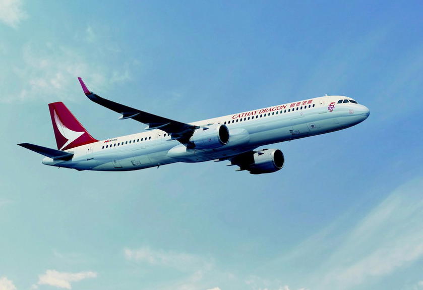
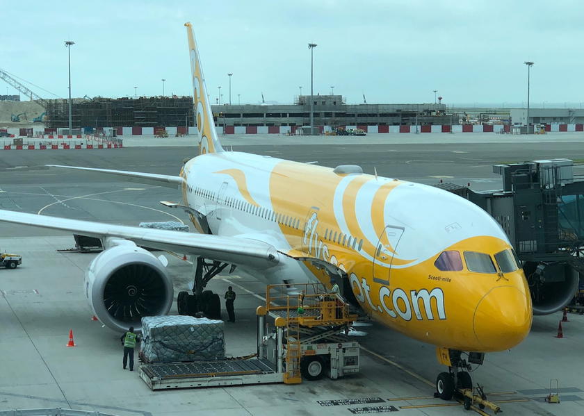
I’m not surprised to see fully separate branding maintained, as many full service airlines like to keep their ultra low cost carrier branding fully separate. For example, just look at Singapore Airlines and Scoot, and Qantas and Jetstar.
Bottom line
Cathay Pacific’s HK Express has undergone a full rebranding, with a new livery and new slogan. In the future you can expect a new website, new employee uniforms, and more.
I can’t say I’m a fan of these changes. I think HK Express went with the most generic rebranding option imaginable, removing any elements that remind you of Hong Kong. Meanwhile I see what the airline intends with its “Gotta Go!” slogan, though that’s certainly not what I’d choose to use.
What do you make of HK Express’ rebranding?


Membership is free and takes no more information than commenting as a guest. Earn status points for good contributions, and see fewer ads as your status grows.