Sun Country is going through radical changes at the moment. The airline is transforming from a full service airline that’s loved by Minnesotans, to an ultra low cost carrier that’s taking after Allegiant and Spirit.
Within the past couple of weeks Sun Country has revealed the ways in which they’ll be reconfiguring their planes, as they’ll be adding 21 seats to most of their 737s, and will be eliminating their first class seats altogether.
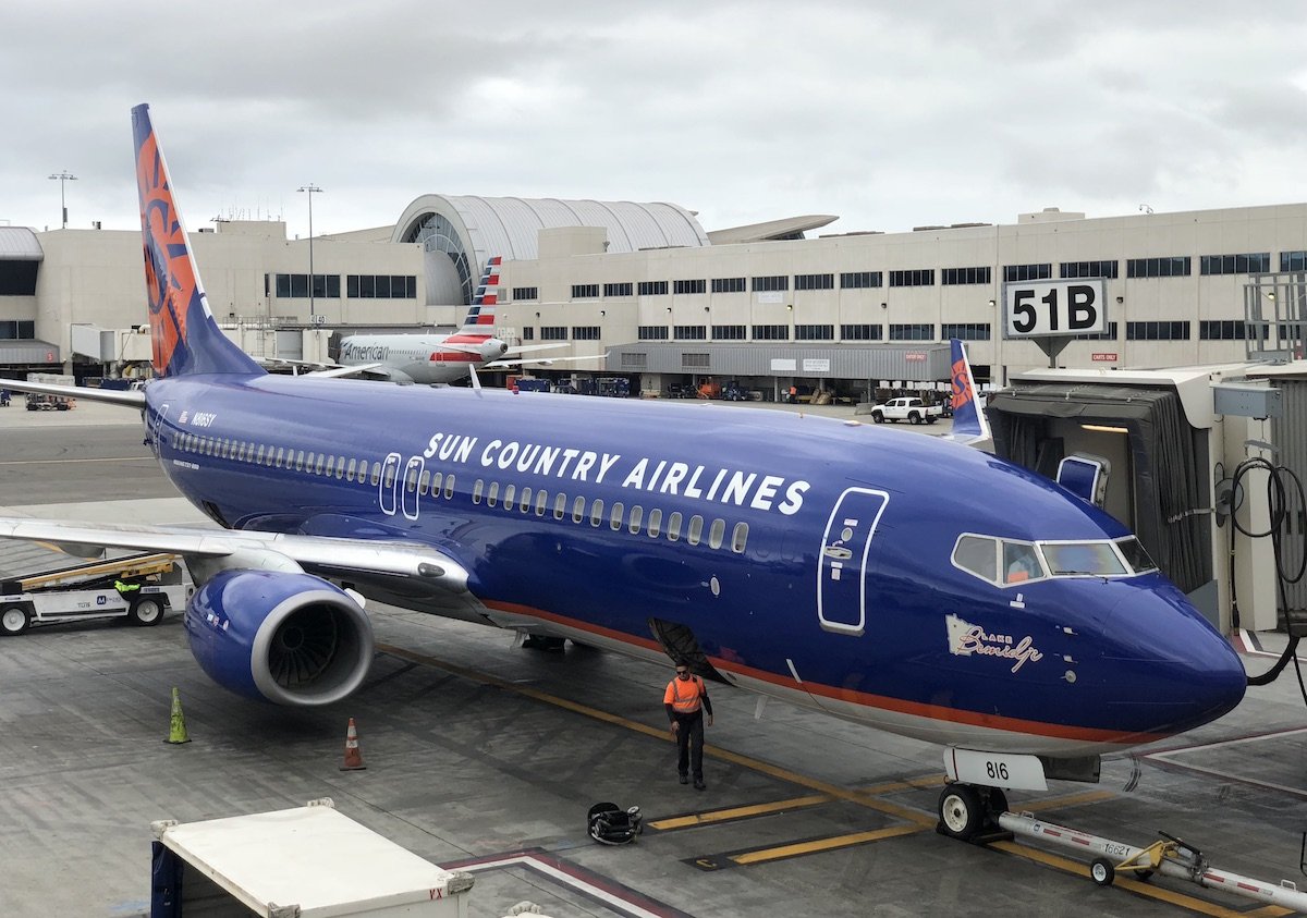
As part of this radical transformation, the airline is also updating their branding. Personally I quite like Sun Country’s current livery, and find it to be distinctive.

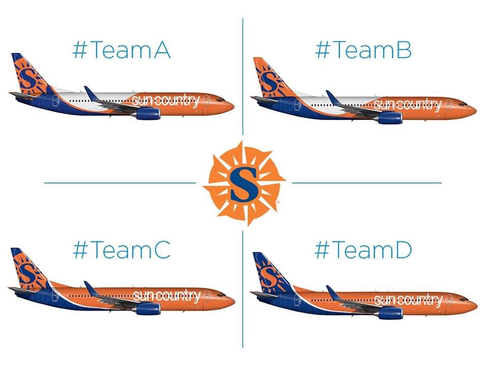
However, I guess the airline is looking to make some livery changes at the same time, and they’ve chosen an interesting way to go about that. Sun Country has let their employees vote on their new livery, giving them a choice of four options. All the liveries have similar elements, so the options they’re voting between have fairly subtle differences.

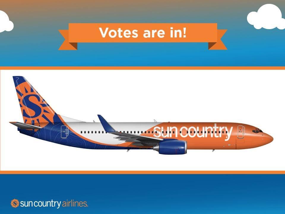
The employee votes are now in, and the airline says it was a “landslide victory” for the winning livery. Specifically, they chose the first livery above.

Here’s how they describe the new livery:
This livery reflects our brand in several ways. As you can see, the compass logo on the tail mirrors the tail of our current livery, keeping us connected with our wonderful passengers we’ve come to know throughout the years. Second, the introduction of Minnetonka’s depth chart as our new “lakes” design element demonstrates our continued commitment to our home state and local customers. Lastly, the refreshed bold use of orange symbolizes our bold vision for a bright future serving leisure travelers ahead. See you in the skies!
Maybe I’m in the minority, but I think that’s one sharp-looking livery. It’s unique, bold, and modern, and I think it’s a nice improvement over the current one. And that’s saying a lot, since new liveries are almost always met with negative responses, given that we’re naturally resistant to change.
When it comes to refreshes within the past year, I’m a huge fan of Air Tahiti Nui’s new livery, but definitely not a fan of Lufthansa’s new livery.
What do you make of Sun Country’s new livery?


It would be perfect (for me) if JetBlue flew Fort Lauderdale - Minneapolis.
I like it though the B option is even better
I hate liveries that put text across the windows - it just makes the text look weird and unclear.
@Eric
+1
Grew up on the East Coast, work in Minneapolis. Please add more routes JetBlue!!
The employees picked the best of the 4, for sure. Sharp! I like it.
I much prefer the current livery, which is very smart-looking.
@eric - Dollar General livery...classic!
Lol, immediately thought of Aeroflot too before reading the comments.
I like the current livery more, it's much more distinctive.
The new one is just so all over the place.
Andrew:
+1 !
Are they joining SkyTeam? :-)
Lucky, you're in the minority. Minnesotans prefer to leave things the way they are, and this will be too much for us. If Dollar General had an airline this would be their livery, but that may be what Bricker is going for. Just back from Fort Myers last week using up the last of my Sun Country points on aircraft Lake Bemidji and Lake Harriet. Now we're all waiting for JetBlue to add more than just the Boston route to MSP.
Truly, the Payless Shoe Source of the skies.
is it me or is this aeroflot?