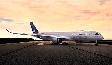
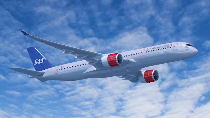
SAS has today launched a brand new visual identity for the first time in 21 years. The livery will debut on newly delivered Airbus A350 and A320neo aircraft. SAS says that this is a modern and new upgrade to their livery, just as they’re updating their fleet to add modern and more fuel efficient planes.
The intent is that the new livery matches the SAS cabin and onboard concepts that they introduced in 2015, so that the interior and exterior of the planes match.
The plan is for all SAS aircraft to feature the new livery by 2024. This is because planes will get the new liveries the same time they undergo heavy maintenance, which is every 5-6 years.
Here’s how SAS describes the new design elements of the livery:
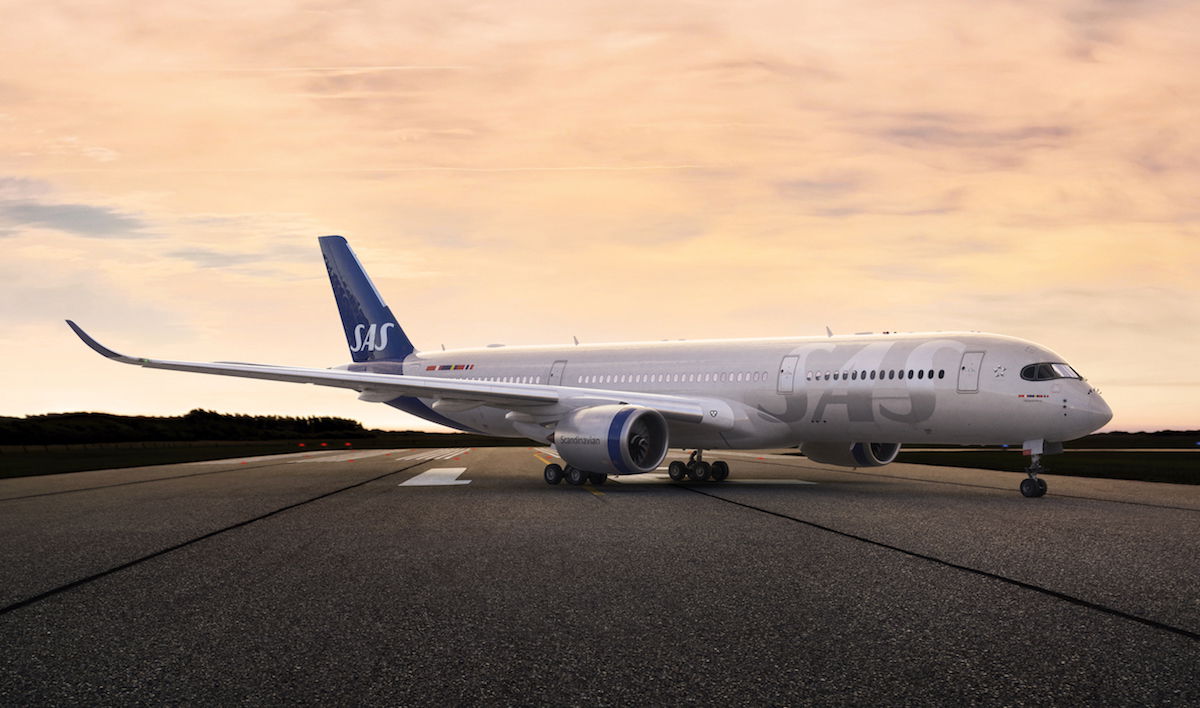
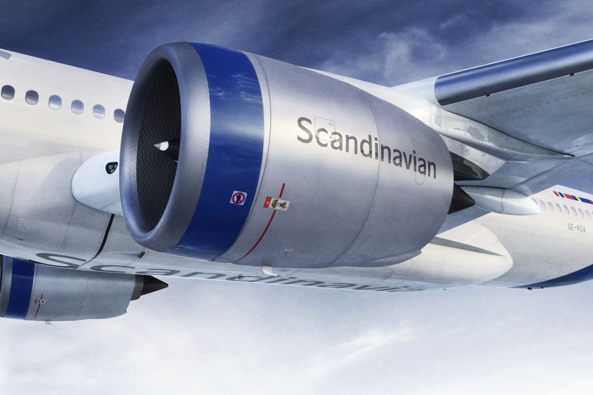
- The previous grey color used on the fuselage has been updated to a fresher shade of grey
- A big proud and confident SAS logo has been placed at the front of the plane, in a silver grey tone
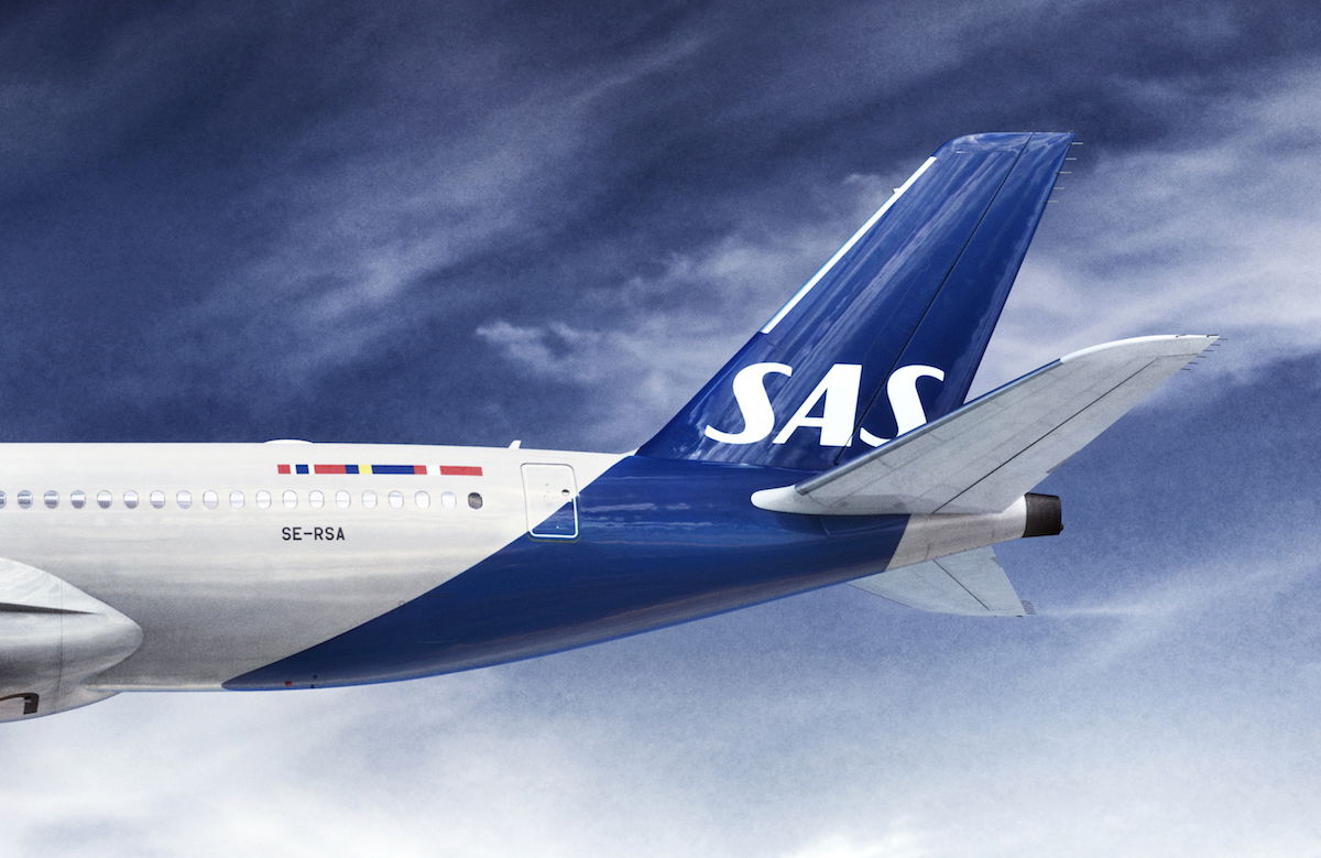
- Analysis and customer feedback showed that the unique SAS blue color is strongly recognized by the community of SAS travelers; the new SAS livery embraces this unique relation between SAS and true travelers by enhancing and extending the blue color of the tail further down the belly of the plan
- The earlier red engines have now been turned into silver grey and dressed with SAS blue crowns to harmonize with the SAS current visual identity, and to also embrace the connection to the SAS blue for SAS true travelers
- The word mark “Scandinavian” is still located on the engines, but it is now in dark grey, in order to provide sufficient contrast to the light grey and silver color of the fuselage and to flirt with the SAS interior design color scheme
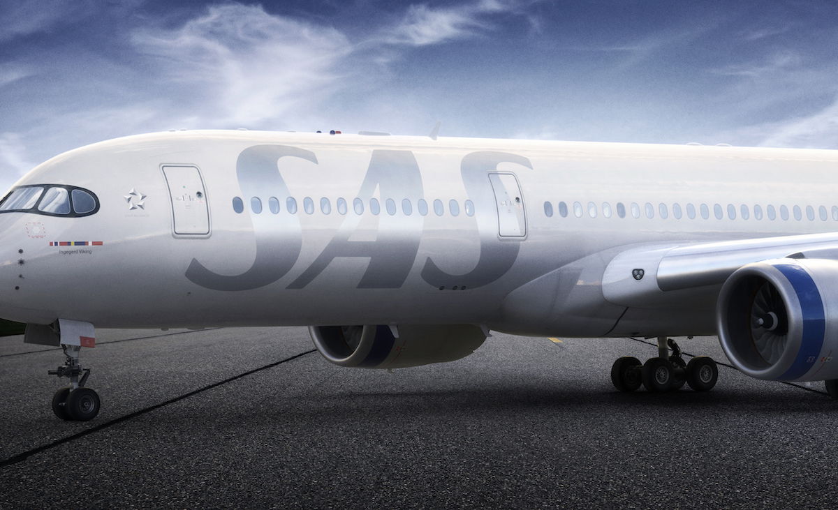
- The word “Scandinavian” has also been largely and proudly placed under the plane on the belly as a symbol for SAS’s Scandinavian heritage and for clear visual identification from the ground
- The Scandinavian heritage is also shown in the three Scandinavian flags that have been updated in a modern, elegant way
Rickard Gustafson, CEO of SAS, had the following to say:
“The new livery design is a symbol of our future, a more sustainable and competitive future for SAS, but one that also embraces our heritage. Travelers from Scandinavia will recognize their home, while global travelers will encounter the renowned feeling of the Nordics.”
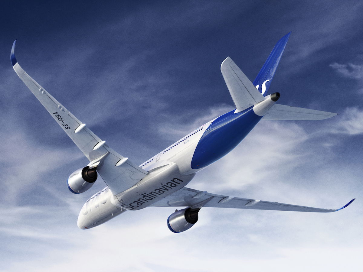
Here are some pictures of the new livery:
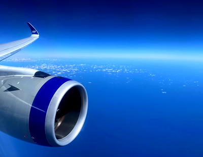
As a point of comparison, here’s SAS’ old livery:
Usually new liveries take some getting used to, and I’m opposed to them at first. But I actually think SAS did a spectacular job with this rebrand, and I instantly prefer the new livery. The new livery is bold and beautiful while also being elegant.
Really, really well done, SAS!
What do you make of SAS’ new livery?


Boring, unattractive, convensional. Not stunning at all. Such good airlines, and SAS somehow always manages to betray superb Scandinavian design. This is Lufthansa minus, and the SAS logo looks like a decoloration of the equally boring white. Sleek? Professional? Serious? No, just cold, forgettable. AER LINGUS is a beautiful livery, as is THAI, AIR TAHITI NUI, HAWAIIAN. SAS could have used the colourful three flags, the nordic culture, but failed... again.
Love it. Classy and beautifully modern. Please carry over the appeal to the interiors as well.
As usual, SAS follows the trend that was new and innovative many years ago. And still everyone believes that it's superior because it comes out of Scandinavia, it seems. It's pretty tame, conventional and 3 steps behind the rest, as usual with SK. A clone of LH at best.
It's the Qantas-Lufthansa-Aer Lingus tail again
The Swedish Navy has painted bar codes instead of numbers on the side of their ships so when they return to port they can scan da navy in.
The new design is lagom yet modern. Well done.
“All look same”!
I miss the orange-red of SAS!
A new shade of grey? Really? By definition grey is boring.
Dull AF. The colors are dull and the font of “SAS” doesn’t match somehow.
I miss the red accents.
No. Not an improvement.
I like the billboard SAS titles on the fuselage. It reminds me of the scheme once used by Sabena. The tail is similar to LH but looks good from the underside. And I do miss the red engines. At least the fuselage is not pure white like too many airlines these days.
Kudos to Bob for finally mentioning the term Eurowhite.
And I really hope that Andrew (Personally I prefer AA’s livery. World best.) is being sarcastic
It is elegant but not stunning.
To those who think SAS copied United or Lufthansa, Google a bit to see what UTA widebodies looked like, hint : Qantas even copied it save for the color and the roo.
Design is not everything. SAS is the worst airline I have ever used. In Europe any cheap airline is better. I will never fly with them again - doesn't matter how nice aircraft looks like.
What a mess.
It really is a step backwards and nothing at all special.
Bring back the red engines.
Well, they are just following the current (and quite boring and outdated) trend of Tails á la Qantas and big billboard name.
By the way, it doesn’t take much effort to improve the forgettable previous livery.
Nine of them compare to the originality of the 80’s colors.
Stunning, I say, stunning!!!
What Simon said.
What is so bloody “stunning’ about it? Just another bland, uninspired livery that we have been fired to endure since the late 70s.
This looks everything but unique. If anything I will miss the red engine covers, which is what made their planes stand out the most
How do you actually pronounce the airlines name? Is it by the initials S-A-S or as SAS as is 'sassy?' I've flown with them once (or rather twice as part of a return journey) and both ways were used by various crew members.
I like the second way better.
Doesn't really stand out to me. My favorite European liveries are Norwegian.
This is not actually a rebrand - they were rebranded as a whole by the agency Bold Scandinavia, but as part of that they proposed a livery that didn't go do too well (a blue gradient going from the tail into the main fuselage), see below.
https://www.underconsideration.com/brandnew/archives/new_identity_for_sas_by_bold.php
The brand on the whole was stunning and but the general feeling was the livery let it down, so I think Bold went back to the drawing board...
This is not actually a rebrand - they were rebranded as a whole by the agency Bold Scandinavia, but as part of that they proposed a livery that didn't go do too well (a blue gradient going from the tail into the main fuselage), see below.
https://www.underconsideration.com/brandnew/archives/new_identity_for_sas_by_bold.php
The brand on the whole was stunning and but the general feeling was the livery let it down, so I think Bold went back to the drawing board and came up with what we see here - and I for one am glad they did! It's stunning, and more truly goes with the overal brand touch points!
Elegant, understated, and clearly Scandinavian.
Stunning? LOL.
It's Eurowhite with a bit of blue and silver accenting. Blah.
Completely unremarkable.
Lufthansa Scandinavia will probably be announced soon.
Huge improvement and I agree that it’s stunning. Good job SAS!
As "brave" and "stunning" as most half-baked movements these days. 80% similar to the old one.
So what, it's the same thing almost every airline has now. No Designers needed for that, i'd say. Slightly different colour than the others, slightly different font than the others, that's it.
They literally copied United, and everyone hated Uniteds new livery. The engine is good but thats it.
For the young folks that weren't around some decades ago, the washed out silver SAS in the fuselage is a Sabena revival. The stripe on the engine is a Swissair tribute and the tail, well, you all know it...
Oh. Yet ANOTHER solid light color fuselage wrapped with a solid color tail.
How creative.
Meh.
Dull. Prefer the old one. The change will be at the insistence of shyster consultants : “ You must have something crisp and fresh to resonate with millennials “, here’s our bill for € 1 M.
It looks like a partner airline of Lufthansa.
The big SAS in front is a little too not understated.
I like the very old dragon livery. The current one is too childish. The new one is "just ok" to me. Not ugly. They also need to choose SAS or Scandinavian. SAS is best for Japanese or Chinese. Scandinavian is better for UK or USA.
It's conventional for a 2019 livery, but how on earth do you get "stunning" out of this?? ....it's almost a verbatim copy of Lufthansa.
It's pretty good, certainly much better than Lufthansa's recent update, but I wouldn't call it "stunning". Would have preferred something that breaks up all that white to the front of the tail.
I personally like United's 2019 livery best out of all the newer ones. This isnt bad though but it would be better if they kept the red engines.
Well, I will say that it's an improvement over their current, very dull, livery. And it is sharp as new liveries go in 2019. That said, it still demonstrates this current fetish that airlines seem to have with the tail swoop while the remainder of the aircraft is monochromatic.
Personally, I prefer many of the classic liveries with the nice cheatline and evenly applied titles. China Southern is the best current example of such...
Well, I will say that it's an improvement over their current, very dull, livery. And it is sharp as new liveries go in 2019. That said, it still demonstrates this current fetish that airlines seem to have with the tail swoop while the remainder of the aircraft is monochromatic.
Personally, I prefer many of the classic liveries with the nice cheatline and evenly applied titles. China Southern is the best current example of such a design and it's really nice. This? Not so much - though it is better than Lufthansa or Aer Lingus. That's not saying much though.
Only a tad different from Lufthansa’s livery.
Personally I prefer AA’s livery. World best.
Meh....
Stunningly boring.
Who will bring about "The End of the Plain Plane", Part 2?
Ah Lucky.. I remember you being harsh about Lufthansa and Aer Lingus, this is hardly original or stunning.
There is also a Latam Star Wars based: https://www.milhasedestinos.com.br/latam-aeronave-star-wars/
How does it look in the dark? Hopefully better than Lufthansa’s. Looks very elegant though.
Somehow I do not quite like silver liveries like Aeroflot, American and SAS. A wasted opportunity to move away from silver.
Note that SAS is the only Star Alliance member with a non-white livery. Compare that with SkyTeam (KLM, KE, Vietnam and AR are blue, SV is the colour of sand and Aeroflot is silver).
Looks like they copied LH, who also seems to copy Airbus.
+1 to @Ameya
Colour and style wise, Lufthansa, LOT and SAS look very similar.
Icelandair is the northern European airlines with real stunning liveries, they fly around with glaciers on their planes. Now, that is STUNNING.
It is underwhelming at best. Not at all "Stunning"
Looks like all the Star Alliance airlines got a package deal to update their livery.
It's an improvement, but lol at calling that blue "unique"
SAS livery designer:
«Looks at the new Lufthansa livery»
*CTRL+C*
*CTRL+V*
Well, not too ugly.
It may not be the most original design, but certainly elegant! Hope to see it in person soon.
Scandinavians have a good design taste in general imho.
I like it too! Want to see that big SAS in silver. Kinda miss the red on the engine cowlings though...
I like it a lot.
Give it a decade before every livery is the exact same as each other, EI unveiled a similar tail recently and they were hardly the first