
Several weeks back images leaked of Icelandair’s new livery. The airline has today formally revealed its new livery. It’s very similar to what we’re seeing from other airlines, with one twist…
In this post:
A look at Icelandair’s new livery
Icelandair has revealed an update to the carrier’s livery, which is the first full livery redesign in over 15 years, since 2006. This is part of a planned complete refresh of the Icelandair brand. As it’s described, this rebranding is intended to “find new, refreshing ways to bring the spirit of Iceland to the world.”
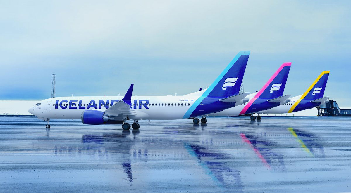
With the new livery, Icelandair will have a total of five different tail colors, representing different phenomena in Icelandic nature. These include the following:
- Boreal blue
- Magenta
- Sky blue
- Yellow
- Green
As far as the overall color palette being used goes, here’s how that’s described:
- The midnight blue is the heritage color and the backdrop to the dancing auroras
- The snow white represents glaciers
- The boreal blue is a representation of the northern lights
- The magenta signifies the collective creative power of Iceland, with just a hint of sunrise
- The crisp blue is the Icelandic summer sky that’s filled with light
- The golden yellow is the sun reflecting off waterfalls, glaciers, and even simmering magma
- The green represents the life that can be found even after the harshest of events
For some more details on the timeline of planes being repainted:
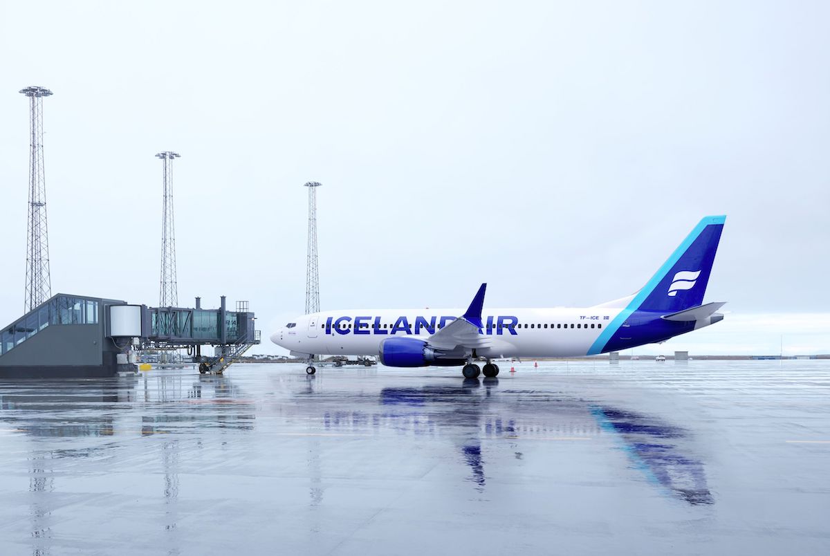
- TF-ICE, a Boeing 737 MAX 8 named Jökulsárlón, is the first plane to feature the new livery; it was painted in mid-January, and arrived at Keflavik International Airport today (Friday, January 28, 2022)
- By the end of February 2022, Icelandair plans to have five Boeing 737 MAX aircraft in the new livery in service
- The rest of the fleet will be repainted according to the maintenance schedule of each airplane
How does this compare to Icelandair’s old livery?
For context, Icelandair’s previous livery used yellow prominently, including on the engines and tail. That will no longer be the case with the new livery. As you can see, the engines will also be painted in blue, and the “ICELANDAIR” name will be written in much bigger font. Furthermore, the carrier’s logo on the tail will start to show a white flag (I think that’s what that is?) on a blue background, rather than a yellow flag on a blue background.
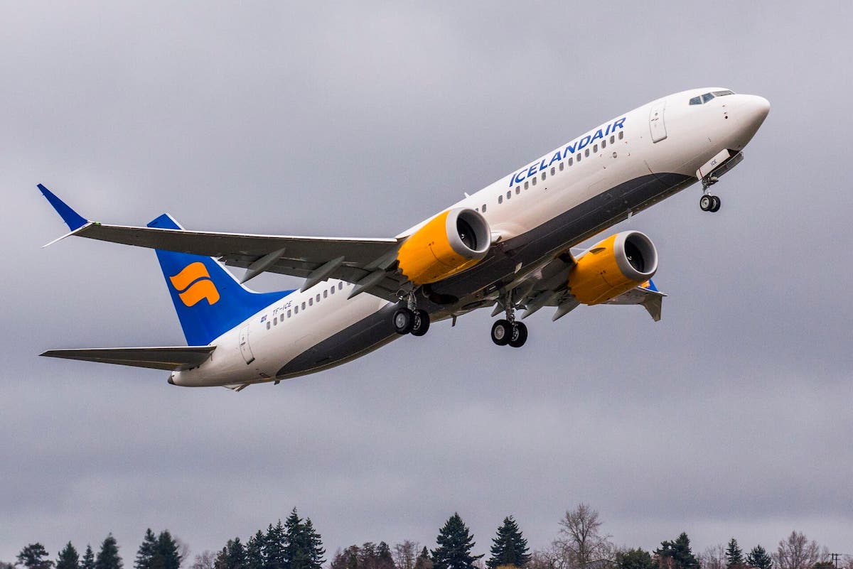
In the avgeek world, we’re almost always averse to liveries being changed. Sometimes the liveries grow on us over time, while other times they don’t. I will say that I think Icelandair’s old livery is more visually interesting and also still looks modern. Maybe the new livery will grow on me over time.
Bottom line
Icelandair has officially unveiled its new livery. The first plane with the new livery arrived in Iceland today, and it’s expected that a total of five Boeing 737 MAX aircraft will feature the new livery by the end of February 2022.
The new livery pretty much follows the industry trend, though one unique element is that different planes will have different accent colors on the tails, as there are five to choose from. Personally I prefer Icelandair’s old livery… I think.
What do you make of Icelandair’s new livery?


Copy/Paste of Ryanair.... Thought they'd come up with something more original.... Its cheap looking!
Very disappointed with this livery... it looks cheap and reminds me a lot of RYANAIR. Doesn't really make any meaningful selling points compared to PLAY.
Took the words right out of my mouth.
Hope they still paint at least one in the northern lights livery! It's stunning.
More and more airlines are choosing the blue thrust reversers on the engines. These look great until you have to borrow one that isn't. I always pay attention to details of aircraft at the gate and like my plane to look shiny and as advertised.
Losing the yellow was a fantastic idea
I would much rather they improved service and reduced fees than waste money on fixing something that does nothing for the traveling public. There is so much wrong with air travel now, why not spend money om improving the experience.
So duplicative and in dearth of imagination.
What kills me is that some design firm probably got $1million+ for this....
Looks too much like United
I'm now convinced there is but a single branding company that updates (unlikely that is the correct word) airline liveries for all airlines. They design a white body with the airline name in large block letters down the side of the fuselage. And a solid painted tail that flows in to the rear of the fuselage.
No imagination or creativity at all:-(
It’s pleasant enough - I would have liked to see the engines painted in the accent color too. The old livery’s yellow engines were one of the defining features, makes the plane much more identifiable from a distance.
The new one is pleasant but the old one is more attractive. The new lettering is a little too big.
Good one Red Robo!
I hope they still keep TF-FIU in the Aurora Borealis livery.
I think I do quite like look of them, but why do airlines always come out with such marketing agency b*ll*cks when making their announcements?
Why don't they just say they fancied a change, and leave it at that?
I think it might look great although we have only seen a glimpse of the full livery, so maybe it is to early to be so judgmental. Change is good. Refreshing a brand makes a statement.
My initial reaction was “What the?!” Hopefully this isn’t more than a mistimed April Fool’s joke. Literally Lufthansa all over again. The epitome of “if it ain’t broke don’t fix it.” The current livery on the 757s and 767s was perfect (except for writing out “Icelandair” on the tail). It’s sad seeing Icelandair dump an identity that clearly reflected their more premium status, compared to WOW or PLAY, in favor of a RYANAIR look.
I always found the old Lufthansa livery dull and boring, and the current one is an improvement in my eyes. As with anything concerning taste it’s wholly subjective.
It looks now very much like a lcc, really a bad idea, almost as bad as the world tails from BA.
Garish.
The tail reminds me the F from Finnair...
It would be criminal if they paint over Hekla Aurora with this new livery. IcelandAir, please don't, I beg you.
Nice that they are paying homage to all the failed Icelandic transatlantic LCCs with their colour accents on the tail
I like it, yet I don't. I like the large "Icelandair" on the fuselage (tough to see the font). On the other hand, while I like the idea of the different colors, it looks a little "clunky" here, and I don't like the white logo on the tail, it just looks a little flat and dull when compared to the yellow in the previous scheme. Maybe if the logo was done in the multiple signature colors with the previous shading?
Oops I thought the plane said RYANAIR !
Oh wait it says ICELANDAIR
Hmmm...it does look a lot like RYANIAR ....
I'm dumbfounded that people can find this an improvement. It's horrendous! It screams cheap and classless.
Maybe improving the service would be better.
I think it is an improvement. The tails look particularly nice.
I’m pretty sure the “flag” logo is a stylized “F” for “Flugleidum Íslands,” which is the airline’s original name in Icelandic. (The “d” in that word is supposed to be the letter “eth” which had a hard “th” sound.) Anyway, it also has always been drawn this way—I think—to resemble the prow of a Viking ship. SAS had a livery in the 1980s with a similar motif.
Not sure I care for the new livery, though. Too much like Ryanair.
Ah! Now I know why their IATA code is FI. Meanwhile Finnair, which seems like it should be, is AY (which is from their original name Aero Yhtiö, which means Air Company). Interesting history behind some of those abbreviations.
I need to correct myself: the airline’s original name was “Flugfélag Íslands.” The word “fligleidum” means “air routes” or “flights,” but “flugfélag” means “airline.” They use the Icelandic name on many of their domestic jet-prop aircraft.
Domestic flights were operated under the Flugfélag Íslands name between 1997 and 2017 after which the subsidiary was rebranded "Air Iceland Connect". In 2021 it was absorbed into the Icelandair brand.
Yes, the large dark blue block letters on the fuselage remind me of Ryanair as well, which is not a good image for an airline. I think the tail with the different colors is an improvement. I've never been a big fan of the main logo though as I thought it was too generic. I wouldn't have minded something completely different.
It makes the airline look like a budget carrier.
Very Ryanair.
It is
Tails cool but the fuselage looks cheap and garish
Let’s see if it gets the cool recepton of BAs late 90s diversity tails
These look horrible. The old one was classic, distinctive, and instantly recognizable.
Hm, beauty is in the eye of the beholder. The new livery looks generic and boring.
I liked their northern lights livery very much.
Very Ryanair/Malta Air!
I’d assume the logo was meant to look like a stylized aurora as opposed to a flag
Those are some awful looking airplanes.
Any word if they'll be keeping or even adding to the special liveries they have (like the northern light one)?