
Emirates has today formally unveiled its new livery. It’s not life changing, but it does feature some subtle yet significant differences.
In this post:
Emirates modernizes aircraft livery
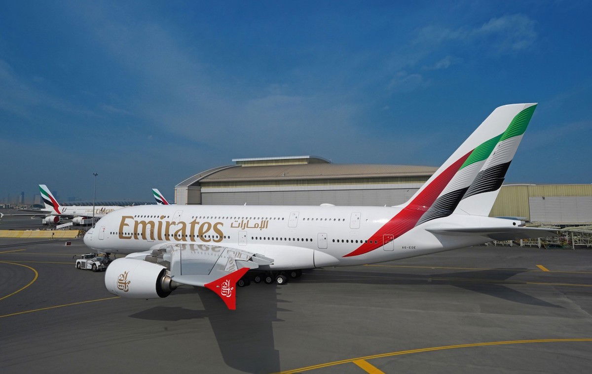
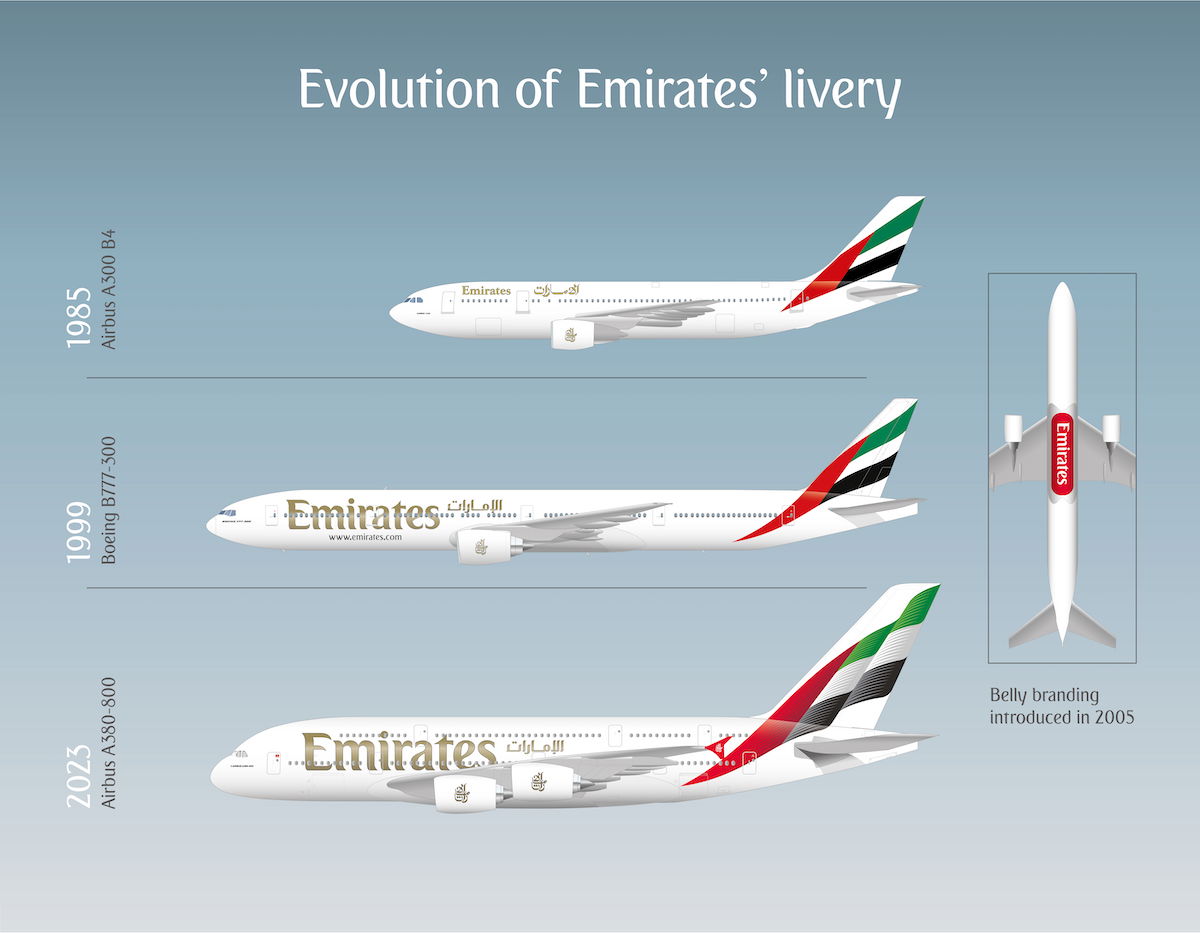
Emirates is one of the world’s most recognizable brands, and the airline has done very little to change its livery in its roughly 38-year history. For the first time in 24 years, the airline has rolled out a change to its livery.
So, what has been updated?
- The signature gold “Emirates” lettering across the main body in English and Arabic is bolder, and 32.5% larger
- The “emirates.com” website URL has been dropped from the design
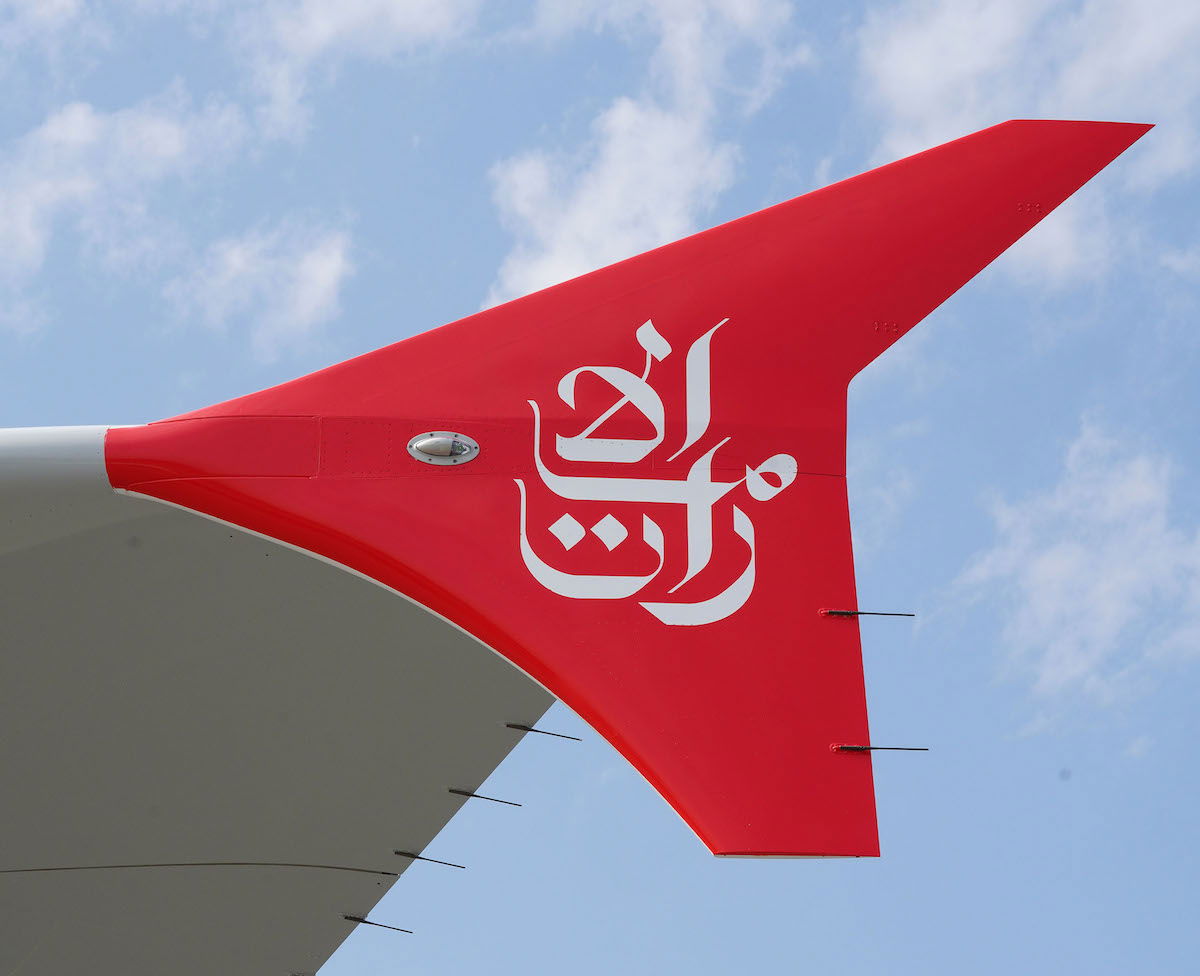
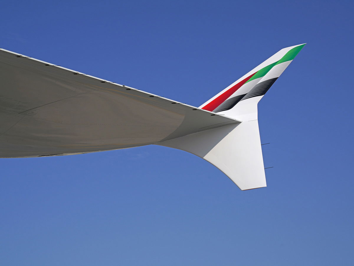
- The A380 winglet design has been changed, with a red color and Arabic calligraphy facing outward, and the Emirati flag facing inward
- While the tail features the Emirati flag as before, it’s now intended to look more like it’s “fluttering”
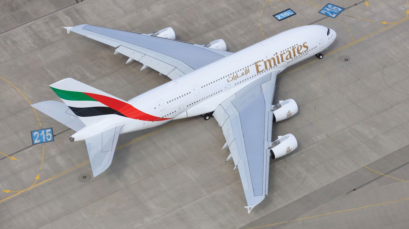
As a point of comparison, below is what the previous livery looked like on an Airbus A380.
The first aircraft to feature this new livery is A6-EOE, a roughly nine year old Airbus A380, which has rolled out of Emirates Engineering this week after its makeover. For its first flight back in service, the plane will fly to Munich on March 17 as flight EK51.
The new livery will gradually be rolled out across Emirates’ fleet. 24 aircraft, including seven Airbus A380s and 17 Boeing 777s, are expected to feature the new livery before the end of 2023. All newly delivered Emirates aircraft will feature the new livery, with the next new planes being the Airbus A350s that will be delivered as of August 2024.
This is only Emirates’ third livery iteration since the company launched in 1985. The airline had the same livery until 1999, and at that point it was updated as Emirates took delivery of its first Boeing 777-300.
Here’s how Emirates President Tim Clark describes the new livery:
“Aircraft livery is the most instantly recognisable brand real estate for any airline. It’s a visual representation of our unique identity, something we wear proudly, and display in all the cities we fly to around the world. We’re refreshing our livery to keep it modern, without losing the key elements of our identity such as the UAE flag on our tailfin and the Arabic calligraphy.”
My take on Emirates livery changes
Let me preface my comments by acknowledging that us avgeeks care more about liveries than the average consumer. Emirates is such an iconic brand with global recognition, and amazingly enough the airline has made so few changes to its livery over the past decades.
I find that my take on new liveries tends to evolve over time, as I start to see planes “in the flesh,” and as I become accustomed to the liveries. There are some new liveries that I hated at first and ended up loving, and vice versa.
As I see all the changes to Emirates’ livery, I’m not sure what exactly to make of them. My first impression is that the livery kind of looks like something that an avgeek put together in 10 minutes in photoshop. It almost doesn’t look real.
Individually, there are changes I like. For example, I appreciate how “Emirates” is written larger, and how “emirates.com” has been removed from the body of the aircraft (that seemed unnecessary). Furthermore, it’s cute how the winglets now have the Emirati flag on them.
While I can appreciate that Emirates probably wanted a more realistic-looking flag, the tail design almost looks like clip art. As noted by a Twitter user, it seems that Emirates is more or less copying Aeroflot here, as the airline has the same exact type of fluttering flag design on its aircraft tails (except with the flag of Russia, rather than the flag of the United Arab Emirates).
Bottom line
Emirates has formally unveiled its new livery, which is the first redesign we’ve seen in 24 years, and only the second redesign in the carrier’s nearly 40 year history. The changes are fairly minor, but should still be noticeable for anyone paying attention.
I’m not sure what exactly to make of the new livery. I’ll reserve judgment for when I see it in person.
What do you make of Emirates’ livery changes?


I honestly don't like the new livery. It (in my opinion) looks rather old-fashioned. I think the 1999/2005 one was much better as it seemed much more modern, and streamlined. The www.emirates.com thig was fine, but I'm happy to see it go, the wingtips look flashy, but the tail is lacking with its over-designed 3D effect artwork. Like how the Windows logo used to have a 3D effect, but now it's much more flat, simplified, and modern.
As an avgeek, the changes are big. Honestly, this is fairly comparable to the redesign of the Delta livery back in the 2000s. More sleek, less overdone, more defined.
Why would EK copy or nod Aeroflot, you are no making any sense dude.
I like the larger lettering and more minimalist design which is inkeeping with many contemporary liveries. But.. I think the flag on the tail looks tacky and cheap.
To me, it seems fairly subtle, in that unless I see it side-by-side with the current livery, I don't know that my reaction would be more than "Something looks a little different." What amazes the most about this and its sister poster from a few days ago is just how steady their livery has been over two decades - and, IMO, it still looks very up-to-date and modern. I think back 24 years ago and...
To me, it seems fairly subtle, in that unless I see it side-by-side with the current livery, I don't know that my reaction would be more than "Something looks a little different." What amazes the most about this and its sister poster from a few days ago is just how steady their livery has been over two decades - and, IMO, it still looks very up-to-date and modern. I think back 24 years ago and Delta was going through their "revised cheatline look" followed by their "flowing fabric" tail leading to the current design. Any cheatlines from the late 90s, updated or otherwise, would look very out of data today, but the B727 you showed could fit in well today (aside from being an aircraft that you never see anymore!)
Funny that you mentioned Aeroflot. I thought the same thing.
"Furthermore, it’s cute how the winglets now have the Emirati flag on them."
I'm confused. The Emirati flag is on the tail.
The inside of the winglet.
All it needed to improve was to remove the website address.
The other changes - notably the increased name size, and tail flag noise - make it worse.
But how’s their cabin retrofit progressing?
What’s next, Singapore Airlines changing their livery to a swoopy blue and gold tail thing? If so, I’m tempted to say I’d be done with following commercial aviation.
I thought the Emirates livery was iconic as is. Minus the www.emirates.com of course.
I have an issue with big billboard titles that cover the windows (not specific to Emirates) -- to me it looks like someone has shot holes through the lettering:-(
The only airline I can think of that good job with billboard titles was JAL and their previous two liveries. I just feel like billboard titles are too "in your face" if that makes sense.
"Emirates is one of the world’s most recognizable brands"
Sorry, that's just complete nonsense.
Most people have never heard of Emirates, and would not recognize the visual branding if it sat on their face. Show the Emirates "branding" to 100 random people on the street, or to 100 of your friends/family who are not into the miles and points game. You'll get blank looks and shrugs from virtually all of them. It's only slightly more...
"Emirates is one of the world’s most recognizable brands"
Sorry, that's just complete nonsense.
Most people have never heard of Emirates, and would not recognize the visual branding if it sat on their face. Show the Emirates "branding" to 100 random people on the street, or to 100 of your friends/family who are not into the miles and points game. You'll get blank looks and shrugs from virtually all of them. It's only slightly more recognizable than MIAT Mongolian Airlines.
It's a nice airline by all accounts (well, for consumers...it might not be wonderful to be an employee) but one of the world's most recognizable brands? Come on.
That’s bollocks. They advertise everywhere, sponsor a multitude of organisations etc.
There is the emirates stadium in London. They sponsor New York Cosmos, Real Madrid, AC Milan, Benfica, PSG, Olympique Lyonnais, Arsenal which also covers hundreds of millions of potential customers who watch football.
In fact hardly a day goes by here where I don’t see an Emirates ad.
Of course if you’re American living in the trump belt, you would be...
That’s bollocks. They advertise everywhere, sponsor a multitude of organisations etc.
There is the emirates stadium in London. They sponsor New York Cosmos, Real Madrid, AC Milan, Benfica, PSG, Olympique Lyonnais, Arsenal which also covers hundreds of millions of potential customers who watch football.
In fact hardly a day goes by here where I don’t see an Emirates ad.
Of course if you’re American living in the trump belt, you would be hard pressed to even find the US on a map.
@Icarus
You're still talking Trump? Over two years after the election. Two years.
Let. It. Go. Gurl. (Normal people have).
It’s because a huge number of Americans, mostly trump supporters , are dumb and couldn’t even place the US on a map let alone the UAE. Those that think Africa is a country and Europe is west of New Zealand.
Hence the word trump should be in the dictionary meaning someone who is ignorant, a dotard, a conspiracy theorist and lacking any knowledge of the world.
The analogy is clearly lost in you, so I’m assuming you’re one
Gurl, your assumption is as feeble as your 'argument' is brittle. Now let the grownups talk about the subject at hand and you keep to the kiddie's political playpen where you belong. BOOM!
Hook, line and sinker. Thanks for playing my game. You're my new Eskimo kicking toy.
I would say it's probably the most globally recognizable out of all of the airline brands out there. They fly to pretty much all corners of the world, from the Americas to Africa to the Far East to the South Pacific. They advertise excessively around the world, whether it is all those soccer/football teams, Emirates Stadium, the Rugby World Cup, or the Los Angeles Dodgers. I remember seeing Emirates commercials without realizing that it was...
I would say it's probably the most globally recognizable out of all of the airline brands out there. They fly to pretty much all corners of the world, from the Americas to Africa to the Far East to the South Pacific. They advertise excessively around the world, whether it is all those soccer/football teams, Emirates Stadium, the Rugby World Cup, or the Los Angeles Dodgers. I remember seeing Emirates commercials without realizing that it was an airline or that it flew people to and from Dubai. In fact, I read a blog post written by a pilot who called Emirates "The Airline of Planet Earth".
Of course, Emirates is not going to be globally recognized in the way that Coca-Cola is. The thing is that the vast majority of the people you see on the street are not AvGeeks or miles and points people. They just want to go from Point A to Point B as cheaply as possible and could care less about a particular airline unless they have some sort of personal association with it (e.g. has flown it before, works for it, word of mouth). They have no reason to think about it otherwise. I bet the vast majority of the general population could not name more than 5 airlines off the top of their head.
I would say that in most of the world it’s very recognisable by airline standards. Perhaps not in the Americas and parts of East Asia but to suggest that it’s only marginally more well known globally than MIAT is patently absurd.
Maybe depends on where you live. Here they do a lot of sports and stadium rights sponsorship, and until last year were a key global partner of F1. Their tagline of "Fly Better" probably helps if you don't recognise it at first as an airline.
Lipstick on a pig. Still the same 2-3-2 non-lie flat J on a significant portion of their fleet. They should have corrected that instead.
I usually quite like incremental updates (I think CX and AF nailed it and QF, QR and El Al have done nice jobs over the years, for example) but I thought one of the big strengths of the Emirates livery was its simplicity so I’m not sure about this one. I’ll reserve judgement until I see it in person, though.
All of those updates are a step back in my opinion. The Cathay livery is soulless. The Qantas kangaroo doesn't look right without the arm. I thought the new AIRFRANCE/ titles were too big at first but by now I have sort of warmed up to it. What bothers me though is how they moved the SkyTeam logo away from the cockpit so it is no longer consistent with all of the other SkyTeam airlines.
Not a huge change. I do agree keeping the previous livery while dropping the .com part would have been just fine.
Overall I run on the idea that “less is more”
but recognise that I need to see the finished article esp on the A380 before offering a firm
opinion .
What I do hope is that the new livery is indicative of cabin upgrades and perhaps greater provision for an updated premium economy class .
Reminds me of interlaced video.
YinDao. There goes your point..........straight out the window.
Have they kept the red and white emirates logo on the underneath of the plane?
That’s one of the reasons I moved house to near Heathrow…
yes, they will be retaining the red branding underneath.
"On the aircraft belly, Emirates has retained its iconic red branding which it introduced in 2005."
I think the disproportionally large titles and the flat typeface design just seem really disjointed with that tail... would have looked nicer had they kept the previous 'Emirates' title design (without the website).
I like the tail though, I think it looks very lively and expressive.