We’re constantly being asked how we make the maps that show our crazy itineraries. Obviously they’re helpful for blog posts, but I know other people like them for showing to friends and family, adding to a photo album of a trip, etc., and as I was taking some screenshots for an upcoming post it occurred to me that we’ve never done a tutorial.
There are probably other tools and sites out there, but our preference is Great Circle Mapper. The interface is simple, so you could go there right now and not even read this post, but there are some advanced tricks that I thought might be fun to go over.
Know your airport codes
In order to use the map tools, you’ll need to know the airport codes you’re planning on flying through. You can technically search for airport codes based on city names, but if you try and enter a routing with just city names you’ll get an error.
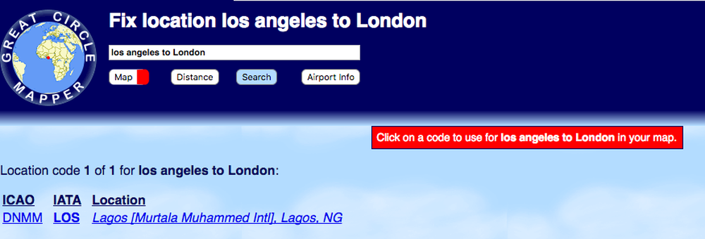
It’s much better to instead enter the IATA code of a given airport. You can enter specific airports (like LHR for London Heathrow), or city codes (LON for all the London airports). To show a routing, connect the airport codes with a dash.
So if you wanted to plot the line between Los Angeles and London, you’d enter:
LAX-LON
Which would generate:
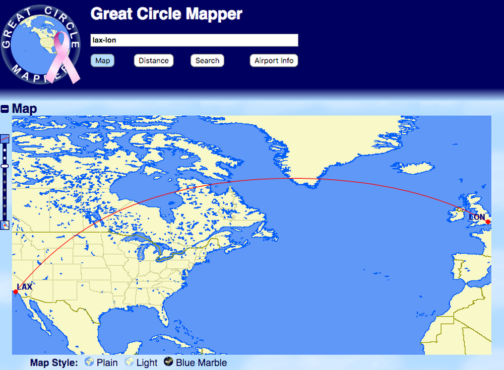
This goes beyond city pairs. If you wanted to show a route from Los Angeles to Dubai via London, you’d enter:
LAX-LON-DXB
Which would generate:

In addition to stringing together flight paths, you can also show multiple routes by separating them with a comma. To show a Miami to Madrid flight on the same screen as the flight to Dubai, you’d enter:
LAX-LON-DXB, MIA-MAD
Which would generate:
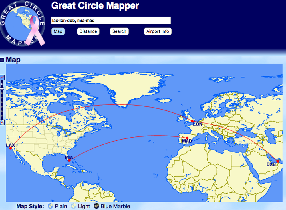
Basically, you’re going to be connecting everything with a dash, or separating it with a comma. This will be helpful info going forward.
Styling the map
While the default maps are a great start, you can also customize them quite a bit. Let’s use the crazy trip Ben and I are taking as an example of when you might want to tweak the map a bit more. Our routing is:
LAX-SVO-BEG-JFK-GYD-IEV-JFK-DCA
As one does, of course.
Because the Los Angeles to Moscow flight is a polar route, the map defaults to showing that projection:
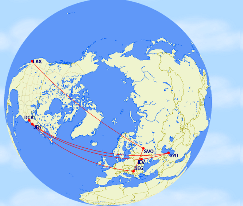
But if you scroll down, and click on the “Map Conf” tab, you can choose a different angle for your map.
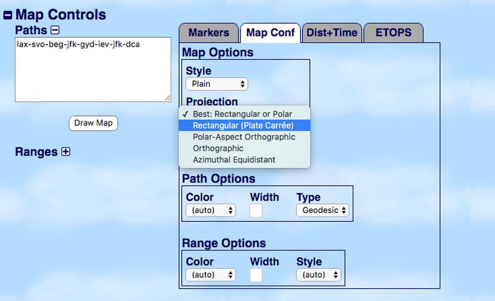
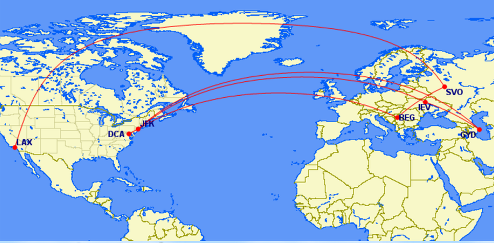
The rectangular projection is a bit easier to look at, in this case.
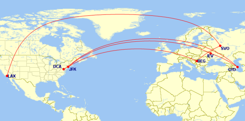
You can also change the background of the map. There’s a lighter option, which can be easier to see the lines on:
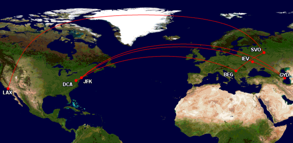
Or the “Blue Marble” option, which shows some terrain:
You can also have quite a bit of fun with the fonts, line thickness, pin shape, etc. At the bottom of the page there’s a tab for “Markers” which lets you control all of that.
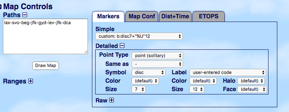
There’s also drop-down menu for “Label” which allows you to choose to display the city name (or several other options) instead of the airport code.
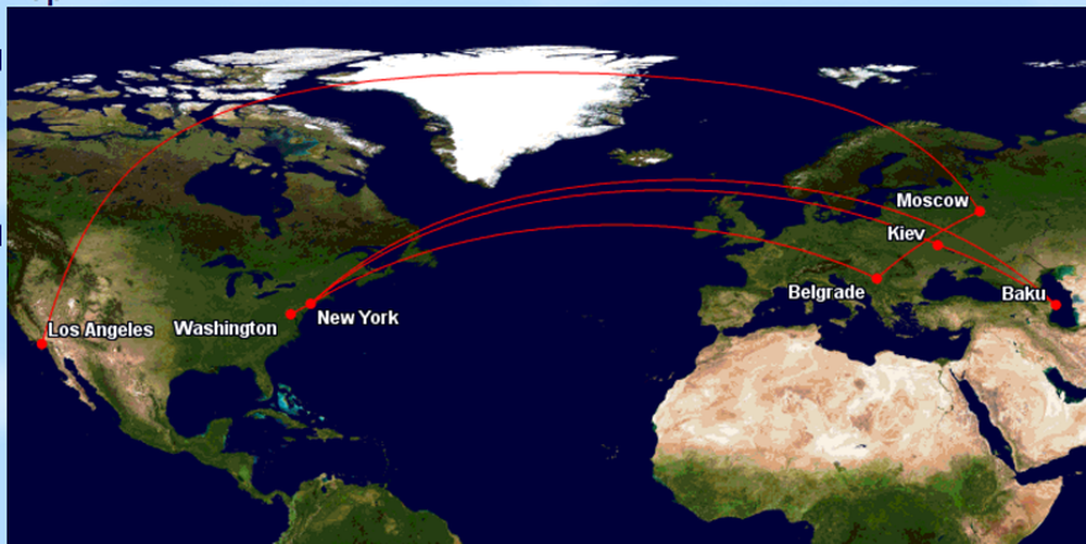
Much better, right?
Changing the colors
This is advanced Great Circle Mapper, but you don’t have to stick with the red dots and lines. Let’s say I wanted to show the breakdown of our current trip, for example, since it involves several sets of tickets.
I can change the color of each line (or series of lines) by adding “color:[color name]” in front of a string, separating it from the next airport code with a comma.
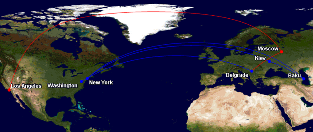
So, if I wanted to emphasize the SkyMiles award we used to get to Belgrade, I might leave that red, and change the rest of the flights to blue. In this case, we’d enter:
LAX-SVO-BEG, color:blue, BEG-JFK-GYD-IEV-JFK-DCA
And get:
Or if I wanted to go all out and show each set of tickets in a different color I could do that too:
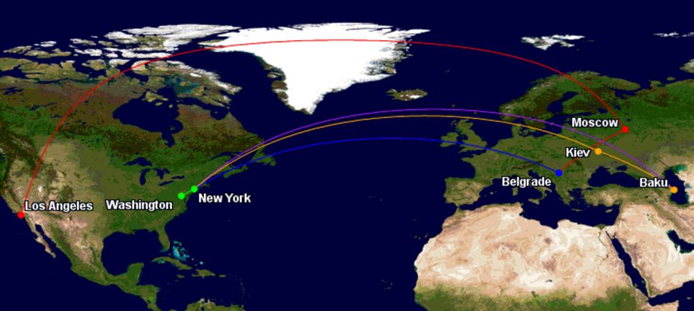
The code for this is:
LAX-SVO-BEG, color:blue, BEG-JFK, color:purple, JFK-GYD, color:orange,IEV-JFK, color:green, JFK-DCA
Keep in mind that if you want to change the color at a connecting point you’ll need to repeat that city in your string. So something like this:
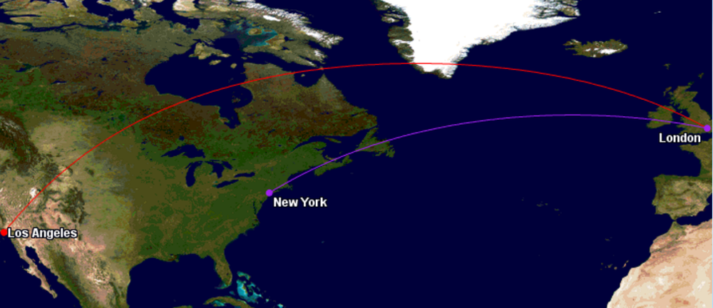
Would be written as:
LAX-LON, color:purple, LON-JFK
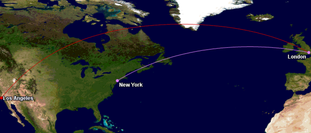
You also don’t have to stick with the stock colors. Any color name can be replaced with a hex code. So if I wanted to choose my own particular shades of purple and red, I could enter:
color:#cc0000,LAX-LON, color:#df80ff, LON-JFK
And get:
Much much more
This is just the “pretty” side of Great Circle Mapper. The site owner, Karl L. Swartz, has built a fantastic tool that does much more than show flight paths.
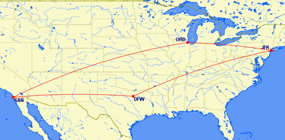
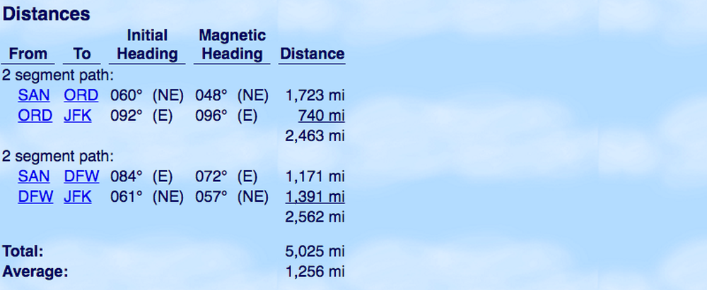
You can also calculate approximate distances of flight segments, which are generally pretty close to the calculations used by the mileage programs. So if you were deciding whether to connect in Chicago or Dallas on a San Diego > New York trip you’d enter:
SAN-ORD-JFK, SAN-DFW-JFK
In addition to the map, the site shows you the flown distance of each flight, and of the routing as a whole.
You can map ranges, look up ETOPS, see the latitude and longitude of an airport, etc. It can be quite the rabbit hole, and he puts up fun featured maps from time to time as well.
So nothing earth-shattering, but hopefully helpful to some of you!
Do you have a flight mapping tool you’d recommend?
Maps generated by the Great Circle Mapper – copyright © Karl L. Swartz


Is there a way to define the center of the map? I want to map an around-the-world route beginning and ending in California. The map automatically puts North America at the center of the map. I'd like to put it at the far left side of the map, at it is the starting point.
MarkNick, California
I just signed on and am reviewing the main page. I do not see how one starts a map. I have a lot of flights to add and would like to return to mapping to continue where I left off.
Where do I begin the mapping?
Mike D Lancaster, Pa
This is a good, possibly great tool, as long as the system recognizes the ICAO. If not, and the airport doesn't have an IATA, you're out of luck.
@Tiffany Thank you so much for the link you provided today. This map making website is sooooo fun. I was stressed out but a few minutes of making maps calmed me down so I can re-start work.
Thank you Tiffany
-From India
Thanks for this @Tiffany!
Bookmarked
Great post ! One thing I would like to see is the ability to show the order of the flights, e.g. by showing the direction of travel like adding an arrow in the flight paths. Don't think this is possible. Let's say the flight order is SAN-ORD-JFK-DFW-SAN, the map won't really tell the difference between that and SAN-DFW-JFK-ORD-SAN.
The closest I could get is to add a number label along the path, to show the...
Great post ! One thing I would like to see is the ability to show the order of the flights, e.g. by showing the direction of travel like adding an arrow in the flight paths. Don't think this is possible. Let's say the flight order is SAN-ORD-JFK-DFW-SAN, the map won't really tell the difference between that and SAN-DFW-JFK-ORD-SAN.
The closest I could get is to add a number label along the path, to show the order of the flights. But it's a hassle to look up the lat/lon of where's best to place the label. For example,
SAN-ORD-JFK-DFW-SAN,COLOR:PURPLE,"%T1"[email protected],"%T2"[email protected],"%T3"[email protected],"%T4"[email protected]
would get you a map of
http://www.gcmap.com/mapui?P=SAN-ORD-JFK-DFW-SAN,COLOR:PURPLE,%22%25T1%22%2b%4038.618542n102.054410w,%22%25T2%22%2b%4041.582257n80.510575w,%22%25T3%22%2b%4037.212521n86.226422w,%22%25T4%22%2b%4033.321309n106.278692w
which can better tell the order of the flights. Anyone has better ideas ?
Another great use is that it shows how "out of the way" a given routing is. For example, if you enter jfk-hkg,jfk-cdg-bkk-hkg, it will tell you that the later routing is 30.8% longer than a direct flight. This can be useful for programs like Aeroplan where you can piece together a route over the phone, as long as it doesn't go over the maximum permitted mileage. This gives you a good idea as to whether or not your routing will be legal.
Great post - I've always wondered how you guys do those maps. Might have a play myself today :)
Thanks @Tiffany for this post. It's fun to use!
Great post!!! Is there a way to show every itinerary as a separate segment?For instance, i have 3 flights - day 1 has JFK-MIA, day 3 has MIA-UIO, and day 8 has UIO-MIA-JFK.
Even if I use colors, it does not really show UIO-MIA-JFK differently than JFK-MIA and MIA-UIO.
@ BlueMountain -- Yeah, it's tough when routes overlap like that. Not sure of a way around it.
Yay! The perfect new toy for a rainy Sunday -- thank you!
How about skyvector?
Hi Tiffany,
Is there any way to export the map in a larger size?
@ matt -- There's an embed option, maybe that would work?
I've used Great Circle Mapper before but never realized just how customizable it is - thank you, Tiffany!
@Michael C, if you're looking for a tool to help calculate mileage, I recommend Webflyer's Mileage Calculator as it even lets you add in different types of bonuses - class of service, elite, etc.: http://www.webflyer.com/travel/mileage_calculator/
I'm planning a surprise trip around the world and this will be a great thing to put under the Christmas tree! Thanks for the great detailed post!
A million thanks Tiffany!!!! Love this tool!
What about how Air India flies in two different directions for SFO-DEL?
Thank you! This will come in handy for my blog.
@Tiffany - thank you very much for this post!
One question - generally speaking, how close are the Great Circle Mapper mileage estimates to the number of miles you'd actually earn by taking the given flight (assuming you earn 100% miles flown)?
@ Michael C -- Thanks! Generally pretty accurate, within a few miles either way in my experience.
@Tiffany thanks!
I love GC Mapper - use it all the time!
Tiffany is awesome. Clearly it shows here, and in essentially every post she does.
IS there a way to add state/country names?
@ endre - Yep, you can choose to show the country using the location drop-down.
Thank you @tiffany. What I meant is how to show every states and countries showing on map not just waypoints. Thanks
@ Endre -- Ah, not that I know of. You'd probably need a fancier mapping tool for that.
cool! Thanks
Very useful. Thanks! I've used that website before but never explored the advanced options.
You are awesome.
That's all I got.