I’m a sucker for a good retro livery, and a beautiful(ish) one has just been rolled out on an American Eagle jet.
In this post:
Special American Eagle retro livery
American Airlines regional subsidiary Envoy Air has recently unveiled an Embraer E170 in the heritage American Eagle livery. The plane to get this special paint job has the registration code N760MQ, and it’s a 12 year old jet that first started flying in 2009. Envoy Air has even published a photo gallery with pictures of this beautiful plane.
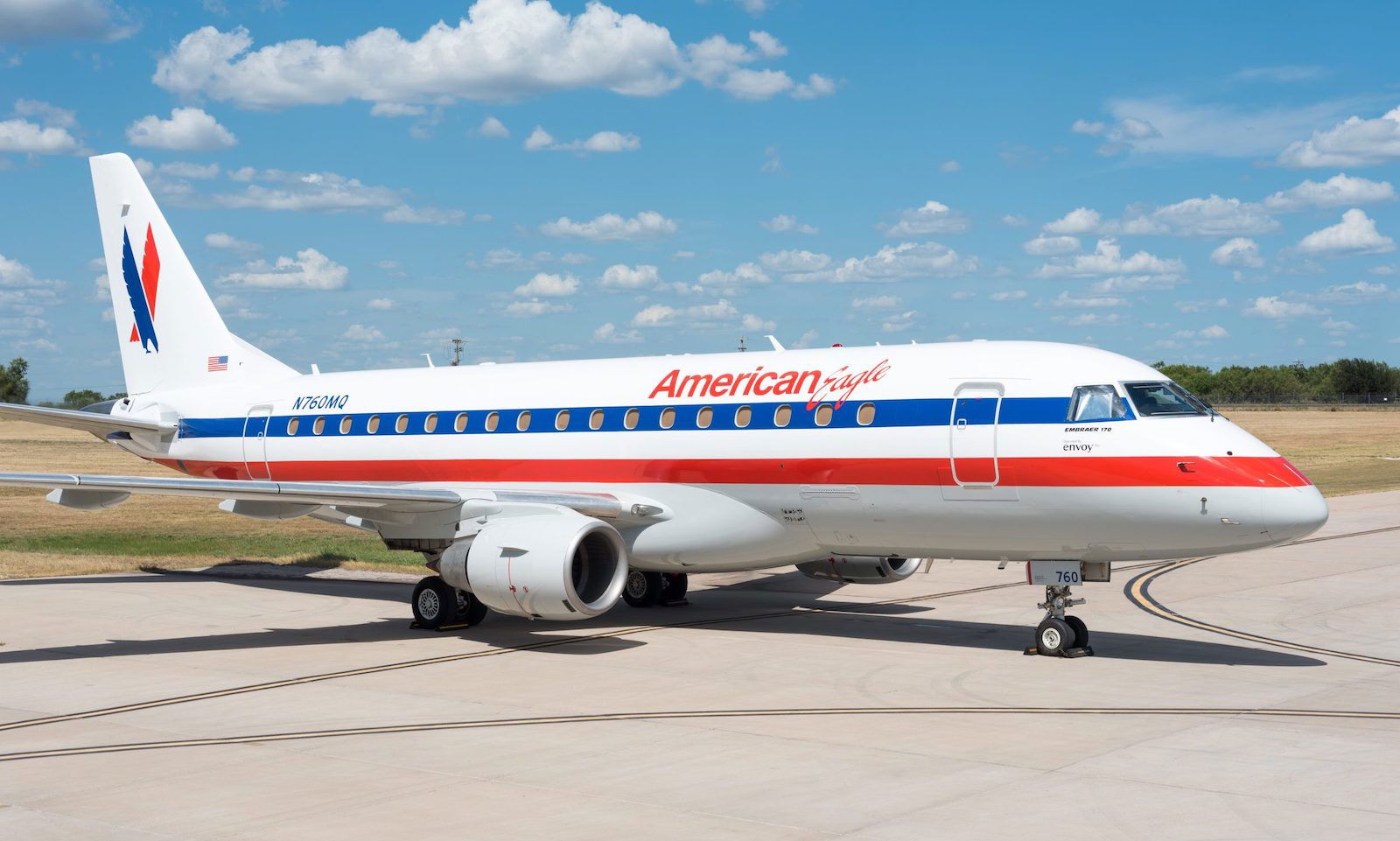
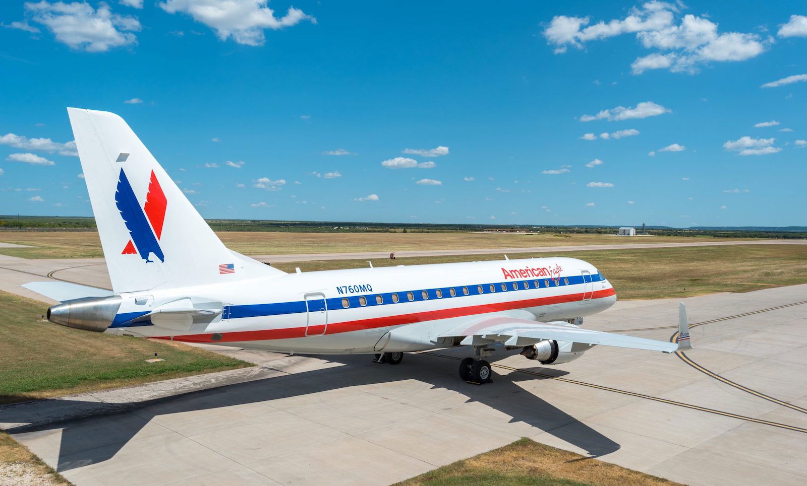
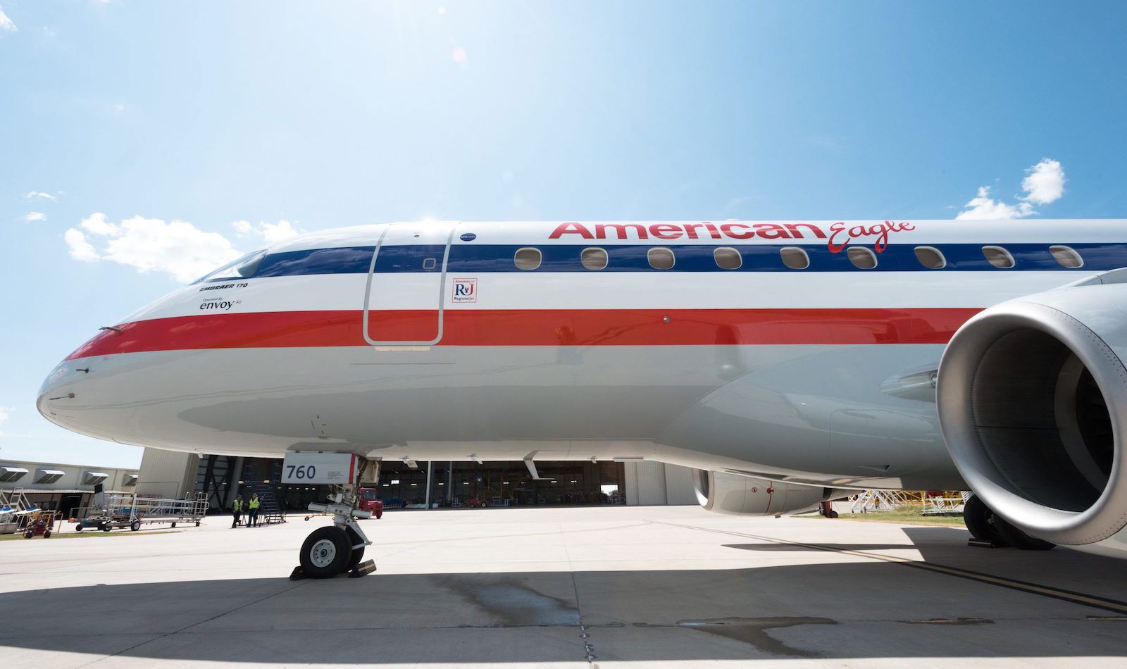
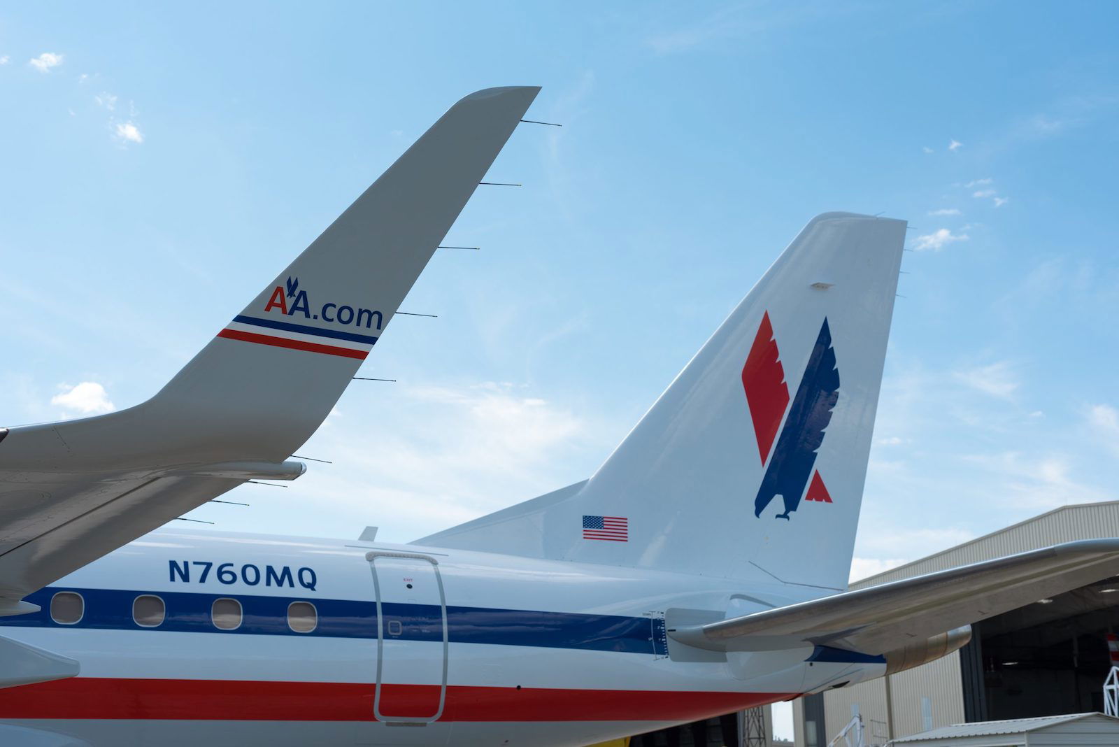
For those not familiar, back in the day this used to be the standard American Eagle livery, though it was never found on mainline American Airlines jets (which instead had a “bare metal” finish). When American Airlines introduced a new livery for mainline jets, it introduced a matching livery for regional jets, to create better consistency.
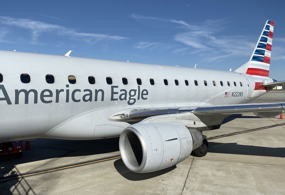
American Airlines also has some retro liveries on mainline jets, with one plane for each of American Airlines’ predecessors, given all the mergers and acquisitions that happened over the years. It’s always fun to spot these at airports.
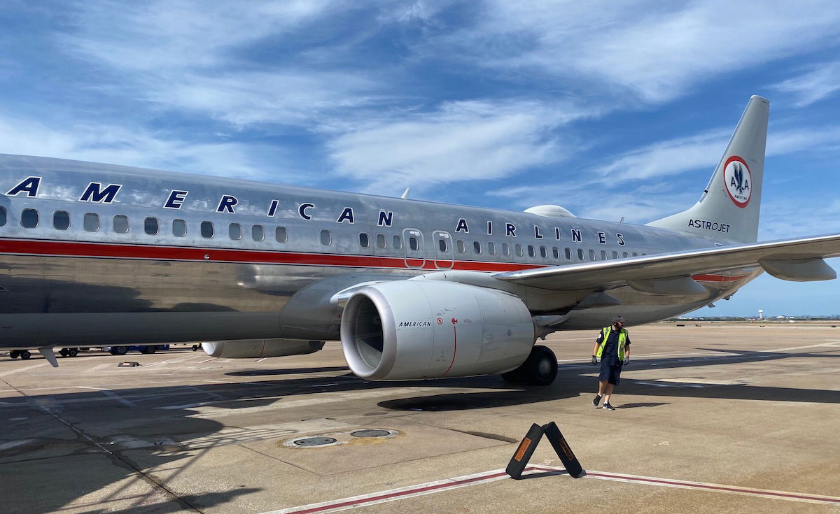
I didn’t love this livery at the time, but…
The funny thing is that I didn’t particularly care for the old American Eagle livery back when it was the predominant one found on regional jets. I appreciated that it was colorful, looked “American,” and that it stood out. However, it had looked outdated to me for many years. In my opinion the new livery looks more modern and sharp, though it is perhaps a bit more boring.
Regardless of how I felt about the livery at the time, as an avgeek there’s something I really love about a good retro livery plane. It’s always such a treat to see one of these planes taxiing at an airport, as it’s a real blast from the past. It reminds me of the “old” American Airlines, like the days when American flew 767-200s on transcon routes, when American was installing TVs on planes (rather than ripping them out), and when American’s food was actually pretty decent. Gone are those days!
Bottom line
An American Eagle Embraer E170 has been painted in the regional carrier’s former livery, which is what was found on all American Eagle regional jets until the merger between American Airlines and US Airways, at which point American changed its livery.
I didn’t love the old livery at the time, but I sure do love seeing it now. I hope to spot this plane in real life sometime soon.
What do you make of the American Eagle retro livery jet?


So? How does this affect my points and miles strategy?
@Scudder that is nice to know- I wondered why they got rid of the shiny metal finish (which I loved) but of course it makes sense that carbon fibre requires a coating but I wonder why it couldn't be a metallic paint? Too heavy perhaps?
Agree. Somehow the retro liveries look better than they did at the time. Also, sometimes I deliberately get a paper pass at the counter when I board just because I love the retro look of American's ticket stock
Because you are not seeing an ERJ and imagine yourself sitting in one.
E-Jets are a much more pleasant sight.
Love the old neons they had
https://photos.app.goo.gl/CGgVthyxsb51gCBu5
Love the old neons they had
Ben if you never flew in the AA eagle shorts 360 then you never really flew AA eagle. That’s a fact!!!!!
So you can quit with your livery BS!
The flying shoebox?
We used to say the Shorts was the box the Twin Otter came in.
Old American and American Eagle liveries were fantastic. The new livery is just not attractive at all. Just like Lufthansa, sorry sometimes there's just no reason to change. Alabama has the same football uniforms they've had for decades. You don't always have to change just to do it!
In the case of the mainline fleet, change was, in fact, necessary. “Bare metal” wouldn’t work on fuselages that aren’t made… of metal. And carbon fiber needs a paint coating to protect the resins from UV degradation.
This looks amazing as a retro livery. Now, this reminds me, if only they’d take it a step further and bring back the iconic AA logo. In my opinion, the slash mark bird logo they have right now needs to go. It doesn’t “say” the airline like the AA. I can’t stand looking at it. The current logo identity (with the word mark placement) somehow manages to gives me the feeling that it was made...
This looks amazing as a retro livery. Now, this reminds me, if only they’d take it a step further and bring back the iconic AA logo. In my opinion, the slash mark bird logo they have right now needs to go. It doesn’t “say” the airline like the AA. I can’t stand looking at it. The current logo identity (with the word mark placement) somehow manages to gives me the feeling that it was made by a 5-year-old. It’s hard to take it seriously, but you could technically say the same for their current product on domestic narrow bodies. Sure, I agreed that the last livery that wore the AA logo was very 1980s-1990s and becoming very old and ugly, and doesn’t make sense on newer-generation aircraft. I think the gray they have now is unique and a nice starting point, but the rest of the livery looks pretty off. The current American flag tail is too literal for a non-government owned commercial airline company, and looks more appropriate for a VIP plane carrying the US president. It’s the kind of tail that makes you think American’s the one who would fly Team USA to the Olympics, but in fact, they don’t. I’d even say it’s kind of ugly with those garish gradient lines. Also, I wish they would put something on the winglets or engines, although putting any piece of the current branding on them probably wouldn’t look great. And the fuselage... didn’t I already mention the slash mark? Anyhow, it’s great how American has been making some retro liveries where we don’t have to see the hideous slash mark bird logo slapped onto it (to show us that the plane is American’s). I wish the iconic AA logo would come back, and replace the current branding, which simply blows. They could simply have made the livery current and modern while still keeping the AA. I would prefer to see a refreshed AA on the tail than that American flag thing.
The 'eagle' script and fresh white were always nice to see.
Glad it's living on in a retro livery!