A couple of days ago I wrote about how Aer Lingus plans on rebranding for the first time in nearly 25 years. At the time there was a leaked picture of the new livery.
Today the airline officially revealed their rebranding at a ceremony in Dublin. If you want to watch the press conference they just had, you can do so here:
Aer Lingus’ new livery
Here’s an official look at Aer Lingus’ new livery:
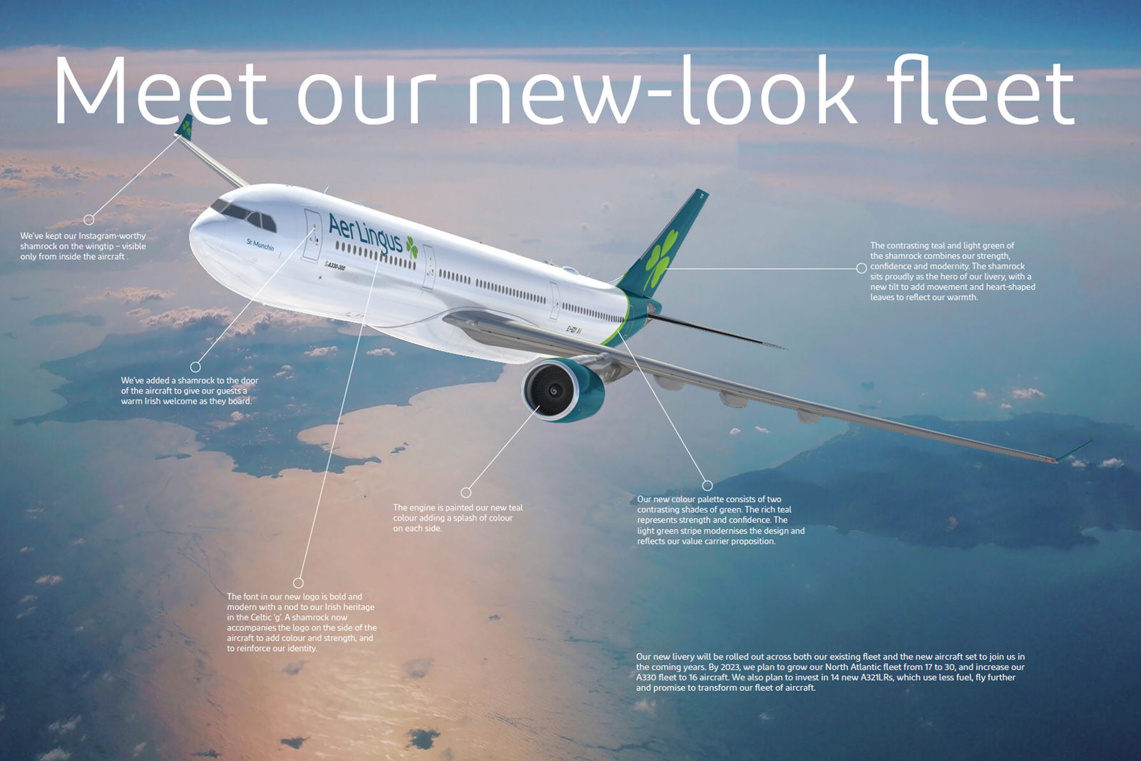
Here’s how they describe the various elements of the new livery:
Aircraft Doors
We’ve added a shamrock to the door of the aircraft to give our guests a warm Irish welcome as they board.
Brand mark
The font in our new logo is bold and modern with a nod to our Irish heritage in the Celtic ‘g’. A shamrock now accompanies the logo on the side of the aircraft to add color and strength, and to reinforce our identity.
Engines
The engine is painted our new teal color to bring color to the aircraft.
Winglets
We’ve kept our Instagram-worthy shamrock on the wingtip – visible only from inside the aircraft.
Swoosh
Our new color palette consists of two contrasting shades of green. The rich teal represents strength and confidence. The light green stripe modernises the design and reflects our value carrier proposition.
Tailfin
The contrasting teal and light green of the shamrock combines our strength, confidence and modernity. The shamrock sits proudly as the hero of our livery, with a new tilt to add movement and heart-shaped leaves to reflect our warmth.
My take is that the new livery is fine. It’s nice enough, but of course not nearly as iconic as the old Aer Lingus livery.
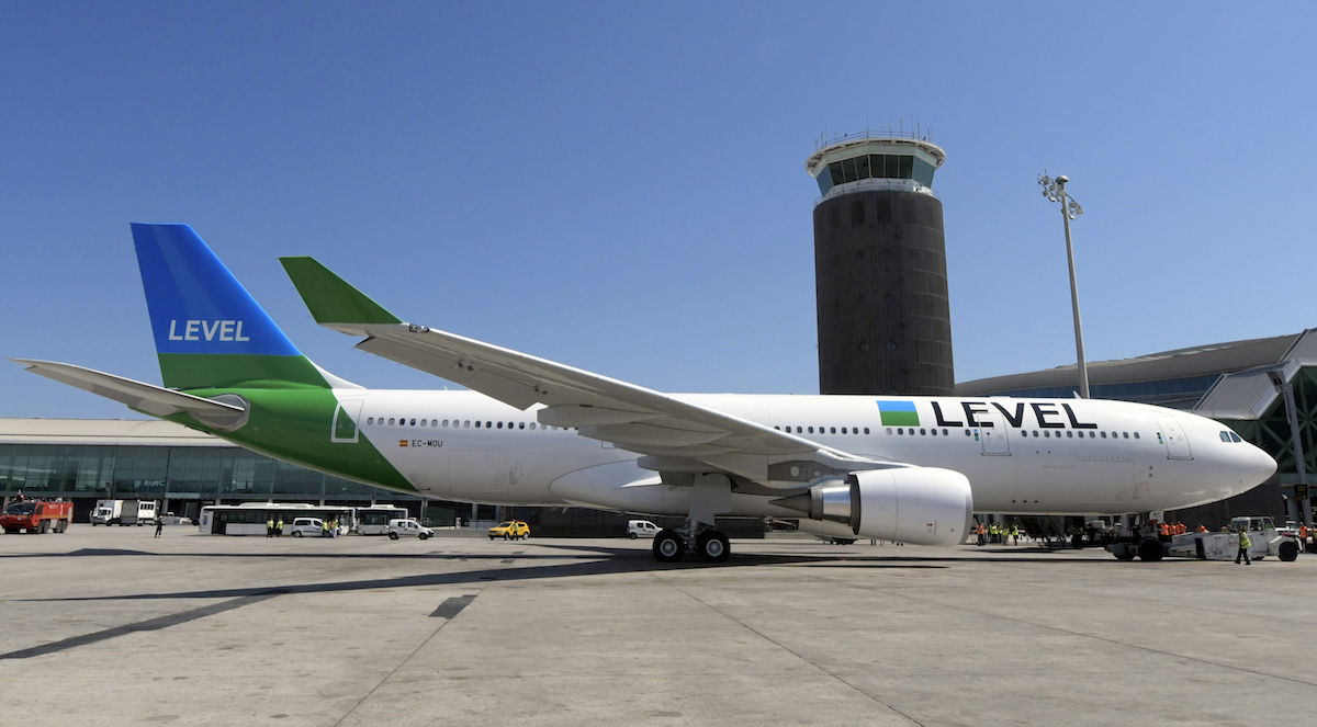
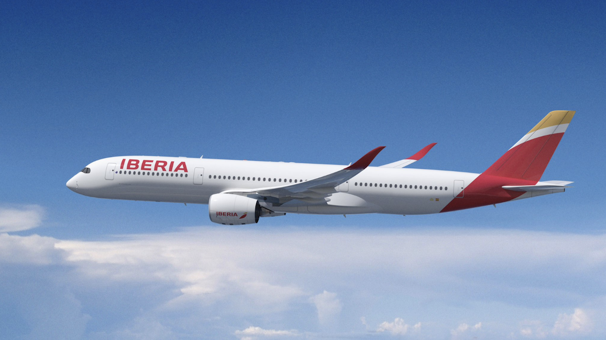
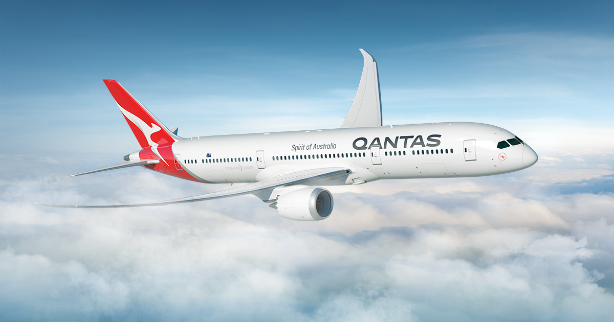
I can’t help but feel like so many airlines are choosing similar liveries nowadays. It seems like Aer Lingus largely copied Iberia, LEVEL, and Qantas here, no (not in terms of colors, obviously, but in terms of design)?
Timeline for Aer Lingus rebranding
The first plane with the new livery will be flying immediately, and the airline hopes to repaint their entire flight by 2021.
On top of that, the new branding will appear on the website and app as of today. Furthermore, Dublin Airport Terminal 2 should feature the updated branding today, while outstations will feature the updated branding within a week.
I was also under the impression that the airline would reveal new uniforms today, though that isn’t quite happening. Instead they’ve just shared this picture:

And have said the following:
We can’t wait to reveal our brand new uniform later this year. It’s been 20 years since we introduced a new style and we’ve got renowned Irish designer Louise Kennedy on board once again as our designer.
Other than that, there’s not really much news. Aer Lingus also stressed that they’ll take delivery of A321LR aircraft this summer, and that they’ll partly use these to reintroduce business class on select flights within Europe.
The only new news (at least news that I wasn’t aware of) is that Aer Lingus will be opening their own lounge in Boston this year. Many years ago the airline did have their own lounge in Boston, so I guess you could say this is a reintroduction.
What do you make of Aer Lingus’ brand refresh?


I was on EI105 today from Dublin to JFK which was the first flight of any plane with the new livery. They made a little fanfare of it and when we landed they held the plane on the ramp before reaching the gate and a small crowd of journalists and staff took photos of the plane. It was pretty neat as you could see ground staff coming out on the jetways and a lot of...
I was on EI105 today from Dublin to JFK which was the first flight of any plane with the new livery. They made a little fanfare of it and when we landed they held the plane on the ramp before reaching the gate and a small crowd of journalists and staff took photos of the plane. It was pretty neat as you could see ground staff coming out on the jetways and a lot of people in the windows of Terminal 5 taking pictures and enjoying seeing it in person for the first time. That said, from the inside of the plane there wasn't much new to notice... I have a few pics which are fun.
Just saw the new livery on the plane heading into JFK. its simple really modern and cool looking!
@Pae
The white section is still painted with two coats, the whole airframe is painted. White paint is not lighter, but it does resist UV fading better meaning a longer time between repaints or touch-ups. It's likely that with this new livery EI expect repainting only to occur during a d-check when the airframe is stripped. They were possibly touching-up the old faded green much more frequently in the past hence the move to eurowhite.
"The light green stripe modernises the design and reflects our value carrier proposition."
What does this even mean? Talk about corporate double-speak...
I'm not sure how a light green colour reflects value carrier propositions.
Pretty much all cost driven which is why so many airlines opt for the same design. White is cheaper to paint and lighter to fly and it makes the plane easier to sell when done.
+1 Alpha Golf
The Aer Lingus marketing folks are obviously out of ideas. It's like watching Hollywood constantly recycling old movies into remakes because, well, they need to be doing SOMETHING to justify their jobs.
Yeah, super impressive. I guess they'll get their big raise now.
Alaska-with-a-shamrock
^^ UTA French Airlines had one of the best liveries in the 1980's. I love it. I wanted to fly them. United's pre-battleship gray was also nice.
In modern days, I like ANA, old Lufthansa, Qantas. British Airways, Air France, Virgin Atlantic, and Swiss. Some are not bad, like Singapore, Alaska, LAN, soon to be old/current Aer Lingus, Hawaiian, Cathay Pacific.
Aer Lingus didn't need a new livery. Some airlines do.
Years ago, I flew US Air but thought the livery was ugly. In contrast, I liked Northwest. The reality is I felt happier flying Northwest. Weird, I know.
Paint adds a lot of weight to the aircraft so I'm not surprised they decided against a full body paint job.
"It seems like Aer Lingus largely copied Iberia, LEVEL, and Qantas here"
No one copied QANTAS, as QANTAS copied UTA's iconic blue tail introduced some 10 years before it became red Down under ;)
And UTA did fly from France to the South Pacific.
"We’ve added a shamrock to the door of the aircraft to give our guests a warm Irish welcome as they board."
But will one really see this as one boards the plane? The door is usually out of the way, yes?
I like it. Full or half painted bodies belong to the past. That pastel strong color is all but classy and this rebranding (like many others) clean up the livery. For me its simple and nice.
I missed the lounge news in Boston. Thats good news for me as a JetBlue commuter, if I ever have an afternoon flight back to LGA, that lounge is closed to Priority Pass when the Aer Lingus flight takes it over. The Aer Lingus lounge at JFK is pretty good, so I'd expect good things for them in Boston.
Teal, huh? If only there was a super recognizable color that the island of Ireland could be closely associated with...
LH new livery essentially the same design on the tail with their logo too.
The previous version of their livery was so classic...identifiable from miles away, a bold green in a sea of bland white liveries around the world. It could have used an update but this..is just so disappointing
Do you think the Level, Iberia and now Are Lingus similarities are an IAG plan for consistency, and to make repainting easier if they ever swap aircraft from brand to brand?
it's fine, but I liked the old greener one better.