
There had been rumors for quite a while of Lufthansa introducing a new livery for their planes, after having the same livery for about 30 years. On February 1 the new livery was unofficially revealed, in the sense that pictures of it started to appear online, even though the airline had scheduled a media reveal of the new livery on February 7 (today).
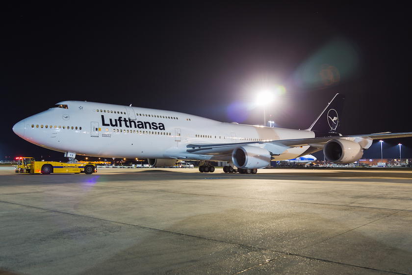
As expected, today Lufthansa has officially unveiled not just a new livery, but also a new brand design. As they describe it — “Heritage meets the future. Lufthansa presents a new brand design.” With this brand design, dark blue becomes the leading brand color, and yellow accentuates.
The airline held two events today, in Frankfurt and Munich, where they showed off a 747-8 and A321 sporting the new design. Lufthansa suggests that the response to the new appearance has been predominantly positive, though notes that some people miss the traditional yellow tone. I’m not sure I’d agree that the response has been overwhelmingly positive, though I don’t remember the last time an airline introduced a new livery and people initially liked it.
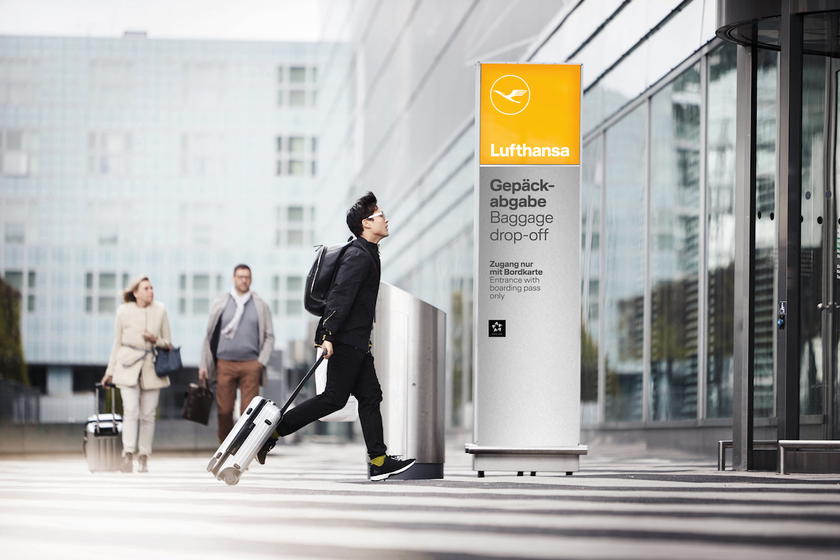
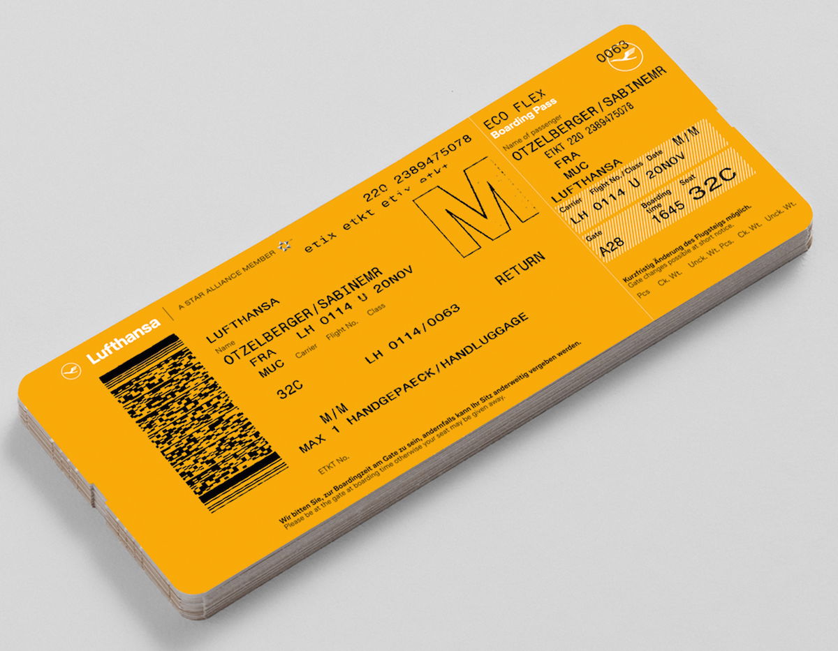
Lufthansa notes that the yellow tone “will receive a specific function to serve as a means of orientation and differentiation” (I don’t actually know what that means), and says that the color will be found in the future on every boarding pass and at every Lufthansa counter at the airport.
Here’s what Lufthansa’s CEO has to say about the redesign:
“Lufthansa has changed and is more modern and successful than ever. From now on, this will also be visible to the public through a new design”, says Carsten Spohr, Chairman of the Executive Board of Deutsche Lufthansa AG. “The crane has always been with us and clearly stands for the promising performance from Lufthansa. To this day, it still stands as a symbol of highest quality, excellent service, flying expertise, reliability, innovative spirit; and it stands for trust.”
The airline claims that they decided on this livery after considering more than 800 designs:
The design was developed in a complex process with numerous experts. After intensive preliminary studies, more than 800 designs and own color developments in the laboratory, the new aircraft design was completed. In keeping with the airline’s claim to be premium, the blue color of the livery will dominate the sky and the world’s airports for the next few decades.
It took 800 designs to decide on this simple copy of the Qantas livery (in blue instead of red, and with the crane instead of the kangaroo)?!?
It’s not just planes that will be repainted, but over the next couple of years Lufthansa will also be exchanging up to 160 million items onboard to feature the new branding, including tableware, amenity kits, blankets, pillowcases, and more. Furthermore, while Lufthansa isn’t completely reworking employee uniforms, they are adding some accessories featuring the new branding.
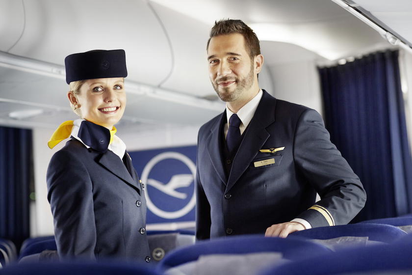
As part of this rebranding, Lufthansa will be launching a new #SayYesToTheWorld brand campaign. This campaign will “question familiar ways of thinking and habits.” I guess we’ll see more on that campaign soon.
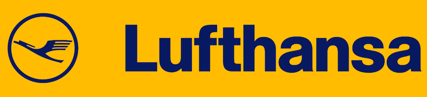
What’s interesting here is that Lufthansa will essentially have two different logo designs going forward. For reference, up until now they’ve used the following logo, incorporating blue and yellow:
Meanwhile going forward their logos will be blue and white or yellow and white, as you can see below:
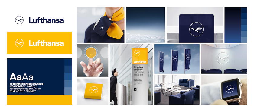
While Lufthansa has a lot of brand recognition in Germany, that’s less the case in other parts of the world. As a result, you’d think a single, consistent logo for an airline would make sense. That’s why I find it weird that check-in counters will have a yellow and white logo, planes will have a blue and white logo, etc. Isn’t that unnecessarily complicated?
What do you make of Lufthansa’s new branding?


Membership is free and takes no more information than commenting as a guest. Earn status points for good contributions, and see fewer ads as your status grows.