
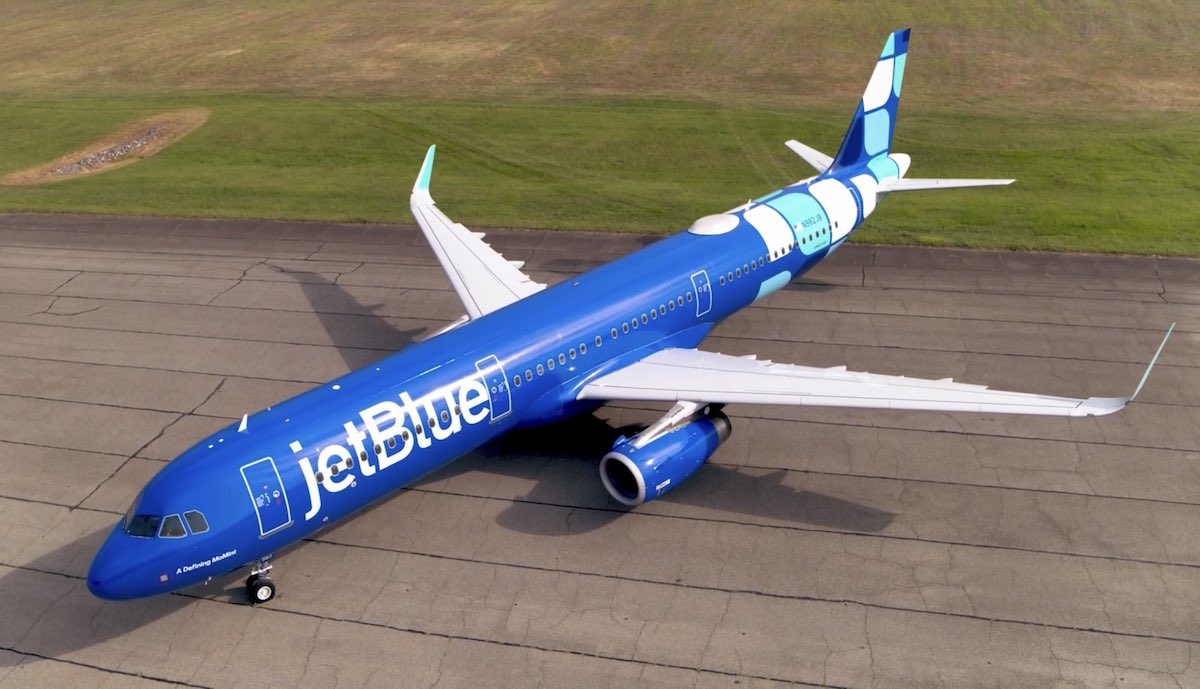
In June 2023, JetBlue unveiled a new livery, which the carrier refers to as the “Hops” design. This was a major development for the company, as it’s the first time in JetBlue’s nearly 25-year history that it had a complete design refresh. There’s now an update, as JetBlue has revealed a variation of the new livery, which will eventually be featured throughout the A220 fleet.
In this post:
The basics of JetBlue’s (very blue) new livery
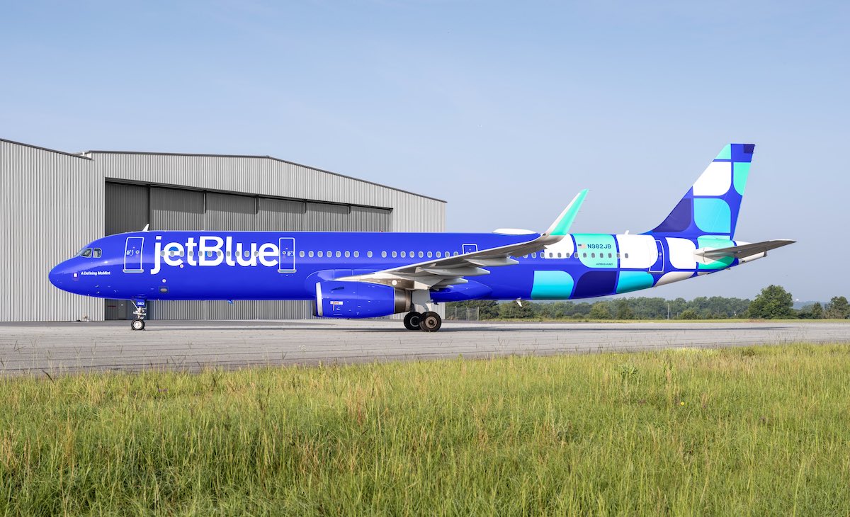
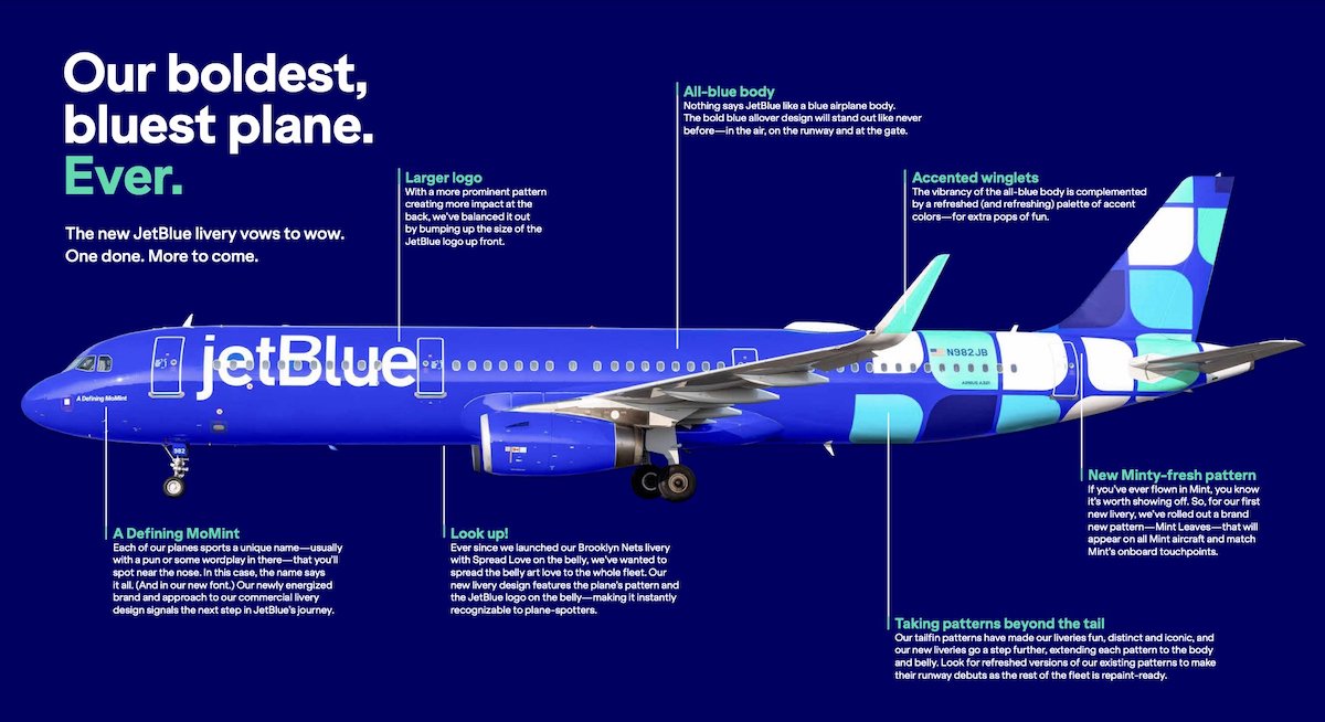
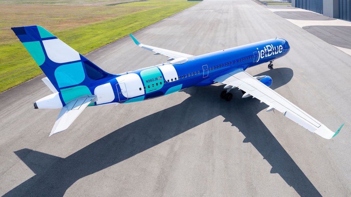
For some background, let’s start with the basics of JetBlue’s new livery, which was unveiled in the middle of 2023. Not surprisingly, the livery is very blue (there’s a hint in the name!). It first debuted on an Airbus A321 with the registration code N982JB, but several other planes have received the new livery since.
The new livery design builds on JetBlue’s previous design. Here’s how JetBlue describes the highlights of the new livery:
- A blue fuselage that goes all-in on the company’s namesake color
- Iconic tailfin patterns now energized and extended to embrace the body and belly of the aircraft
- A larger JetBlue logo to represent the bold impact these aircraft have in the industry
- Colorful winglets that add an extra pop of fun with a refreshed palette of accent colors
- The aircraft’s pattern and the JetBlue logo featured on the belly, making it instantly recognizable to plane-spotters
The new was supposed to be an extension of JetBlue rolling out a new visual brand identity on digital assets and social platforms, intended to “reflect a more joyful, contemporary and digital-first appearance.” Here’s how Jayne O’Brien, head of marketing and loyalty at JetBlue, describes this redesign:
“Liveries have always been a part of our identity. When you spot a JetBlue aircraft—whether on the ground or in the air—we want customers to recognize us as a travel brand that moves them differently than everyone else. The new livery helps us stand out among a sky of legacy carriers, and is a stunning reflection of our role as a disruptor that uniquely combines lower fares and great service.”
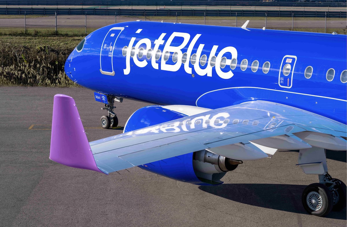
JetBlue introduces livery variation on Airbus A220
The Airbus A220-300 very much represents the future of JetBlue’s fleet. The plane is as awesome for airlines as it is for passengers, as it has great economics, and superior passenger comfort. The airline has finally painted the first A220 in the new livery, and there’s a surprise — it’s a little different than the other new livery.
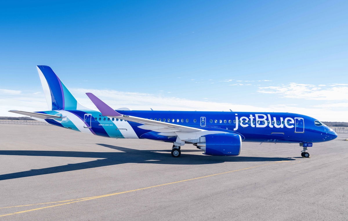
The first plane with the new livery is a brand new A220 with the registration code N3241J. As you can see, the patterns of the livery are different, and on top of that, the A220 livery has violet accents, which you won’t find on other aircraft. JetBlue describes this update to the new livery as being “multidimensional, playful, and full of motion.”
My take on JetBlue’s new livery
Us avgeeks tend to have strong opinions on new liveries. Even if we eventually end up liking a new design, it can often take some getting used to.
As a reminder, below is what JetBlue’s previous livery looks like, though there are some variations with the tail design. If you ask me, JetBlue’s previous livery still looks pretty modern. And while the fuselage is white (as is the case with most airlines), it still has some unique elements that set it apart.
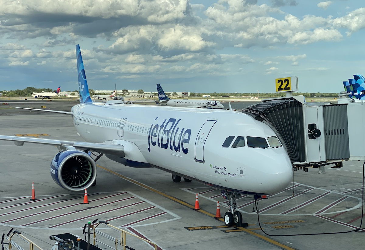
By comparison, the new livery definitely stands out a lot more. When I first saw the livery, I wasn’t sure what to think, and was kind of indifferent. However, having now seen it in person several times, I quite like it, and appreciate how distinctive it is. Yes, it kind of looks like a cross between Breeze and Southwest liveries, but it’s still unique.
I do find it unusual (though not necessarily bad) how the airline is introducing meaningfully different liveries on the A220 and other jets. Yes, they all primarily use blue, but otherwise there are quite some differences. I suppose JetBlue isn’t alone in doing that — Riyadh Air is even more extreme, and plans to have two completely different liveries.
Bottom line
In 2023, JetBlue unveiled a new livery, which represents the first full livery refresh in the carrier’s history. JetBlue has long used blue as its signature color, and the new livery most definitely reflects that. Now the airline has introduced an update on the new livery, which will be featured on the A220 fleet going forward.
What do you make of JetBlue’s new livery, plus the variation?


Maybe it's the lighting of the fact that the A220 looks better than the A321, but I prefer this livery to the other one! The purple is a bit out of place, but it's overall sleeker and sharper, if that makes any sense.
What JetBlue should do, however, is paint their their tail liveries on the fuselage. Just think how eye-catching an A220 in the "Hops" livery, or how elegant an A320 would look...
Maybe it's the lighting of the fact that the A220 looks better than the A321, but I prefer this livery to the other one! The purple is a bit out of place, but it's overall sleeker and sharper, if that makes any sense.
What JetBlue should do, however, is paint their their tail liveries on the fuselage. Just think how eye-catching an A220 in the "Hops" livery, or how elegant an A320 would look fully decked out in the "Highrise" scheme.
Honestly, when compared to that, this livery just looks (relatively) boring and just another addition to the list of all-blue ones.
Or*
A new paint job doesn’t solve a failing business model.
The leaders of B6 still ignoring what made them successful in the first place.
Anything that means there is less boring eurowhite liveries, is good in my book.
Agreed! We need more distinctive, "ballsy" liveries like Condor & Spirit, not Eurowhite garbage like Lufthansa & Iberia, and fortunately this livery is part of the latter.
Hah! Lots of branding experts commenting...
I like the A220 livery, not so much the 321s. Very distinct in my opinion.
Death to B6.
I guess shilling for the Big 3 pays well, huh?
Both new liveries are ugly and will not age well. Remarkable how B6 wastes money on this when it is headed toward bankruptcy and an eventual acquisition by AA.
This will get old very quick.
In a few years (if they are still around), management will be looking for a new, dynamic logo. As long as they don’t duplicate the new, very woke Jaguar theme, they may have a chance.
While the forward fuselage of the new livery will be standard the back half was never stated nor implied would be the same…..the variable tail fin concept will still be retained.
"Us avgeeks tend to have strong opinions on new liveries. Even if we eventually end up liking a new design, it can often take some getting used to."
R.I.P. to United's Battleship Gray. They will never come close to the beauty of that livery, not that they are trying, tbh.
I agree with you on that United livery. Very classy. Timeless and they should have stayed with it much longer.
Battleship Gray with the Tulip. Get it done today and get the Death Star.
It’s Breeze!! No wait….ITA.
Yep... it was the livery. That's why JetBlue has been struggling. Way to go, Management, you fixed the airline!
Tbh the new one looks too much like Southwest. Seems less distinctive as a result.
It reminds me of all the slogans and gimmicks tried by JC Penney over the last two decades as they sank deeper and deeper into the mire.
Never mind those troubled books! We've got a new tagline, plus new colors and a celebrity face in our ads!
Maintaining those colours wouldn't be so easy. Not only the variety, but also the blue fuselage which ages quickly, will definitely require JetBlue to paint their jets more frequently and consequently costing more.
I like the livery itself, though.
Less is more and prefer the understated elegance of the former livery. This new livery hurts my eyes and brain.
Yep Southwest is the first thing that came to mind when I saw the new livery. Not what you want your branding to accomplish. OTOH maybe that's a harbinger of future consolidation:-(
I forgot all about this hot garbage. At the time, I thought it was just a gimmick - that they'd paint one plane like this, or it was an April Fool's joke. But they were serious.
It looks awful. It looks cheap. It looks a far cry from their brand identity of crisp and upscale business-plus travelers.
What ever happened to taste and timelessness in airline branding? United's tulip, or American's AA, or Continental's golden...
I forgot all about this hot garbage. At the time, I thought it was just a gimmick - that they'd paint one plane like this, or it was an April Fool's joke. But they were serious.
It looks awful. It looks cheap. It looks a far cry from their brand identity of crisp and upscale business-plus travelers.
What ever happened to taste and timelessness in airline branding? United's tulip, or American's AA, or Continental's golden meatball? Those logos lasted decades, and bought them lasting brand identity. What the hell is this all-blue plane going to do, except heat up on a hot day and make the plane look like Southwest's cheeky stepsister?
All good points. What really honks me off are differently painted winglets by any airline! And then they usually take it a step too far and paint the engines some oddball color. It's too cute by half. For the sake of everything that's good, true & beautiful...
United's tulip??? C'mon! That was complete rubbish!