Passport Plum wasn’t the only change that Delta made this month – over the past week, they’ve started to roll out a new delta.com website. As you can probably expect, like with any new website, the transition has been far from perfect.
Interestingly enough, this seems to be more of a rollout than a flat-out change, as the website is operating both on the new and the old interface, depending on which internal page you are on.
I imagine this will change over time, but in the meantime, there are no shortage of bugs to be found. Below are five issues that I’ve run into in my brief time with the new interface – and the best workarounds that I’ve found (where possible).
So, in no particular order…
Issue #1 – Where is the old booking screen?
Okay, this first issue isn’t so much a bug as it is a question of personal preference, but anyone who works in software (or uses software, for that matter) knows that interface matters. When you go to book a flight on the new Delta site, it opens up this view on the home screen:

If you open up the “Advanced Search” options, it looks like this:

Not necessarily awful, but it takes some getting used to.
If you find yourself pining for the old booking screen, there is a way to get it back. First and foremost, you can access the old booking screen here and bookmark it.
But I imagine you may want to access the link internally for the website as well. You’ll find that if you click on any of these options, you will be held captive on the home screen:

But if you hover over any of these options, you will be taken to a host of internal links:

Simply hover over any of these options and click on any of the links below:

And you should be taken back to the old Delta website that we know and love (or at least tolerate).

If you click on the “Book a Trip” link, you should be redirected to this page, which should look familiar, save for a few color changes:
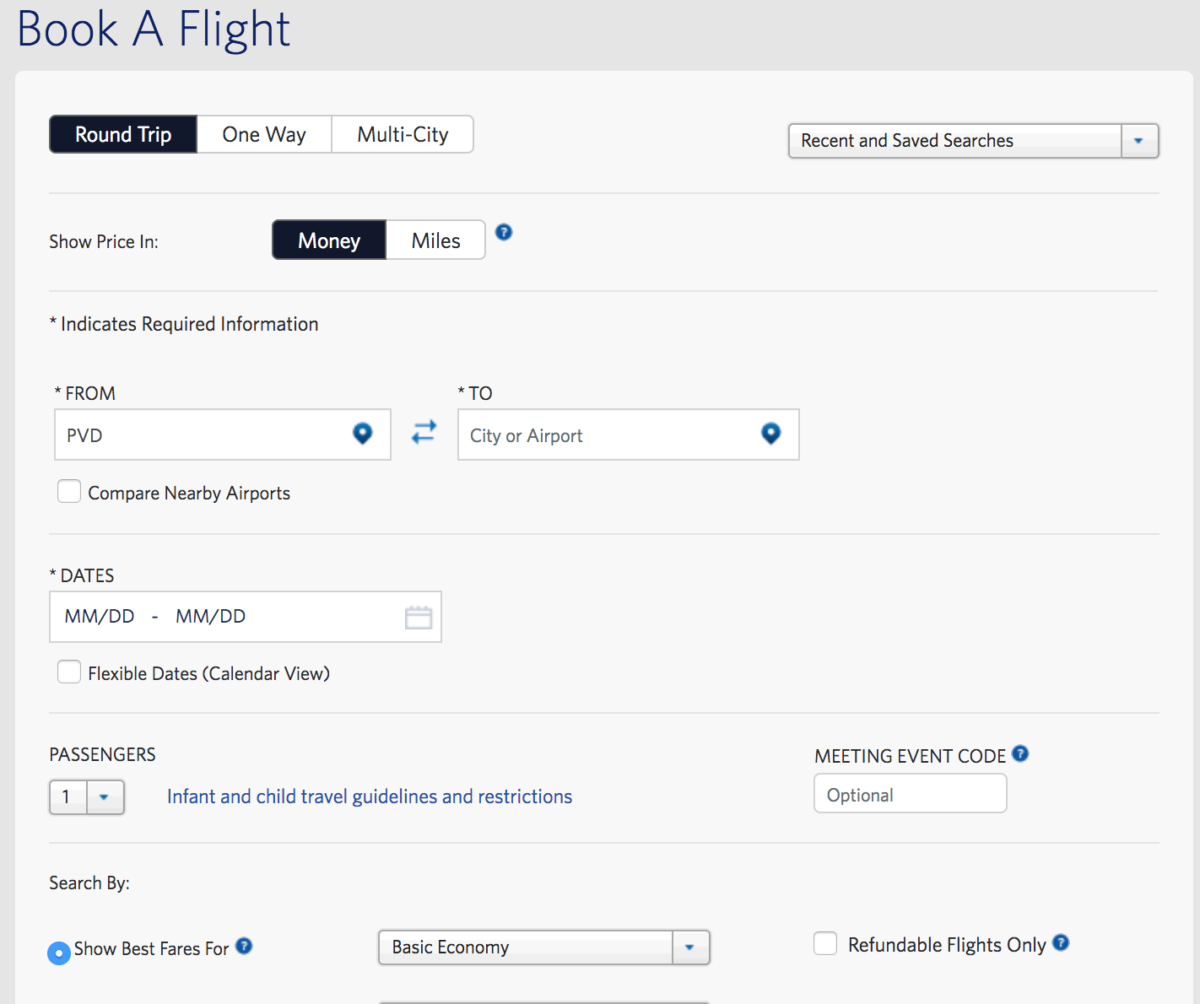
So if you find that you are allergic to interface changes, this should help at least relieve some of that stress.
Issue #2 – How do I register a comment/complaint?
One my favorite features of the old Delta website – and Delta as a whole – has been their incredibly easy process for registering a comment or complaint. I’ve had a lost passport returned to my house, I’ve had bonus miles issued in a matter of hours when I’ve had a delay or cancellation, and I’ve even had agents proactively look up the SkyMiles accounts for my travel companions when an issue has impacted all of us.
(And yes, I give lots of love for the good experiences, too!)
Their form is pretty intuitive, and they used to make it really easy to find in the top right corner of the home screen:
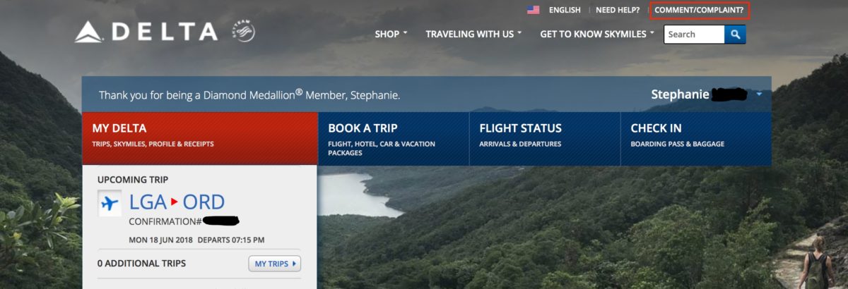
But unfortunately, with the new website, the link is nowhere to be found.

Right now, the quickest way to access this link is to follow the instructions from issue #1, until you are redirected to Delta’s old website, where you should, once again, be able to access the link from any of the internal pages:

It’s still unclear whether this link will be accessible once the whole site converts to the new format, but you should still be able to access Delta’s comment/complaint link here.
Issue #3 – “My Delta” doesn’t take you to anyone’s Delta
Again, this is more of an annoyance than a completely broken system, but you may have found that when you log into the new Delta website and click on your name on the top right corner, you are redirected to something that looks like this:
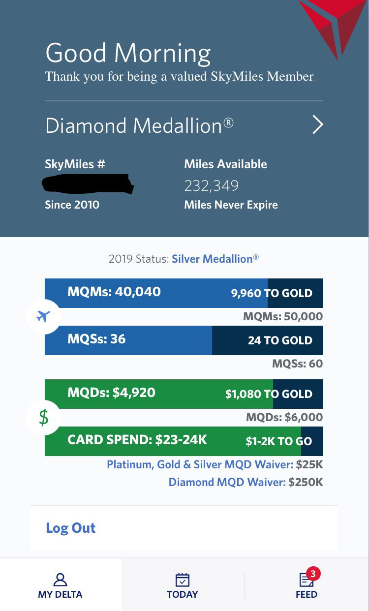
This is nice and all, but when you click on the “My Delta” link in the bottom lefthand corner, it keeps you right where you are and doesn’t redirect you to the main “My Delta” page.
If you click in this area:
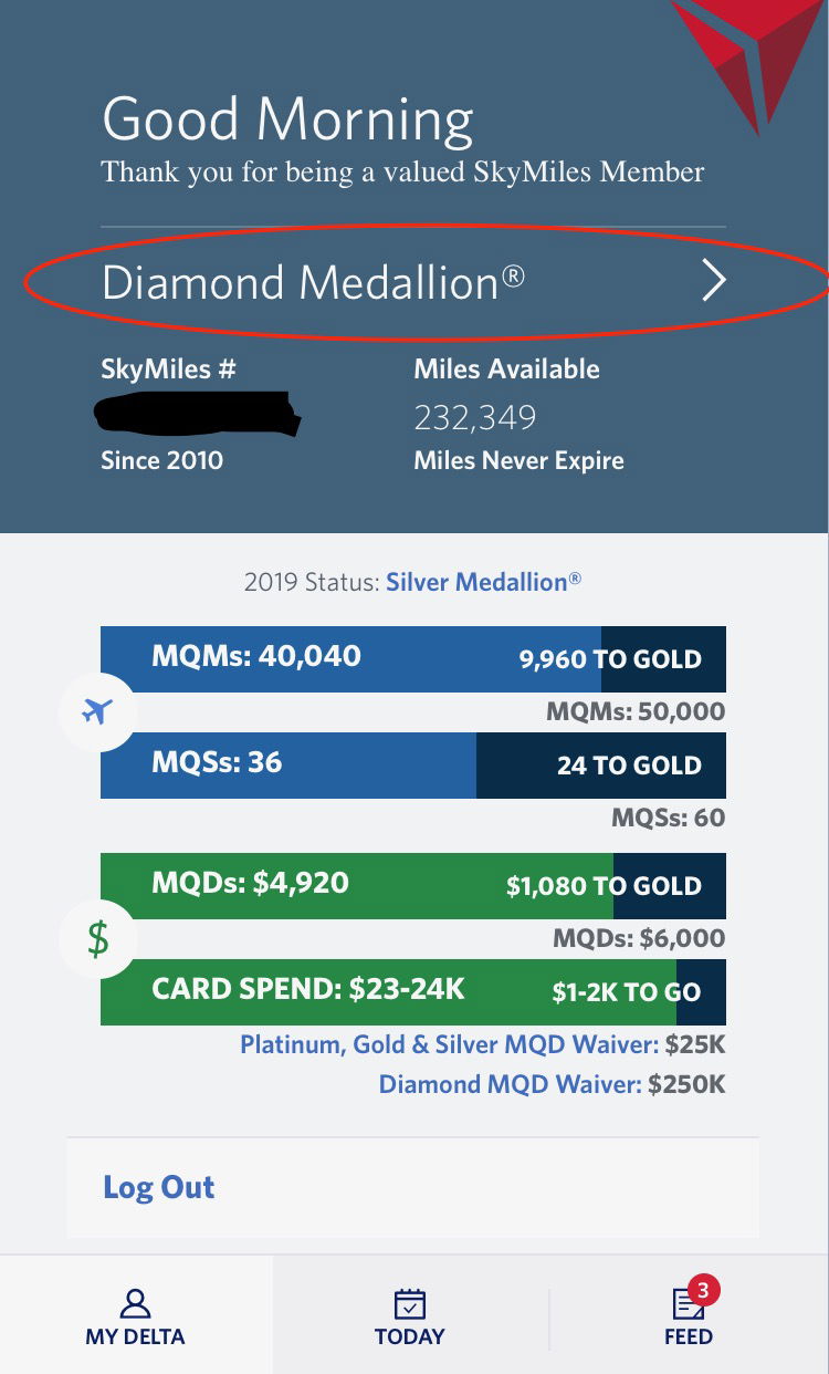
…you will be redirected to the main “My Delta” page.
You can also access the My Delta page here.
Once you’re there, things should look like they used to…for the most part.
Issue #4 – Where have my MQMs gone?
This is a fun one that I’ve been seeing recently. Part of the thrill (or chagrin, in some cases) of maintaining elite status is the fun of tracking your progress (much like what we see in the pictures above). However, some of you may have seen something like this when you’ve logged into your My Delta page (below is a screen shot of my husband’s account showing this issue):
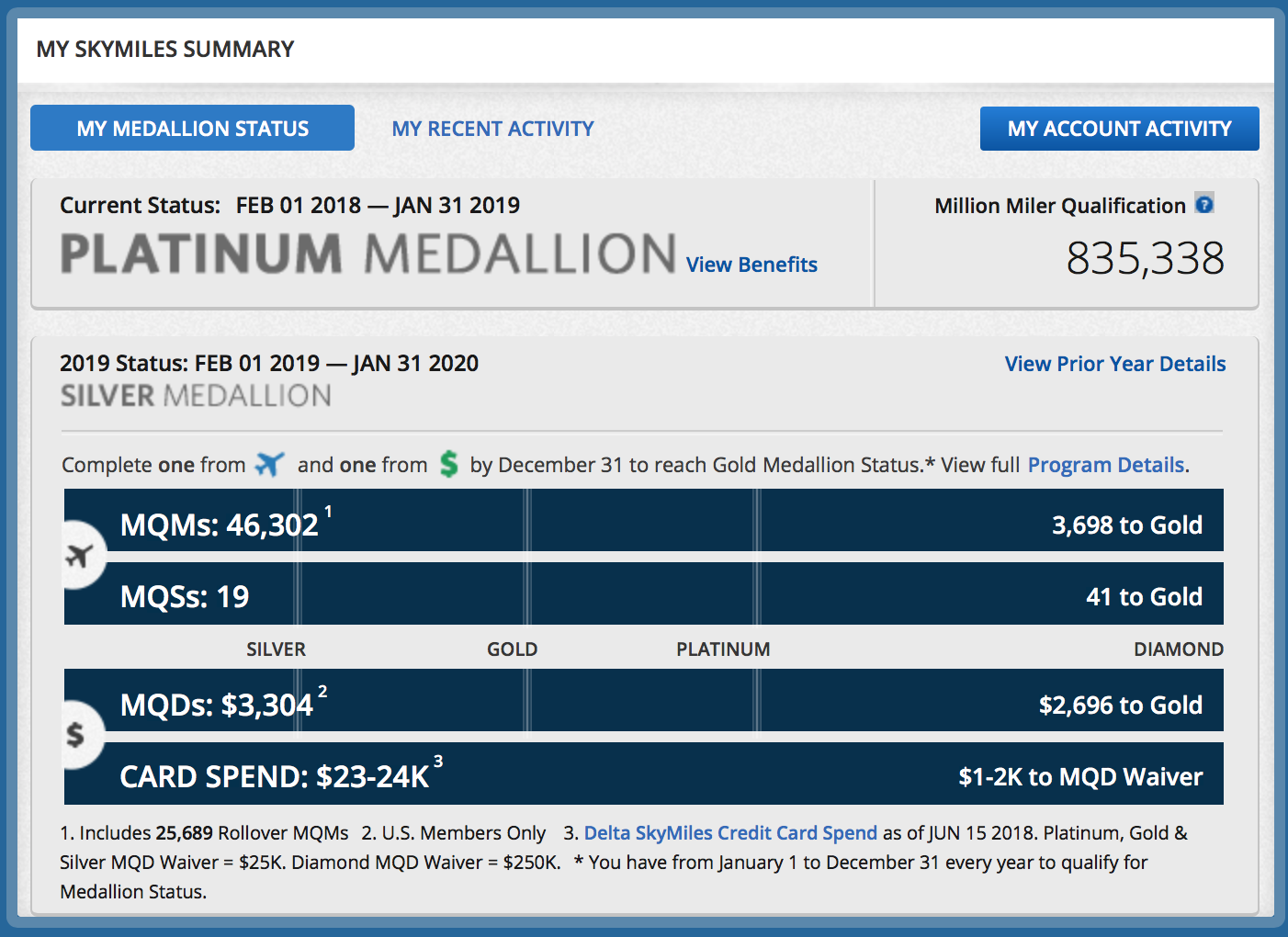
While the information is still there, the blank bar graphs may be disconcerting.
Here’s what you need to do – simply click on any other link on the website, and then click the “back” button on your browser. This should fill everything back in and fix the chart:
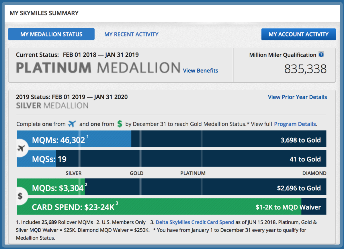
So while my husband probably won’t be qualifying for anything based on his individual segments flown, at least we get an accurate snapshot of his progress.
Issue #5 – Help! Where do I get help?
Similar to the Comment/Complaint section, the “Need Help?” section has visibly disappeared from the website’s header. Here are three different ways to access the help area, now that it’s hidden away:
Scroll down to the bottom of the screen, where the new “Need Help?” section lives:

OR
Follow the steps similar to those from the Comment/Complaint section, and locate the “Need Help?” section where it was before:

OR
Follow this link to get to Delta’s help section
So, to recap…
If you’re looking for the links to any of these pages, here they all are in one place.
You will probably want to be logged in to your Delta account before clicking on the links, as they may or may not redirect you otherwise (I’ve had mixed luck on different browsers, so it’s probably easiest just to stay logged in).
Okay, this is helpful, but I’m still frustrated with the new site. What can I do?
If you’re still finding that you’re struggling with the new website, I can pretty much guarantee that there is at least one change that you will like. They’ve added a “website feedback” section at the bottom of the footer:

If you click on it, you’ll see this window:
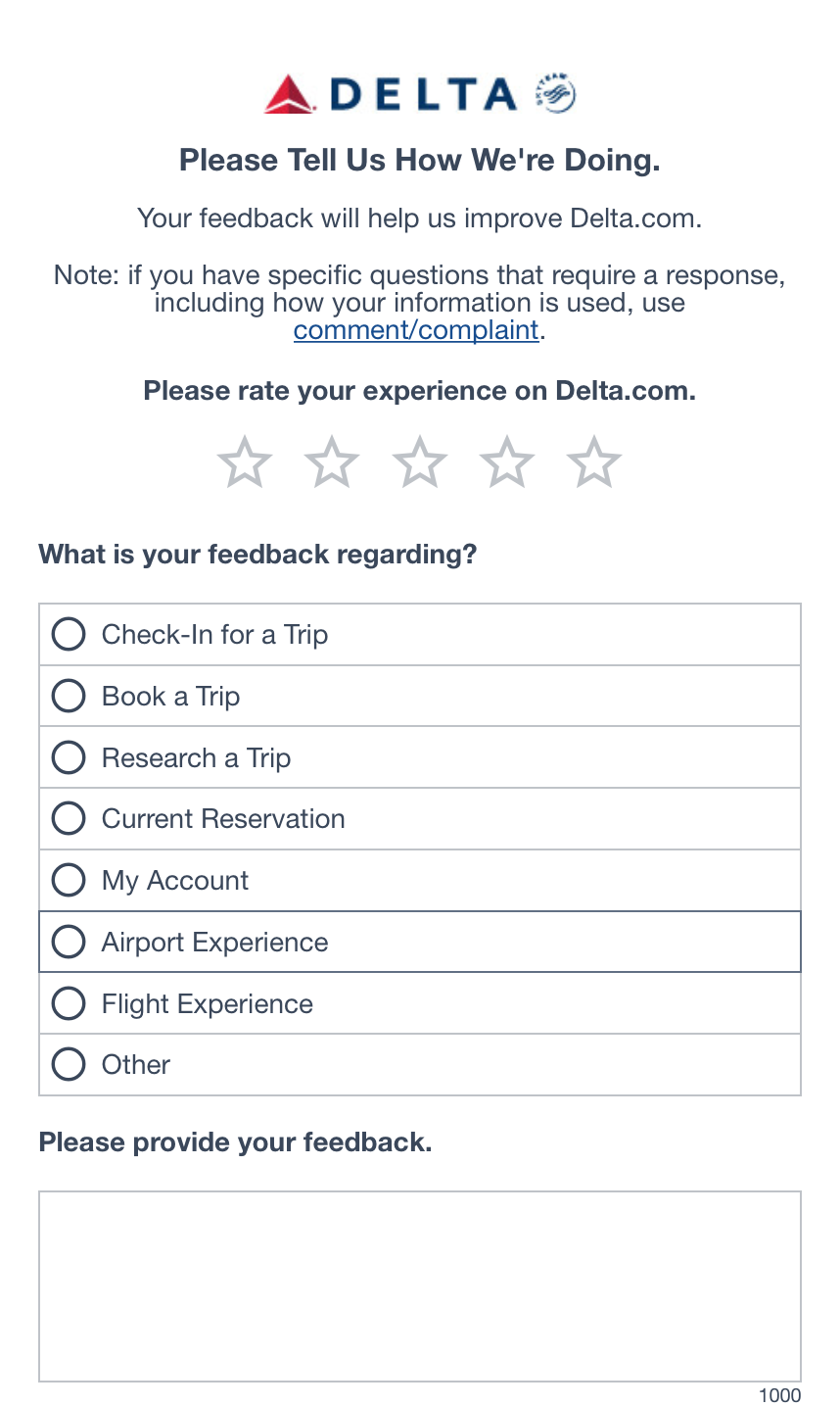
So if you’re having issues of any kind, be sure to let them know. No guarantees on the effectiveness of this feature, but at least it’s there.
Bottom line
While the bugs will hopefully get fixed (and if you are having bugs, please tell them!), the new interface is probably here to stay. Hopefully some of these workarounds help to ease the pain, at least until we get used to the new and fully developed delta.com.
What do you think of Delta’s new website? Have you run into any issues? What solutions have you found?


Difficult to add a second credit card with a different address. Does not take the address.
Received email on Sunday about a Wednesday flight. Failed to include the original flight to LGA, just the return flight info. Makes you think something was booked wrong.
STEPH,
YOU'RE THE BEST IN HELPING ME BOOK A FLIGHT ON DELTA - THE AIRLINE THAT I HAVE EXCLUSIVELY FLOWN FOR OVER 3,000,000 MILES!
I LOVE DELTA BUT THIS NEW DELTA WEBSITE IS HORRIBLE!!!
THE DESIGN IS BAD ENOUGH BUT GETTING TRAPPED ON SCREENS WHEN YOU TRY TO BOOK A FLIGHT IS THE WORST !!
SOMEBODY IN ATLANTA SHOULD BE SHOT
I have worked in the IT field for more than five decades specializing in user interface and usability. I travel several hundred thousand miles a year and use the site almost daily. This new version of the website is the worst I have ever experienced - the UIX is not intuitive, sensible and I see no compelling justification in the navigation to drive this to this UIX. It would be wise for Delta to go...
I have worked in the IT field for more than five decades specializing in user interface and usability. I travel several hundred thousand miles a year and use the site almost daily. This new version of the website is the worst I have ever experienced - the UIX is not intuitive, sensible and I see no compelling justification in the navigation to drive this to this UIX. It would be wise for Delta to go back to the previous UIX - and change the cosmetics, if they must, but leave the UIX navigation the same. If you are a frequent flyer with a Sky Miles account this interface is a step backward. It is a shame that Delta has improved the quality of their customer service in every other area - why did they trip up on the new Website?
Hey Steph,
You can easily access Comment/Complaint by scrolling to the bottom and clicking Email Us.
Great and very helpful! Thanks! My new Delta Website exproemce is that I no longer can log in. I spent an hour with a Delta Help desk agent which went like this:
You accout has been locked let me unlock it. Thanks. I created a new password and it still doesnt work. Its a browser issue - do you have Chrome. No, so I downloaded it. It didn't work. I deleted the app pf...
Great and very helpful! Thanks! My new Delta Website exproemce is that I no longer can log in. I spent an hour with a Delta Help desk agent which went like this:
You accout has been locked let me unlock it. Thanks. I created a new password and it still doesnt work. Its a browser issue - do you have Chrome. No, so I downloaded it. It didn't work. I deleted the app pf both my iPhone and Tablet, still didnt work. the agent said she would help me change my seat (on my 2 China Eastern flights today) but told me she couldn’t - the seat maps weren’t coming up (even though on the old site on Safari they came up no problem).
There was no resolution because the agent either hung up or we got disconnected (I had been calm and nice through out). When I logged in as a guest Delta.com told me I had no upcoming flights - I have 2 today: ICN-PVG PVG-JFK.
Both award tickets on China Eastern booked on Delta.com
Let’s hope Delta.com is wrong and I have flights to board!
I really like the new site. Sure there are a few bugs as to be expected with any new product launch, but I think we, frequent flyers as a group, tend to resist change a little too much.
Very helpful article. I'd been wondering about escaping from the new booking page. I stumbled out of it once, but it's good to have the escape route nailed down--until they close it off. :(
If you want to make a complaint/comment, just tweet them. In my experience, Delta will be on it very quickly.
Removal of things like clearly visible help and complaint links are less of an interface issue and more of a business decision.
Thanks for the info! Though for years I’ve found the Delta app way easier to navigate than the website (&was bummed when they stopped supporting the separate iPad app).
What has happened to Delta to make it suck in such a short period of time? Let's take a really excellent website and app and make them bad on purpose. DELTA SUCKS.
My biggest complaint with Delta's new UI (and unfortunately it's not restricted to Delta) is how sparse the pages look. And how you need to scroll down seemingly endlessly to find what you are looking for. The website is clearly designed for mobile devices where you use your finger to flick up and down the page. But the design is not well matched to a high resolution desktop/laptop monitor where you can pack a lot...
My biggest complaint with Delta's new UI (and unfortunately it's not restricted to Delta) is how sparse the pages look. And how you need to scroll down seemingly endlessly to find what you are looking for. The website is clearly designed for mobile devices where you use your finger to flick up and down the page. But the design is not well matched to a high resolution desktop/laptop monitor where you can pack a lot more info into a page without having to scroll.
What I don't understand is that web sites can identify the type of device being used and could tailor the web page to the device (isn't that the idea behind responsive web design) but I guess companies don't want to spend for dual web page design:-(
Neil
Thanks for that! Actually very helpful.
Is it a coincidence that a few sites updated recently and look the same (JetBlue as well, maybe some others too)?