Go figure that when I hop on a 20+ hour flight Delta announces a revenue based frequent flyer program and American unveils their rebranding.
Let’s start with American’s rebranding. This has been in the works for a long time, so here it is:
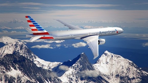
American also produced a video about the thought process behind the new branding here:
It’s 1AM in Singapore and I had one too many shots tonight (which is to say I had exactly one shot) to write anything constructive.
What do you guys think of the new branding? Love it? Hate it? Expecting a Bank of America merger?


@Nathaniel,
If they merge with US airways my understanding is that US management would most likely be in charge. So they would select the livery wouldn't they? Or did US sign off on this? If you are in bankrupcy your bargaining power is generally limited.
The new livery is GREAT. I LOVE IT!!!
Definitely love the new logo though I will miss the double A that has make the airline easy to identify for a long time. The tail is kind of flashy but I think it is all about getting used to it. Just saw some pictures of the plane in the hangar and it looks better than in the promos. The plane looks elegant and modern. And the best thing is that with all this changes...
Definitely love the new logo though I will miss the double A that has make the airline easy to identify for a long time. The tail is kind of flashy but I think it is all about getting used to it. Just saw some pictures of the plane in the hangar and it looks better than in the promos. The plane looks elegant and modern. And the best thing is that with all this changes the interiors are also changing and the colors that will be uses make first ans business class look more classy as I have never liked the colors been used now they are too plain.
If you showed me just that tail and asked me which airline's now livery it was, I'd probably say US airways. Airlines usually put their logo, or part of their logo on the tail, and which airlines uses the flag as a logo? If this isn't a clear sign what's to come and I don't know what is.
I don't care and I think it is a sheer waste of money to do so given that AA has been fighting with its pilots for so long ...
They took the shield from Captain America! Now you can hear the annoucement when you board the plane: Dear Pessengers, This Is Captain America Speaking!
Is it just me or is this like a cheap rip off of the US AIR tail just done in red - well I guess that fits.
I don't care for it only because I don't feel it was necessary. They already had an iconic brand and logo. They didn't need to change it.
@Rich it really isn't a waste of money, they needed to do something to announce the rebirth of their airline out of bankruptcy and if they do merge with US, American will be the one sticking around, they are bigger, and have a better image than US.
Why waste money on this when they are bankrupt and may up merging/being bought?
Should have given the job to Pentagram, designers of the beautiful UA tulip livery.
Several of us like it. It's different from the pack and distinctive. My first impression was "I like it." I don't say that very often and I deal with these branding issues regularly. Congrats and let's hope it inspires change throughout the organization and allows them to deliver on promises of a better airline for everyone.
I love it. No sarcasm. A+
Makes it look like an LCC. Looks like something my 9 year old sister painted.
The tail is terrible! What were they thinking? Looks like some kind of bad Wonder Woman bustier crossed with 1970s plaid jacket!
Did they not see that they have the ideal tail design inherent in the new logo - duh!
@UA-NYC I know.. I didn't like it on Continental either.. But the Font is especially hideous.
The eagle logo is terrific.
I can take it or leave it. I don't get what all the fuss is about when liveries change. It's fine, get on with creating an airline that people want to fly with and enjoy parting with their money that they can rely on that has good consistent customer service.
Wayyyyy tooooo muchhhhhh time spent "how the liveries make you feel"....makes me throw up a little every time I see all the time and...
I can take it or leave it. I don't get what all the fuss is about when liveries change. It's fine, get on with creating an airline that people want to fly with and enjoy parting with their money that they can rely on that has good consistent customer service.
Wayyyyy tooooo muchhhhhh time spent "how the liveries make you feel"....makes me throw up a little every time I see all the time and money spent on redesigning an airlines look.
Kind of like all the time spent in companies doing mission statements. Such wasted time..But the manager's feel
like they are accomplishing something and everyone goes along with it. Same with livery changes. Marketing
folks get a warm fuzzy they changed everything and everyone goes along with the charade.
I'll stop. I think I'm going to throw up again...
I like the tail...
The tail colors don't blend well with the rest of the plane. I think it would have looked much better if the bottom 2 red stripes came up the fuselage a bit, maybe in a gentle swoop.
So ugly.
@ Simon, I'm with you. Initial reaction was bad, but I think I could get used to it. A bunch of different types lined up in a row could look pretty spiffy
The tail reminds me of Captain America's shield.
Very interesting article about the logo change. http://aviationblog.dallasnews.com/2013/01/a-tail-of-two-airlines.html/
Funny to see at the end of the article they offer a picture of what is believed to be the source of American’s inspiration for the new paint colors and design: an old Greyhound bus. LOL!!!!
Sure, it's somewhat derivative of other logos, but it's also very modern and forward looking. I like it.
I am a fan.
With that tail they should have changed their name to 'Murikan Airdohickys
"Santastico said,
The tail looks like a spinning barber pole to me. Maybe Executive Platinum will get a free hair cut????"
Maybe elite benefits are getting the hair cut /s
The tail is kind of loud, but overall, I like the new look.
I'm with the mob - new logo is great, tail is eh.
I didn't like it initially, but it's really growing on me.
Like it a bunch. They needed something bold! THink about how you'll feel seeing that tail on the last let of a long international trip
Vignelli interview video on the old AA design
http://youtu.be/x8u-yryGGF4?t=1m14s
Aeroflot? No. Cubana, yes. http://img.ly/rRVb
Why did they go with a picture of 90's style 3D glasses for their logo?!
agree that the logo is great...tail i don't like at all...
The tail looks like a spinning barber pole to me. Maybe Executive Platinum will get a free hair cut????
The PJ looks better in the video than in the picture. Massimo Vignelli must be pissed though, he was so proud of his old logo design.
They should have invested in better customer service. The new look will not make it my favorite airline as long as they treat customers so poorly. I will continue to fly it only as a last resort.
Horrible tail. But The rest looks slick.
AF anyone?
For some reason, it makes me think of Aeroflot.
I actually like it. I like the bold colors...they'll definitely stand out.
@Nathaniel - nothing new about UA's paint job, it's a 20+ year old livery
I kind of like it. Not sure it's 'stylish' but like the bold colors and graphics. definitely noticeable. I definitely like the stylized eagle
I'm good with the logo. Think the shots of the new branding for airports and promotional materials look good. I don't love the new typeface, mostly the spacing is too wide.
As for the livery, it's fine except that terrible tail. As I said on twitter, "Buzz...your girlfriend...woof!"
Wow.. I don't like it at all.. looks almost as ugly as united's new paint job.