Back in November I stayed at the Fairmont Olympic Hotel in Seattle and was thoroughly impressed — so much so, in fact, that I felt compelled to write a review for OMAAT detailing my experience there.
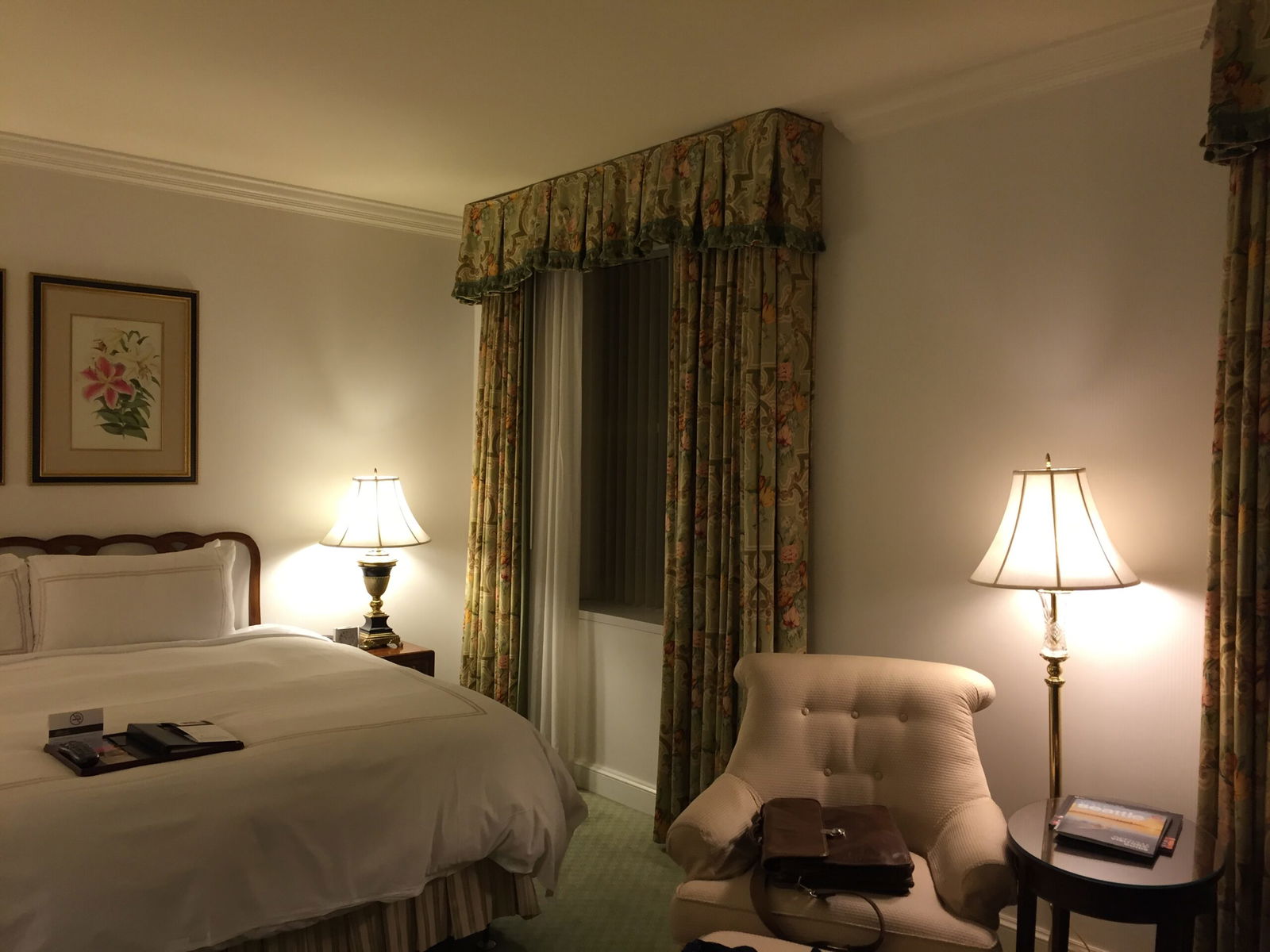
When I stayed at the hotel in November, I noted that the rooms were slated to be refreshed. The guestrooms certainly called for an update, since they featured a “classic” decor that didn’t feel dated so much as rickety — they hadn’t been materially updated since the days when the hotel was a Four Seasons, pre-2003.
I stayed there again this past weekend, in a renovated room — in fact, it’s my understanding they are nearly all renovated at this point. The public areas have yet to be renovated, though I was told that was to happen shortly.
Since I reviewed the hotel in depth before, I won’t rehash the basics — the excellent service, the historic and charming public spaces — but will instead focus on how the hotel has changed.
Booking Through Amex Fine Hotels + Resorts®
Choosing the Fairmont Olympic this time around was a no-brainer, since I was able to book it through American Express’ Fine Hotels + Resorts® program, which offered me a lower rate — $242 per night — than any I could find online. The rate came with free daily breakfast, a 4:00pm checkout, and $100 in hotel credit, which was excellent, particularly for Seattle on a summer weekend when cruise ship tourists can swell hotel occupancy rates and prices.
In practice, I thought the FHR recognition was fairly decent if not entirely smoothly executed. I received an upgrade to an Executive Suite, which is hard to complain about, but I will note that the Executive Suite is tiny. At 450 square feet, it’s a true suite with a separate living room and bedroom, but it almost seems pointless; I’d much rather have one 450-square foot bedroom than a 200-square foot bedroom and a 250-square foot living room. As a point of comparison, the Fairmont’s Deluxe Rooms — I stayed in one last year — are 430-square feet in one large space.
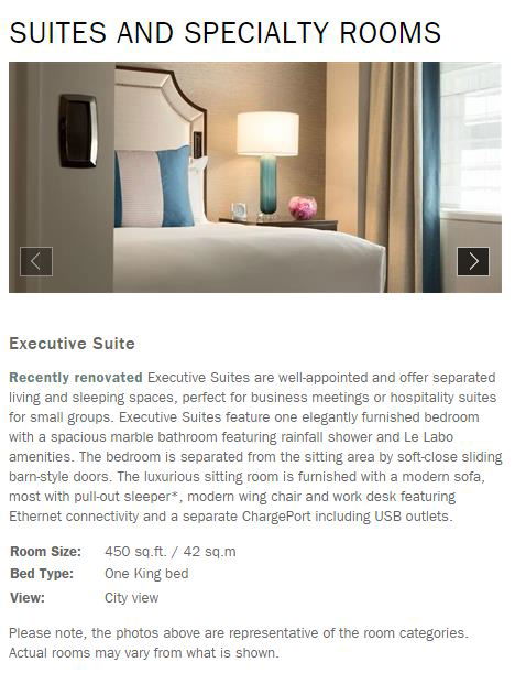
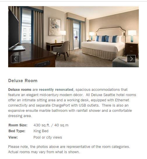
In other words, while I received an upgraded room in every sense of the term, I would have much preferred to have stayed in a large deluxe guestroom rather than a tiny suite.
Breakfast was capped at $64 per day per guestroom, and each day I went over by about $10 including service charges (for just myself! — that’s what I get for ordering a pot of coffee, crab omelette, English muffin and juice through room service), — and those overages showed up on my bill. I actually asked the front desk about how they came up with $64, and I was told that was the average check for two (two!! keeping in mind most breakfast entrees hit the $26 mark without beverages or extras) people at breakfast. I get that every hotel interprets “complimentary breakfast” differently, but it seems wildly chintzy to charge for a few dollars over an arbitrary limit. (I was told that this was to prevent people from “ordering a side of caviar on their omelette.”)
The Renovated Guestrooms
Oy vey.
In my November review, of the upcoming refresh I wrote: “I hope that the renovations don’t take away the soul of the hotel, which is palpable. I do hope the renovations add at least some basic technological advances.”
Not only did the refresh take away the soul of the hotel, but I had a few friends check out the room and — independently of each other — all said something along the lines of “this feels like a mid-range Las Vegas hotel.”
Previously, the rooms had been a little “grandma’s house,” but, like, if your grandmother was a fabulously wealthy society doyenne with impeccable, if traditional, taste. The furnishings were of highest quality and the decor was well thought-out, if a bit fuddy duddy. I knew that part of that was the fact this was once a Four Seasons, but I’d hoped that the Fairmont would keep up the high class look.
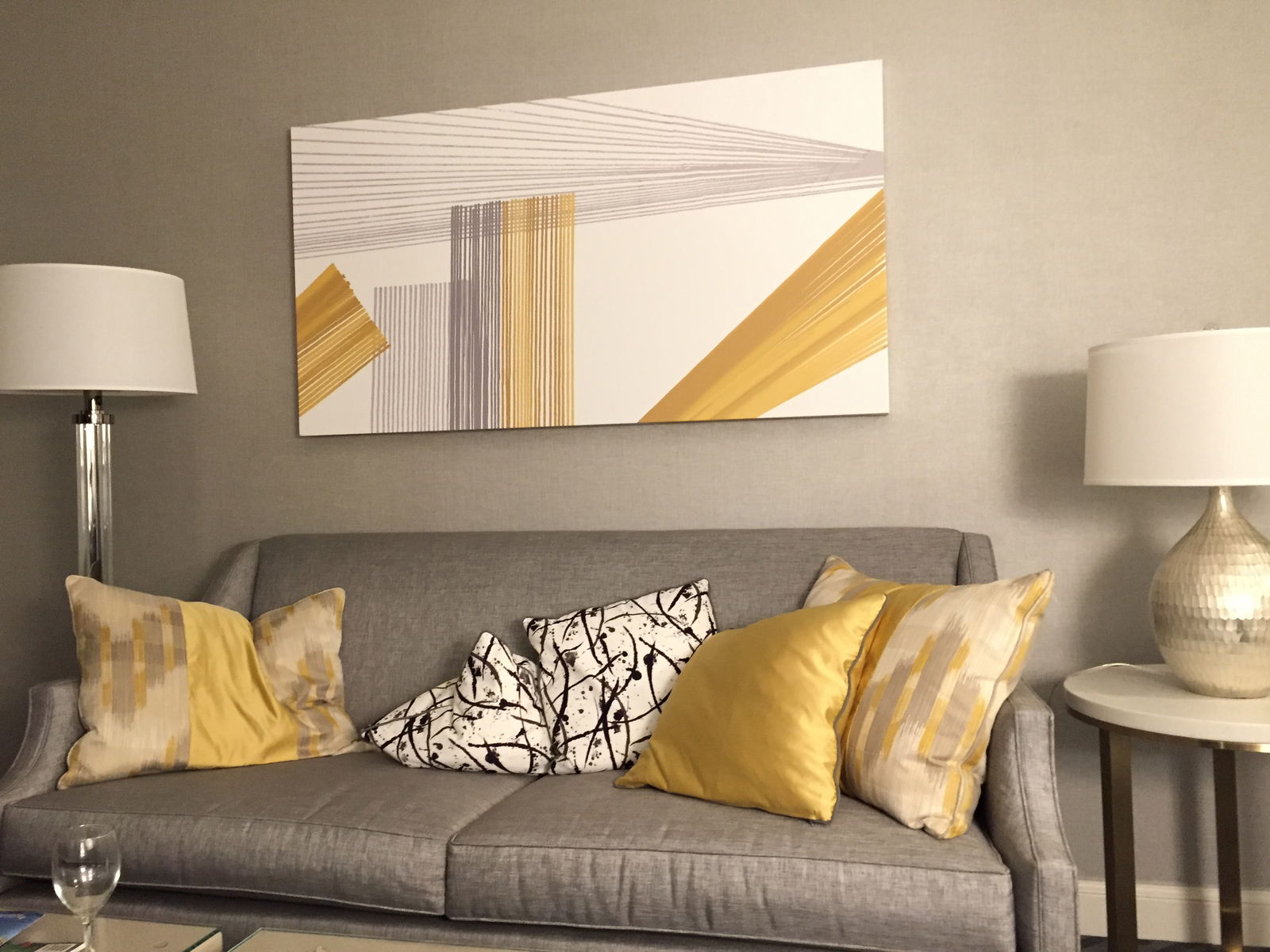
Instead the Fairmont must have told its designers to use all the metallics and grayscales in the world, because my room managed to be both drab and tacky at the same time.
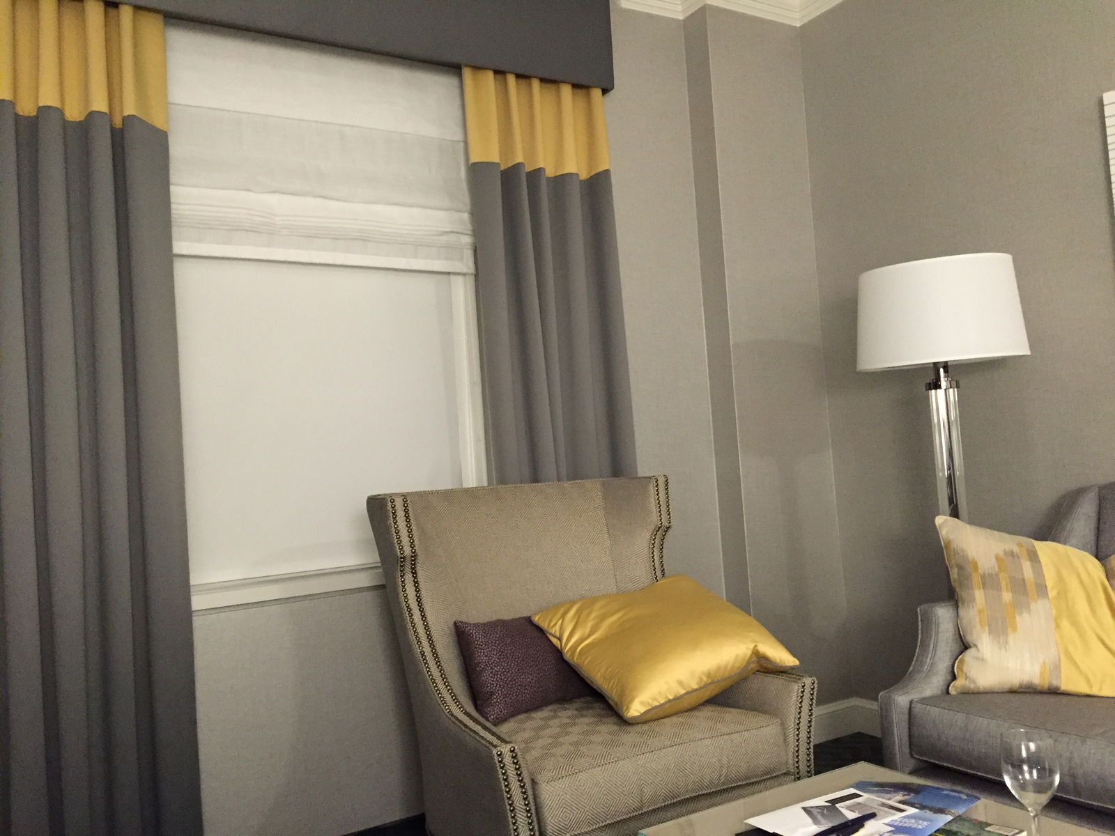
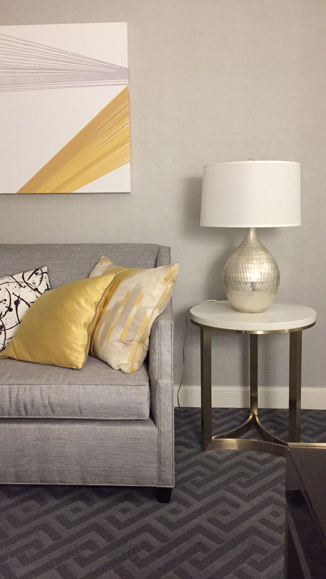
The living room featured metallic silver wallpaper in the living room against a gray pattern carpet with metallic-flecked gray fabric furniture and gray curtains. The floor lamps were lucite, and it all felt very much like they tasked a W Hotel designer to “make it classy.”
The curtains were merely decorative, as they did not close. (Instead, the window featured two layers of blackout shades, which did a marvelous job of blocking out the light.) It boggles my mind how anyone would think decorative, non-functioning curtains would class up a room.
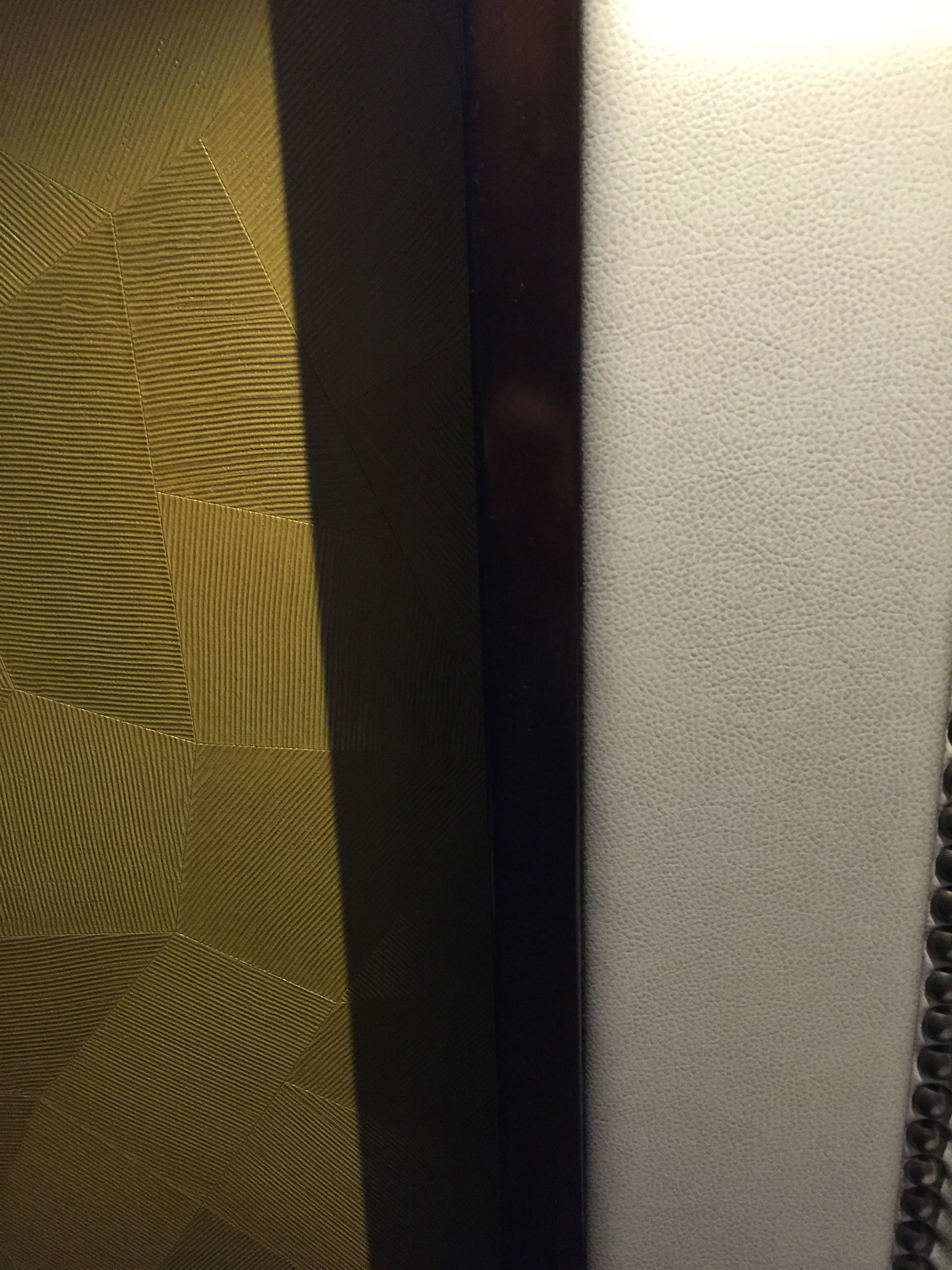
As for the (minuscule) bedroom, the wallpaper behind the bed was gold metallic instead of silver, featuring a subtle geometric pattern.
It was ugly.
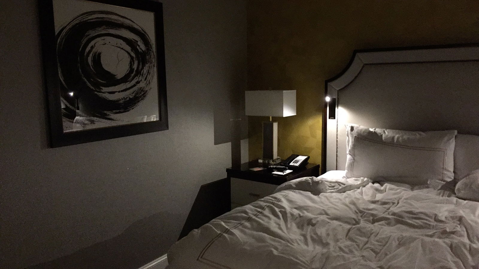
The bed itself was incredibly comfortable, but also startlingly modern-looking, a sort of pale grayscale faux-snakeskin patterned hulk of a thing whose only redeeming features were the two built-in, pop up reading lamps on either side of the bed.
On the plus side, the bedside tables do contain USB charging ports. If you can find them (it took me a day, as they are located on the side of the table and not on the table itself, are the same color as the table, and aren’t clearly labeled). So that takes care of my complaint about the old rooms and the lack of any bedside outlets.
That said, that was about it for technological advances — with all the time and money spent on renovating the rooms, they didn’t add any bedside controls for lighting, window shades, and the like, which is a lost opportunity.
Finally, with a breath of relief I can say the bathroom renovations are a net positive. The bathrooms were bright, spacious and relatively subdued though covered in white carrara marble. The mirror had built in lighting and all-in-all it was a beacon of good taste in comparison to the guestroom decor.
Dear Fairmont: PLEASE DON’T RUIN THE LOBBY
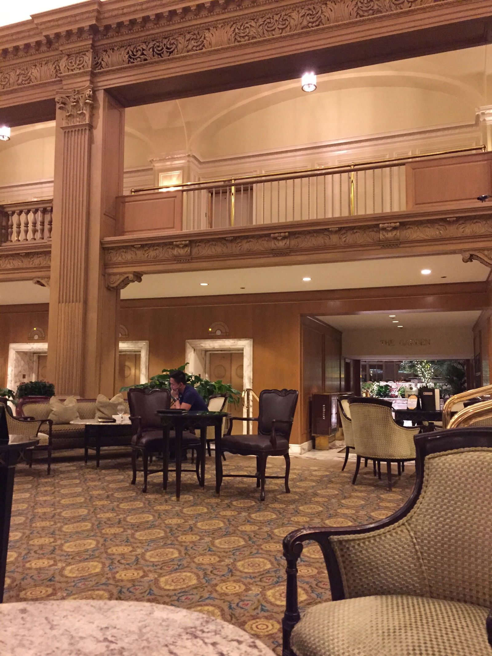
While having drinks with friends in the charmingly throwback lobby bar, our cocktail server casually mentioned that the lobby was due to be refreshed. She said they would keep some of the historic details — as well they should because I believe as a historic landmark they couldn’t mess with the historical nature of the grand space — but would totally replace the furniture with stuff that’s “way more modern.”
PLEASE GOD NO, FAIRMONT.
The furniture in the lobby, again leftover from the Four Seasons, is incredibly high quality and utterly timeless.
Do not replace it with some crap your designer found at a Z Gallerie.
Instead — though I’m sure it’s much too late now — when you have an expensive piece of furniture, reupholster it. You can get a refreshed look while staying true to the classic lines of a gorgeous, historic hotel.
Bottom Line
With a poorly thought out renovation, the Fairmont Olympic Seattle has gone from being a grand old dame with dignity, to an old lady with bad plastic surgery. The new rooms seem furnished from the depths of a Z Gallerie, as I mentioned above, and are entirely lacking in timelessness. Instead, they will feel thoroughly dated in just a few years.
I suppose it was naive of me to think that Fairmont would redo one of its flagship hotels on a Four Seasons budget, but it’s disappointing nonetheless because the guestrooms and the guestroom floors feel so cheap and Vegas-y as a result. On top of that, the heavy reliance on metallic grayscales in the renovation lends the rooms a dark, gloomy feel – which is unfortunate anywhere but especially in Seattle.
While the service remains terrific at the Fairmont, I’ve also had excellent service at the Grand Hyatt — whose rooms are larger, far more tastefully designed and more technologically advanced than the Fairmont Olympic’s.
I hesitate to “withdraw” a recommendation on a hotel based on decor alone, but it worries me that, in renovating a historic classic, the Fairmont sucked the soul out of the Olympic.
Have you stayed in one of the refreshed rooms at the Fairmont Olympic? And would you rather have a room with a “modern but cheap” look or a “high quality but dated” look? I’d choose the latter every time!


Alex S is right about the Barclay, all it needed was a refresh not a total make over which has turned it into a bland generic looking place, with some questionable designs - it could be in Dubai or Beijing, no feeling or respect for what was a real New York looking, fine hotel. I have found this to be the case in a number of U.S. hotels recently- the Plaza has been ruined as...
Alex S is right about the Barclay, all it needed was a refresh not a total make over which has turned it into a bland generic looking place, with some questionable designs - it could be in Dubai or Beijing, no feeling or respect for what was a real New York looking, fine hotel. I have found this to be the case in a number of U.S. hotels recently- the Plaza has been ruined as well. If you want to see a totally professional renovation of a classic look no further than the Savoy in London, it's operated by Fairmont but they were not responsible for the work!
These are my same thoughts about the Intercontinental Barclay in NYC. What used to be one of my favorite, classic hotels has been completely ruined by a "modern" upgrade.
Yes, the Intercontinental was starting to get worn, but it was predictable and stood out as from another time. Dependable, faithful, never-changing. It was like coming home to visit an old friend every time I was up in NYC.
Now all of it's been...
These are my same thoughts about the Intercontinental Barclay in NYC. What used to be one of my favorite, classic hotels has been completely ruined by a "modern" upgrade.
Yes, the Intercontinental was starting to get worn, but it was predictable and stood out as from another time. Dependable, faithful, never-changing. It was like coming home to visit an old friend every time I was up in NYC.
Now all of it's been demolished and turned into some generic hipster-centric trendy crap.
Maybe you should start a blog for interior decorators
At the end of the day, how was the crab omelette from room service? Not too dry, was it?
"gone from being a grand old dame with dignity, to an old lady with bad plastic surgery"
great line and spot on. i hate, hate, hate the cheap modern look that has proliferated in the age of IKEA. in my experience, sofitel has the most consistent aesthetic that conveys comfortable, modern luxury without looking too fussy or antiquated. the one in beverly hills is a good example.
That's so disappointing when new design doesn't respect the original feel of the hotel. The Palace Hotel in SF did an amazing job at their renovations. It maintains the charm and history of the space but with modern amenities like Toto washlets in the rooms.
C.P., totally agree with you that the Palace is a perfect example of a historic grande dame whose renovations honored the heritage and spirit of the hotel while keeping the guestrooms comfortable, up-to-date and fresh.
Considering a substantial number of Fairmont's properties are historic grande dames, their approach to the Olympic is disconcerting.
I stayed there a couple weeks ago, also in an Executive Suite. Instead of Silver and nasty Gold, my room was done in Silver and Teal, and I thought it was modern and classy.
As for the furniture in the lobby, I found it old and worn. The couches down by the valet were saggy and looked awful.
The Guest rooms and lobby, definitely don't match.
Same experience at the Fairmont Victoria which their newly renovated rooms and def offercharging food offers and afternoon tea
Oh no!! I'm sorry to hear that. I had never stayed there before but stayed there this past June as I was in town for an interview. They put me there at the Fairmont. I actually really liked it. I was not in a suite, just a regular room. But I thought the bathroom was awesome, the towels and linens all excellent (plush towels, soft and high thread count sheets, etc etc) and I liked...
Oh no!! I'm sorry to hear that. I had never stayed there before but stayed there this past June as I was in town for an interview. They put me there at the Fairmont. I actually really liked it. I was not in a suite, just a regular room. But I thought the bathroom was awesome, the towels and linens all excellent (plush towels, soft and high thread count sheets, etc etc) and I liked the décor in the rooms. Service at all touches (check in, concierge, gym) was excellent. And the breakfast room (I think it was called the Georgian) was excellent. Tremendous service and I thought the food there was both traditional and creative (loved the avocado toasty for breakfast). I really liked it and I'd stay there again.