
Brussels Airlines has just revealed the details of a major rebranding, including the introduction of a new livery.
In this post:
Brussels Airlines’ new livery
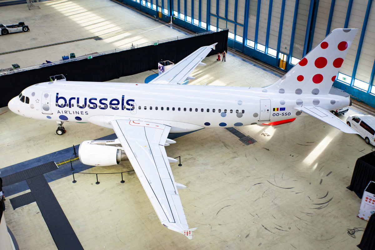
Brussels Airlines, which is part of the Lufthansa Group, has just unveiled a new livery. This new livery is supposed to confirm the carrier’s “position in the market as Belgium’s home carrier.” As the company describes this:
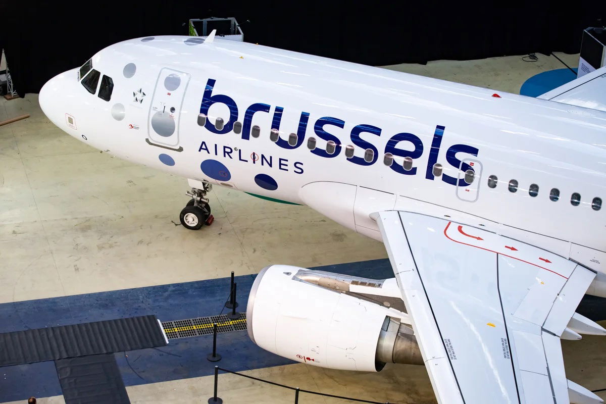
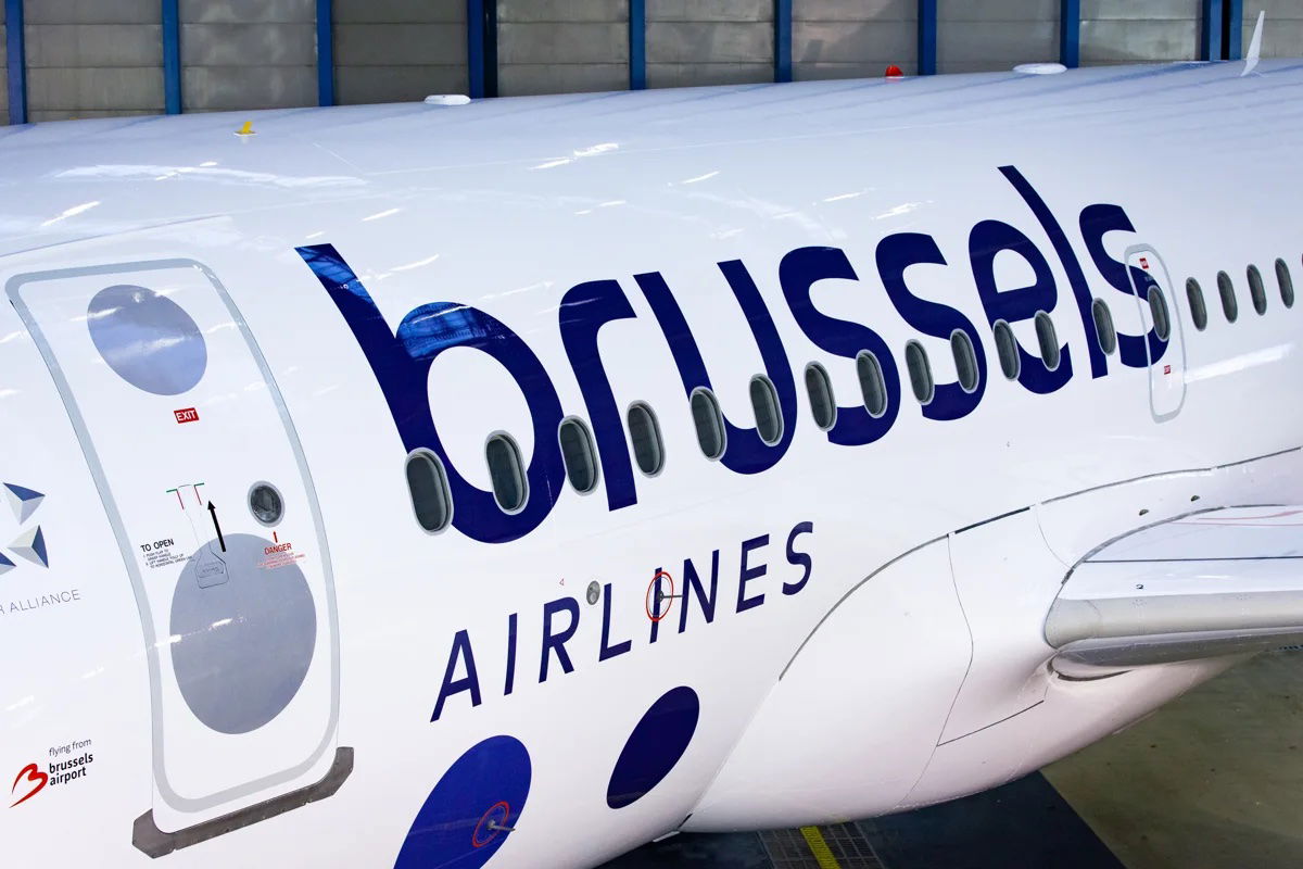
- The new livery features a new version of the Brussels Airlines signature red and blue colors, as they’re now a deeper red and a darker share of blue
- The dotted “b” that’s currently on the tail is being replaced by nine dots of different sizes in the form of a square, to represent the diversity of customers, destinations, and employees, with no two dots being alike
- The updated logo makes use of a new, more modern type font
- The two words of the brand name are now stacked, with the word “brussels” gaining more importance with its larger size, to emphasize the carrier’s Belgian identity
The new livery is very… white. And with all those dots, I’m kind of getting flashbacks to biology class in middle school.
For context, below is what Brussels Airlines’ previous livery looked like.
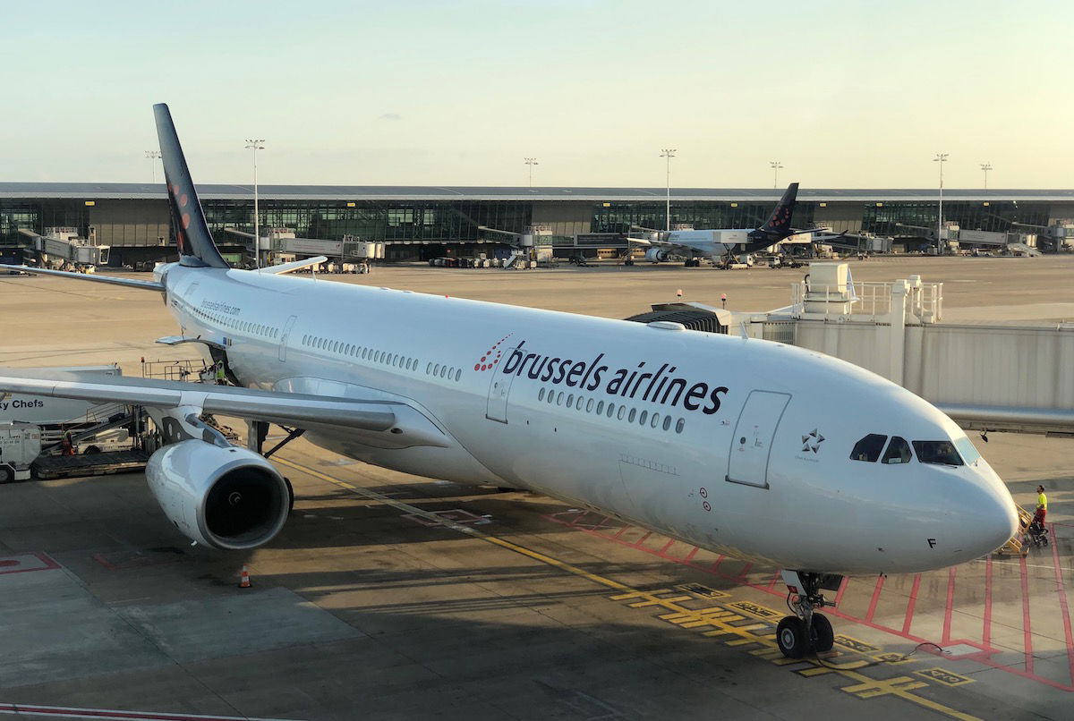
My initial thought is that I prefer the old livery to the new livery. I thought the old livery was one of the better ones out there, and still felt quite modern, really not in need of a refresh.
However, I’ll admit that many of us avgeeks are pretty consistently opposed to any livery changes, and it can take a while for them to grow on us. For example, I hated Lufthansa’s livery when it was first introduced, but now I kind of like it, I think?
Brussels Airlines’ new brand identity
Brussels Airlines claims that this rebranding is more than just a new livery, but that it’s part of a new brand identity for the airline. Frankly Brussels Airlines has long lacked an identity as an airline, due primarily to Lufthansa Group not being able to decide what to do with the airline, specifically regarding how full service the airline should be.
Here’s how the airline describes the rebranding in a statement:
As a consequence of the COVID-19 crisis, Brussels Airlines accelerated and intensified in 2020 its transformation plan Reboot Plus, in order to pave the way for a future-proof company that is able to face the competition, with a sound and healthy cost structure.
After the restructuring, the company started the second phase of its Reboot Plus plan: the build-up and improvement phase. Brussels Airlines now turns its attention to the future with strategic investments in an improved customer experience, new technologies, digitization, new ways of working, and the development of its employees.
The Belgian company is transforming to become a healthy, profitable airline that offers perspectives to its customers, partners and employees; an airline with a constant focus on the environment and the reduction of its ecological footprint. A New Brussels Airlines.
Here’s what Brussels Airlines CEO Peter Gerber says about the transformation:
“We want to clearly mark the start of the New Brussels Airlines. For our customers, who deserve the best, but also for our employees, who are committed to the transformation that we’re pushing forward and to which they contribute every day. That is why today we present the visual translation of our new start. With this new brand identity, we are ready to show our customers, our employees, our partners and all other stakeholders that we are turning a page. As one of the four Lufthansa Group network airlines, we are building the way towards a promising future. We see this new brand identity as a symbol of confidence in our company, re-emphasizing our identity as Belgium’s home carrier.”
All of that of course sounds great, but it doesn’t seem like there’s much substance or specific details to back up this plan, at least as of now? It’s kind of like when a restaurant markets itself as offering seasonal and locally sourced cuisine — those are buzzwords restaurants love, but they don’t actually tell me a whole lot about what to expect.
So it’s nice that the airline is going to make strategic investments, improve customer service, have new technology, and be sustainable, but doesn’t that describe virtually every airline?
Bottom line
Brussels Airlines has revealed the details of its rebranding, including the introduction of a new livery. It always takes a while for new liveries to grow on me, so I’m curious what OMAAT readers think.
The airline claims there will also be substance behind this rebranding, with a new focus on customer service, investment in a better experience, a focus on sustainability, etc. That doesn’t tell us a whole lot, though, because I feel like every airline promises those things.
What do you make of Brussels Airlines’ new livery and brand identity?


Looks like an Eurowings+Croatia Airlines mashup
As someone who has been involved in airline brand development in a past life…I have seen better and I have seen worse. However on balance, at first blush, asking myself what is this airline without knowing the livery; brussels airlines stood out. This is what you want in branding; immediate brand recognition. That is the only good news here. The problem with this livery is unless I read “brussels” on the side of the aircraft,...
As someone who has been involved in airline brand development in a past life…I have seen better and I have seen worse. However on balance, at first blush, asking myself what is this airline without knowing the livery; brussels airlines stood out. This is what you want in branding; immediate brand recognition. That is the only good news here. The problem with this livery is unless I read “brussels” on the side of the aircraft, it is a white plane with a bunch of dots. There is too much white space on the tail, so the logo looks like a bunch of colored dots and not a specific design. I like white on a fuselage, but only when the logo jumps out at me and tells me who you are (think SAS 1982-1999 logo). When you saw that airplane; you could tell it was SAS. You didn’t need letters on the bottom of the fuselage telling us who you are at 10000ft (Emirates?). The old livery was a bit on the dull side, but you could tell from the tail who this was (after a lead in period).
Do I like it? It’s not awful, but I am less certain about how they will build a brand around dots. Something tells me that this will get “a refresh” down the road.
Actually, it’s an improvement from the previous livery but that’s not saying a lot. It seems rather “busy.”
Meh. It’s uninspired, in my opinion, but probably the only type of banal compromise acceptable after winding its way thru all the corporate committees.
SN’s bigger troubles — how to reconcile disparate parts, to accept a legacy lost, to smartly leverage a subordinate role in the group — are all intractable problems.
What’s the strategy? Why can’t SN pick a lane and stick to it: Boutique airline serving Brussels? Feeding BXL hub for Africa...
Meh. It’s uninspired, in my opinion, but probably the only type of banal compromise acceptable after winding its way thru all the corporate committees.
SN’s bigger troubles — how to reconcile disparate parts, to accept a legacy lost, to smartly leverage a subordinate role in the group — are all intractable problems.
What’s the strategy? Why can’t SN pick a lane and stick to it: Boutique airline serving Brussels? Feeding BXL hub for Africa connectivity? LCC across Europe? Eurowings (or not)?
Can’t only blame SN for indecision, because their troubles mirror those of Belgium itself. How to bring together a profitable African network (wealthy Flanders) while racing to the bottom with intra-European flights (struggling Walloon region)? Not to mention being a hapless junior partner to their self-interested LH overlord (Brussels & EU institutions)? Maybe there just isn’t a workable solution to hold it all together.
Like FFF, I am a taxpayer in Belgium. Spot on comment about SN (and previously SABENA) being an expensive hobby of petit esprit bourgousie. Their vainglory can no longer drive the airline’s business strategy. I don’t know if SN will settle on a smart strategy (one more inspired than that new livery) before Flemish taxpayers decide to pull the plug.
Utterly pathetic.
A waste of Euros
Just as the "runway lights" "b" was finally starting to become iconic... Can't tell now whether you're looking at a Brussels Airlines tailfin or Croatia Airlines. And the all-lowercase is so 25-years-ago.
One can't help but wonder what advice these airlines get sometimes.
What about an airline changing its approach to business and then updating its look? A new livery before a company's new focus is -seriously– quite meaningless. Good luck, Brussels Airlines, but seriously, your gimmicks do not impress me at all.
I flew JFK-BRU with SN last weekend and it was honestly a great business class. The “new” hard product they’ve installed is better than the rest of the LH group and the crew were friendly and attentive. Most Covid service cuts also seemed to have been rolled back which is a major plus. The only thing that wasn’t great was the dirty, out of place Eurowings livery which bore no resemblance to the airline nor...
I flew JFK-BRU with SN last weekend and it was honestly a great business class. The “new” hard product they’ve installed is better than the rest of the LH group and the crew were friendly and attentive. Most Covid service cuts also seemed to have been rolled back which is a major plus. The only thing that wasn’t great was the dirty, out of place Eurowings livery which bore no resemblance to the airline nor helped anyone identify which their aircraft was! High time for a rebrand, regardless how generic.
Funny; now it looks a fair amount like Croatia Airlines' livery :-P
If that was the best they could come up with, how dire were the alternatives?
Does livery have to have 'meaning'? And if that meaning is incomprehensible to the average bystander, and needs to be explained by the creator of it, surely it is a failure.
It screams ULCC in my opinion, which is probably not what the Lufthansa Group management had in mind.
The new one is fine and no worse than the old one, as some have said, still a bit generic though. Also both have similar amounts of white, the only difference being there was more tail concentration on the old one.
It's not unattractive, but neither was the old livery. I wonder about the meeting where someone suddenly said what this airline needs most is a new livery.
The biggest question is whether the are keeping the Smurf livery.
Okay, fine, I at least think it’s better than the new Lufthansa livery, but not by all that much. It looks like a bad knockoff of Croatia Airlines and Fly Pop. I’m not sure how this design has anything to do with Belgium, so I agree, what they’re saying to justify it seems kind of like BS. It has an undistinguished, unmemorable logo that could just as easily be for a tech or medical company...
Okay, fine, I at least think it’s better than the new Lufthansa livery, but not by all that much. It looks like a bad knockoff of Croatia Airlines and Fly Pop. I’m not sure how this design has anything to do with Belgium, so I agree, what they’re saying to justify it seems kind of like BS. It has an undistinguished, unmemorable logo that could just as easily be for a tech or medical company in America or Asia. They could have even arrange the big dots so that they form a letter “b” (they could’ve just flipped the logo horizontally), but they didn’t think about that. On a side note, I do think it’s weird how ever since they rose out of SABENA’s demise, they used Brussels instead of Belgium in their name when they’re the primary network carrier of the country.
And Ben....
I appreciate the current situation, but I'd love to see soon more articles/posts covering airlines/flights instead of credit cards...
Hi Ben
Sitting right now in ORD United Business lounge (Polaris will not open untill mid Dec, can someone explain me why? ERD Polaris is open).
Flying back to BRU in couple of hours, and I've read the comments on your post with interest.
As a Belgian citizen and taxpayer, I have mixed feelings. I could only guess what I, my ancestors and my offspring will have paid for all these ...whatever.
SABENA ( as super VC10 has maybe unwillingly explained) and Brussels Airlines, always has been an expensive hobby of petit esprit bourgousie.
Taxpayers, and in particular the Flemish ones, those who always pay the bill, will have had enough soon.
Having said that, service and staff is excellent.
I wish I had a Brussels Airlines flight instead of UA...
Croatia Airlines meets JAT Airways
When i first saw the photo I also thouit is an article about Croatia Airlines. A bit strange choice to have so similar livey as another EU carrier
Their explanation of the new design is hilarious -- just complete nonsense marketspeak BS doubletalk, which is undoubtedly what the graphic design firm provided them upon presentation of the bill -- "the typeface is now more modern!" (in fact, this typeface was trendy in Europe around 1970). The dots are all different sizes now, which honors diversity! (eyeroll). Corporations are so incredibly gullible.
Why does the company write “Brussels” in its press release while on the airplane it is written as “brussels”?
I wonder why this comment was ever upvoted. It is perfectly acceptable for any company to write its name in all-lowercase in the logo, but not otherwise. An example is Air Berlin, and its alliance Oneworld, which many write in lowercase. However, some companies take the all-lowercase approach to an extreme, such as Flair Airlines in Canada.
Even though Air Berlin has been dead for four years, it is still worth pointing out that its name was variously written as either Air Berlin or airberlin; I prefer the former. Similarly, for Oneworld, many people write the first O in lowercase, and some even write the word ‘one’ in bold, but I prefer the O in uppercase as that is what Wikipedia uses. In any case, these things are personal preferences. But with...
Even though Air Berlin has been dead for four years, it is still worth pointing out that its name was variously written as either Air Berlin or airberlin; I prefer the former. Similarly, for Oneworld, many people write the first O in lowercase, and some even write the word ‘one’ in bold, but I prefer the O in uppercase as that is what Wikipedia uses. In any case, these things are personal preferences. But with Brussels Airlines, the lowercase approach of the logo has nothing to do with the official spelling, which will always be Brussels Airlines and not ’brussels AIRLINES’.
Looks like a creation of artist Yayoi Kusama
https://m.youtube.com/watch?v=x8mdIB1WxHI
It doesn't do much for me but then I really don't care what's on the outside of the plane. The product inside is much more important. As a frequent traveler to Africa, I'm always happy to take Brussels or any Star Alliance carrier such as Ethiopian. Both are much better than DL/AF in my experience.
I kind of like it. Every new livery lately is a half painted plane with a solid in the back. It's nice to see something different (though it does look an awful lot like Croatia)
As long as they nickel and dime you for everything unless you are on an expensive fare, Id save my money and fly a real LCC for less
Painting a plane is like giving a make over to a person with cancer w/o treating the cancer. I never understood this back from when TWA did it and I said I couldnt care what the outside of the plane looks like , its the inside the plane that counts
We'll call it: the clown livery.
Why rebrand and waste more money on a company that hardly makes any?
To me, the old livery says, "Eurobusiness." The new says "Eurofun." The new livery makes sense if they want to position Brussels as a LCC that flies to vacation destinations. But their route map strikes me as much broader than that sort of niche.
It looks very like Croatia Airlines!
They must have money to waste.
Looks like Croatia Airlines.
How much did it cost to have someone "design" that ?
And how much more to apply it to the fleet, signage etc
Disgusting waste of money
CS failed at integrating them under the Eurowings brand. This new livery is intentionally generic, and thanks to it being euro-white, they can redistribute airplanes faster within the LH group.
Clarification: CS = Carsten Spohr, Lufthansa Group CEO.
I don’t get it. If the rebranding is all about emphasising their origins, why not rebrand as ‘Belgium Airlines’ instead of rehashing ‘Brussels Airlines’.
I’ve always found that name a bit weird. I mean you don’t really hear of national carriers with names like ‘London Airways’ or ‘Paris Airlines’.
I agree, Duck Ling.
Why name what is essentially Belgium's national flag carrier after one specific city?
In the 1980s and 90s I enjoyed many great flights with SABENA (Societé Anonyme Belge d'Exploitation de la Navigation Aérienne) ~ Belgian World Airlines. The airline was quite glamorous (I loved the 747's Upper Deck lounge), and it was a shame when the 78-year-old carrier folded in 2001.
My dozen or so flights with Brussels Airlines...
I agree, Duck Ling.
Why name what is essentially Belgium's national flag carrier after one specific city?
In the 1980s and 90s I enjoyed many great flights with SABENA (Societé Anonyme Belge d'Exploitation de la Navigation Aérienne) ~ Belgian World Airlines. The airline was quite glamorous (I loved the 747's Upper Deck lounge), and it was a shame when the 78-year-old carrier folded in 2001.
My dozen or so flights with Brussels Airlines have all been totally unremarkable. Rather than a new livery, what is really needed by this LCC is some kind of 'personality' - which is sorely lacking. In my opinion, Brussels Airlines is one of Europe's most boring airlines, and this new paint scheme doesn't change that.
Totally agree with that you and Duck said, in fact, I was literally thinking of this exact thing last night and found out about the new livery this morning. Like I understand Belgium is a small country where the vast majority of travel goes through Brussels, but still you don't see other countries calling their airline after the capital city. I thought the old livery was strange anyway, a grey underbelly, then a purple tail...
Totally agree with that you and Duck said, in fact, I was literally thinking of this exact thing last night and found out about the new livery this morning. Like I understand Belgium is a small country where the vast majority of travel goes through Brussels, but still you don't see other countries calling their airline after the capital city. I thought the old livery was strange anyway, a grey underbelly, then a purple tail with red dots to make a lower case b, and along with the name it honestly made me think it sounds more like a regional airline. And with this new livery it's proven my point even more. Everything in lower case and some basic dot design really reminds me of a budget or regional carrier.
Another thing I found out about not too long ago is that Belgium does have another airline, called Air Belgium, which actually looks like the flag carrier instead. First off the name is more appropriate, its got the colours of the belgian flag and the design is a crown to represent the kingdom instead of some weird modern art b thing. I'd want them to become the flag carrier!
Belgium is essentially a non-country. The only remarkable thing about Belgium is that Brussels is the headquarters of the EUssr.
Otherwise Belgium is highly divided as it consists of 3 parts with different languages and cultures (German, Belgian and Dutch). Divide is so bad that Belgium was even without a functioning government for several years. No wonder the airline does not want to be associated with that.
You mean German, French and Dutch.
The French would dispute that characterization, @VT-CIE, but the Walloons might or might not depending on who made it.
At least they are no longer somewhere in between Eurowings and Lufthansa/Swiss/Austrian. They can now fit much more equally with the others, since none of them are proper full service carriers anymore.
Brussels is the nest major carrier connecting Europe and Africa.
They tend to have rather prohibitive eligible booking classes with Star Alliance partners, plus no service whatsoever, unlike AF/KL.
Ugh, another eurowhite... not surprising but I'm definitely not a fan! As to the brand identity, time will tell if any changes are actually made or if these are just the classic "buzzwords" airlines love so much.