I’m a huge fan of airline marketing and branding, and it’s something I probably pay more attention to than the average person (shocker, I know!). I love when an airline has a cool logo, whether it’s United Airlines’ old tulip logo, Delta’s widget, or Lufthansa’s crane. The reality is that most airlines significantly evolve their logos over the years, or even change them completely.
In this post, I want to talk a bit about Air France’s logo, which I think is the most elegant of any airline. The backstory is perhaps the coolest part, as it really emphasizes how timeless this logo is.
In this post:
I love Air France’s winged seahorse logo!
Air France’s logo is a winged seahorse (hippocampe ailé), and its history dates back nearly 100 years, as I’ll cover below. Despite that, very little has changed about this over the years, and if anything, Air France is increasingly featuring this in various parts of the customer experience.
I think this is really cool for two reasons. First of all, I just think it’s a generally badass logo. It’s fun and mysterious, and in a way, sums up how airlines can connect the world, over land and sea.
Second of all, I’m just generally impressed by how widely Air France is using this logo. In many ways, you don’t even need to see the “Air France” name anymore, as so many customers touchpoints have the logo, and it’s an instant reminder of the airline.
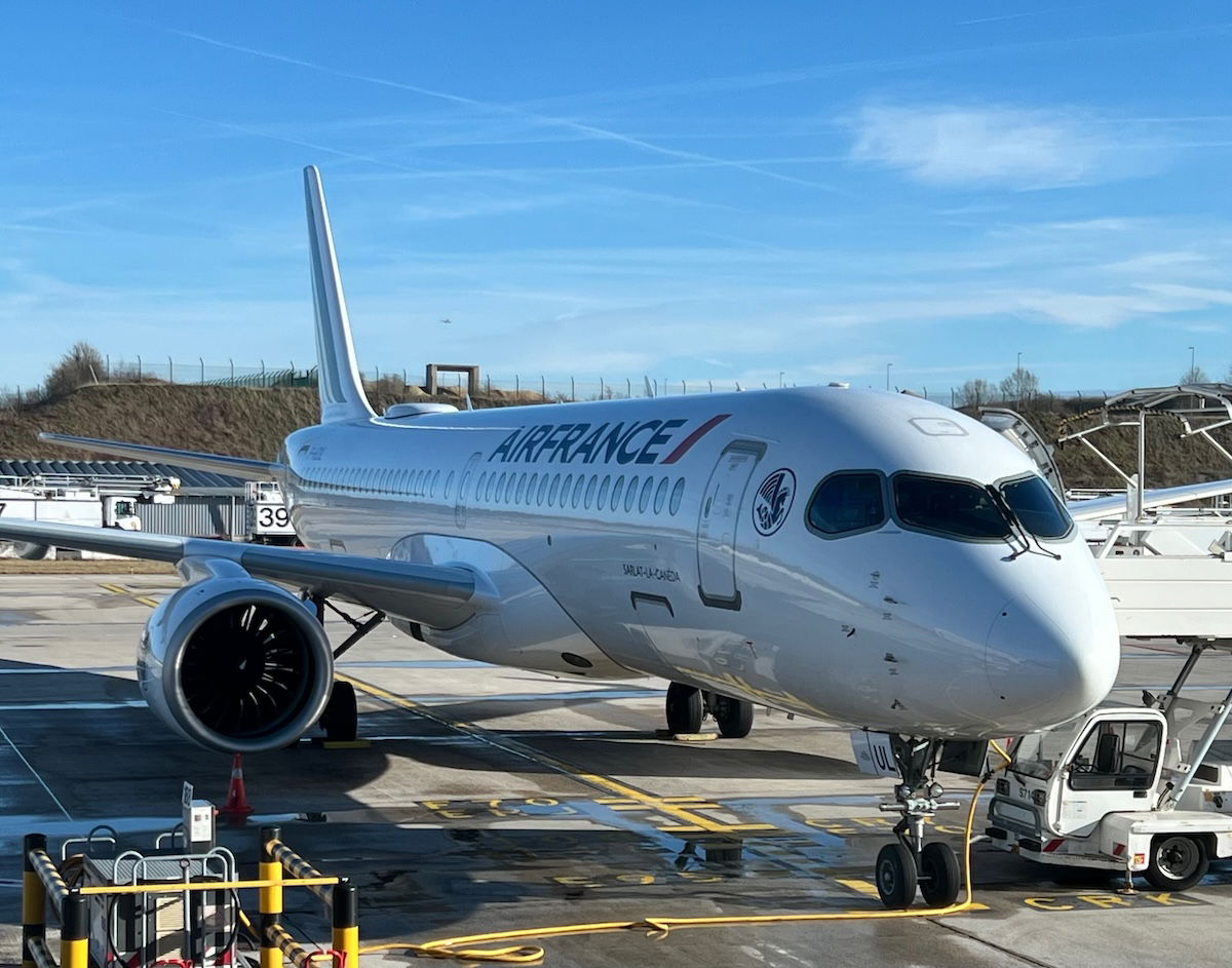
You’ll see the logo just about everywhere, from the front of the aircraft fuselage…
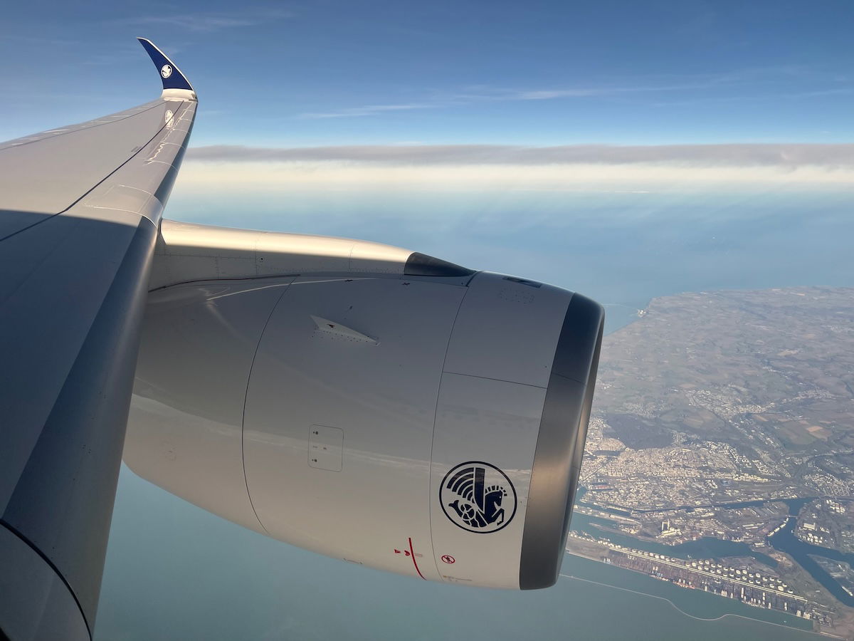
…to engine cowlings and wingtips…
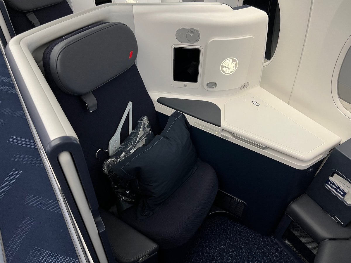
…to seat branding…
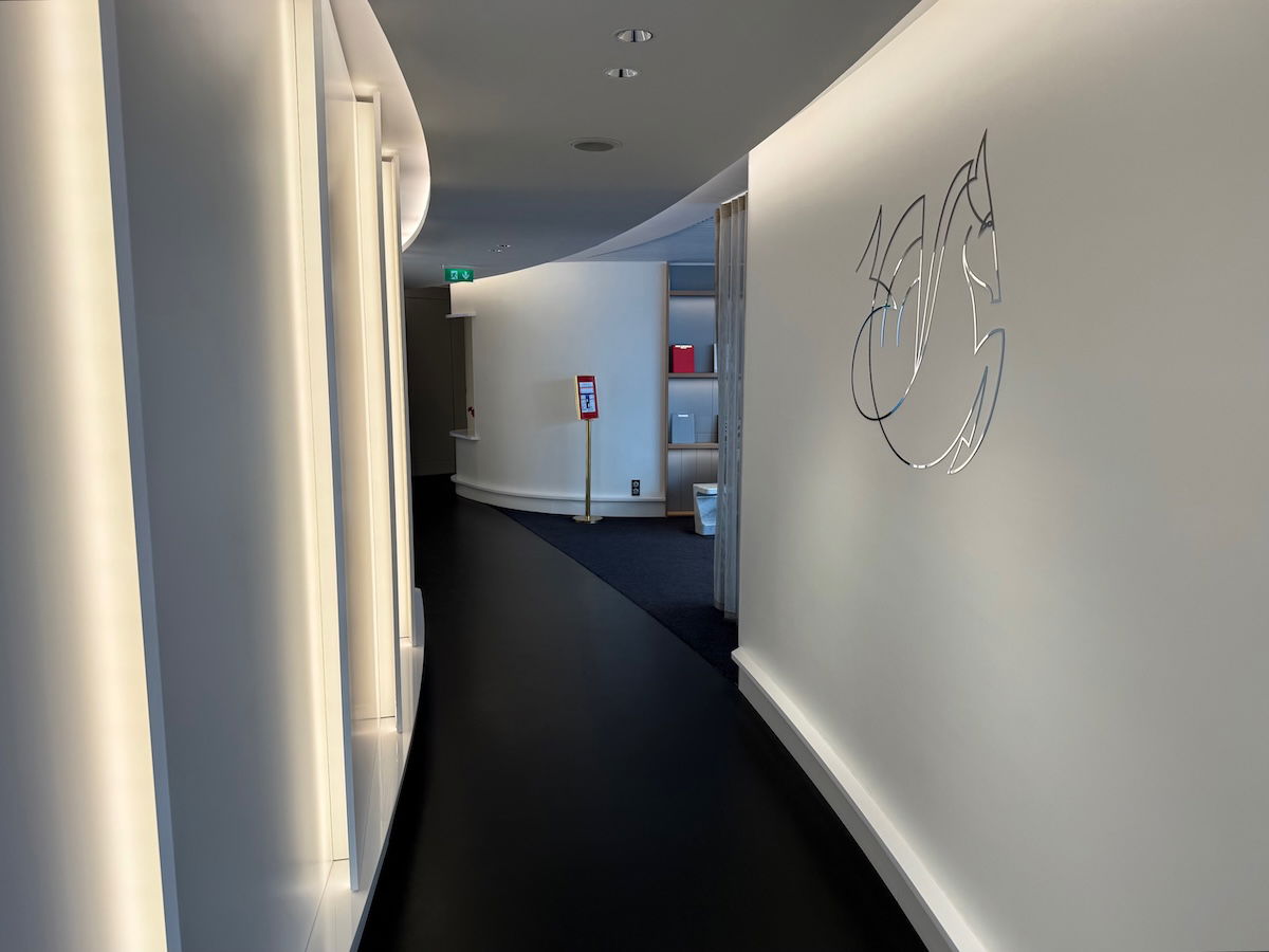
…to lounges…
…to inflight service items…
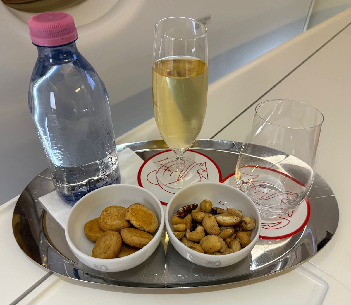
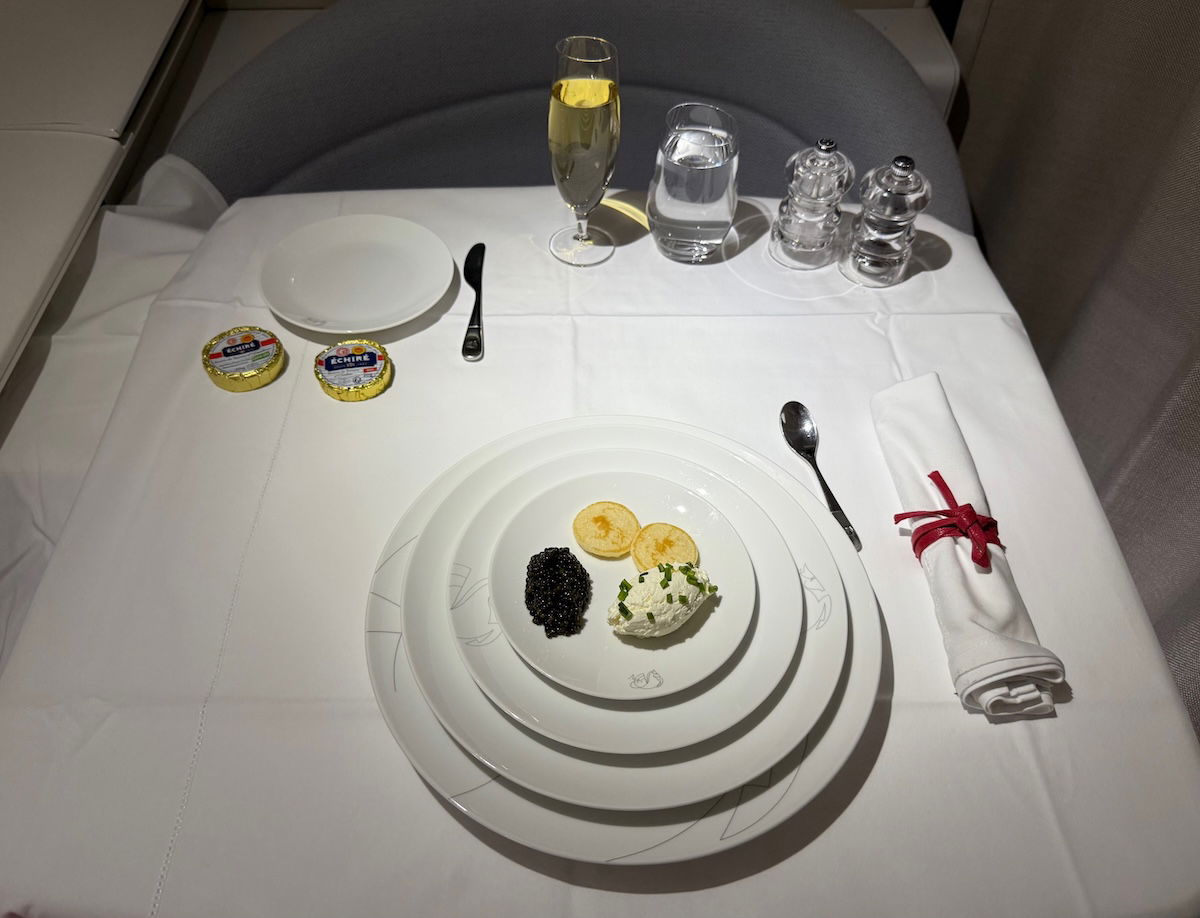
…and much more. You get the point. I can’t think of another airline in the world that uses its logo as consistently as Air France, and I think that’s really cool.
The history of Air France’s winged seahorse
Perhaps what I find most interesting about Air France’s winged seahorse logo is that it has been around for nearly 100 years. Heck, the logo has been around longer than the airline has had a name. How is that possible?
Well, Air France was founded in 1933, as a merger of five different French airlines — Aeropostale, Air Orient, Air Union, Compagnie Internationale de Navigation Aerienne, and Societe Generale de Transports Aeriens. At the time, the decision was made to name the airline Air France, and as you’ll see below, even the carrier’s first planes had the winged seahorse logo prominently displayed.
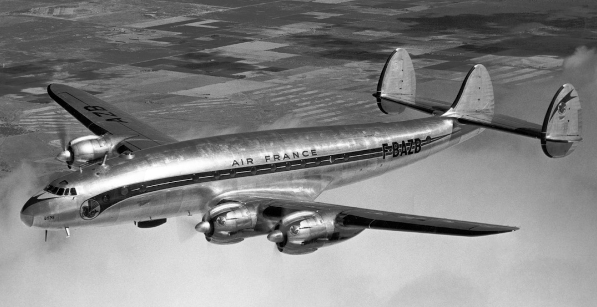
The winged seahorse logo actually belonged to one of Air France’s predecessors, Air Orient, which commenced operations in 1929, prior to becoming part of Air France in 1933. Below is the Air Orient logo, and as you can see, almost nothing has changed compared to 100 years ago.
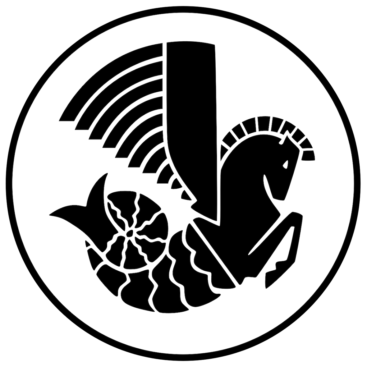
What’s the inspiration for the design of the winged seahorse? Going back to the days of Air Orient, there was disagreement as to whether airplanes or seaplanes were superior (it was obviously a very different time for aviation). So this logo was intended to reflect that, and also to demonstrate that the airline could essentially use the skies to fly over bodies of water, to make the world a smaller place.
Bottom line
There are some memorable airline logos out there, though as brands evolve, airlines often drop them (just look at United’s “tulip” logo from the pre-Continental merger days). What makes Air France’s winged seahorse logo unique is that it has more or less remained unchanged for nearly 100 years, and the airline is even increasingly leaning into this.
I just think that’s so cool, because it’s rare to see an airline stick with a concept for so long. I think this is what we call a timeless logo. Give me that and the Charles de Gaulle chime, and I’m one happy aviation geek.
Anyone else appreciate Air France’s winged seahorse as much as I do?


This symbol has occupied space in my mind all my life because it is shown on the plane in the last scene in the 1942 movie “Casablanca”: the last plane out on a fateful night leaving to freedom from the encroaching NAZI tyranny. It was, in the movie, the last chance to freedom, coveted by hundreds of hopeful travelers, and I’ve never forgotten it.
Looking for fans of Air France’s logo?
Count me in. Why? It projects the romance of early flying, it presents a little mystery, it carries a touch of intrigue, and a Constellation full of class.
(It even makes a brief appearance in one of the best movies ever, Casablanca).
Well done! Vive la France!
When I see a hippocampus logo, my immediate thought is of Omega watches rather than Air France, but AF have had theirs longer. The inspiration for Omega was the decorative but also functional hippocampi on Venetian gondolas, which made for a relatable logo for the Seamaster range.
Fun article. Love the history. Thanks.
The truth is, they want to get rid of it because it's a reminder of Flight 447 plummeting into the Atlantic.
Nothing will ever beat Alitalia's Freccia Alata (winged arrow).
I have always thought it interesting and beautiful. I am so glad to see that it is being continued and even more prominent than it was a few decades ago.
As someone who has never flown AF, I wouldn't immediately think of AF from the seahorse logo. So the line "you don’t even need to see the “Air France” name anymore, as so many customers touchpoints have the logo, and it’s an instant reminder of the airline" may reflect the view of someone who a loyal AF customer.
Thats different from the UA tulip, the LH crane and JAL crane, which are all recognizable to even non-customers of those airlines.
While I agree that someone who has never flown AF or is a non customer might not associate the seahorse logo with AF, why can't the same be said about UA, LH, or JAL? Would a non customer in Malawi or Kazakhstan recognize the tulip or crane for any of these airlines? Sure, UA, LH, and JAL have a larger footprint across the world, but it doesn't mean that their logo is recognizable to all non customers.
Ben, have you been hired by AFs PR department?
I mean, I get it, you’re digging them and are lucky enough to be one of a handful that are able to fly their first class on award miles … it’s just lot of positive Air France press is all I’m saying. ;)
Air France is cool even outside La Première :) I understand Ben's sentiment, I'm charmed by the airline every time I fly them. If only they got rid of tray service in longhaul business, I'd even name them my favourite airline :)
I would go as far as saying that it's not very charming of them to take hot food away from narrowbodies, nor was I charmed by being served food that basically hadn't completed defrosting and was given to me at around 0C on a flight from BCN.
Having said that, AF lounges certainly beat the rodent-infested AMS alternatives, and the experience of flying the airline tends to be less miserable than the Lufthansa equivalent.
It's hard to complain about Air France though... it's like VS without the gamble of getting the 787 coffin.
While I hadn't given the origin of the logo much thought, I would have considered it was a type of Pegasus signifying the leap from ocean liner travel to air travel. Thank you for the history because it is a lovely logo.
Here is a link to the Air France style guide which details which style of hippocampe can be used in which situation. The more modern style is only to be used for LP branding as an example.
I love this post! Your appreciation of the romance of this industry just keeps me coming back.
I always thought that is a Pegasus, a horse with wings. OMG, it is actually a seahorse. Thanks for this very interesting article. I am enjoying it!
I love that logo! Especially because it’s on the plane that Ilsa and Victor board at the end of Casablanca.
There is an entire story about that scene alone. A Lockheed Electra 12A out of plywood and balsa wood at Burbank Airport At one time, that half of the plane was also used as a prop in the Jungle Cruise at Disneyland.
But is the winged seahorse really the logo of air france. I thought maybe its the red strip, thats what is shown prominently on the fuselage. As an economy passenger, you dont see the winged sea horse often
Yes, the main AF logo is the blue Air France text and the red stripe, that's what used in 95% of cases. The seahorse is more of a marketing symbol. I think that's what allows AF to keep its use so traditional since unlike the main logo, they don't really need to modernise it, ever.
The Air France “bar code” tail design is exactly that. It was originally designed for just the Concorde fleet. The measurements of a Concorde tail were put through a computer & that is the modernist design that was created. Bat code style.
It became so quickly popular that AF then put it on all the fleet. Long story short.
The sea horse logo is legendary.
The Air France “bar code” tail design is exactly that. It was originally designed for just the Concorde fleet. The measurements of a Concorde tail were put through a computer & that is the modernist design that was created. Bar code style.
It became so quickly popular that AF then put it on all the fleet. Long story short.
The sea horse logo is legendary.