This week Cathay Pacific has unveiled their rebranding, or I suppose brand refresh would be a more accurate term. They’re calling it “the next chapter,” and they’ve set up a website dedicated to the brand refresh. Here’s how they describe it:
Today, we welcome a simpler, cleaner, more customer-focused Cathay Pacific brand.
Our airline has been built on an absolute dedication to customers, service, quality and safety. As we continue on our journey, we are now unveiling a new design philosophy that will help us shape an even better experience for our customers.
The fruit of an 18-month preparation effort, this new philosophy will guide the design of new websites, lounges, cabins, in-flight service, entertainment products and much more – all with greater consistency, beauty and efficiency. Beyond this, it also clearly defines who we are and what inspires us to help passengers travel well.
Our next chapter begins here.
This is one of the more subtle brand refreshes I’ve seen. I guess they’re also trying to claim that the refresh is symbolic, and that their new design philosophy will help them “shape an even better experience for [their] customers.” Not sure I follow that logic, but I love them to begin with, so…
Take a look at their old logo below, and what they’ll be updating it to:
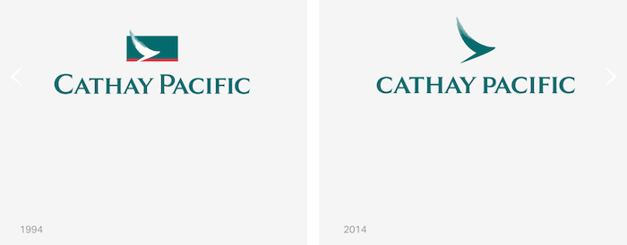
Six in one hand, half a dozen in the other. I liked the old logo, and I like the new one as well. I’ll never quite understand why airlines spend millions of dollars on such subtle changes, but then again I’m no branding expert.
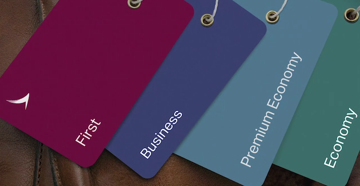
Cathay Pacific has also slightly updated the color coding and branding for each class of service, as you can see here:

On their rebrand website they have a pretty awesome 90 second video about the brand refresh, which is interesting for a whole different reason.
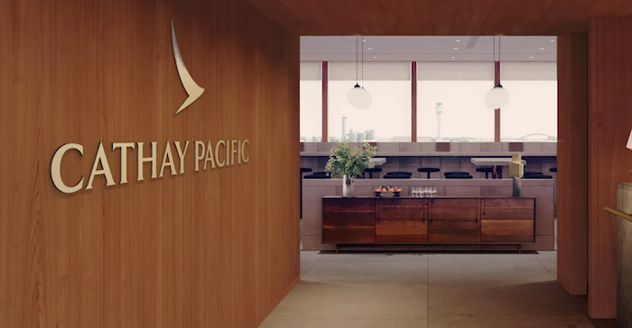
It shows an image of the entrance to a lounge:
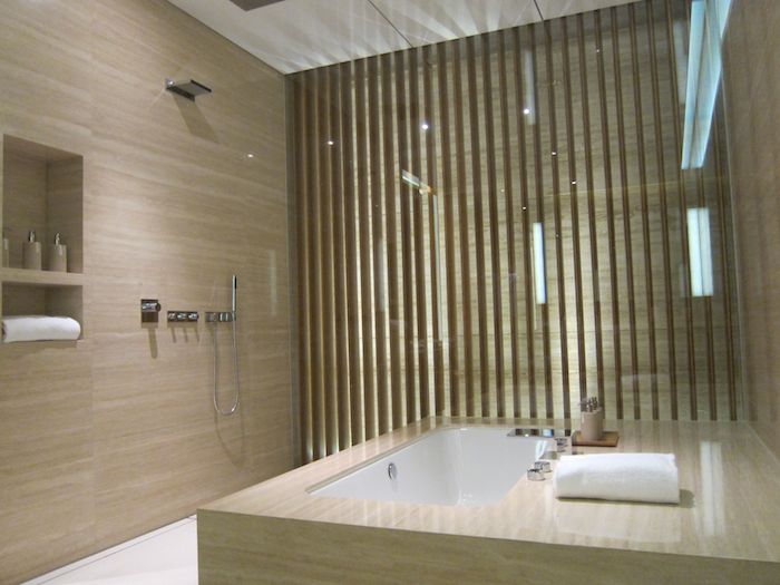
And on the next page it shows the interior, which looks pretty cool:

Based on the runway in the background, I suspect this is The Pier First Class Lounge, which is slated to open around the middle of next year, after being closed for renovations.
I’m not sure if the above image is just a corner of the lounge, or if it’s actually a private room (or semi-private room, based on the curtains). That would be pretty awesome!
Currently my favorite lounge amenity in Hong Kong are the cabanas in the First Class Wing, which are among the nicest shower rooms at any airport.
What do you think of Cathay Pacific’s brand refresh — good, bad, or who cares?


I like it, but then I always liked the old Eastern Airlines logo. If Eastern was still around, I suspect CX would be getting a letter from Eastern's legal department.
@Pat Butcher
The old logo actually looks quite similar to the new one on tags, entrance to lounges etc.
Wbsite has a new look!: https://www.cathaypacific.com/cx/en_US.html?cm_sp=Change%20Language-_-US-_-en
How you guys like it?
Nice clean take on the classic logo and word mark. Now pleas, please clean up the awful mishmash on the fleet itself, that horrid green under the cockpit, and again on the tail. The two/three tone job on the fuselage just doesn't cut it for such a class act as CX. Select a single tone and clean up the body and tail!
This looks like an attempt to save costs on different color paints... The old design was such a classic
@Pat Butcher
Those "tags" you see are probably just swatches or textiles to show the different color palletes for each respective class.
@bobtrial no doubt revenue is king
But why when I do travel In First are there so many empty seats if they are so sought after?
Thanks for the reminder about booking directly through Cathay.
I remember expiring miles kept me away the last time I considered
I wish they'd repaint their planes. Just so much white
@D Wonderment....um, because Cathay can sell those seats for far more than they collect from AA in partner awards. That's why.
CX F award inventory to their own members is far more generous than partner availability. You're welcome to join.
...agree "rebranding" is a wasted marketing efforts if there is nothing else new to market.
Like the new font alot more than the old one. Still like the old logo but new one is cool too. Looks alot better on the tags. Not sure what the old tags looked like but those new ones are nice. Looking forward to getting a sexy purple one in March. Or is it Aubergine or something like that?
A waste of time and money
the logo looks like it had its wings clipped
Put some damn money into releasing more first class seats on award so folks can get a brand experience
and want to fly them again
love the rebrand. it clean and simple and fresh. yet its true to the original. CX is an amazing airline, from the ground services to inflight. excited for what's to come.
I'd say the change isn't going to impact significantly on CX's VI, since the current one already reflects some of simplistic approach in visual arts so it's not really a big leap into the new one. Just wondering how the new livery is going to look like, though.
Unless its a logo change for a change in investment group or company, it wouldn't affect us really much, its the service, products that really matters