
Recently, Korean Air’s takeover of Asiana was finalized, after a process that spanned over four years, due to delayed regulatory approval. The airline has today officially unveiled an updated livery and branding. This was first leaked a couple of days ago, but is now official, so let’s cover all the details.
In this post:
Korean Air’s new and very blue livery & branding
Korean Air has today revealed its first full brand redesign since 1984, which includes a new livery, new logo, and more. This will be introduced across the combined airline over the coming years, though like any rebranding, it’ll take some time. For that matter, Asiana is expected to be run as a separate brand for the next couple of years, until the new branding is more widespread.
The most significant change is a new livery. This has already been painted on a less than one-year-old Boeing 787-10 with the registration code HL8515. On February 23, 2025, the plane flew from Incheon (ICN) to Busan (PUS), and then on March 9, 2025, it returned to Incheon, after getting a fresh coat of paint. For context, below is what Korean Air’s previous livery looked like.
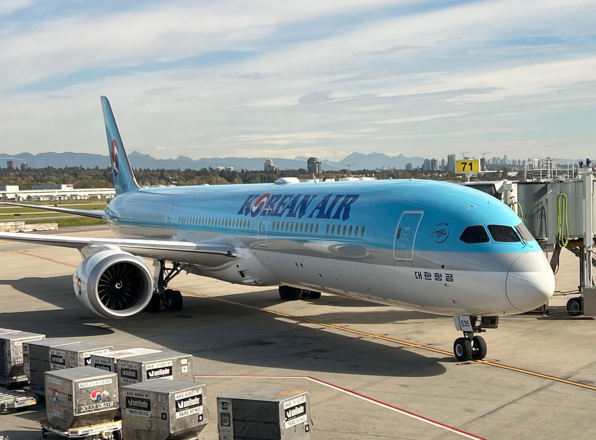
Meanwhile below is what Korean Air’s new livery looks like.
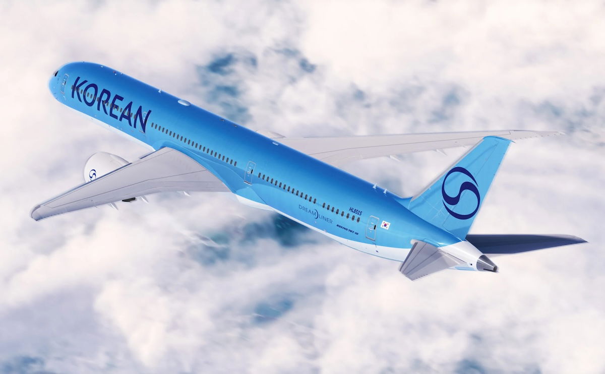
As you can see:
- The side of the aircraft says “KOREAN” rather than “KOREAN AIR,” and in much larger, simplified, and modern font
- The livery is now just various shades of blue, with no red being used anymore
- The straight line separating the blue from the white has been replaced by a curved line
- Korean Air’s logo continues to be a stylized taeguk, a traditional Korean symbol for the harmony between opposing forces used on the country’s flag; however, rather than being in red, white, and blue, as before, it’s now just in blue
As the company describes it, “the updated logo aligns with modern and global minimalist branding trends while preserving the airline’s distinct identity.”
My take on Korean Air’s new livery
Let me acknowledge a few things, to start:
- Airplane liveries don’t really sell tickets, though branding overall does matter, or at least companies spend a lot of money on branding
- Us aviation geeks definitely care about this stuff a lot more than the average traveler
- Often my impression of liveries evolves over time, both as I become accustomed to them, and as I see them in person
All that being said, my initial impression is that the new livery really feels like the lowest common denominator in livery design. It’s almost as if Korean Air asked AI to create a modern livery that’s an evolution of the old Korean Air branding, without doing anything too interesting.
Yes, the new livery looks quite modern, and I do prefer the new shade of blue compared to the old shade of blue. But it also seems so unoriginal, and like it’s such a copy of the direction that so many airlines have been headed with their liveries.
I feel like Korean Air planes used to stand out due to their liveries, while the new one feels forgettable.
Bottom line
Following its takeover of Asiana, Korean Air is undergoing a rebranding, including the introduction of a new livery and logo. The new design is definitely a lot more modern, though also quite boring and forgettable, in my opinion. I can’t say I’m a huge fan, but who knows, maybe it’ll grow on me over time.
What do you make of Korean Air’s new livery and branding?


Overall, I like the new livery. A bit boring? Perhaps — but it's still ahead of the vast majority of airlines flying excruciatingly dull, all-white planes!
so cheap for a merged airline, I expected they would excell, as koreans always seem to come up with very innovative and interesting things. Asuan airlines have been messing it up lately, what surprises me the most is that they keep on hiring western companies for this type of rebrands, and end up having the most hideous liveries.
As many have said, any kid could have come up with this while playing on indesign or photoshop.
The tail is the biggest disappointment, changing from one of the most distinctive brandings in the industry to a boring, silly squiggle.
The link below shows an A330 in much better light as well as various liveries and logos they've considered.
https://www.threads.net/@ishrion.aviation
Looks fine to me. I could take or leave the exact shade of blue, but generally speaking clearer/bolder text is a good thing.
Just to add, why repaint a roughly 8-month-old 7810 when they could've easily repainted a 777 going in for a heavy check, or better yet, wait until the last minute to paint the white-tailed A350s? When CX unveiled their new livery, a 77W went in for a heavy check.
What a design mistake...
Passenger : We want better catering
KE: We serve the same Economy class Bibimbap in Business but in in China bowl and real silverware.
Very boring, uninspired and unoriginal. Looks like something chosen by committee. Modern, blue and boring it is. Kind of a shame, as their current livery is so distinctive.
Rough week for aviation fans, I guess.
What a pathetic livery - and they actually paid a design company to come up with this? Looks like theyve borrowed a KLM aircraft, and stuck some temprary logo stickers onto it. Dull, anaemic, lacking in any type of style, this looks as though it was thought up in 5 minutes - if that. It follows the example of whichever company designed the current SAS, Lufthansa & Finnair liveries - minimalistic, boring, fails to stand...
What a pathetic livery - and they actually paid a design company to come up with this? Looks like theyve borrowed a KLM aircraft, and stuck some temprary logo stickers onto it. Dull, anaemic, lacking in any type of style, this looks as though it was thought up in 5 minutes - if that. It follows the example of whichever company designed the current SAS, Lufthansa & Finnair liveries - minimalistic, boring, fails to stand out as a representation of Korea, and instantly forgetable. The current livery is stylish, looks good on any aircraft type, and is instantly recognisable as Korean - other than the name of the country plastered on the front there is nothing that stands out as "Korean" on the new design - its blandness and lack of contrasting colours is indicative of design companies approach of taking a classic livery and replacing it with something so boring and insipid that even the most enthusiastic aviation geek would fall asleep just looking at it. Remember the classic SAS viking longboat livery?....now look at their present livery which looks like it was done by an untalented child - I fear that Korean has headed down the same path.
Passengers: We want in-flight WiFi
KE: Best we can do is new paint
Very boring yes, but it's not going to change so we'll have to deal with it.
Apparently they'll have a new first class too!
https://www.executivetraveller.com/news/korean-air-new-first-class-a350-787-777
And I thought they were done offering first class.
The new livery is screaming "meh". Why are they doing this? Just because of a merger with Asiana? Font looked LCC and the logo is not striking. Airlines looks like they have an aversion to bright colors. Korean with red, Lufthansa with yellow, SAS with ref.
I really like it. I liked the shades of blue on the old livery but hated the font. This is much more modern and I think rather elegant.
I'm wondering imagine how horrible this livery would look like on 747s and A380s. Looks not too bad for a 787 or perhaps an A350, but newer liveries intended to match the mood of newer planes usually don't go too well with older planes.
The same went for their previous livery which was nice for 747s and 777s but started to look a bit weird on 787s and A350s.
Sorry, meant to write that as a separate comment but somehow became a reply.
"... as if Korean Air asked AI to create a modern livery." Very good description of the new livery. I think it looks sleek and soulless (lacking character and individuality, uninspiring). A couple of truths, though:
– Most passengers do not pay much attention to livery, but they do consider an airliner safer if it has some design on its fuselage than non at all (bare white or metal), especially if it's in good...
"... as if Korean Air asked AI to create a modern livery." Very good description of the new livery. I think it looks sleek and soulless (lacking character and individuality, uninspiring). A couple of truths, though:
– Most passengers do not pay much attention to livery, but they do consider an airliner safer if it has some design on its fuselage than non at all (bare white or metal), especially if it's in good condition (not peeling or dirty).
– New livery, like redesigned logos, grow on people.
I never understood what's the big deal about a livery. It's just a color scheme.
So just keep the airplanes painted white?
Does the company you work for not have a logo/brand?
It just screams AI Assisted.
It's just ghastly.
Why mess with the classic?
Sorta surprised that there's no Korean-language hangul on there, and instead just western/phoenician alphabet.
I was just talking about this with one of my friends.. It would have been really cool if they did something with hangeul (like a big 대한 or something). Definitely a missed opportunity
haha ai generated I'm dead. it also looks a bit LLC adjacent to me, but I guess I'll get used to it.
This is the first time Air Koryo has something on Korean Air.
I say go with it, it looks fine to me.
And, at the very least, idiots can't call it the "Pepsi" livery anymore. Not only was that moronic, but also highly disrespectful to the Korean culture.
They borrowed La Compagnie's spare cans of paint
Two amazing liveries reduced to an awful one
Definitely!
I like the new livery, the old logo needed a new refresh so this is good news.
Would be better if it was all white.
Thanks, I hate it
I always feel the current Korean Air design like Pepsi. The new one looks more elegant to me.
Thank you!!! Old Pepsi colour scheme is very dated. New one is derivative, but at least it’s modern.
The use of much bigger fonts and less text is a general trend in branding.
It's supposed to embody a form of simplicity, pride, prominence and authenticity. Why write "air" if everyone knows it's an airline and there only one Korean airline that counts?
If I'm not mistaken Emirates has also recently increased the font size on its liveries.
To emphasize how this is a bigger trend, see how the Nescafé brand uses...
The use of much bigger fonts and less text is a general trend in branding.
It's supposed to embody a form of simplicity, pride, prominence and authenticity. Why write "air" if everyone knows it's an airline and there only one Korean airline that counts?
If I'm not mistaken Emirates has also recently increased the font size on its liveries.
To emphasize how this is a bigger trend, see how the Nescafé brand uses a bigger logo spanning the totality of the available space. The rebranding was done end 2024.
https://patternpd.com/nescafe-farmers-origins
https://worldbranddesign.com/everything-starts-with-nescafe-cba-design-refreshes-nescafes-visual-identity-blending-tradition-with-modern-experiences/
I mean at least it's not euro-white. That has to count for something for a legacy airline.
I mean, we got used to the current design of this website...
LOL!!! So true. Much like a new version of windows, iOS, or Android, we all moan for a few days and then acquiesce.
the shade, I live!
Interesting. Korean Air last changed its livery in the early 1980s following the KAL 007 incident and so the livery that it features today has not really changed much in 40 years. The new livery though looks boring. The one it replaces is a bit more timeless and classic.
and that's exactly what their old livery looks like ... i saw it and thought "1970s?"
Yawn
The black color for the Korean and especially the logo are bland.
Maybe they did that to save money for everywhere they need to put the logo and Korean text
Blah and depressing
Gross
Its gonna take time to getting used to
Looks like NORSE
Norse, KLM, La Compagnie, Kuwait… nothing really distinguishes it.
The curved blue line looks far too similar to KLM for me
Need to see it during the day but first impression is below average.
Not a fan...it has no flair or marketing advantages.
I like the old one. But I suppose the new one goes better with the new interior finishes, more «sleek» and modern looks.
Proximanova gonna let you visualise livery ;)
It looks unfinished.
If that's the new livery, it does make you appreciate the refreshed liveries of CX, EK, UA, et. al., more, doesn't it?!
I feel like it's a missed opportunity. They could've done something creative by combining KEs blue and OZs brown. At least they could've filled the logo (called the taegeuk, akin to the yin and yang) with the current blue and red.
Unimaginative it may be, but, so far, I like it!
There is always one... Firm proof there's no accounting for taste, methinks.
I like it too!
For some reason it reminds me of Saudia.
Oops, I meant to say Riyadh Air.
Is that TUI?
it's neos
Some Korean avgeeks have been suggesting that this is a decoy livery placed over the 'real' new livery, due to the painting quality. Of course the picture itself was taken at a night so may have been because of that.
What's certain about this is that nothing is certain at the moment - let's just wait until 11th March when they will officially reveal the real new livery.
That is far fetched. Spend money on a decoy livery just for the lulz. Right...
Perhaps you didn't read what I wrote up here
I did, and my reply is regarding what "some Korean avgeeks have been suggesting."