Historically Hyatt hasn’t exactly been known for great IT. But then Marriott came along and was like “hold my beer,” and now by comparison I’d say Hyatt does much better in that department than Marriott does.
Many people may not even notice this, but as someone who uses Hyatt’s website on a daily basis, I just noticed a pretty significant change. It seems like this might just be in a test phase here, because when Tiffany goes to the Hyatt website she doesn’t see results displayed this way.
It used to be when you searched a destination on Hyatt’s website you could choose whether you wanted the hotels displayed on a map or one below the other. For cities with a lot of hotels, that meant a lot of scrolling was required.
Then again, historically Hyatt hasn’t been such a big hotel group, so there were few markets where they had more than a few hotels. As Hyatt continues to grow, they’ve made some changes to the website that seem to accommodate that.
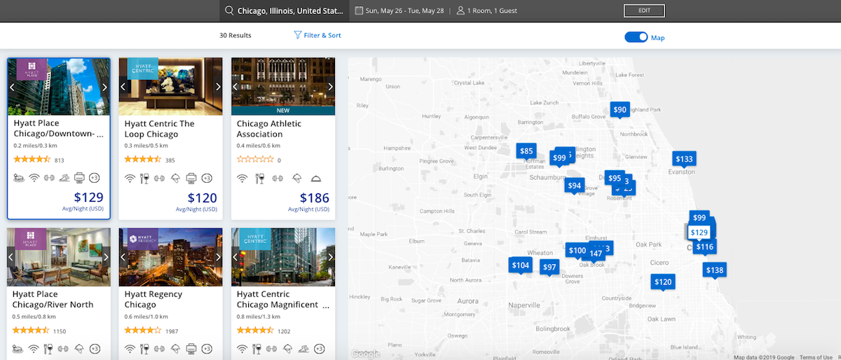
For example, today I searched Hyatt hotels in Chicago, and the search results looked as follows:

As you can see, it now displays both the map and shows various hotels at once.
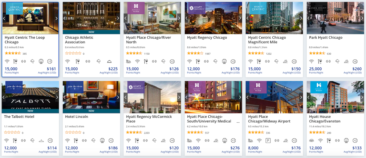
At the top right there’s a little bar you can toggle, and you can choose to get rid of the map setting, at which point you get this absolute beautifulness:

It’s not often that I think website redesigns are great, at least for desktop users. That’s because websites are increasingly catering to mobile users, and that often comes at the expense of the desktop experience.
But overall I really love the changes that Hyatt is making here, as you can compare a lot of hotels easily. This is so much better than the old site.
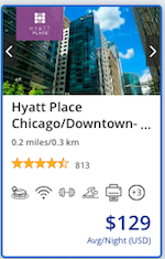
My one criticism is that you have to click twice to select a hotel. You’d think based on the above page that you could just click on the cash or points total, or the hotel name, and be taken to the rates.
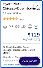
Rather you have to first click anywhere in the hotel’s “box.”

Once you do that it gives you the option to “View Rooms.”

Bottom line
Color me impressed by Hyatt’s website changes. Like I said, I’m not yet sure at which point this will be available to everyone, as not everyone seems to be getting the new site. But for those markets with many Hyatt hotels, I find the new site to be a big improvement.
My apologies if this site has actually already been in the test phase for a long time and/or if I’m missing something obvious, but I swear this is the first time I’ve seen it.
What do you make of Hyatt’s new hotel search page?


Website good if u have all day to wait for it to respond
Now if they would only clearly identify the resort fee in those "cards".
Yes, there definitely should be a shortcut way to go straight to comments for everyone familiar with the matter / the article.
They're probably still A/B testing the design, but I love it.
I hope Hyatt continues to allow you to sort by price. Marriott does NOT offer this as an option. (Apparently, all of Marriott's customers are on corporate expense account, and price is not a factor?)
I like the cards change but I hate the map. It's so minimalist that you can't easily tell where in the city the hotels are.
+1 to Lukas. I have a GS9+ and I have about a 5 second slowdown though. I believe you also disabled clicking on the author with profiles as well.
@Tiffany, I do read the articles but once I am finished with it, I like to read other people's experiences/opinions and that link was super helpful (no slowdown on my Samsung Note9).
Ben, why isn't the number of comments clickable anymore? I really liked the fact that you can just click on the number of comments and the link would skip the article and go to the comments but now it's not working anymore. Thank you.
@ Lukas -- It was one of a few things causing a process overload that was hurting the overall user experience (pages were taking 15+ seconds to load on mobile in some cases), so we disabled them until we can get it fixed properly.
But we do like when people read the articles too ;)
I am so happy that Chicago Athletic Association is on the new updated Hyatt list. Hyatt has changed so much in the last few months. All for the better with Thompson and Allila.
I occasionally get the "doing some maintenance, can't log in" note w/Hyatt - but it is so nice to check out and get an email folio 10 minutes later.
I only see "list" or "map", not sure what I'm doing differently than you. Tried 2 browsers, one in incognito mode.
Wow, normally I hate the whole "cards" paradigm, especially when Google does it, because it decreases information density compared to a list due to lazy web developers not optimizing for widescreen tablets/desktops. This is a refreshing example of somebody doing cards right and increasing information density compared to a list.