
Lufthansa Group has just unveiled a new brand identity, which is a visual element of the company’s goal of centralizing management of the individual airline brands, and bringing them all closer together.
In this post:
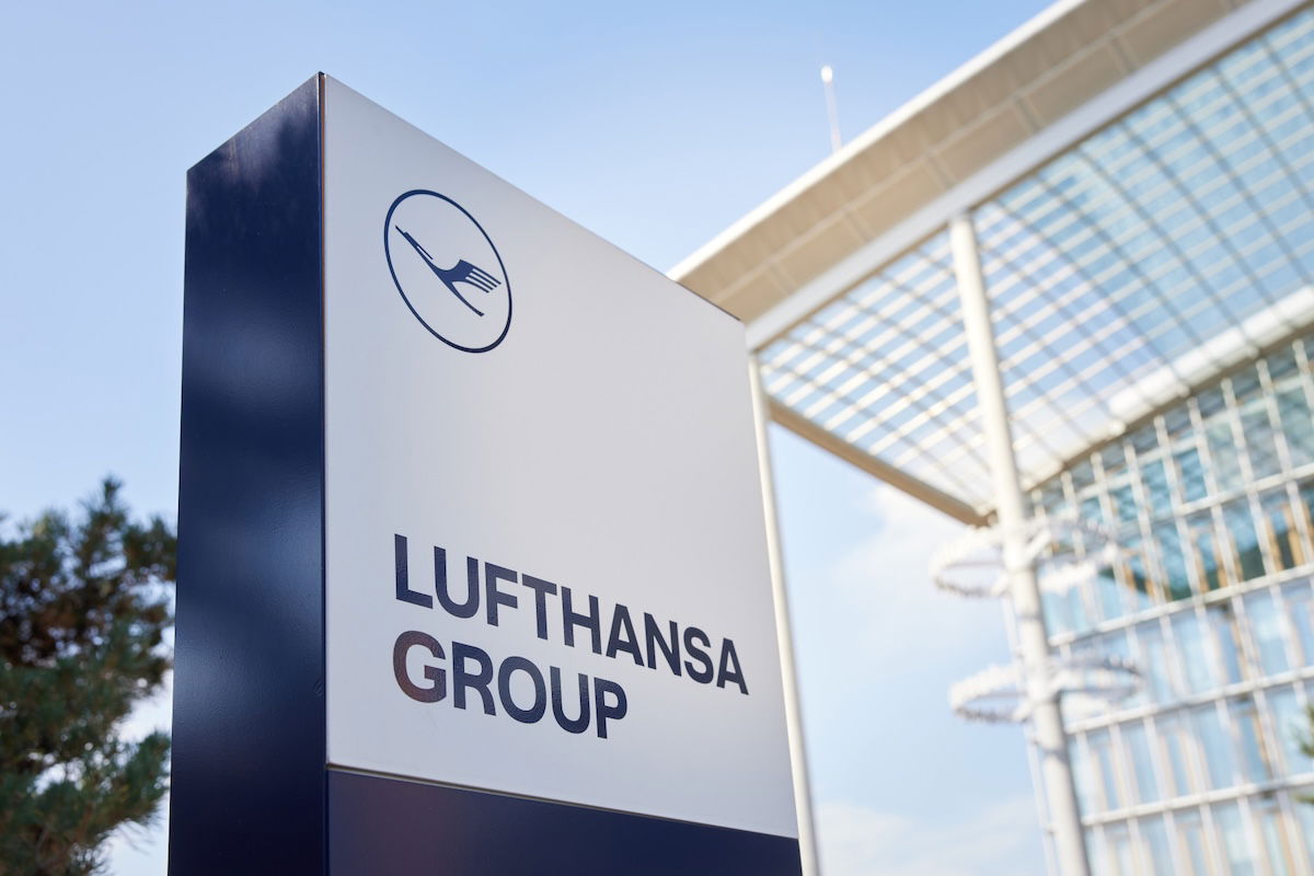
Lufthansa Group’s new brand identity revealed
Lufthansa Group, the parent company of Lufthansa, SWISS, Austrian, Brussels, Discover, Eurowings, etc., has just unveiled a new brand identity. This will slowly start to be rolled out effective immediately, with a wider implementation in 2026.
As it’s described, “the goal of the new brand identity is to make the strength of the Lufthansa Group more visible,” and “service offerings will be bundled under the Group brand, making them even more clearly recognizable.”
The new brand identity is recognizable by the iconic crane logo, which will be used in the future without the circle surrounding it. 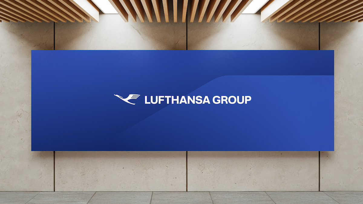
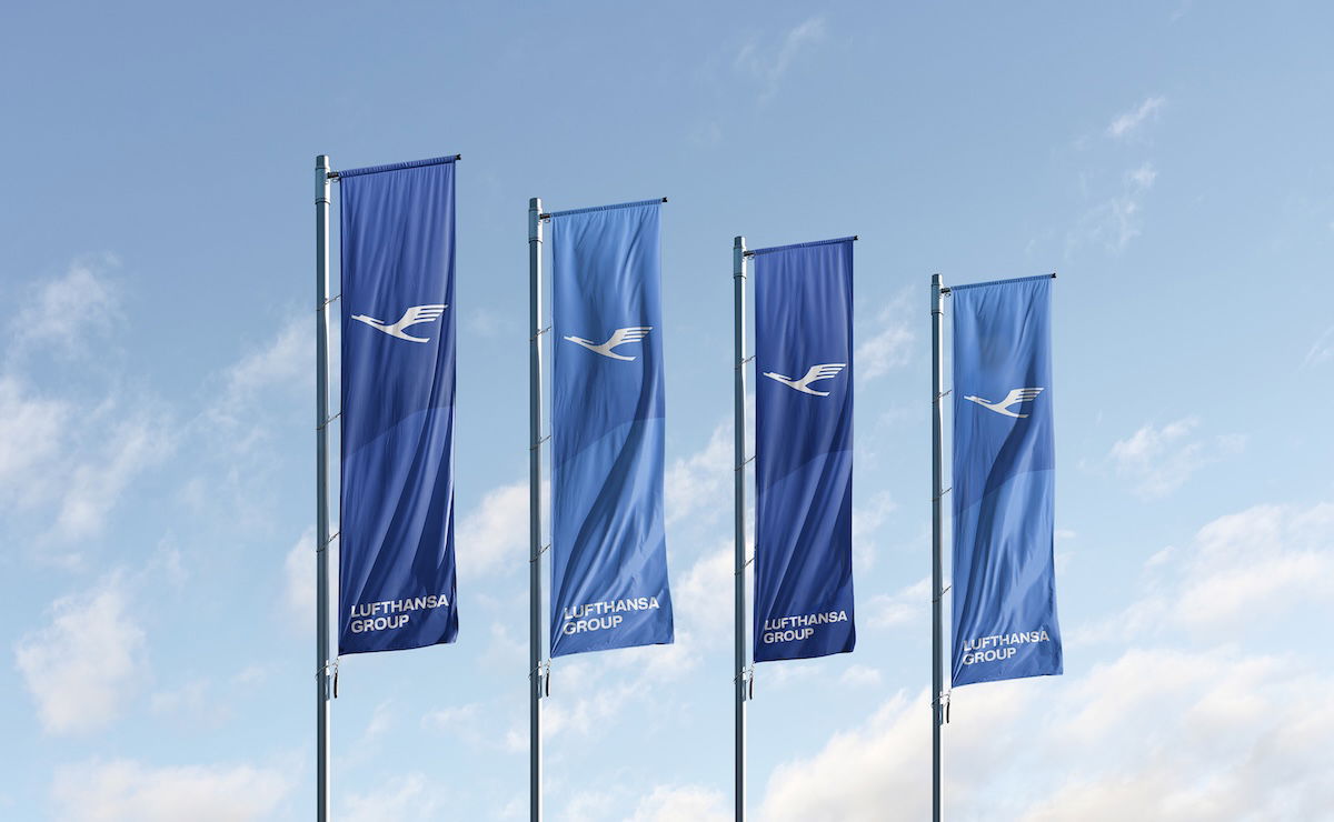
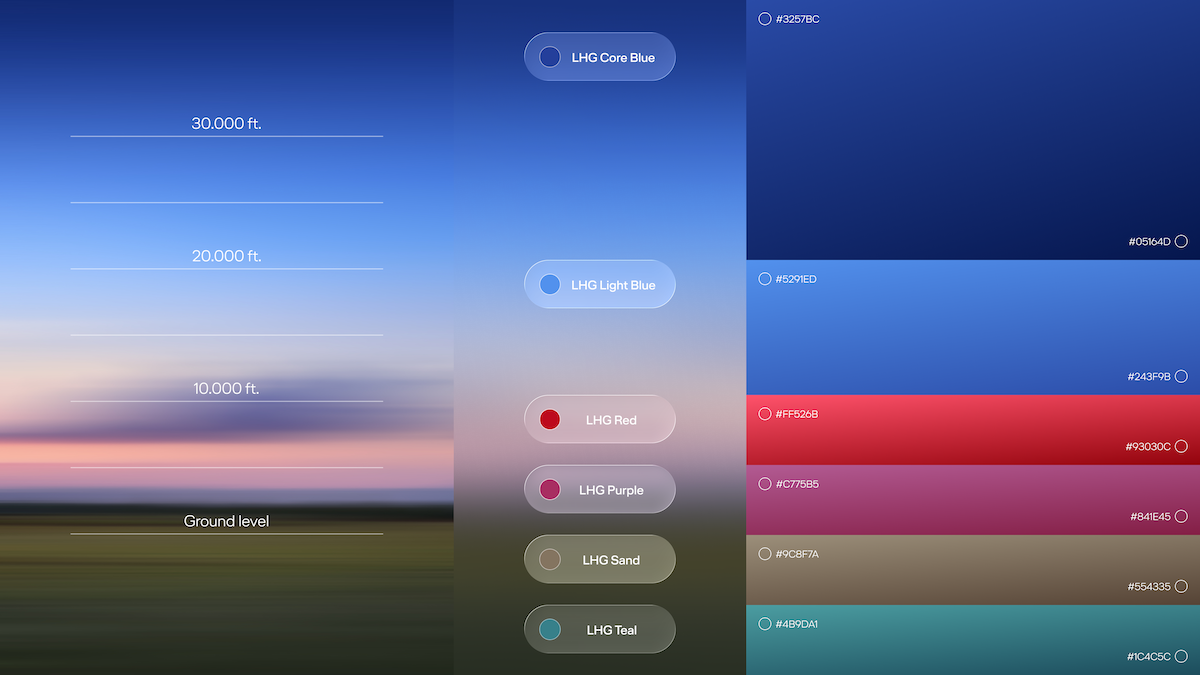
In addition, there is a new font and color palette, expanded by six new tones. The new tones are supposed to “represent different heights from the ground to the sky to reflect the diversity of the Lufthansa Group.”
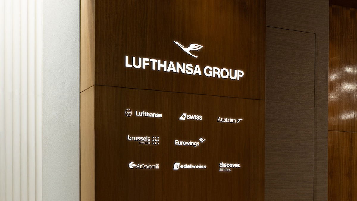
The airlines of the Lufthansa Group will keep their own brands under the umbrella of the strengthened group brand. The endorsement of “Member of Lufthansa Group,” which will appear on all aircraft in the future, “signals the unity of the individual airlines that operate under a brand name other than Lufthansa.”
In 2026, the Lufthansa Group brand will also be visible at lounge entrances worldwide, as is already the case in Rome, Milan, and Brussels. The “Member of Lufthansa Group” label will also be visible on materials at airports, such as baggage tags, and onboard aircraft.
Here’s how Dieter Vranckx, Lufthansa Group’s Chief Commercial Officer, describes this updated branding:
“The Lufthansa Group is evolving from a group of airlines into an integrated airline group. The new brand identity is therefore more than just a redesign; it is a strategic milestone. In a challenging environment, this step creates a visual anchor of trust for our customers. A visual identity in aviation must do much more than just create an eye-catching appearance. It will reflect our strategic brand values and a promise we want to make to our passengers across all our brands. The new brand identity enables a holistic brand experience, provides orientation, and strengthens identification with the Lufthansa Group.”
For those curious, below is what Lufthansa Group’s branding was like before this change.
My take on the new Lufthansa Group branding
As easy as it can be to pick on Lufthansa Group, I actually think this is a pretty sensical rebranding. I don’t think this is any sort of a game changer that’s going to rock the boat, but the changes seem fairly thoughtful, in the scheme of things:
- I’m happy that the crane logo is staying, and I don’t have a strong opinion about the circle around it vs. not
- I’m also glad to see more branding that connects all the Lufthansa Group airlines, and think it’s logical that lounge entrances will increasingly have the Lufthansa Group branding
- I do find the range of colors being used to be a bit strange; for example, some signage will seemingly have various shades of blue, while other signage will have more of a gray or sand color, so that strikes me as being a little inconsistent
- I did find the old combination of dark blue and gray to be sterile, so at least the new range of colors is a bit warmer and more interesting
Bottom line
Lufthansa Group is introducing a new visual brand identity. The crane logo is sticking around (though without a circle around it), and Lufthansa Group will still be written in all caps (though with slightly different font).
The biggest changes are the range of colors being used in the background, plus that we’ll increasingly see the entire Lufthansa Group integrated more closely visually, including at the entrances of many lounges.
What do you make of Lufthansa Group’s updated visual identity?


Lufthansa solve your indiscriminate against economy class passengers & stop threatening them before reorganising & paint a fresh paint over a mold paint & eventually it will peel & review the truth again , very bad experience with staff threatening me on board the flight but yet to do anything , I am awaiting
Lufthansa solve your indiscriminate against economy class passengers & stop threatening them before reorganising & paint a fresh paint over a mold paint & eventually it will peel & review the truth again , very bad experience with staff threatening me on board the flight but yet to do anything , I am awaiting
So ITA, after a rebrand as Lufti, will equal to deportation flyer, aka African connection through Brussel and Discover.
Wonder how many brand executives are in place to ensure #93030C color code is used on all Swiss flights and each FA's uniform matches the brand identity. As much of a mess it is, I'm grateful for the memes and laughs.
Good start. However they will need a "troika" management to keep up with the world. One CEO from Germany doesn't make it as they are so far out of the mainstream.
Boring
The rebrand has now meant Allegris won't be fully rolled out until 2050. Seats will be available for sale on the 787 by 2064.
...and thus makes a difference HOW, exactly?
Brand identity… the only brand with the different J products on one aircraft ;)
LH should rename itself "allegris group"
I would've preferred they kept the original Lufthansa branding with "Group" at the end.
Plenty of airlines have kept the same branding, same typeface as their parent company. Here are some examples:
-Hanjin Group (parent company of Korean Air)
-The Emirates Group
-Cathay (incl. Cathay Pacific Catering Services (now Cathay Dining), Cathay Cargo, Cathay Pacific Engineering, et. al)
I just don't feel that a different typeface was necessary.
But a change at Chairman might be productive.
Now Allegris finally makes sense. The new categories of business class seats will be branded as:
- AL Core Blue
- AL Light Blue
- AL Red
- AL Purple
...
Where’s ITA in the lounge render?! They’re going to be a pretty important part of LHG, no? Even if AZ isn’t in Star yet…
That blank space in the middle-right is conspicuous, no? I'm sure they'll add ITA shortly, maybe waiting until they have majority ownership.
Maybe I'm being pedantic but should ITA be fitted in after Eurowings? Possibly this could make sense if it's in alphabetical order after the core LH-LX brands. Or is it actually in airline code order with EW last as the low-cost arm in which case ITA needs to go upfront, unlikely. But this seems as confused as the overall brand strategy and the ever-multiplying subsidiaries CityLine, City Airlines
Sorry to ask, how unified are Lufthansa Allegris? Even excluding the short-term capacity products brought in using secondhand aircraft.
So uhh…they rebranded to Xiamen Airlines? Lol
Holy Xi-t.
It really does look like Xiamen.
Ya know, the Chinese never respected our intellectual property; about time we, in the West, started copying theirs. Bah!
More like Xiamen copied Kuwait Airways
Good to know Carsten Sphor has a unified mood board for his contempt for the business and his flying passengers
I thought they’d go with your ‘LuftKafka’ for sure. Maybe next time!
DNS means denial of Service attack for LHG.
Lol Carsten is a talented practitioner of doublespeak
Corporate waste.
All this does is makes some pointless middle management jobs and project managers jobs justified.
No one cares what font you use in your branding.
"No one cares what font you use in your branding."
Tell that to BP, ExxonMobil, Mercedes, John Deere, Accenture, Wall Street Journal, Freshfields, Qantas, etc. etc. etc.
... and the US Government. officially changing back to Times Roman from Calibri !
Ask Little Marco about fonts.
I’ll avoid comments on the mess that is Lufthansa.
But anyways I love how on the lounge image you can see 1 empty square… I wonder who will be there
Condor or Condor with an asterisk?
You would think Lufthansa has more pressing issues to address instead of putting more lipstick on a pig.
Hey, that is totally unfair...
...to pigs.
Quiet ... Piggy?
Thanks, other ‘1990,’ that’s somewhat what I’d’ve gone with. You’re getting good.
Thus is wonderful news! Thanks for your support and mentorship as we work to improve our services!
LOL
Bull. There in the middle of a HOSTILE TAKEOVER of SWISSAIR.
How can Lufthansa Group be in the middle of a hostile takeover of a company (LX) they already own outright and have owned for almost 20 years? Like, 100% owned?
I am employing a figure of speech.
Why are you seeing a bull located in the middle of a hostile takeover of Swissair? Tell us what you're taking and maybe we can talk you down. Did the edible just kick in?
Franklin. RELAX!!
Eskimo... CALM DOWN!!!
BAH!
Oof. That’s good. Well done, ‘other’ 1990. Quick evolution. You’ll be a Charizard in no time!