Yesterday United Airlines’ new livery leaked, one day ahead of the official reveal from the airline.
While I’m sure they weren’t happy that the details leaked early, the reality is that with the number of people working on the project, it’s not surprising that someone shared a picture that they shouldn’t have.
Following this leak, United also released the following video about the new livery:
Our next livery has been cleared for takeoff. Stay tuned right here for more from our celebration in Chicago tomorrow! pic.twitter.com/n4CJrAJERG
— United Airlines (@united) April 24, 2019
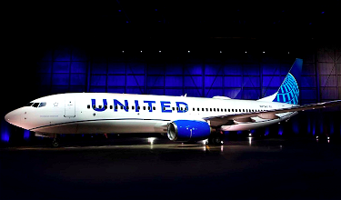
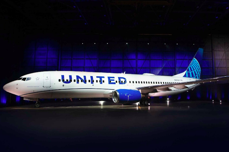
United Airlines’ new livery
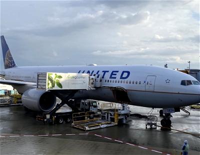
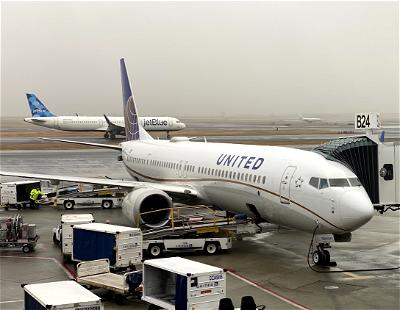
United has now officially unveiled their new livery, with one plane already featuring the new paint job. As United describes it, with this new livery it’s “out with the gold, in with the blue.”
This is a big development for United, since it’s the first new livery they’ve introduced since United and Continental merged, and will be part of a larger rebranding.
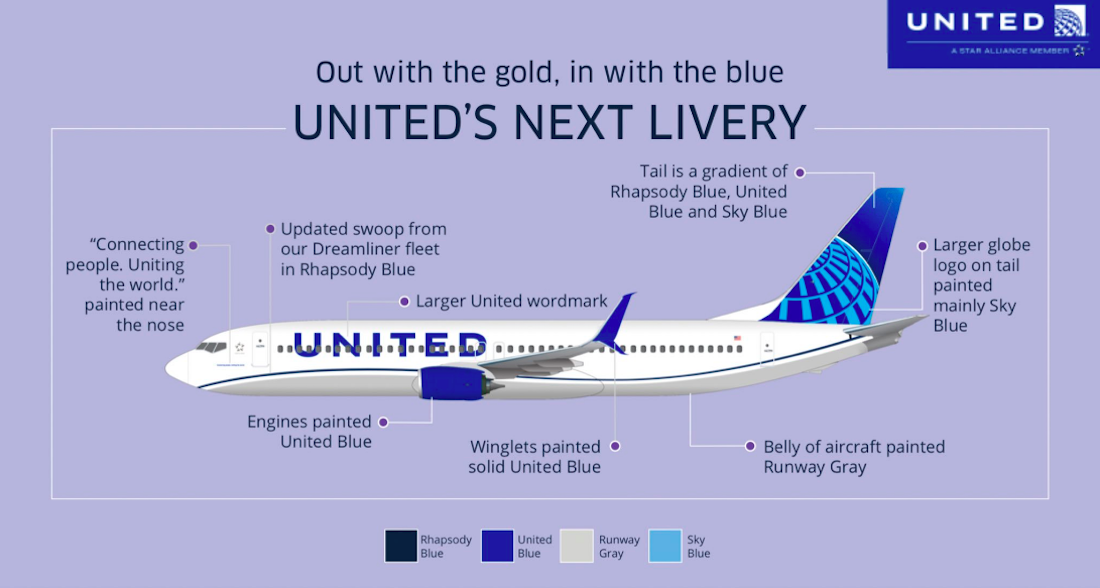
So, what are the major design elements of United’s new livery?
- Blue is the predominant color in the new livery, with three different shades, which United describes as Rhapsody Blue, United Blue, and Sky Blue
- “Connecting people. Uniting the world” is painted near the nose on each plane, to further connect United to their purpose
- Both the engines and winglets are being painted in solid blue
- The globe logo on the tail is larger than before
- Plane bellies are being painted “Runway Gray”
- The “swoop” that’s currently on the 787 will be added to other planes as well
The new design features build on United’s updated brand palette, which was introduced last year. United says that the importance of blue is that it’s what employees and customers see when they look out the plane window at the sky.
The airline is also using purple, and they say that the combination of blue and purple creates a soothing environment. These updated colors will also be featured in United’s new uniforms, which will soon be worn by 70,000+ employees.
Here’s how United CEO Oscar Munoz describes the new livery:
“As we improve and elevate our customer experience, we are changing the way people think and feel about United, and this branding captures that new spirit. Each improvement we’ve added to our service advances our evolution as an airline, furthering our effort to elevate and redefine customer service in the sky. This modernized design, especially our iconic globe, enhances the very best of United’s image and values while pointing in the direction of where we intend to go next in serving our customers.”
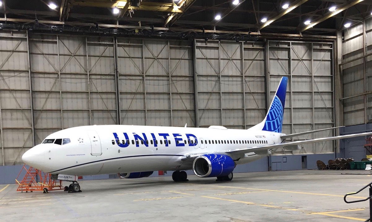
How soon will United planes be repainted with the new livery?
As of now, only a single Boeing 737-800 features the new livery. It has the registration code N37267, and you can track it here, should you want to get a picture if it visits an airport near you.
On average, United aircraft receive new paint jobs every seven years, so you can expect that we likely won’t see this new livery throughout United’s fleet until about 2026, give or take.
My take on United’s new livery
I’m usually pretty resistant to new liveries, because they take some getting used to. However, I think this one doesn’t look half bad. I don’t love it, but I don’t hate it either, and I’d say that’s probably an endorsement, all things considered.
When Continental and United merged they basically kept the Continental branding, as they maintained the colors and also the globe on the tail. This was pretty reflective of the “merger” on the whole, as one of the few aspects of United that survived was the name.
To me this new livery does a better job of incorporating elements of both United and Continental, as they’re maintaining the globe on the tail while also incorporating United’s signature blue color, and even expanding on it.
My one thought is that there’s something about the livery that seems kinds of basic to me. I don’t know if it’s the font used for the big, capital letters, or what, but there’s a small part of it that almost looks like a bad photoshop job to me.
What’s your take on United’s new livery?

It's boring. It looks like the paper napkins they use. Blue and white.
Real downgrade from the Continental globe with the gold. That was classy and a good choice - this looks like a very poor version.
My favourite Pre Merger United livery is probably Battleship but carriers don't use that much colour (non-white) nowadays
United has stepped up their service recently. I am only a Silver Premier but I fly out of IAD and staff both on the ground and in the air is improving their attention to detail. The new livery, opening of the Polaris Club, and hopefully the retirement of the old 752' 753's, and 763's with 789/10 and A350 replacements will allow United to compete with European and Asian airlines.
Garbage. Just like the garbage that was Continental Airlines, and their arrogant, pig headed, delusional employees. Twice bankrupt and needed Jeff Smisek to testify to Congress Continental couldn’t survive without being bought by United. Unfortunately CO is to UA what the Coronavirus is to China. Long live the Tulip
“Out with the gold, and we are buying Jetblue” :)
Hey......it’s pretty good. Oscar Muñoz said it was not going to be a complete redesign, rather a refresh to the current livery. It’s simple......love the incorporation of different shades of blue along with the majority of the fuselage being white. The larger „UNITED“ on the fuselage goes along with what both Southwest and American did.
I‘m only a Silver Star Alliance member and a low premier with United. They have treated me well since I...
Hey......it’s pretty good. Oscar Muñoz said it was not going to be a complete redesign, rather a refresh to the current livery. It’s simple......love the incorporation of different shades of blue along with the majority of the fuselage being white. The larger „UNITED“ on the fuselage goes along with what both Southwest and American did.
I‘m only a Silver Star Alliance member and a low premier with United. They have treated me well since I was a child flying them. And yes, I have experienced weather and mechanical delays, delays and cancellations because of crew duty regulations........but 99.5% of the time things go right for me. Also, a smile and kindness goes a long way to someone in the service industry.
And folks, were talking about going long distances.....faster, cheaper and more safe than driving a car! Safety is #1.....and United has a great track record!
They had a design committee that came up with this......and none of us were asked to be on it......so why do you really care!
Beautiful, in honor of Continental Airlines that saved the bankrupt "tulip" United Airlines!
I love it.
Lufthansa must have dared United to come up with a livery even more monochrome and boring and even less aesthetically interesting than the recent Lufthansa livery, and it seems that United more than rose to the occasion. My overriding thought is "Dull. Boring and dull."
It’s boring. It looks like the paper napkins they use. Blue and white. fake fake fake
I still see continental
The only positives I have:
The 'evolution' wasn't worse.
Perhaps the new scheme will look better on some planes than other?
I like the billboard United font.
The negatives:
The billboard titles, the swoosh and the tail 'globe' seem like three unconnected elements - as many have claimed. So while neither of these three elements is off on it's own, together it doesn't work.
I do like the following design posted by...
The only positives I have:
The 'evolution' wasn't worse.
Perhaps the new scheme will look better on some planes than other?
I like the billboard United font.
The negatives:
The billboard titles, the swoosh and the tail 'globe' seem like three unconnected elements - as many have claimed. So while neither of these three elements is off on it's own, together it doesn't work.
I do like the following design posted by carbonfibre on airliners.net:
https://imgur.com/jLsjItc
Disappointed overall. I prefer the current livery to this one, TBH.
Adam
Nothing matches, I am completely disappointed. They should have left the tail the United Blue and a simple white globe. Its different than the continental globe which had gold in it. They should get rid of the grey belly and blue swoosh line and make the entire fuselage all white. I do like the United blue engines. It looks like a coloring book made by children. To many different blues that don't compliment each other. Get rid of the baby blue in the tail.
As a marketing guy, I would have kept the contrast of the gold lines in the globe instead of a three different (still monochromatic) blue livery but that's just me. No one likes anything new unless its an I-phone.
I heil from the CO side or the merger, a Gordon Bethune fan and now lifetime 1K. I'm one of those folks who has never been mistreated by a UA employee (not that I condone or...
As a marketing guy, I would have kept the contrast of the gold lines in the globe instead of a three different (still monochromatic) blue livery but that's just me. No one likes anything new unless its an I-phone.
I heil from the CO side or the merger, a Gordon Bethune fan and now lifetime 1K. I'm one of those folks who has never been mistreated by a UA employee (not that I condone or minimize those who have).
Bottom line: Paint the plane, the napkins, the cups any color you wish. The more blues, the merrier, it makes the Pantone shades easier to match for vendors. Just increase the Polaris seat pitch so I can get in and out of the pod (no, I am not overweight), treat your employees well so they will pass on the favor to UA's guests and get me home on time.
wish they would change the globe, too similar to Copa
"It’s sad how many people can’t get over the damn tulip, or are longing for the days of the four-color monstrosity that defined United in the 80s."
No need to be ridiculous, nobody said they aren't over the "damn tulip."
From a pure branding standpoint, jettisoning the tulip was a mistake, full stop.
The globe says "Continental," not "New United."
That's the long and the short of it, nothing more and nothing less.
I just realized the new United livery is more or less Qatar livery in different colors.
I prefer the old livery with blue and gold. The new one looks ordinary and a bit old.
Meh.
Why people care about this stuff is beyond me. Truly useless - and all these bloggers and self described "influencers" jumping up and down to get a junket to see the "big unveil", just eyeroll.
Who cares?
It looks very similar to jetblue livery. Basically has all the same design elements. It's a milquetoast livery and they probably wanted it that way. BFD.
It's boring. It looks like the paper napkins they use. Blue and white.
Anyone else see a resemblance to a Sketchers Shape Up sneaker?
I wasn't expecting a the return of the tulip or even the meatball, in no way were my hopes up - but this is just so much worse than I could have imagined.
As a resident of Chicago and in fact under a flight path, looking up to see this...convoluted leap backwards, fills me with a certain amount of dread.
* ok but hardly worth any effort or expense
* They clearly feared a revolt from ex-Continental employees, thus the globe. Tail is still ugly.
* Lettering reminds me of Frontier. Not in a positive way.
* Could have relieved the monochromatic feel by bringing the purple to the exterior
* Whoever suggested stars like Polaris, instead of the globe, has a great idea. Could look truly fresh.
* whoever said Delta is a cutting...
* ok but hardly worth any effort or expense
* They clearly feared a revolt from ex-Continental employees, thus the globe. Tail is still ugly.
* Lettering reminds me of Frontier. Not in a positive way.
* Could have relieved the monochromatic feel by bringing the purple to the exterior
* Whoever suggested stars like Polaris, instead of the globe, has a great idea. Could look truly fresh.
* whoever said Delta is a cutting edge design, must not fly them or go to airports.
It is awful. It still reminds me of double bankrupt Continental, the crappy niche airline that ruined United.
The always eloquent Patrick Smith of Ask The Pilot fame said it best here, in another livery rant:
http://www.askthepilot.com/new-united-livery/
Looks OK to me, but doesn't seem different enough to go through the whole effort.
On the photo shop issue of the UNITED letters. United had the same issue when then showed United instead of Continental on a photo of a plane. They did not curve the letters, so doesn't really look like it is painted to the curvature of the airplane.
Originally the UNITED letters were United in the same font as...
Looks OK to me, but doesn't seem different enough to go through the whole effort.
On the photo shop issue of the UNITED letters. United had the same issue when then showed United instead of Continental on a photo of a plane. They did not curve the letters, so doesn't really look like it is painted to the curvature of the airplane.
Originally the UNITED letters were United in the same font as Continental . But then UA changed it to the bolder U N I T E D due to some complaints. I
I would think it would be better to keep the UNITED letters the same size as now. I am not a big fan on writing over the windows - then some the blue in the letter is missing due to the window.
The more I see this, the more I like it. It's sad how many people can't get over the damn tulip, or are longing for the days of the four-color monstrosity that defined United in the 80s. I also find it funny that many of the same people now saying this is "too busy" were dreading what they feared was inevitable Eurowhite. With all this being said, United is still a shit airline I won't be flying if I can avoid it!
@Stephen -
"– Give up on the tulip, people. That was the 1970s. We are in a new millennium. It is nostalgia. It was a design for its time. American and Delta have achieved that now. United has not."
True that the tulip was created the 1970s (old people like me remember when it was rolled out - 1974 to be exact), and was updated over time through 2010.
Delta still has the widget, but...
@Stephen -
"– Give up on the tulip, people. That was the 1970s. We are in a new millennium. It is nostalgia. It was a design for its time. American and Delta have achieved that now. United has not."
True that the tulip was created the 1970s (old people like me remember when it was rolled out - 1974 to be exact), and was updated over time through 2010.
Delta still has the widget, but now it's on the body of the plane and the tail of the plane, but instead of the logo being blue and red, it's all red. Furthermore, on the tail, Delta has angled the logo to face forward and upward, taking an iconic logo and updating it for a more modern era. They've been using some form of that widget since 1959, and they've been smart to keep it.
American Airlines has had some form of the eagle since 1934, updating it and stylizing it over time, keep it modern and relevant.
No reason United couldn't have done the same kind of thing with the tulip. Now United's logo says "Continental." It will matter less as people like me die off, but it's a mistake for major brands to jettison any reference to their past, especially when their past is so rich in history.
I love the people commenting on how much money it costs to paint planes, and what a waste it is. In actuality, they are repainted every seven years, regardless of any livery change. Most were repainted about seven years ago with the merger, so many are due for their next refresh anyway. Just for their next scheduled paint job, they'll get this instead. Say what you want about the livery choice itself (personally I think...
I love the people commenting on how much money it costs to paint planes, and what a waste it is. In actuality, they are repainted every seven years, regardless of any livery change. Most were repainted about seven years ago with the merger, so many are due for their next refresh anyway. Just for their next scheduled paint job, they'll get this instead. Say what you want about the livery choice itself (personally I think it was a huge missed opportunity, but was very clearly articulated months ago as an "evolution", not a "revolution"), but this effort itself was not a huge amount of extra cost.
I really didn't notice much difference than before. Seems basically the same. Why make a change if so minor
Hey United, JetBlue called and they want their colors and part of their livery back. At least they didn’t use a bunch of mosaics in the tail.
Who cares about an airlines livery?? Honestly it is bewildering. Paint it all white and I don’t care. Would like good fares, comfortable seats and for the airline to be on time before I care about the design.
United drove me away with lies about flights being on time and lies about cancelled flights. Now I'm supposed to care about a crappy paint job and come back?
Treat me like you did right after 9/11.
I'm with Mike!
This is a dumb way to spend money. Get more comfortable seats, fix the slow WiFi & and fire Scott Kirby.
Then this airline will go somewhere.
It's easier to change livery than poor culture, management, or service.
Dull. Dull. Dull.
@ the nice Paul. Although I haven’t flown them in years united carried about 300 million customers since the dr dao incident.
Regarding the livery , I see no point as it’s hardly an improvement
Thanks, Chris. Agree with both Ben and you. Same theme here.
Additional thoughts:
- American and Southwest both have big shouty lettering on the fuselage but pull it off because there is unity of the whole.
- Delta's design history was abysmal until the last redesign and now it is the most consistently serious and cutting edge in design terms.
- Give up on the tulip, people. That was the 1970s. We are in a...
Thanks, Chris. Agree with both Ben and you. Same theme here.
Additional thoughts:
- American and Southwest both have big shouty lettering on the fuselage but pull it off because there is unity of the whole.
- Delta's design history was abysmal until the last redesign and now it is the most consistently serious and cutting edge in design terms.
- Give up on the tulip, people. That was the 1970s. We are in a new millennium. It is nostalgia. It was a design for its time. American and Delta have achieved that now. United has not.
- why not a Polaris north star instead of the gradient at the top of the tail. It would have been ugly, yet more brand consistent and supportive of their best product.
I really don't care... It doesn't make me want to buy more tickets with them.
The UNITED emblem being cut up by the windows is hard for me to ignore. Overall just a bad design in general.
Not bad but is it worth all the effort and cost?
I quite like the curvy cheat-line but I think more differentiation of the two blues on the tail would have been better. Also (and this is not unique to this livery) the problem with these bill-board liveries is that when they encompass the window-line they break up and look messy. May be on a wide-body with taller letters, less of the height will overlap with a window?
What a waste of money. So let me get this straight, they remove the gold from the livery at the same time they're remodeling all the lounges and adding....wait for it....gold! How about some consistency in the marketing/branding?!? Also, the UNITED is distorted as broken up by the windows. Poor design, and overall a downgrade rather than an improvement from the current livery.
What's the intended payback on such a major $ undertaking?
I think it was a mistake painting the engines blue and i think we'll see that mistake once engine covers get replaced/swapped.
And I agree they should bring back the Tulip. At least that was unique. The globe is probably one of the most overused and least effective motif in modern branding.
If you hadn't mentioned this was a new paint job, I would have never noticed any difference.
It is garbage without the tulip.
Even the old Continental Saul Bass ball is better than the globe. The globe is crap.
Their management, customer experience, customer service, and a million other things about their organization are complete garbage, and repainting their planes is what they're worried about. The next time I fly United will be when the captain is a pig who sprouted wings and flew out of my ass.
Really this has very little bearing on the quality of service. However, the fact that their design team got away with copying Jet Blue is... typical of United. How much money did this set them back and will they charge the traveling public for this banality? I'm def sick of subsidizing this level of laziness.
The swoop is wrong.
Steven, Spot on.
It seems really disjointed. The tail seems like it's stuck on the fuselage rather than blending into it.
And the MASSIVE United lettering actually makes me want to be a little sick!
And as for connecting people, uniting the world... That's not what they do, they fly people to and from the US. Emirates is probably the only airline that could claim that slogan.
I quite like the colouring...
Steven, Spot on.
It seems really disjointed. The tail seems like it's stuck on the fuselage rather than blending into it.
And the MASSIVE United lettering actually makes me want to be a little sick!
And as for connecting people, uniting the world... That's not what they do, they fly people to and from the US. Emirates is probably the only airline that could claim that slogan.
I quite like the colouring and the tail design bit it just does not feel like a joined up livery.
It almost feels like the design team was split in three. One did the tail, one did the fuselage and one did the lettering, and they were never allowed to speak to each other during the process!!
Before anyone accuses me of being a United hater, I fly them all the time, and am Global Services status, so no not a United hater!
Maybe it's just me, but this livery is a mess! There's no clear design language, no cohesive color scheme, and there's nothing that brings it all together. It's almost as if each part of the plane was designed by a different team, without any collaborative effort. Why is the belly gray? It serves no purpose other than cluttering up an already noisy livery. Add to that the bright blue winglets and engines and you've created...
Maybe it's just me, but this livery is a mess! There's no clear design language, no cohesive color scheme, and there's nothing that brings it all together. It's almost as if each part of the plane was designed by a different team, without any collaborative effort. Why is the belly gray? It serves no purpose other than cluttering up an already noisy livery. Add to that the bright blue winglets and engines and you've created a livery that looks like it was created by a group of kindergartners.
Oh, and the tail.... I mean, where do I start? First of all, why is the globe light blue with a gray border? It looks hideous. I can't believe they spent presumably millions of dollars and weeks testing out different color combinations, and they came up with this. It's pathetic. It looks cheap, Also, again, it simply doesn't make sense from a design perspective. Using different colors on each part of the plane simply won't create something that looks anywhere near aesthetically pleasing. Never mind the gradient at the top of the tail. It's like they tried to incorporate as many different colors as they possibly could. It's simply bad. Really, really bad.
Usually, a livery grows on me the more I look at it. This one, however, gets worse every time I look at it. It's just painfully bad.
Never have I thought “ok, that’s the flight I’m going to book” based on livery.
Misguided...plane interiors and customer service needs should be addressed before repainting planes...
Bring back the tulip!
I'll still try to avoid United, but their planes would look better...
There are some real design errors here - to me, and I'm not a design professional - but that have been cropping up a bit lately. It reminds me of AeroMexico's livery, which I hate for the same reasons:
- there is an incoherent mix of elements: a swoop is soft and flowing, the letters are oversized and bold, and the blue tail is angular and stark. These contrast to not add up to a...
There are some real design errors here - to me, and I'm not a design professional - but that have been cropping up a bit lately. It reminds me of AeroMexico's livery, which I hate for the same reasons:
- there is an incoherent mix of elements: a swoop is soft and flowing, the letters are oversized and bold, and the blue tail is angular and stark. These contrast to not add up to a cohesive, satisfying mix; instead, they add up to inconsistency and discordance. Like United doesn't really know who they are. Or can't fit its own pieces together for a coherent message.
- The globe, on its own, is a mess. Why make it blue, when the stand-alone United logo globe is white and looks great in a square? The disaster is really the white horizon line, which draws all of the attention from the two other elements (globe, gradient sky).
- The gradient sky is so 2000s, is expensive to apply/maintain (was one reason Delta dropped its gradient fabric tail).
Is it an improvement? Probably, the previously 100% Continental livery was not reflective of a new, contemporary airline.
I can't wait to read what Brand New - the brand design gurus - write about it today or tomorrow. They have been ruthless about United's branding/livery in the past...
I agree with you. I don't love it but it's ok. It reminds me of a few years ago when Polo Ralph Lauren super enlarged their logos on their shirts.
It seems like airlines nowadays change liveries every 10 years or so when perhaps it may be better to save that money and just stick to a simple logo that everyone will immediately recognize. Seems to me the only companies that are making the big bucks from these updates are the design firms.
Boring and ugly!
It’s lipstick on a pig.
Who’d choose United - an airline that beats up its customers - if they had other options?