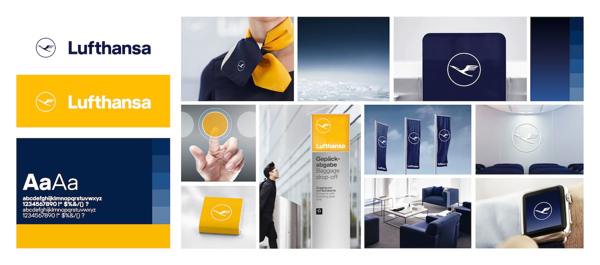
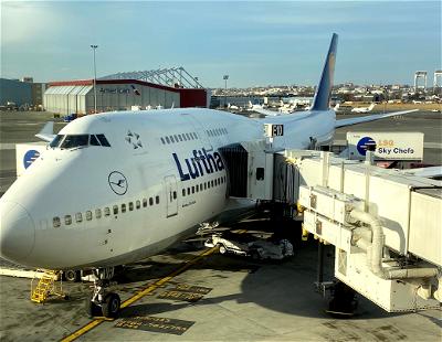
Earlier in the month Lufthansa revealed their new brand design, which is their first major redesign in about 30 years. With this brand design, dark blue becomes the leading brand color, and yellow accentuates, while previously Lufthansa had a lot more yellow in their branding.
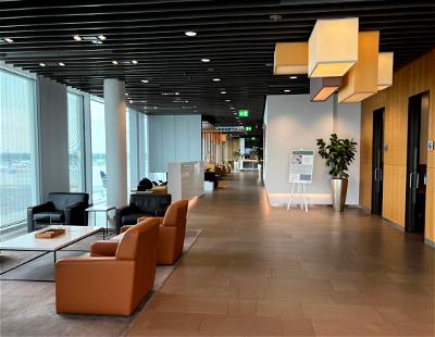
Personally I’ll miss the yellow on the Lufthansa planes, as the new livery is less distinctive and more generic-looking, in my opinion. Rather oddly, Lufthansa is sort of splitting their branding here — much of their airport branding will exclusively be yellow and white, while their planes are now exclusively blue and white.
The rebranding hasn’t been terribly well received by enthusiasts. While we like these sorts of things as aviation geeks, I’d note that I personally don’t think it has much impact on the company’s bottom line, one way or another.
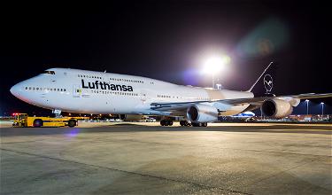
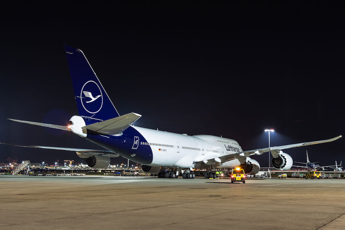
Lufthansa presently has two planes flying with the new livery, though it looks like they may be having second thoughts, at least with how they’ve executed it so far. Wandering Aramean points to an internal communication posted on a German frequent flyer board.
Essentially it says that after the two planes with Lufthansa’s livery have landed at many airports around the world, they’ve noticed that the blue paint appears significantly darker than they were expecting based on test environments, especially in bad weather. As a result, they’re working on optimizing the new livery. They’re also working on a new version of the design that combines the Lufthansa word mark with the crane logo.
The note goes on to explain that this is a dynamic process, and it’s important for them that the new design works under all conditions, and that the practical execution is more important than the theory here. They’re going to keep collecting feedback and then make changes as needed.
So for the time being I expect we won’t see more Lufthansa planes repainted, as they likely want to get the new livery right before painting more planes. What I’m curious about is if they’re truly just going for a slightly different shade of blue, or if the feedback hasn’t been quite as they expected, and perhaps they’ll make bigger changes.
Do you think Lufthansa is truly just updating the shade of blue here, or do you think they’re making bigger changes to their new livery?

I was very disappointed with Lufthansa's new livery colors.
They should have left well enough alone.
The previous color combination with the yellow was iconic. The new livery makes it hard to even disquinguish Lufthansa from the rest of the crowd now.
They should have run the new design past the test group of passengers and flying public.... and even just " plane watchers ".
Lufthansa: you can save yourself by...
I was very disappointed with Lufthansa's new livery colors.
They should have left well enough alone.
The previous color combination with the yellow was iconic. The new livery makes it hard to even disquinguish Lufthansa from the rest of the crowd now.
They should have run the new design past the test group of passengers and flying public.... and even just " plane watchers ".
Lufthansa: you can save yourself by making the crane yellow again and the name Lufthansa in yellow.
The new livery is beyond a joke. I can’t believe Lufthansa would ruin their brand into something so cold, drab, and unmistakable. The iconic crane is there, but nearly invisible to the point that there might as well be nothing on that very dark blue tail. The crane means nothing if people can barely see it in the first place. I don’t understand why they couldn’t have just left well enough alone and focused on...
The new livery is beyond a joke. I can’t believe Lufthansa would ruin their brand into something so cold, drab, and unmistakable. The iconic crane is there, but nearly invisible to the point that there might as well be nothing on that very dark blue tail. The crane means nothing if people can barely see it in the first place. I don’t understand why they couldn’t have just left well enough alone and focused on something more important, like getting their long overdue business class onto some actual planes earlier or catching up with competitors on short-haul catering. It’s kind of random they would just go and do something like this; I can understand if it coincides introduction of a new aircraft type, which isn’t the case here. And I’ve seen the new livery myself when on an afternoon layover at FRA a while back. Now the plane tail looks black and even worse, it blends into the primarily dark trees and buildings in the background, almost looking as if the back section of the plane got sliced off. Seeing a bunch of LH planes there has this effect that just makes rust whole airport look bleak and cold. If I’m ever there later on after the whole fleet is repainted, I’ll have to stare over at Terminal 2 to cheer myself up. I could go on about how it resembles a cheap charter airline, particularly how the Lufthansa 747 looks like one of those United Charter 747s. It’s just so sad. Even the terrible new liveries of Iberia, Aer Lingus, Aegean, and a bunch of other Eurowhites at least have plenty of color, and they at least try to distribute it throughout the plane (e.g. colored engines). Along with that, even to those who don’t care about planes or livery design, I’m pretty sure at least most of the traveling public would like to be able to identify which one is the airline they’re flying at the terminal, even if it’s a long walk away. I’m pretty sure they would care if it is potentially hard for their eyes to quickly make out the new logo in white on a yellow background at check-in. It would get missed easily by those in a hurry to catch their flight. Especially if they’re not familiar with Lufthansa, I’m pretty sure they would care if the logo on airport signage was yellow and white but they potentially get confused when they see the incongruous dark blue and white look of the plane. I wish they would just keep the old format, with the much more easily readable blue logo on yellow and vice versa for airport signage, and of course the old livery, and simply changed the font; nothing else. I’m still in such disbelief that the yellow circle on blue, that I feel made Lufthansa Lufthansa, and that was the first thing I think about when I hear their name, is now one of their old, defunct liveries.
All I'm going to say is...if they won't color the crane on that tail yellow, I'M going to go up and do it myself!
Hopefully Lufthansa will realize that the public, their frequent flyers and the many people who work around the aircraft mostly despise the retraction of the yellow from their airplanes. They no longer stand out, they no longer reflect the warmth of the Lufthansa employees or the positive experience of flying them. This childish and un-inspiring livery sends the wrong message to the flying public giving the Lufthansa family a cold and extremely drab appearance that...
Hopefully Lufthansa will realize that the public, their frequent flyers and the many people who work around the aircraft mostly despise the retraction of the yellow from their airplanes. They no longer stand out, they no longer reflect the warmth of the Lufthansa employees or the positive experience of flying them. This childish and un-inspiring livery sends the wrong message to the flying public giving the Lufthansa family a cold and extremely drab appearance that is destroying a once beautiful German icon. If your exterior is drab, imagine how your interior will be perceived. Who wants to spend 12 hours in a cold harsh environment? Perhaps give the circle around the crane the iconic yellow, or is yellow paint just too expensive?
Dear me.
I wonder just how much they paid for this ineptitude...
The world is driven by ineptitude and idiocy, it seems. The last livery was a backward step, but this new one is a giant leap in the same direction...
Leave the LH livery alone! I've already seen US carriers dookie on Massimo Vignelli and Saul Bass. Thank Goodness DL had the sense to keep the widget— and with refined & minimalistic taste, that was in a way forward thinking. Ugh, even if the crane was yellow or something. LH, you can do better sweetie!
Who gives a rats posterior in any case? We can think what we like, but none of us know what’s actually going to happen. They may even make a complete u turn.
I’m more concerned with what they put on the inside of the plane rather than the paint scheme on the outside.
Honestly: I do not care!
The new Lufthansa livery appears black in many photos. It looks like the official airline of ISIS.
If LH must change for the sake of change lighten the blue - although it will probably still show as black at night - and make ‘the bird’ yellow as a nod to the past. Whatever they do however won’t attract a single incremental passenger. Customer allegiance is built on loyalty to service levels not liveries.
@Claus Thanks for posting that link. I thought the Qatar livery looked ok back then but it looks terrible compared to the current version.
But do people actually choose an airline based on it's livery? I mean, it's great for branding and whatnot, but at the end of the day, people are going to choose their airline based on things like service, price, etc.
I mean, people think Korean and Asiana have some of most God awful interiors of any airline...but most people would still fly them given the option.
Lufthansa's new livery fails to serve its principal purpose: clear identification and distinguishing of Lufthansa planes. That JNB tarmac photo confirms that it's very difficult to see the crane logo and distinguish the Lufthansa tail from that of a LOT plane. The problem is not the color, but the lack of bold tail detail with the thinner lines used for the circle and crane. Air New Zealand does black and white very well with the...
Lufthansa's new livery fails to serve its principal purpose: clear identification and distinguishing of Lufthansa planes. That JNB tarmac photo confirms that it's very difficult to see the crane logo and distinguish the Lufthansa tail from that of a LOT plane. The problem is not the color, but the lack of bold tail detail with the thinner lines used for the circle and crane. Air New Zealand does black and white very well with the bold koru/fern design.
Lufthansa's problem can be fixed, though, while keeping the crane. The liveries that need to be binned and re-done entirely are the geometric/color block ones that have no distinctiveness whatsoever -- Avianca, Asiana, Etihad, Eurowings, LATAM, and particularly the new Iberia livery. Compare those with Qantas, Air New Zealand, Thai, Swiss, and Hawaiian -- no one is going to wonder which airline is operating one of their planes. Fiji Airways has the coolest new livery -- such a change from the banal livery of Air Pacific.
@callum - Many of the LCC are monochromatic (Air Asia, Scoot, EasyJet, Wow). It looks a little cheap (only paint one color) and not very sophisticated. But more than anything, the new LH design looks too much like Joon to me. :)
I do like Vueling's livery so not all LCC's have boring design. To be fair, LH did avoid the other extreme of trying to be too trendy. I'm not sure how well the new Air Italy livery is going to hold up...
Anyone else wondering why are we even talking about this? It is not an international crisis. Ben - I love you but this is really putting me to sleep.
I was typing too fast. It should read IF IT AIN'T BROKE, DON'T FIX IT
If Lufthansa really wants to get rid of the yellow - then they should GET RID OF THE YELLOW. Keeping it for uniforms and signage and boarding passes, etc. makes little sense if the most recognizable color of the company - for many decades - is removed from the livery of the aircraft.
This reminds of how some years ago Delta decided to ditch the 'widget' and painted a sort of wavy flag on the...
If Lufthansa really wants to get rid of the yellow - then they should GET RID OF THE YELLOW. Keeping it for uniforms and signage and boarding passes, etc. makes little sense if the most recognizable color of the company - for many decades - is removed from the livery of the aircraft.
This reminds of how some years ago Delta decided to ditch the 'widget' and painted a sort of wavy flag on the tail. But higher-ups at the company just couldn't stand parting with their iconic, delta-shaped logo and so it was retained on the fuselage and advertising material. (So what was the point of removing it from the aircraft tails?) Within a few years saner minds prevailed and the widget was returned to the tails of the planes, where it remains to this day.
IF IT AIN'T, BROKE DON'T FIX IT!
White writing on yellow isnt particularly easy to read though, especially from a distance and for partially sighted people.
Heathrow uses black writing on a yellow background since it was found to be one of the easiest designs to read from a distance.
This new livery is not that bad in my opinion. The main reason could be an economical one. Instead of three different colors (blue, yellow, grey), they only need one. And it looks like, as if the painted surface became smaller. Less weight? How much time do they save per aircraft for the painting procedure?
Yes, there are three planes in new LHlivery, not two.
I just don’t understand the reasoning behind the redesign. The DLH YELLOW is recognized the world over as LUFTHANSA. Why spend the millions to update the paint, just a small portion of the cost. Put the money into upgrading the 1995 vintage Business class seats instead and keep up with the competition. Frankly, after having flown this airline consistently since the late seventies, I have seen them grow to one of the world’s best airlines...
I just don’t understand the reasoning behind the redesign. The DLH YELLOW is recognized the world over as LUFTHANSA. Why spend the millions to update the paint, just a small portion of the cost. Put the money into upgrading the 1995 vintage Business class seats instead and keep up with the competition. Frankly, after having flown this airline consistently since the late seventies, I have seen them grow to one of the world’s best airlines in all areas. They just are too humble!
Three aircraft are painted. 748, 321 and CRJ900. Granted the CRJ is operated by Lufthansa Cityline but it is still in a full LH livery and not branded LH Cityline or LH express.
The use of yellow on there website (where they use it as a focus color for naviation element) makes a lot of sense to me; same for airports (where the yellow does stick out and helps finding LH).
I also did like the new livery for planes: it was more elegant, although it was more generic. Yet, I think they might have missed that the yellow did do the "yellow highlight" thing for planes - make them stick out.
I saw one of the newly-liveried planes on Thursday when arriving at FRA, and I only noticed the plane because I knew about the mini-hype around the change. The point of LH branding in FRA is obv that one notices their ubiquity, subconsciously as it were. That is not the case with the new livery, which blends into the background. It's like muji design; it's like mineral water in a clear bottle. Stylish for people...
I saw one of the newly-liveried planes on Thursday when arriving at FRA, and I only noticed the plane because I knew about the mini-hype around the change. The point of LH branding in FRA is obv that one notices their ubiquity, subconsciously as it were. That is not the case with the new livery, which blends into the background. It's like muji design; it's like mineral water in a clear bottle. Stylish for people at a graduate seminar at Cooper Union or whatever, and in line with management training LH might purchase from EBS a few minutes' drive into the Taunus, but - as has been observed - directly revenue-neutral and indirectly a loss of brand power because of a pseudo-cool stylishness that makes LH recede into the background. Tbh I don't like the current LH design, 70s-ish as it comes across, least of all in the lounges which I find terribly bland and sparse without being truly minimalist, and I am no fan of yellow-grey. But I would say it was still better than nothing, which is what we are getting now.
A few days ago when I flew from Munich our plane was parked nearby a Bombardier of Lufthansa in the new livery. And the dark blue looked almost black in the snow. Just as long as they changed the color to be a bit lighter then it should be fine. I personally quite like the new livery.
And by the way Lufthansa have three planes in operation with the new livery, not two. :)
I think the lack of yellow on the plane is a big mistake. They are walking away from half of a strong branding color scheme, at least on fuselages. I don't get how this is updated, I just see drab.
Qatar called from the 90s, they want their livery back...
https://upload.wikimedia.org/wikipedia/commons/thumb/6/6f/Qatar_Airways_Airbus_A310-200_JetPix.jpg/800px-Qatar_Airways_Airbus_A310-200_JetPix.jpg
The smartest thing would be to cancel this entire nonsense and use the money to speed up introduction of the new business class seat.
LH should make that bird yellow and the lively will speak of eleganz and reliability.
BA currently doesn't fly 2 daily A380s to JNB. That picture is fake but tells the story.
Based on these 2 pictures, I don't think it looks too bad. But then again, I might be in the minority on that.
Xtina - In what way does it look like a LCC? I can see why people may prefer the old one (though I think the new one looks far classier), but I can't see any logical way it can be described as looking "too LCC".
I really hope they add some yellow or make their livery a bit more interesting rather than just using a lighter shade of blue. Their new livery is a major disappointment. I wish they would just scrap their new livery and keep their old one. It looks better and it wouldn't cost them anything!
I hope they just forget to implement any of the livery changes and attribute it to "on-going research". I liked the existing Lufthansa livery and graphic design. The new proposed design is way to simple and cheap/LCC looking for what they want to be as a brand.
I hope they make the air hostesses to wear cheer leader type clothes.
It will help in safety.
The only certainty when redesigning a livery is that aviation buffs will moan that it's horrible. They should do focus groups and survey people in the airports to decide if it's a successful change. Livery also surely is part of a larger brand design and will be considered in that context.
Like the new brand identity, and I really like the way they plan on using the new colors, while the livery looks like it could be better.
Wow thanks for hyping me up for nothing, Ben. I won’t call it clickbait, but it’s close. Slightly changing the shade of blue? Really?
I just saw a photo of one of their planes taking off with the new livery and I was wondering why it was looking so dark. It almost looked like black from far away in the daytime.