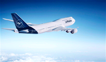
For a while there have been rumors of Lufthansa updating their livery, and everything I heard suggested that they were going to reveal the new livery in the first week of February. While they have an unveiling event next week, it looks like there’s now an official rendering of what the new livery will look like. Here it is, on the 747-8:
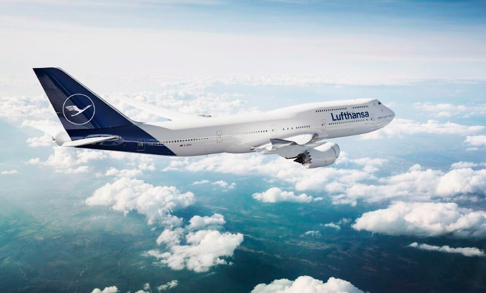
As a point of comparison, here’s the old livery, pictured on a 747-400:
I’m not really sure what to make of this, to be honest. Maybe I’m too risk averse and just subscribe to the “if it ain’t broke, don’t fix it” philosophy too much. Rarely do I actually like new liveries when they’re introduced, though over time they do sometimes grow on me.
I suspect that’s largely a function of the experiences I associate with certain airlines, and when they change their branding, my feelings towards them change. That’s not to say anything is actually substantially changing, but it suddenly doesn’t feel like “my” airline anymore.
As you can see, Lufthansa is eliminating the yellow, and instead going for an all white and blue livery. The yellow always added a nice splash of color to Lufthansa planes, though that will be no more.
Personally I thought Lufthansa’s old livery was timeless, so I hate to see it go. I don’t like the new livery quite as much, but I also don’t think it’s too bad. I just wish it had a bit more color. Ideally they’d incorporate some yellow, but otherwise even some more blue or silver would look nice. It’s not that the plane is any more “bare” than before, but rather previously there were three colors, while now there are just two, so it just looks plainer.
The Flight Detective points out that the new Lufthansa livery is basically just a blue version of the Qantas livery, and he’s spot on. My gosh, they basically copied it.
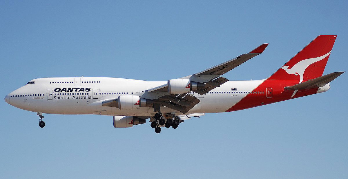
Image courtesy of Aero Icarus
What do you make of Lufthansa’s new livery?
(Tip of the hat to @AeronewsRO)


Lufthantas. What an unoriginal, uninspiring, totally insipid non-event of a 'rebrand'. They just copied the Qantas scheme but did it in a dark drab shade of blue.
just a frozen livery ! no creativery, no personality anymore, no identity ! just a cheap copy of UTA, Qantas, ex Malev ... etc ! The best way back to an unknown "Anyone Airline" - but not more LH !
And next LH will replace the yellow duck with a white goose.
Would be very fitting if the first passenger to board
the inaugural flight in the new livery is Mr Terry Bull.
Just imagine how depressing the entire Frankfurt airport will look when Lufthansa will paint all aircrafts in a new shade of blue. New logo looks very generic and boring.
The old sign has gone. It was a crane flying long distances with the sun in the background. It was a promise to bring you into warmer regions far away, a promise to fullfill your desire for exotic destinations. The new crane is a white ghost flying through the dark. That's bull, isn't it?
So they will save money no longer having to print the extra yellow colour. However, now they will have to spend a stupid amount to replace all the signage. Just stupid! Long live the LH Yellow!!!
I just wish Otl Aicher was still alive to give a good lesson to LH design dept.
How much money did LH pay to have this “3rd grade art class” livery designed?
What difference does it make? I simply don't care what the plane looks like I am flying in - I don't see the outside anyway.
I completely agree with your impressions about the timelessness of their old design. It reflects German simplicity and elegance. I like how the color on Quantas, and the new Lufthansa, reaches around the body rather than stopping at bottom of the tail. They could have simply stuck with the scheme with the yellow, which I like better too, but then extended it around the fuselage and called it a day.
Typically German . Boring and bland. I don’t get all the hate for Air Canada. Huge improvement over the sky blue planes and pixelated logo.
If someone gave me five seconds to make Lufthansa's current livery worse, this is what I'd come up with. So unimaginative and SO bland. The yellow is iconic and the grey differentiates; despite its simplicity, I love the current livery! If this leak is correct the new one is a huge shame and a waste of cash.
in 20 years from now, they'll get the yellow back and have all sorts of campaigns 'back to origins' and whatnots.
I saw a photo of it and thought it was a special edition, not the new livery.
The best would have been the old one plus blue extended down. The 2nd best is the old one. The 3rd best is the new one. The new one isn't terrible.
How can you have Lufthansa without the yellow???!!! Big mistake in my opinion. This tail wont tell the tale.
This one doesn't look all that bad...
Hey, Air Canada did way worse.
But Qantas has the roo! Can't copy that.
Lufthansa's new one is boring.
& Qantas's livery was just a red copy of UTA's ! So in fact Lufties livery would pay tribute to UTA - if so - hopefully they elevate their service levels to UTA's!
i hate this. Lufthansa's yellow is such an iconic part of its brand and heritage and has been there forever. its not just the seats even uniforms have yellow color integrated in them. they could have updated it with modern design element while keeping the yellow.
@Gilbert: "But unfortunately, Lufthansa only knows friendliness as a sort of carefully measured intelligence that comes from the brain and not from the heart."
I have to say, during my latest misconnect in FRA, LH staff were warm, friendly, understanding, efficient and competent. I was quite pleasantly surprised.
This is even worse than United eliminating the "tulip" U in favor of the Continental latitude/longitude globe.
Has LH changed their livery at all in the last 50+ years? It seems like all my life, I've been flying on Lufthansa planes with a yellow circle/blue crane. Yellow is indelibly the color of Lufthansa, as all their signs, boarding passes, etc invariably have yellow. Why remove it from the plane livery? It's bizarre.
its definitely more clean and crisp and distances themselves from the low costs carriers but a little yellow wouldn't hurt. Seems like outside of AA all the new branding/liveries look worse. Its been years since AA redid theirs but I still find it to look really really good and I never fly AA.
I hope the yellow removal is only on the aircraft. I do not want to see the yellow disappear from the check-in counters, signs, Senator lounges, etc.
Am guessing the the yellow signage and lettering at all their lounges, counters, gates change as well.
Leaves me puzzled. The only explanation I could imagine is like @Tom said, that they feel the blue and yellow color scheme has been highjacked by Ryanair...
The current livery was introduced in 1988. I am pretty sure the new design will not last as long, doesn’t look nearly as timeless.
Overall I like the new livery.
That said, the crane flying in front of a gold background is classic, and I wish they hadn't felt the need to change that part. I'm no Photoshop pro, so I can't do this myself, but I would love to see the new livery but with the circle still in gold.
I also wonder if the gold circle was supposed to represent the sun. Whether or not that's...
Overall I like the new livery.
That said, the crane flying in front of a gold background is classic, and I wish they hadn't felt the need to change that part. I'm no Photoshop pro, so I can't do this myself, but I would love to see the new livery but with the circle still in gold.
I also wonder if the gold circle was supposed to represent the sun. Whether or not that's the case, the gold added much needed warmth. The new liver with simply a crane in a circle is too austere. I hope the flight attendants keep the gold accents.
How sad. The yellow added some warmth to their brand. It made the plane cheerful, matched by the beautiful yellow scarfs onboard.
Apologies for being pedantic, but that version of the Qantas livery has already been updated twice (albeit subtly).
I confess that the paint job on an aircraft is something I rarely notice, much less care about.
If they were going to change it, I'd rather they would have gone to the retro jet look that D-ABYT sports... this is just boring
Why get rid of their iconic yellow and copy another airline.
Giant waste of money.
Lufthansa's current livery has four colors (white, blue, yellow, and gray), not three. The new livery only has two (white and blue).
I'm surprised so few people have noticed the elimination of the gray paint on the belly and engines. It was the sole element of color on an otherwise all-white fuselage (aside from the tail).
Can't someone start a campaign to Save The Spiegelei! (fried egg)?
Another BOAC story - when a timeless livery is replaced with something not necessarily bad, but nowhere near so iconic! Always loved Lufthansa for the timelessness and the strict, business-like style. Goodbye, sweet prince!
I prefer the new one.
They could not possibly have been more uncreative, boring and fake five-stary than this.
Congrats Lufthansa management.
I am really disappointed by this bland, uninspired (and uninspiring) new livery and I will dearly miss the iconic LH yellow. It‘s still on the FA uniforms, but as these have been around for 18 years or so, I am afraid the yellow is doomed to vanish for good also from the uniforms ...
It totally fits with Lufthansa's lack-luster and love-devoid culture. Yellow sort of represents something bright, like genuine friendliness from the heart. But unfortunately, Lufthansa only knows friendliness as a sort of carefully measured intelligence that comes from the brain and not from the heart. Sorry, you can't teach genuine friendliness to the robots that comprise this corporation. It is best that LH keeps to the lackluster boring DAAAAARK-BLUE without the yellow, because this truly represents...
It totally fits with Lufthansa's lack-luster and love-devoid culture. Yellow sort of represents something bright, like genuine friendliness from the heart. But unfortunately, Lufthansa only knows friendliness as a sort of carefully measured intelligence that comes from the brain and not from the heart. Sorry, you can't teach genuine friendliness to the robots that comprise this corporation. It is best that LH keeps to the lackluster boring DAAAAARK-BLUE without the yellow, because this truly represents their coldness and business like approach to everything.
This new livery is fantastic, I've never liked the yellow. It is now clean and crisp, like I'd expect from an iconic German company.
I agree with Lucky in that livery changes almost never look good to me when first seeing them. There's one exception though: American. They have my favorite livery in the sky, and such an improvement over the old, albeit iconic, design.
Boring and uninspired. There's such a thing as too minimalist. They should've kept the iconic yellow, but perhaps slimmed the lines of the circle and crane while extending the blue down the empennage as they've done. Of course I'm no graphic designer, but as a consumer I'm not a fan.
Definitely a bit of a boring option, but I’ve always thought Lufthansa was very soulless and dull frankly... I mean the inflight magazine is just called “Magazin”!
I would imagine they’re trying to distance themselves from the blue and yellow colour scheme which in Europe is increasingly seen on Ryanair (and Ikea) and might give a ‘cheap’ impression.
Whenever I think of LH I think of yellow too! The new livery is ok, a bit boring but not offensive.
if the contest was "how to make a bland generic Eurowhite and make it even more coma inducing" then LH's new livery would've won hands down.
This is one thing that always amazes me, i.e. how much time is spent writing about and discussing how airlines paint their planes. To be it seems absolutely trivial compared to so many other things that they do, or the industry in general. Maybe I'm just no fun, but who really cares what color the plane is. I care much more about whether the plane is safe, the seats are comfortable, it's clean, the food is good and I get there well rested and on-time.
I agree it didn't need to be changed but I quite like the new design.
More importantly though, can we just get emirates to go full Trump with a gaudy all gold livery?
From a design theory and a management perspective, I can see this; exactly such ´updates are by the book, and the Lufthansavorstand surely has his backside covered with all kinds of FH professors' reports that this will increase their recognition by 2.56% and shareholder value by 0.165 or some such. But I agree with the dismissive tone of everyone here, I would just say that the new blander LH is in line with the lounges,...
From a design theory and a management perspective, I can see this; exactly such ´updates are by the book, and the Lufthansavorstand surely has his backside covered with all kinds of FH professors' reports that this will increase their recognition by 2.56% and shareholder value by 0.165 or some such. But I agree with the dismissive tone of everyone here, I would just say that the new blander LH is in line with the lounges, the soft product and the purchased five stars. LH for me (I am based near FRA a good part of the year) means it's never exciting or special or friendly or stylish or delicious, but there is a basic solidity and reliability here and a certain assurance that sooner or later you and your luggage will actually reach your destination.
Don’t forget that the belly will no longer be grey.
depressing blue
The new LH livery is unimaginative, uninspired; in a word, it's hideous. I would think they have have far better things to do with their time and money than this.
I've been flying Lufthansa since the early 70's and so I will miss the iconic navy & yellow livery. I certainly don't see this as an improvement.
I wonder what will happen to the flight crew uniforms; they had yellow flair which will likely also disappear.
It will be drab looking on board. Ha ha
The new logo is a bit more bland. LH flies the 747-8I to BLR, hopefully I'll catch it once I get my US visa renewed.
Indian citizens need a US visa stamped on their passport to travel from US to India via Germany.
It's an unusually burdensome rule, since US visas take 8 months to get renewed, can only be stamped in India, and Indians can travel via Germany only after that.
I agree that there was nothing wrong with the old one, but I kind of like the new one.
Most of the new liveries are awful. Air Canada and now LH are making it worse...
What a waste of money! I'm sure Lufthansa paid a design company $$$ for the redesign only to see it was a copy of Qantas's! Would be funny if Qantas and Lufthansa hired the same company.
In addition, it also costs $$$ to repaint all their planes when they didn't need to. Not sure what they're thinking but clearly they have money to spend.
I understand a change in livery if the brand...
What a waste of money! I'm sure Lufthansa paid a design company $$$ for the redesign only to see it was a copy of Qantas's! Would be funny if Qantas and Lufthansa hired the same company.
In addition, it also costs $$$ to repaint all their planes when they didn't need to. Not sure what they're thinking but clearly they have money to spend.
I understand a change in livery if the brand wants to change its image (Malaysia Airlines comes to mind) but in Lufthansa's case, they didn't really need it.
I always liked the Lufthansa gold and blue colors and what they evoked. The new livery looks clean but definitely lacks the impact that the accent gold was bringing. I like how the blue continues down on the fuselage but wish they had somehow kept the gold!
I don't see the appeal of the new livery. Seems like change for no reason, other than to perhaps celebrate becoming a five-star airline?
I do admit I love the retro livery on one of the 747-8 fleet.
Ukraine International livery, plenty of yellow and blue
https://www.flyuia.com/assets/img/fleet/boeing-767.png
well, there's really only so many things you can do. I'm sure there are many more examples of that sort of tail livery beyond QANTAS.
I like the LH update. It looks like the tail has some kind of graphic to it though, it's not just plain blue. Most companies update these things on a schedule of several years.
Kinda similar to LOT Polish
Lufthansa is yellow for me.
Echoes what Cathay Pacific did with their livery - reduce and simplify to the core elements (crane / brushwing) on a deeper and richer variation of their primary colours (blue / green). However, I think in both cases the exercise has reduced them to bland eurowhite liveries that don't leave much of an impression.
I can’t see either why a change is needed, or that the new image is an improvement. Like you, I feel the current identity is classic rather than dated.
Not sure I agree that more colours is necessarily better; have a look at original BOAC liveries - just black on white. They look timelessly stylish.
Whoever they paid to do the re-design are laughing all the way to the bank. As Lucky said, if ain't broke, don't fix it!
Totally agree on the need for the yellow accent
hah. I genuinely thought of qantas before scrolling down. Slick nonetheless.